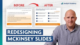
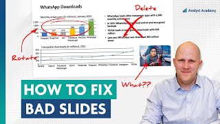
How to build slides like McKinsey (the easy way)
ฝัง
- เผยแพร่เมื่อ 11 ธ.ค. 2024
- Billing slides like McKinsey is actually really easy.
I'm a PowerPoint instructor for the consulting industry, and I'm telling you, all you have to do is follow the movie framework.
First, decide on a message by making a slide about Spotify's growth. I'll put that right in the title. Second, organize your slide.
Think of all the supporting data you can for your message and categorize them into 2 or 3 groups. Then remove whatever doesn't fit. Third, visualize your information. See if you can take 1 or 2 of those categories and turn it into a chart or some sort of visual that explains it better. Fourth is the most important step, and it's calling out the insight.
There's a couple different ways to do this. The first is to state your insights directly. Don't just say the category name. Tell your audience exactly what you want them to know. And the second part of this is to highlight the insights with bolding colors, text, arrows, callouts, whatever you need. The fifth and final step is to worry about the extras.
This is all the little stuff you don't usually think about, like aligning your text and your boxes to make sure everything on your slide is organized and neat. All this framework and I promise you, soon enough you'll be building slides like a pro.
=============================================
📣 FREE STUFF
1-Month Ampler Subscription* ☞ bit.ly/3tFq4Ze
SlideStart (Slide Database) ☞ bit.ly/3HctLIM
Slide Building Course ☞ bit.ly/3v5vcCZ
Umbrex Template ☞ bit.ly/3S7dxar
🏆 COURSES
Presentation Design Course ☞ bit.ly/3UJJi88
Data Visualization Course ☞ bit.ly/3TKt11s
PowerPoint Speed Course ☞ bit.ly/3hOxjaM
Courses for Teams ☞ bit.ly/3H4YSGv
🎬 VIDEOS
• The 5 Most Popular Con...
• Why McKinsey uses blue...
• How I redesigned 3 McK...
• How McKinsey creates m...
🚀 MORE STUFF
Follow us on Instagram ☞ bit.ly/3H7S3ny
Connect on LinkedIn ☞ bit.ly/41T7SIk
Paul's LinkedIn ☞ bit.ly/3tyAOsr
*Affiliate relationship
=============================================
ABOUT US
At Analyst Academy, we teach high-value consulting skills found at the world's top consulting firms. Our clients include small businesses, Fortune 500 companies, universities, and individual students in 100+ countries around the world. Each of our courses combine years of knowledge from high-performing consultants into highly engaging lessons packed full of best practices, time-saving tricks, and some of the industry's best kept secrets. Our downloads, courses, and articles are all inspired by best practices from the consulting industry. Learn more at www.theanalyst...
All views expressed on this channel are that of Analyst Academy LLC and its employees. Any materials mentioned or shown have been obtained through publicly available sources (e.g. firm or client website).
#powerpoint #presentations #consulting #datavisualization


Wow, this is so insightful! And the visualisation is super-great at explaining the steps! Thank You.
So glad to hear. Thanks!
I like the "gather all supporting data, categorise and then remove the least fitting" - this tightens up the slide's message (I tend to add one too many messages). Thank you!
Have you read the book, "Strategic Storytelling: How to Create Persuasive Business Presentations" by Dave McKinsey (2014)?
In the book, Dave McKinsey goes through three interlinked deliverables by McKinsey, BCG and Accenture that they did for a US Postal Service engagement in 2010 (USPS Future Business Model) when the postal service was facing a real profit catastrophe. It's a real gem, really thorough with constructive criticism and detailed information for learning how to do analysis, effectively utilize data insights and build storytelling. I would love to see an Analyst Academy course/resource with a similar approach. It would be a big project but incredibly useful, and the demand for it exists.
Maybe focusing on a newer, publicly available deliverable (hint: BCG Reshaping NYCHA project? Or Loose Dogs in Dallas?)
Never heard of it actually, but it sounds like a good one. That would make for interesting content - thanks for the suggestion!
Always insightful. A great help with data visualisation.
Thank you!
Awesome, always enjoyed having this information. You are masterclass!!!
Thank you!!
Simple but powerful, thank you
You are welcome! Thanks for watching.
Thanks, another great one. Very informative.
Too damn good, wish I had seen this 3 years ago
Awesome, Thanks for the lesson
Gold information!
🚀🚀🚀
love this
How would i go about gathering information so i can organise it?
This depends on the project and the source of your information, but if you’re starting with nothing just ask Chat GPT!
Ha, work in consulting for 2 years and it’ll be second nature