Hi, Thank you for the video Had a doubt here your are only comparing end of month... What if I had to select the daterange that the user has selected in slicer maybe 2 weeks and based on that show the trend by comparing it with the previous 2 weeks...
Thanks, If you wanted to be able to show trends on a two-week /fortnight basis, you will probably need a dedicated column in the date table to show the fortnight values. Then the process would be quite similar
Thank you very much for sharing. The video and your article are very helpful. I appreciate you taking the time to share your knowledge and insight. You have a great way of breaking things down.
Good video. Thanks for giving an explanation eventhough you mentioned that it isn't that important for this video. When you gave your breakdown, it was easy to follow what you are doing. Thanks!
Yes, I just haven't made any videos recently, but hoping to start making them more often. If you gave ideas on what you would like to see, let me know, and I will see what I can do....👍
Nice video - can't wait to try this. I've just sub'd Out of interest, do you know if there is any (dis)advantage to using TREATAS in your "Net Rev - RM" measure instead of the FILTER?
Thank you very much for sharing. I have a query for the Colour Measure, you create the var instead of writing directly. What is it for, will it be much different from writing directly attached? Colour Format Rev = SWITCH(TRUE(),[Total Order Net Revenue] >= [Target Monthly Revenue], "Dark Blue", "Dark Red")
Thanks for your comment. It is fine to write a direct SWITCH(TRUE()) statement. I only used VAR here because I was copying my measures across, and my standard format was to include variables.
The intent was to provide a blank model so people could follow along and create it. There is a blog post with all the calculations included too. Link in the description
Gerard, absolute great content. I started with a dashboard in excel. Are these easy to transfer to Power BI? As a result of your content and visuals, I have been inspired to change.
Are you using power query in excel, or just straight excel? If using power query, then the jump to power bi should be quite straightforward. Power bi is not so difficult, just needs a slightly different approach than excel. It is based on analysing columns and rows with applied filters, rather than individual cells or defined ranges.
Gerard: excellent! Just be aware that the dynamic title is not working well with the horizontal bar chart (100%). It then does not recognize when something has been cross selected in the page.
Just confirming you are selecting a line chart only, and not a line and bar chart combo? If it is a line chart, there should be a reference line option on the formatting pane. It should be third item from the bottom of the pane, above anomalies and error bars
@@dganalysis appreciate the response. Confirming I'm using the line chart only. that's why it's very strange.... do you have a video where you go through how to create the "DATE XA" table in power query?
Thank you... there are a few videos I have done on customising visuals with conditional formatting. Feel free to check them out. I will be back in the new year with some new content.
Great work! Thank You. One help, please... When I apply the subtitle measure to the chart it is not working and showing can't display visual. The visual is not showing after applying the conditional formatting.
Let me know a little more context. What size is the chart (horz and vert pixels), and have you applied the month slicer? And did you use my model, or create your own?
@@dganalysis Yes. I used your model and was following the video. After applying the measure for the subtitle 'subtitle reporting year rev' the line chart is showing an error 'couldn't load the data for this visual'. Formatting options also became unavailable. The size was 278*374. I applied the slicer too.
I guess it depends on you situation and what you need to communicate, and whether that is required in each report you produce. Once you create one, it is simple to copy. On a side note, a company that has "hundreds" or reports which required this type of kpi card would ring alarm bells in my head.
@@dganalysis they did not “fixed” dark mode (there is no dark mode), auto exist is called a feature not a bug, so i guess that it won’t be fixed in years. In my whole life I have never work with such bad designed and counterintuitive software as Power BI so…🙂
@Wzxxx haha, yes, sometimes I wonder about their priorities... sometimes they fix things that don't need fixing, and ignore more important things. I guess I got used to it, and we have to come up with workarounds to do what we want....


Thanks for the video.
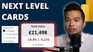
The concept of returning several metrics as a subtitle was mind blowing to me.
Thanks, yes, subtitles are opening up a lot of opportunities....👍
Great Content on Advanced KPI Card, No Online website will have this Advanced DAX , thanks for the Content and please create more contents
Thanks Karun,I will make an effort
How does even find that thing with the markers color lol it was such a neat discovery
Very inspiring. Thanks for your time.
love this kpi hack!!
Out of curiosity - what canvas size do you use? I’m having a hard time fitting everything using 16:9
Thanks, typically I set a custom of 1600:900.
Considering the smallest font size is 8, I find 16:9 can be a bit restricting
Hi, Thank you for the video
Had a doubt here your are only comparing end of month... What if I had to select the daterange that the user has selected in slicer maybe 2 weeks and based on that show the trend by comparing it with the previous 2 weeks...
Thanks,
If you wanted to be able to show trends on a two-week /fortnight basis, you will probably need a dedicated column in the date table to show the fortnight values.
Then the process would be quite similar
Thank you very much for sharing. The video and your article are very helpful. I appreciate you taking the time to share your knowledge and insight. You have a great way of breaking things down.
You're very welcome, glad it was helpful for you. Planning some new videos for the coming weeks
Amazing way to display KPI. Thank you for sharing
thanks a lot for this video, i wonder if with november update reference labels in kpi card should be more easy?
Yes, potentially, but not sure about the text formatting and spacing, etc. I think there might be issues with alignment and text overlap.
I'm definitely excited to go through this video, to see how you did it 😊
Great, let me know how you go - and if you come up with any cool alternatives 👌
me too
1:58 now card visual has a title and subtitle since March 2023, Thank you Gerard!!!!
8:15 workaround for the markets via conditional formatics
Amazing way to display KPI. Thank you for sharing
@@garudabowo my pleasure
Hi Gerad ..many, many thks for sharing.. I used it to build some of my own KPIs.. thaks again !😀
That's great, glad it was useful 👍
Good video. Thanks for giving an explanation eventhough you mentioned that it isn't that important for this video.
When you gave your breakdown, it was easy to follow what you are doing.
Thanks!
Cheers, appreciate the feedback
Amazing Video, I followed you step by step and it really helped me build a Multi KPI Dashboard. Thank you so much!
Thanks Gerard, I have now used the Disconnected Table idea at work and believe it will be much appreciated.
Thanks, happy to hear it has helped
Excellent use case of titles and subtitles. definitely going to use it
Cool, glad it helps 👍
Never knew that you have a YT channel already! Thanks for sharing your knowledge. You are truly a superstar
Yes, I just haven't made any videos recently, but hoping to start making them more often.
If you gave ideas on what you would like to see, let me know, and I will see what I can do....👍
Looking forward to see more video from you❤
@@hasanakhtar2120 one coming this week, will preview on LinkedIn tomorrow
End to End project please if possible. Love from India@@dganalysis
Nice video - can't wait to try this. I've just sub'd
Out of interest, do you know if there is any (dis)advantage to using TREATAS in your "Net Rev - RM" measure instead of the FILTER?
That's fantastic! Would it be possible for you to share the PBIX file for this project?
I'll be dropping a copy of the model this week on my blog. I'll add a link in the description of this video when I do it.
Thank you so much .. I can explain.. but thank you so much
No worries! Happy that it helps...
Thanks @Gerald, this will improve on my Dashboard layouts going forward
Hi Gerard, thanks for this video, very helpful. I'm curious how you've created and used MonthCompleted and YearCompleted in your date table?
You can download the file and see the calendar table code inside power query.
Wow! Very cool!
An example of non-standard and creative thinking.
Thanks - yes, applying a little creativity and bending a few rules can help us come up with some more innovative solutions 👍
Thank you very much for sharing. I have a query for the Colour Measure, you create the var instead of writing directly.
What is it for, will it be much different from writing directly attached?
Colour Format Rev =
SWITCH(TRUE(),[Total Order Net Revenue] >= [Target Monthly Revenue], "Dark Blue", "Dark Red")
Thanks for your comment. It is fine to write a direct SWITCH(TRUE()) statement. I only used VAR here because I was copying my measures across, and my standard format was to include variables.
Gerard looks and sounds very similar to Jason Isaacs. So all this video is pretty much Lucius Malfoy explaining you some Power BI
Haha, thanks, I'll take it as a compliment....Jason Isaacs is a legend 🙌
❤❤❤❤ awesome man
@@Dev_Bartwal thanks
Hi, can I use Full Excel features, Power BI, and other Microsoft analytics tools on MAC, or it's not supported?
community.fabric.microsoft.com/t5/Desktop/Installing-PBI-on-Macbook/td-p/3095410
Could you share the pbix? the file on your google drive is empty and contains 0 measures
The intent was to provide a blank model so people could follow along and create it. There is a blog post with all the calculations included too. Link in the description
Once again amazing new video after a very long time.
Thank you
Thanks Mohammad, starting to get a little more time to write and make videos. Hopefully more to come
Oh! finally i found you! thanks for great video! trying to do it myself on my data! will be very cool if you can explain how to work with data
Thanks for the idea! Glad it was useful
Amazing .Can You share the pbix file of this project?
Yes, will add the base file on my blog this week, will update the notes on this video with a link
Great!!!
Thank you
Can You share the pbix file of this project? it would be really helpful
Yes,I will share the blank model to help people follow. I will use it on future videos too
❤❤❤❤
awesome
Gerard, absolute great content. I started with a dashboard in excel. Are these easy to transfer to Power BI? As a result of your content and visuals, I have been inspired to change.
Are you using power query in excel, or just straight excel? If using power query, then the jump to power bi should be quite straightforward.
Power bi is not so difficult, just needs a slightly different approach than excel.
It is based on analysing columns and rows with applied filters, rather than individual cells or defined ranges.
Very awesome technique, Thank you so much.
Thanks, glad it helped
Fantastic Gerard. Thank you very much for sharing.
Glad you enjoyed it
Wow thanks a million for this
Excellent video. Thanks for sharing.
No problem, thanks for watching
Gerard: excellent!
Just be aware that the dynamic title is not working well with the horizontal bar chart (100%). It then does not recognize when something has been cross selected in the page.
Thanks, is this an issue with selected interactions?
Yes
Much awaited video.
Amazing.
Many thanks for sharing this only kind of video on TH-cam.
You are true Gem.
Thanks, glad you like it. If there is anything else you would like to see, let me knwo
wow! Incredible!!! Congratulations and thanks for sharing
Thanks Fernanda
hell ya. thanks mate for the tutorial
No problem - I have a few more released in the past few weeks that you can check out.
If there are other things you would like to see, let me know.
Stunning work! Could you also share how you created the horizontal bar charts with comparison against target?
Thanks, those are created in deneb. I will maybe start some deneb videos soon.
I'm currently doing one for a donut and bar chart kpi card
Awesome work ..high level dax and a request from my side can u abke to do rev n cost analysis based on employees FTE week ok week n qoq n mom
I'll add it to the list and see what I can do.
@@dganalysis thank you will for it....
Welcome back Gerard
Thank you Moses :)
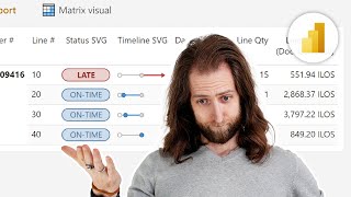
Thanks for the video. I can’t seem to find the reference line section in my line chart. I’ve got julys version of pbi. What am I missing here? Thanks
Just confirming you are selecting a line chart only, and not a line and bar chart combo? If it is a line chart, there should be a reference line option on the formatting pane.
It should be third item from the bottom of the pane, above anomalies and error bars
@@dganalysis appreciate the response. Confirming I'm using the line chart only. that's why it's very strange.... do you have a video where you go through how to create the "DATE XA" table in power query?
@oneeyeshutcreative yeh, weird, I went back to check mine, and it was there. If you are connected with me on linkedin, feel free to dm .me
Excellent ❤❤❤great. Thanks. Waiting for next great work.
Thank you... there are a few videos I have done on customising visuals with conditional formatting. Feel free to check them out.
I will be back in the new year with some new content.
We are waiting for you. love you for such a great work ...😍 Excellent Sir Excellent Sir ❤👋👌👍@@dganalysis
Thanks for sharing. Amazing job!🤩🚀
Thanks, appreciate it, new video coming in a few days
The UNICHAR(10) is not producing a new line. Anyone else having trouble with this?
It only works with the subtitle (not title), and ensure your version on power bi has been updated within the last year.
@@dganalysis I just figured out the problem. I had text wrap on. I had to turn it off.
@@DrewMery all good 👍
That was interesting. Thanks a lot for sharing
Glad you enjoyed it
your teaching is good but we have noise of your keyboard
Brilliant. Love your content 🎉
Thank you 🙌
Parabéns! 👍
Thank you!
Dude! That is insane. Well done
Cheers Ross, appreciate it 👍
Great work! Thank You. One help, please... When I apply the subtitle measure to the chart it is not working and showing can't display visual. The visual is not showing after applying the conditional formatting.
Let me know a little more context. What size is the chart (horz and vert pixels), and have you applied the month slicer? And did you use my model, or create your own?
@@dganalysis Yes. I used your model and was following the video. After applying the measure for the subtitle 'subtitle reporting year rev' the line chart is showing an error 'couldn't load the data for this visual'. Formatting options also became unavailable. The size was 278*374. I applied the slicer too.
@anjaliunnikrishnan5814 it may be a data type error, try dropping the subtitle in a card visual and see if it shows the text
@@dganalysis Thank you. But it is not showing on the card too. Same error
@@anjaliunnikrishnan5814 then you likely have an error in a data type or in the dax calculation
Awesome!
Cheers Injae 👍
Realy good vidéo !
Thanks 👍
I loved It. I want more.
Thanks! I dropped a video on conditional formatting and parameters a few days back.
Next video is being prepared!
Great video!
Cheers 👍
🔥 🔥🔥 Thank You!!!!
Hope it helped...
Where did you get the Date and Date XA table ?
Date table is just a custom date table. The DateXA is basically just a copy of the month end column from the main date table.
@@dganalysis Do you have a video on how this created? I'm new to PowerBI coming from Tableau
Mind = blown 🤯
Cool 😎
This is fantastic.
Thank you Bhavik 👍
'Promo sm'
??
New subs here.
Welcome aboard 😀
If there is anything you would like to see, hit me up.
amazing!
Thanks Alessandro 👍
awesome
Cheers 👍
Awesome!
Thanks Andre
Great! But is it really needed? Because it's difficult to support it hundreds reports around companies.
I guess it depends on you situation and what you need to communicate, and whether that is required in each report you produce.
Once you create one, it is simple to copy.
On a side note, a company that has "hundreds" or reports which required this type of kpi card would ring alarm bells in my head.
Thx. That workouround! Why it is not implemented in BI? Who will ever know that You can change it like this? Great tutorial!
Thanks - which workaround?
Some of these things may be implemented as standard in the future
@@dganalysis the with switching between chart to adjust point color
@@Wzxxx yes, they should fix it, but not sure when
@@dganalysis they did not “fixed” dark mode (there is no dark mode), auto exist is called a feature not a bug, so i guess that it won’t be fixed in years. In my whole life I have never work with such bad designed and counterintuitive software as Power BI so…🙂
@Wzxxx haha, yes, sometimes I wonder about their priorities... sometimes they fix things that don't need fixing, and ignore more important things.
I guess I got used to it, and we have to come up with workarounds to do what we want....