This has to be one of the most amazing workarounds I have ever seen to enhance a KPI card!! Thanks for sharing your wisdom with us Mara. I loved the last version.
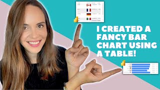
Thank God I found your channel, thank you!!! just one question: is there a way to make this KPI bar chart show negative values, like it centered on zero, and going from -100 to 100%, and according to your measurement, it fills to the left or to the right?
The formula returns 0 for the grey part if that happens, so it means the kpi thing will become full blue and look like a silly circle 😆. A better visual will be using the built-in gauge which is meant exactly for this.
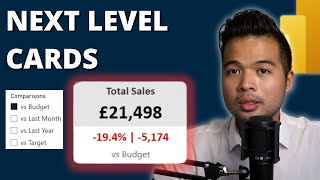
Nice redesign. It's always best to add context to the KPI's so that we know if we're good/bad, how far from the target, previous year, etc. This is what developers/analysts should do, instead of just showing the Big Annoying Numbers. That said, there is also a paid-version of such abilities. It's called Zebra BI. You only need to use the placeholders for Actual, Plan, Previous Year and Forecast and the visuals automatically create the variances for you, plus, many more features. It now depends on whether you would like to invest in Zebra BI or spend some more time to develop your own custom context-enhanced visuals.
I tried this out. Worked well. Well, there's a drawback to it. If your background is white then the viz is great and can crack a handful of claps. But if the wallpaper or background changes other than white then it's a nightmare cause you won't be able to match the background if it is not any plain color background such as red, or black. Other than that it is really good
why are you following her colors choices with white background in your background with different colors. If you have a report with dark visuals , choose border colors or bar colors accordingly , also you can choose background color and border color of each visual- which she has turned off in her case
If you pass your mouse on both object , you can move it like one block. Its like select a lot of archive in your pc to copy-paste in other place from pc . excuse my english, spanish is my native language
I just found this video and therefore your youtube channel, and the first thing I did (before start watching the video) was hit the subscribe button and give you a like! It's a great way to "change" the classic KPI visual. Would you upload some videos explaining or talking about DAX measures? Since it seems you got very good domain on DAX. Best regards!
Hey Mara, great video.. I have a technical question if you don't mind me annoying you... is there a way to connect the video's progression (Frame or which second it is at) with my data? For example.. lets say the report is about a building being constructed from start till finish, and in power bi I have a chart of dates (X) and completion % (Y) that mirrors that... then I have a video simulation of the building being built, and I want to connect the progression of the video with the progression of the chart somehow.. Can you advise me on that?
Hello Mara et al - your screen in Desktop has the pages menu showing on the left side with the 'WARNER Global Tech' logo at the top. How to do that please, including the logo? Thank you.
Hi All, Please guide me on how to Create Power BI Extensions to - Take input value from the PBIX file and apply it as a filter on Slicers/Visuals/Embedded Paginated reports.
About final design How I can add arrow to today in that progress If the target start from start of year and we are in the middle of year I want progress tell me I’m in the middle like 50%


This has to be one of the most amazing workarounds I have ever seen to enhance a KPI card!! Thanks for sharing your wisdom with us Mara. I loved the last version.
I have used this idea in probably 80% of all reports i have built in power bi since i first watched this a year ago. Incredible video!!
Why not just use the gauge?
@@thefamousdjx maybe it's not that much cool to see
Just found your channel. You’re a natural!
That's a great workaround. Makes the dashboards less boring and more attractive!
Amazing!!!! I'm super grad that I found our channel.
Thrilled to learn about that 'animated bar' 🙂
Thank you so much!!
U have a great pronunciation! So clearly!! Love it ❤️. Thanks for that. And for the great tricks! ❤️
I don't know English, but I can understand you perfectly! fantastic
I must admit your videos are better than few other creators. Keep it up
Thank you so much 😀
Caramba, eu adorei as ideias. Muito inspirador!!!! Obrigada!!!
Very helpful and insightful, Thanks. My favorite part is the "You know I'm lazy"😂
I'm glad you liked it!! 😅
I had just discovered your content. This is so helpful provide new insights
Thank's for the video, i've been search for a youtube channel that improve my skills. It'll help me a lot.
Very nice! I am definitely going to try this in my next PBI report.
Very insightful, thanks to share, Mara!
Seen many ways to treat custom cards in Power BI, but trick wiith pill shape is very Smart. Thanks for sharing :)
My pleasure 😊
Excellent work around. Well done
Thank God I found your channel, thank you!!! just one question: is there a way to make this KPI bar chart show negative values, like it centered on zero, and going from -100 to 100%, and according to your measurement, it fills to the left or to the right?
I appreciate the effort in the video edits. New subscriber!
Thank you ma'am. I shall definitely use your methods.
Good work! Thanks for sharing.
Very creative and resouceful…. Great
Thank you! Cheers!
Very good 😍. Pretty and Clever girl .Thanks for sharing👍
Thanksssss.. I will definitely use this now 🔥💯😇
like those tricks! thank you!
Thank you so much for giving me a new visual. Will try immediately
This is sexy!!! I’m still learning Power BI and would surely try this. Thanks a lot
Thanks for this video. I have just started my jouney with Power BI so I am sure that I will stay longer! Liked and subscribed ❤
You got this!
O meu ficou excelente. Obrigado pela inspiração :)
Nicely done. thanks for sharing.
Hi, I just tried your KPI Visual and it's working fine but have you tried it when it reaches the target or it goes further from the target amount?
The formula returns 0 for the grey part if that happens, so it means the kpi thing will become full blue and look like a silly circle 😆. A better visual will be using the built-in gauge which is meant exactly for this.
i wish tha i cam give you a Million Likes❤
Thank you so much ,Can you please tell us about the useful custom visuals
Nice, thanks… its nice to have new videos with nice tricks
Glad you like them!
Thank you so much...needed this tutorial
I love your videos! Keep them up
Putting some real ideas and thoughts.
Thanks.
Love the sloth!! Subscribed.
Thanks for the sub!
Since I listened to you at Datamind, I can't wait to see your videos. I hope you will release the slides because your framework is really useful.
What if you want to show how much you go above goal or target? Is there a way to visualize that using this same method?
Same question came to my mind as well…
Muchas gracias! Se ve genial!
Nice, I am starting to learn PBI this makes me understand more and see how looks an advanced build, thanks for your help
Great!
How about when they heat the target???
very nice thank you for your idea. GREAT!
Nice redesign. It's always best to add context to the KPI's so that we know if we're good/bad, how far from the target, previous year, etc.
This is what developers/analysts should do, instead of just showing the Big Annoying Numbers.
That said, there is also a paid-version of such abilities. It's called Zebra BI. You only need to use the placeholders for Actual, Plan, Previous Year and Forecast and the visuals automatically create the variances for you, plus, many more features. It now depends on whether you would like to invest in Zebra BI or spend some more time to develop your own custom context-enhanced visuals.
This is cool. Thanks for sharing.
Thank you so much.. please keep making videos
Awesome....definitely subscribed to your channel😊
Awesome! Thank you!
very creative, thanks for sharing
Very cool. Thank you
Thank you for your narration and the useful information you give. Do you offer Power BI specific courses etc.?
You are the best. Thank you.
Great explanation! Loved this. Thank you.
Smart visual, thanks Mara!
this is incredible
This is great, seriously. I really like your creative take on the KPI cards! +1 subscriber.
Awesome trick with the bar playing with the borders.. looks great! where are you from? Argentina maybe?
I'm from Portugal! :)
Great, It's a fantastic idea
Awesome content
Great idea. Definitely going to use this 😄
Great desing idea, i have a consult. The menu below Warner tittle did you made it with slicers? or Menu navigation? or there are an image and a text?
Espectacular. Gracias por compartir
Such an awesome idea!
I tried this out. Worked well. Well, there's a drawback to it. If your background is white then the viz is great and can crack a handful of claps. But if the wallpaper or background changes other than white then it's a nightmare cause you won't be able to match the background if it is not any plain color background such as red, or black. Other than that it is really good
why are you following her colors choices with white background in your background with different colors. If you have a report with dark visuals , choose border colors or bar colors accordingly , also you can choose background color and border color of each visual- which she has turned off in her case
Amazing! Thanks for sharing
Wow! That's really cool ! ⭐⭐⭐⭐⭐⭐⭐⭐⭐⭐
So creative!!! Thank you!!!
Great and thanks for the idea
Great dashboard!
This is amazing and brilliant 👏
Is there a way to group them as one object so we can resize ,move them as one object easily?
yeap. click with ctrl button on visuals you want to group, and then RMB and click Group
If you pass your mouse on both object , you can move it like one block. Its like select a lot of archive in your pc to copy-paste in other place from pc .
excuse my english, spanish is my native language
Great idea 👌
Very nice! Just subscribed, keep it up please.
Good job .I like it.Thank you.
I just found this video and therefore your youtube channel, and the first thing I did (before start watching the video) was hit the subscribe button and give you a like! It's a great way to "change" the classic KPI visual.
Would you upload some videos explaining or talking about DAX measures? Since it seems you got very good domain on DAX.
Best regards!
Hi nice design but i hav one question in bar design if value is 0 , kpi color bar should show blank .. How do i achieve this? Help
Great Learning ❤❤
Great tutorial, very helpfull!
Nice and creative way of looking at the visuals. Great Work!
Already add this on my Dashboard tks
Hey Mara, great video..
I have a technical question if you don't mind me annoying you... is there a way to connect the video's progression (Frame or which second it is at) with my data?
For example.. lets say the report is about a building being constructed from start till finish, and in power bi I have a chart of dates (X) and completion % (Y) that mirrors that... then I have a video simulation of the building being built, and I want to connect the progression of the video with the progression of the chart somehow.. Can you advise me on that?
Hello Mara et al - your screen in Desktop has the pages menu showing on the left side with the 'WARNER Global Tech' logo at the top. How to do that please, including the logo? Thank you.
OK I got it Insert -> Buttons -> Navigation
Excellent, can you share the pbix?
WOW EFFECT!
Amazing ideas
Very nice Visuals great
very nice and helpful!
Very nice but something Microsoft standard visual when? :D thank you!
Fantastic!
Excelentes diseños me encantaron
Thank you 😊
You are just awesome!
Arrasou! Amazing
Awesome Mam
Hi All, Please guide me on how to Create Power BI Extensions to - Take input value from the PBIX file and apply it as a filter on Slicers/Visuals/Embedded Paginated reports.
Great job 🔥
Amazing🎉
Nice tips, very simple to apply.
About final design
How I can add arrow to today in that progress
If the target start from start of year and we are in the middle of year I want progress tell me I’m in the middle like 50%
Grandioso, me encantó 🙂
Parabens bem legal!