
- 34
- 204 978
Gerard Duggan
Australia
เข้าร่วมเมื่อ 27 ส.ค. 2021
My name is Gerard. I am a data analytics lead at an engineering and construction company. I will show you my techniques and strategies in analytics, visualization and creation of data stories in Power BI and Power Query, with the possibility of a little more!
From the development of plans and concepts through to data transformation and polished visuals, I aim to help you make sure you are translating and communicating what is hiding in your data.
You can also catch me in on the below social media and blogging platforms
📱 SOCIAL MEDIA
LinkedIn: www.linkedin.com/in/gerard-duggan-15420a55/
Twitter: @DGAnalysis
📔 BLOGS & WRITING
Medium: medium.com/@duggangerard
DG-Analysis: dg-analysis.com/
Maven Showcase: mavenanalytics.io/profile/Gerard-Duggan/44421347
Thanks for visiting and watching my videos
#PowerBI #DGAnalysis
Custom Axis Sorting Orders - Power BI
A quick video showing you how to to apply custom sorting on visuals for days, months and specific categories that you may wish to show in a certain order.
Subscribe for more Power BI advanced tips and tricks.
📱 SOCIAL MEDIA
LinkedIn: www.linkedin.com/in/gerard-duggan-15420a55/
Twitter: @DGAnalysis
📔 BLOGS & WRITING
Medium:medium.com/@duggangerard
DG-Analysis: dg-analysis.com/
Maven Showcase: mavenanalytics.io/profile/Gerard-Duggan/44421347
Subscribe for more Power BI advanced tips and tricks.
📱 SOCIAL MEDIA
LinkedIn: www.linkedin.com/in/gerard-duggan-15420a55/
Twitter: @DGAnalysis
📔 BLOGS & WRITING
Medium:medium.com/@duggangerard
DG-Analysis: dg-analysis.com/
Maven Showcase: mavenanalytics.io/profile/Gerard-Duggan/44421347
มุมมอง: 336
วีดีโอ


Maven Coffee Challenge - Case Sensitivity Issue
มุมมอง 1.3K4 หลายเดือนก่อน
The Maven Coffee challenge examines answers to a questionnaire on coffee preferences. On performing some simple unpivoting of the data, I notices an issue in getting one to many relationships in the data model. I soon learned there was an issue/conflict that was arising dur to Power Query being case sensitive and Power BI models being case-insensitive. For this challenge, that is a potential is...

Maven Power Challenge - Power Query Clean - Pt2
มุมมอง 1.2K8 หลายเดือนก่อน
The Maven Power Challenge has presented a real life case in "dirty data" with power outage data provided between 2002 and 2023. In Part 2 of this cleaning exercise, I look at using Power Query to: - Look at two methods to find individual state names within a free text column - Split column text to rows using split delimiters for NERC Regions - Categorise Alert Criteria types using a hierarchy o...

Maven Power Challenge - Power Query Clean - Pt1
มุมมอง 3.2K8 หลายเดือนก่อน
The Maven Power Challenge has presented a real life case in "dirty data" with power outage data provided between 2002 and 2023. In this video, I look at using Power Query to amend and join data from each year period, then go about cleaning and formatting the event date and time and the restoration date and time. I employ a customised M code to extract dates from multiple format types, whether n...
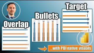
Overlaps, Bullets and Target Charts in Power BI
มุมมอง 8K8 หลายเดือนก่อน
A walkthrough on how to take your viz to the next level and create overlap, bullet and target style data viz charts in Power BI using native visuals with some creative DAX, formatting and trusty error bars, so you can include in your next dashboard creation PBIX file is available for download below, and walkthrough includes both horizontal and vertical versions of the visuals Subscribe for more...

Calculating CAGR in Power BI
มุมมอง 3.8K9 หลายเดือนก่อน
A look at how to apply CAGR (Compound Annual Growth Rate) calculations in Power BI using tow different formula, and also a dynamic year slicer. Subscribe for more Power BI advanced tips and tricks. 📱 Data Source: Maven Challenges - Apple Greenhouse Emissions www.mavenanalytics.io/challenges/maven-environmental-challenge/27 📱 Original LinkedIn Post: www.linkedin.com/posts/gerard-duggan-15420a55_...

Multi-Layer Slope Charts with zero DAX
มุมมอง 69910 หลายเดือนก่อน
Recreating a multilayered slope chart, showing both high level and detailed components and trends. See how to use line style, size and colour to simplify a story and improve communication to the end user. Subscribe for more Power BI advanced tips and tricks. 📱 Data Source: Makeover Monday - Week 33 2023 www.makeovermonday.co.uk/data/ 📱 Original LinkedIn Post: www.linkedin.com/posts/andykriebel_...

Simple Gauge Chart Alternatives in Power BI
มุมมอง 13K10 หลายเดือนก่อน
The Gauge Chart is not everyone's "go-to" visual in Power BI. But what if you want to show some kind of scoring value? What can we use? Here, I show some simple alternatives using vertical and horizontal stacked bar charts, reference lines and a few little tricks to give a nice clean finish. Subscribe for more Power BI advanced tips and tricks. 📱 SOCIAL MEDIA LinkedIn: www.linkedin.com/in/gerar...

Super Scorecards in Power BI
มุมมอง 7K11 หลายเดือนก่อน
Here, I will show you how to combine a structured excel table and a series of SWITCH/TRUE functions to create a scorecard in Power BI that allows you to show multiple measures and data types in a single column I will also add in some custom icons and colour formatting to give it a professional look. This concept method can then be applied by you in multiple working scenarios to create kpi type ...
Hacking a Donut or Stacked Bar Chart in Power BI to Create a Killer KPI Card
มุมมอง 16K11 หลายเดือนก่อน
- Are you looking for ideas to create KPI visuals that measure against a target or the part of a whole, and don’t fancy using the dreaded gauge chart? - Do you want to add in some dynamic measures to provide insightful context? - And do you also want to apply colour formatting and some visual flourishes to set it off? Is the answer is yes, yes, yes, then you have the right video. I am going to ...
Colour Formatting Column Charts Based on Values
มุมมอง 5Kปีที่แล้ว
In this video, I will walk you through how to create dynamic colour formatting in column charts based on: - Max/min values - above or below and average - above or below a threshold set by a dynamic parameter All formatting takes into account the selected date ranges, and there is even the bonus feature of creating dynamic subtitles to capture key information and provide that added context. The ...
Combining Field Parameters and Conditional Formatting
มุมมอง 4.6Kปีที่แล้ว
Here, I will show you how to combine the power of field parameters and colour conditional formatting in Power BI to create dynamic visuals that allow you to select metrics and highlight the top performer in that metric, as well as show how they did in other key metrics. The data model file is linked below if you want to follow along, and the medium link below shows the walkthrough steps and cal...
Next Level KPIs in Power BI
มุมมอง 85Kปีที่แล้ว
I am recreating a next level KPI in Power BI using a native line chart visual, just like the one I used in the Maven North Wind Challenge. This involves writing a series of logical formula to take advantage of the conditional formatting of the title and subtitle to provide a dynamic KPI. I have also written an accompanying article in medium to walk through the steps and provide the dax measures...
Book Review - The Wall Street Journal Guide to Information Graphics
มุมมอง 712ปีที่แล้ว
In this video I provide a review of the Wall Street Journal Guide to Information Graphics, a data visualisation book by Dona M. Wong. Links: ft.com/vocabulary (this will redirect to a github page where you can download the chart visuals) Books mentioned: storytelling with data - Cole Naussbaumer Knaflic show me the numbers - Stephen Few Subscribe at: th-cam.com/channels/B0-lEpIO-Dc20Fc9nGKLtQ.h...
Visualizing the Energy Transition in Power BI
มุมมอง 1.3Kปีที่แล้ว
Visualizing the Energy Transition in Power BI
Running Total in Power Query - Maven Pizza Table Utilisation
มุมมอง 5Kปีที่แล้ว
Running Total in Power Query - Maven Pizza Table Utilisation
Likert Scale and NPS Power BI Walkthrough Tutorial
มุมมอง 12Kปีที่แล้ว
Likert Scale and NPS Power BI Walkthrough Tutorial
Maven Unicorns Challenge - Extracting Investor Names in Power Query
มุมมอง 1.3K2 ปีที่แล้ว
Maven Unicorns Challenge - Extracting Investor Names in Power Query
Maven Remote Work - Dashboard Walkthrough
มุมมอง 3.4K2 ปีที่แล้ว
Maven Remote Work - Dashboard Walkthrough
Power Query - Unpivot Data from Multiple Columns - Maven Super Bowl Challenge
มุมมอง 3642 ปีที่แล้ว
Power Query - Unpivot Data from Multiple Columns - Maven Super Bowl Challenge
Power Query - Creating Categories - Maven Super Bowl Challenge
มุมมอง 4362 ปีที่แล้ว
Power Query - Creating Categories - Maven Super Bowl Challenge
Simplified Filter Flow in Power BI Models
มุมมอง 1.7K2 ปีที่แล้ว
Simplified Filter Flow in Power BI Models
Power Query - Count or Extract Text from List - Maven Challenge
มุมมอง 1.3K2 ปีที่แล้ว
Power Query - Count or Extract Text from List - Maven Challenge
Building a Sankey Chart in Power BI with SUMMARIZECOLUMNS
มุมมอง 7K2 ปีที่แล้ว
Building a Sankey Chart in Power BI with SUMMARIZECOLUMNS
6 Simple DAX Measures to Build a Social Media Dashboard in Power BI
มุมมอง 5K2 ปีที่แล้ว
6 Simple DAX Measures to Build a Social Media Dashboard in Power BI
Nested IF-AND-OR Statements in Power Query
มุมมอง 5K2 ปีที่แล้ว
Nested IF-AND-OR Statements in Power Query
Maven Taxi Challenge - Power Query Cleaning Plan and Execution
มุมมอง 3.3K2 ปีที่แล้ว
Maven Taxi Challenge - Power Query Cleaning Plan and Execution
Highest Scoring English Premier League Players
มุมมอง 1522 ปีที่แล้ว
Highest Scoring English Premier League Players
Who are the Highest Scoring Team in English Premier League History?
มุมมอง 1272 ปีที่แล้ว
Who are the Highest Scoring Team in English Premier League History?
Hello could you make a video of dax function Filter and All in detail. When to use them together while calculating measures !!❤
I just implement this features in my sales report! Thanks for sharing!!
Just wondering, for the subtitle MAX/MIN that you declare the variable and the you wrote it again instead of using the measure, but for the GLTA you chose the No Months measure instead of writing the measure, why's that?
So you did the background in Power Point? I really thought you used a designing software!
Yes I use PowerPoint for almost all my report backgrounds, in challenges, and in everyday work
@@dganalysis Thank you for answering. You just motivated me to improve my power point designs :) What you do is just incredible!
I just star watching all your videos and let me tell you sir! That I really enjoyed a lot every one of them! Like the maven analytics challenge you have solved! A must see video for everyone who wanna learn good and personalized visuals 👌🏼👌🏼👌🏼👌🏼👌🏼
@andresramirezortega6218 thank you, appreciate it. If there are any types of videos you would like to see, let me know
Very inspiring. Thanks for your time.
A gem among the YT videos! The only item I found difficult to locate was the line used across the column. In my PBI desktop I had to click on the magnifying glass which is the third icon above the options and search for "line" then constant line appeared. Afterwards including the measurement I wanted as a conditional formatting did the trick. Thank you so much for this wonderful KPI tool that is far superior than the included gauge. I've used it to track a number of items as a percentage indicating health of a part of my program. The only trick I'd suggest to the other nascent data visualization fans is to use ChatGPT to write a dax formula Table = x Column = x I need a dynamic measure of that by (whatever you need say in the last 12 months etc) Thank you Gerard for a great video!
@jonsanders6405 thanks, glad it helped
It is kind of silly that a very common type of measure doesn't come out of the box
@ericstefko4852 yes, might be an ideal function... maybe needs a request to the MS PBI team...
This is great video and learned on KPI dashboard. I have got a slightly different KPI dashboard, can you advise how to do it? similar to the details you mentioned category, definition, target and previous three months numbers for each KPI. How do I make relationship from this static table to invoice table to retrieve monthly information against these metrics?
@maheshbabumamidi9511 thanks, it's difficult to give advice without seeing the model set up, but potentially using a summary table to list out the value, target and previous 3 months value might work best/easiest
@@dganalysis I can take example of your video itself, instead of category value field, if it has to be monthly category value for 3 months. March Category value, April Category value, May Category value. How do you connect ScorecardTable with other tables to show this monthly values in the score card?
very cool, just used it in my P&L report
Hi I have doubts about the slicer is this possible to when we select any category in the slicer then the slicer pop up does not disappear automatically when we have to click any other place then the slicer pop up disappear. Any solution i want when we click on the category in slicer then the slicer pop up automatically disappears.
How does even find that thing with the markers color lol it was such a neat discovery
Amazing way to display KPI. Thank you for sharing
@@garudabowo my pleasure
my if and does not work
Very awesome technique, Thank you so much.
Thanks, glad it helped
Thanks Gerard! Great Tutorial keep uploading!
Underrated Gem 💎
Thanks, appreciate it 👍
excelent!!
nice explantion
Love it!
Any clarification on how i copy across the measures for each column
crazy guy...fantastic!
Really a nice one❤
Gerard looks and sounds very similar to Jason Isaacs. So all this video is pretty much Lucius Malfoy explaining you some Power BI
Haha, thanks, I'll take it as a compliment....Jason Isaacs is a legend 🙌
Hello Sir, When to combine ALL function with Calculate + Filter function in DAX in detail ? Please make a video of it 🙏 ❤
Great Video. Thank You Dear Gerard.
Thanks, much appreciated
Promo>SM
Such a great method. I was thinking how could I achieve measuring customer flow in a span of 1h and always felt that I was missing something. Thank you Gerard!
Thanks, glad it helped
Fantastic work. Learned so much from the hack. Your explanation and simplicity of writing the DAX measures really made me understand a lot. Kudos. Looking forward to learning more from you. Would be applying this on a live project in the coming days.
Thank you 👍
Amazing way to display KPI. Thank you for sharing
Really thank you!!!!!!
Unpivot!!! Did use it once a hundred years ago, but I really didn't remember it. You are a hero! Thanks!!!
Thank you so much for such a useful video! Allowed our company to skip purchasing likert scale visual subscription.
Thanks, great to hear!
thank you so much, you helped me alot
Happy that it helped
Thank you for sharing! On the last method, I could not get my % at the bottom to start with 0. I also only had negative, unsure, and positive.
Hi Gerard, what is your design inspiration?
For which project?
@@dganalysis for current challenge going on sales one and also in general. How do you choose which chart to use and design report layout?
I cant find the excel file used for this class. Would be great to practice along with him.
If you go to mavenanalytics.io they have a data playground that has all the data tables for this
love this kpi hack!! Out of curiosity - what canvas size do you use? I’m having a hard time fitting everything using 16:9
Thanks, typically I set a custom of 1600:900. Considering the smallest font size is 8, I find 16:9 can be a bit restricting
Hi, Thank you for the video Had a doubt here your are only comparing end of month... What if I had to select the daterange that the user has selected in slicer maybe 2 weeks and based on that show the trend by comparing it with the previous 2 weeks...
Thanks, If you wanted to be able to show trends on a two-week /fortnight basis, you will probably need a dedicated column in the date table to show the fortnight values. Then the process would be quite similar
Hi Gerard, I Love the insight, I had a challenge of not copying and pasting it.
Thanks, glad it helped. Maybe I should try and update this.
Have gone back to this video again and again these last few months. Very informative. Very helpful. Sometimes your voice fades so I think you have a tendency to be soft spoken :). But one of the best, if not the best step-by-step walkthroughs for making a divergent Likert scale. 'Appreciate the fact that it brings together all the arguments on how best to visualize this kind of data. Thank you very much! :)
Thank you, yes my microphone wasn't that great on some of my earlier videos, and I am also not a naturally loud talker. But glad it has helped, thanks for the feedback, appreciate it.
Amazing Video, I followed you step by step and it really helped me build a Multi KPI Dashboard. Thank you so much!
Which bubble chart are you using for this data
I used a deneb custom visual for this one.
Where did i get this codes
@@logocreative1694 vega.github.io/vega-lite/examples/
Thank you
Great one! Have you tried making it with Dax?
Thanks, I haven't revisited it to work with dax. I think it would be possible with two measures, one picking up each point, and one picking up only the max and min point
@@dganalysis Yep! A few days ago I had a meeting at the company I work for. Users' requirement was to create a slope chart for price in the begin and end of YTD. In the middle if it - broken down by category, must be displayed the %var. I guess its doable to get it!
May I know the color scheme for your pbi?
There is a link to download the file. You should see the colour scheme in there.
Audio is very low for me to hear.
Not sure if it was just me, but found the audio a little quiet.
Not sure, I thought it was OK, but will check it out
Amazing!
Thanks Mr. Duggan. It's a great video
You are very welcome
Wow, this is impressive. Thank you.
Cheers
Are we keeping the missing values? Or removing them?
When you unpivot, null values are removed. If you are talking about the main table, it depends, but you could remove line items that don't provide any information, but you may want to calculate the % of all people surveyed who drink coffee, for example - depends what information you want to communicate
Thanks a lot for the suggestion.