Dashboard Creation: Explain vs. Explore Visuals
ฝัง
- เผยแพร่เมื่อ 24 มิ.ย. 2024
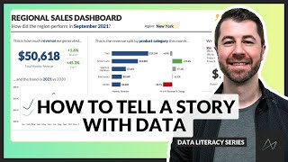
- When creating dashboards, it's essential to consider the type of visualization that best suits your audience. There are two main categories data visualizations may fall into: Explain vs. Explore.
Explain Visualizations: These are designed to convey key information quickly and clearly to executives or stakeholders who need a high-level overview. Examples include bar charts, line charts, and pie charts. These visuals should be simple, easy to read, and highlight the most critical data points.
Explore Visualizations: These should be used for someone who may want to delve deeper into the data to uncover insights. They are more complex and allow for interactive data exploration. Examples include scatter plots, heat maps, and more detailed dashboards with filtering capabilities.
By choosing the right type of visualization for the intended audience, you can ensure your dashboards are both effective and user-friendly.
#constructionmanagement #constructionindustry #dataanalytics - วิทยาศาสตร์และเทคโนโลยี


