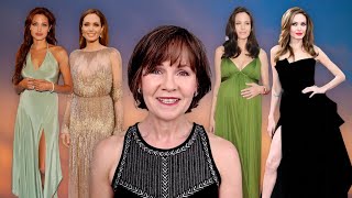
Colour Analyst Reacts to Duchess Kate's Colour Evolution

ฝัง
- เผยแพร่เมื่อ 27 ก.ย. 2024
- Duchess Kate makes consistently better colour and style choices than many celebs. Which of these looks were her best and which could have been improved?
This video is non-profit and made for educational purposes.
Fair Dealing Disclaimer: The Canadian Copyright Act allows the use of material from a copyright protected work without permission when used for research, private study, education, parody, satire, criticism, review, and news reporting (Canadian Copyright Act (R.S.C., 1985, c. C-42)
Find out more about colour analysis at my website: 12blueprints.com
#ColourAnalysis#12Blueprints#DuchessKate#fashioncolour#seasoncolor#royalfamily
Image sources:
2006: www.womansworl...
2008: www.mirror.co....
2010: www.zimbio.com...
2014 (bright turquoise dress): www.huffington...
2014 (soft teal coat): From: www.huffington...
2015: www.mirror.co....
2017 (pink dress and hat): www.townandcou...
2017 (warm blush dress with black bands): Kate Middleton's Best Fashion Looks - Duchess of Cambridge's Chic Outfits (townandcountrymag.com)
2019 (camel coat): www.townandcou...
2019 (green top): www.townandcou...
2020 (camel coat): www.townandcou...
2020 (heart print scarf): www.townandcou...
2021: www.townandcou...


To learn more about colour analysis and find makeup colours for your Season, check out my website at 12blueprints.com
The photos you see of Catherine, Princess of Wales, are her working wardrobe. She dressed differently before she became a working royal. She now dresses for her present role as Princess of Wales, and for her future role as Queen Catherine. She often does diplomatic dressing, which involves wearing the colours of the regions she is visiting. For example, when she visited Canada, she wore lots of red and white which are the colours of the Canadian flag. She often chooses clothes from British designers when representing British fashion, which is also part of her job. She tends to wear a lot of coat dresses as well because she is following the pattern set by Queen Elizabeth. I think the Princess of Wales does an excellent job of dressing for her role.
I agree, she is masterful at dressing for her role and developing her own identity within it. I imagine it helps that her body type, facial features, natural colours, and personal style are so well suited :)
I've always assumed Kate was warm, but so enlightening to see her categorized as cooler.
I think that she's neutral in her warmth, meaning between fully warm or completely cool in her colours. About 75% of the people are of neutral warmth. I do see her on the cooler side of neutral, or cool-neutral, but we'd need an in person analysis to confirm that. Her cosmetics seem to stay fairly similar but the hair colour is warmer at times and I much prefer cooler choices.
If Kate ever shows up to get her colour analyses, ask her if you can film the final drapes, lol. Btw, I like your rose top. Fancy!
I'll remember to ask Kate when she's here :) In the ongoing series of experiments that is my life, I've been wondering if black is less distracting to the image on screen, and also what my colour limits for video would be. This top is as warm in colour (DA/DW border) and large in print as I'd wear, and I wondered if it was a little too much in those ways. So thank you for commenting that it looked dressy and not too distracting for you.
Loved this video! and I have to agree, nothing suites a person more than their natural colour. The nature created a special unique blend of pigments just for you :)
Agreed. I wonder if the majority of people have never seen it or know what it means. Once we see it, we understand (and then wonder how we hadn't seen it sooner).
I think Cate Blanchett is the celebrity that wears her best colors, especially for how many outfits she wears and how high fashion she is.
Interesting, I'll make a point of looking at her outfits.
not always. She sometimes wears black because she is paid to promote couture gowns at events but at least mostly on her bottom half only. She seems to be a light spring imo
@@SueRosalie It’s true that she wears black sometimes. But I think she pulls it off because she has a strong Dramatic essence. I’ve noticed that Dramatics can wear stronger, darker colors even when they’re a lighter season. Same with Gamines who can pull off brighter, bolder colors.
Amazing that a Royal doesn’t have a color consultant to your caliber, Christine! Everything you say is obvious once I see what and how you see color on her. ❤
Thank you, I'm glad to know that you enjoyed the video and were able to see the effects I mention. I imagine that royals have many needs and voices to satisfy besides looking great. What they wear may be more political than we realize. Celebrities are similar, but with different pressures, like movie promotion or offers of free apparel. Looking our best is actually easier for us, we only have ourselves to consider!
Great video once again! I appreciate your compassion and objectivity in these videos. The celebrities get judged too harshly most of the time (we don’t know what choices we would make put in their shoes) but I feel I can look at my own colour choices more compassionately, hearing you go through these pictures.
Everything here is interesting, keep doing these videos, please! 🤗
And I’d be interested to see a video of Cate Blanchett.
Thank you, Cate Blanchett is on our list. In my colour journey, which I figure is the same for all of us, there's a necessary balance between self-directed honesty and moving past previous choices to better ways of doing things. High five to Kate and all of us who do our identity upgrades. They can be uncomfortable, but to see Kate today is to forget the times she was still trying to figure it out. We really can look better as we get older!
This channel is fabulous. So informative.
Thank you! Glad you're finding useful information here.
I wish there was a sci-art analyst near me! This is so interesting.
You know about the directory at chrysaliscolour.com, right? Under the Colour Analysts tab. I hope one day, you'll have the opportunity to watch the experience on yourself. It really is amazing to see.
@@ChristineScaman my state wasn't on there unfortunately - I'm in GA but maybe I can travel to one soon!
the proportions thing with william, head and body due to that not perfect blue he wore blew my mind. its true! Never looked for proportions before, thats an interesting new thing to also look for. I believe we notice unconsciously and giving this words and structure helps making it more conscious.
I love that you invited her! :-)))
It's amazing, how connected colour and shape are, and you start seeing it everywhere once it's on your radar. Colour so much affects how we see things. Yes, we can have Couples Day and organize William's wardrobe the next day while the kids fill up on ice cream :)
Do you agree Kate is True Summer? Because she is typed as this season. Frankly speaking, I think she has some warm undertones in her colouring. If she is really Summer type, I would rather type her as Soft Summer.
I rarely think of celebrities in terms of their Season, but sometimes we see them in a different way and wonder (like Julia Roberts in the recent 80s Fashion video). I imagine that I'd agree with you about SSu, but this is never having seen her in TSu colour... I did love the lip colour she wore in the final outfit of this video, probably SSu, I didn't need it warmer or cooler, but again, imagination can only get you so far with Seasons.
In the 16 season system she's typed as a Soft Summer Deep.
@@mariajosemartinez5135 I love the dusty summer palettes. I look great in most SS/TS palettes. But the darker jewel tones of winter look sooo flattering on me and many S as well (I think)
@@leonamay8776 I doubt between summer and winter for myself too. Some colours of winter are too dark for me, but I think royal blue is one of my best colors, and that's a winter one. Black overwhelms me a little, but I look great in optic white 🤷♀️ True summer colors work for me too, and I like how the darker shades of the Soft summer colors look on me. So I don't know exactly what season I am 😅
@@mariajosemartinez5135 you need to examine the amount of contrast and the level of intensity in your colouring and you test that with the right drapes
"This idea that everybody has to have a camel coat" I laughed, cause I could never understand this either, lol. I find Kate chic and polished most of the time because her style is impeccable, but your comments are perfect, her warmer hair really doesn't suit her.
I see it the same way. I often wonder how people in the UK see her style, besides media who sell more by saying that every choice she makes is sublime. Every country has its own beauty aspirations.
ikr camel is such a difficult colour to wear, it looks terrible on me
I think Kate’s “brooch” is a cluster of fresh shamrocks, for St. Patrick’s Day, which many in Northern Ireland, part of the UK, celebrate. The soldiers wearing the same on their caps must be from a Northern Irish regiment. Unfortunately, the shamrocks look quite droopy, so Kate’s corsage looks more like shredded paper. It must be really difficult to keep them fresh-looking, even if picked that same morning, likely these were picked the day before, in Ireland, for her.
Poor Kate, obliged to wear those bright colors that don’t really suit her, just so that she has high visibility in crowds, like the late Queen. I never like bright colors, like her purple bow-tied top, with black. I don’t think those peachy colors like blush and terracotta, suit her, she needs cool-toned pinks and reds. I loved her in her burgundy suit and similar, but light, cool pink, blouse that she wore to the US recently (late 2022).
I think of those high-vis colours like a uniform, it's like a STOP sign or any strong colour where we absorb the symbolic meaning more than how it actually looks. Nurses ask about white uniforms and it's the same situation. Thankfully, it's easy for Kate to look fabulous :)
Fun video. I love hearing your perspective on Kate’s choices. 🌸
Glad you enjoyed!
I think a woman’s natural hair color is the best, Mother Nature doesn’t make coloring mistakes. Having cool-toned, light-brown to bronde hair, I’ve always had to fight hair colorists who want to put yellowish or reddish highlights in it, they just look “off” with my Summer coloring. I love my natural color, it might be “mousy”, but it looks perfect on me, because it’s the color it was designed by my genes. I have my hair colored now, because it’s starting to gray, but I insist that my current, and ten times better, hair stylist stick to my natural color. She does a great job, but as the color fades from shampooing, it does start to look too golden, especially at the ends. So, I get the color done every six weeks to maintain it well, along with a trim. I think wearing one’s natural hair-color, and keeping it healthy and trimmed, is so important. So many bleached-blondes have those long, straggly ends because their hair is so damaged, and those black roots and brows, they look awful.
Indeed yes, I agree with both the logic and the effects you describe. Bleached hair can look dried out and gray and I hope there are colourists who steer women away from blonde when it wouldn't flatter. Once the hair returns to its natural colour, the skin tone is younger and she appears to have thicker hair. Mine is about 1/4 gray and I look at all the sparkly silver lights, which I love, and also find that the different shades among the hair are so much more visible than before.
fine highlights in ash blonde looks great on mousy hair because those of us with that hair colour, had light blonde hair in childhood anyway so it's in harmony with our colouring and looks natural
Exactly, the undertone will come out in both our skin and hair. No need to change your undertone
Great video. She’s so ladylike and when she wears her better or best colors, she really shines. You’d probably have a pretty easy job doing a similar video of Queen Elizabeth. When she wear her colors, she’s just great. But every once in a while, she wears orange...and it’s so jarring.
Thank you! Kate is fortunate that her natural colours and the style that flatters her is perfect for her role, but the queen is a great example of a different person who can also dress beautifully for who she is. Orange is jarring, I agree. Now I think of it, I'm not sure I've even seen her in brown or a print in her public role.
I’m so glad that heavy, black eyeliner isn’t trending anymore, it rarely suited anyone very well. I always prefer more natural-looking makeup and heavy black liner can make the eyes look smaller, as well, the last thing I need as my eyes are very small. As a Soft Summer, I prefer a soft gray, or gray-brown/taupe color for my eyeliner, black looks very harsh. I also like the, very difficult to find, Brown-Black color for mascara. I think Maybelline is the only brand that still makes it, but it’s great for us Soft coloring types where black is too dark and strong, but “dark-brown” mascara can be too light, or too golden-toned. Dark navy blue can work for some people, but people always comment, or ask me, about it when I wear it, so I came to the conclusion that it looks “too separate” from me. I never like even black mascara on women with very light coloring, where the brows and lashes are naturally light, it looks jarring.
Yes, black can be quite ok on the right person, but heavy lines on young people of any colouring seem too forced or artificial, it hides their natural gifts (perhaps something many of us do until the day they're gone for good, and then we want them back, the circle of life).
I agree and it's getting more difficult to find a good brown mascara except for the high end brands
Ha ha! It’s shamrock☘️
I feel Catherine is really a warm color seasonal type. Just look at her hair and her warm skin tone oft her bare arms in the 'disco outfit'
Many people see her as warm. I'd guess neutral warmth. The surface colour of skin is only part of Season and we're seeing it next to disco green and evening light. In the past few years, they were colouring her hair a warmer shade and I didn't find it as attractive, but then hair colour isn't a good guide to Season either :)
I see no evidence that she is one of the warm seasons. Caddie a suntan has nothing to do with undertones.
What I notice in most of Kate's photos is how small her accessories (especially jewelry) are, with the exception of that green bush on the lapel of her green coat. I wonder if it's her preference or if she's limited by her current station? IMHO Kate's accessories are completely eclipsed by her glorious mane. I would like to see some accessories more in scale and drama with the sapphire ring (Was that Diana's?) Kate wears. I think they could help connect her natural colouring with some of her garments. Even a classic strand of soft white pearls could be lovely and look very appropriate for the wife of the second in line to the throne.
Yes, if we're talking style, the jewelry that she wears for events has more presence. She wears larger sizes beautifully and easily, and fortunately the symmetry, wealth, and tradition of ceremonial (British) jewelry also suit her very well. Daytime jewelry is rarely noticeable and contributes less to the look.
Fine jewelry like Kate often wears, tends to be smaller because of the high materials cost of precious metals and gemstones. She mixes in fashion (costume or cheap) jewelry, too, which I love. One can more easily scale up in fashion jewelry. I think Kate does a great job accessorizing her outfits.
Christine, I just finished reading one of your e-books (Light Summer: Return to Your Natural Colors) and it was completely spot on. I wish I’d read it many years ago. Thank you for your help and insight!
Glad it helped clarify things :)
I dont know if this question belongs under this video but maybe others also wonder. Christine, Im a big fan of amber jewelry especially the richer golden\orange types of ambers and I was wondering does amber jewelrry read exclusicely warm autumn or can othrr autumns make sense of it as well? Thank you for your perspective.
It would depend entirely on the piece. Easily see it with Dark Autumn. If it's red enough, possibly Dark Winter. If it's clear and topaz enough, I could imagine Bright or True Spring. There are very few colour that can't be adapted for several Seasons. Actually, I can't think of any.
@@ChristineScaman Awesome!
Re the shorts outfit - sheDIES wear those colours now
Try the warm filter on her photos. It seems like she's a dark summer to me.
I'm not sure what a warm filter would tell us but yes, I could see the Soft Summer possibility for her.
@@ChristineScaman lol yes. I wasnt very clear. The warm filter usually brightens the colors. You get to compare the pale vs bright colors in the same outfit.
That's interesting. I imagine the filter could selectively brighten the clothing without changing the person's colours.
I understand how Kate just looks dull in a camel coat. I have the same problem. That color just does nothing for me. I have a blonde friend who looks absolutely beautiful in camel and beiges and off whites. She looks sophisticated in a camel coat where I just look bluh. So, yes, camel coats aren't for everyone.
You and me both. I would turn exactly the same colour as the coat with weirdly warm hair colour.
I only wear mine with a white, not ivory, top, ideally a turtleneck, it helps a lot. Camel is just not great on us cool-toned people.
Hi Christine! You mentioned the blonde to brunette video with Bella Hadid - please will you post the link! Thanks. X
My apologies, many of the hair videos have been taken down.
Guest Guest explains it very well below. Just a passing comment, using the word celebrity when describing a member of a royal family isn’t good. It is the reason another Duchess has had so many problems, she doesn’t understand the difference either and ended up in the wrong job.
I wonder if the crossover between politics and celebrity began around the time of JFK and Jacquie O. Media makes us hyper aware of where they live, how they dress, the company they keep, and whatever the definition of celebrity is, we do treat them that way. The Obamas, similar. I'm not familiar with the relationship UK citizens have with their royals, but the media appears to make their lives more difficult, for the women especially. I appreciate the strain of figuring it all out and keeping the two jobs separate. It takes a special person, and probably one who was raised there.
❤
You have such a friendly, thoughtful and refreshing way of analyzing 🥰 I subscribed right away. Thank you for the very interesting information, I will watch more of your videos 🤓
Thank you for being here :) Glad you enjoyed the video.
"If the clothes are winning, the person isn't". - Great quote!
Thanks! I wonder what a good ratio would be for how our attention is divided between the clothing-makeup and the person, probably in the 35/65 to 30/70 range. Even at 50/50, a competition is taking shape.
What would you say is Kate's color season or temperature and chroma? I think I have the same coloring as her.
I could imagine Kate as a Soft Summer. The dark hair and light skin tones may look more contrasting and Winter-like, but those colours seem too bright for Kate.
@@ChristineScaman That’s where I would put her, too, we share the same coloring type, I think. I don’t know why people type her as warm-toned, she looks cool to me.
How interesting! I would love you to make a video analyzing Queen Letizia of Spain and other European royals like the princess of Sweden, Máxima of The Netherlands, Mary of Denmark.... Maybe you are not so familiar with them being Canadian (I think I didn't get it wrong) as you are with the British Royal Family but it could be interesting for your European followers 🙂
This is a great idea that others have suggested as well (and you're right, I am Canadian and less familiar with royals of other countries.) This video with Kate and Meghan was among the earlier ones on the channel and I've learned some things along the way. One is that I prefer making videos where commentary can be 80% positive, which may not be so easy to find in many cases. Letizia makes beautiful choices though, and I have thought of Angela Merkel. Everyone is trying their best and it's too easy to criticize when these people have appearance advice coming from every direction, and their clothing is chosen more for public opinion than helping the individual be as beautiful as possible. The second lesson for me has been that people can be protective of the very famous and object to any negative commentary. Diana and the Queen might be examples, or celebrities in America, Beyonce, for example. I have a better sense of the political climate here and thought that Michelle Obama and Oprah would be accepted, but with EU countries, I hesitate to step in. I appreciate the suggestion and hope that you might mention any 'neutral' EU personalities or topics that come to mind.
I think the dark green looks gorgeous on her. She wears darker colors well.
Agreed!
I cannot believe this!! This woman is a color analyst yet wears this auburn hair and red top!!! Terrible!!!!
Thank you for the honest comment, I appreciate your thoughts :)
The hair colour is my own but I agree it looks redder and warmer than it is due to the lighting. Indeed, I look surprisingly different in person, it's a real education to create this other persona that is 'you on a screen'. The black liquid liner is very heavy, I've even switched to a more jewel toned red blush. What I find most amazing is that the brow powder and contour eyeshadow are the same product.
The red top didn't work on screen, I quite agree there too. It's bluer and brighter IRL. I enjoy wearing varied colour and rarely wear black but actually, I now wear only black in the videos for two reasons. One, to be less distracting to the image being shown and second, to be less distracting and create consistency in the TH-cam thumbnails. Well, third because black is least changed by lighting. These thumbnails are an education unto themselves. Even patterned black was distracting.
What I try to keep in mind is that the videos are not about me. My colours don't matter since they can never be accurately represented on screens. I focus on the content. How I see colour and people and my appearance preferences seem very different from yours and you may find information that suits you better on another colour channel, but our differences make us and colour more interesting. Thank you once again for your comment.
I would never put it as rudely as you did, but I agree that the warm red of her top is not a great color for her.