That's really great, I learned most of the tableau from Your dashboard tutorial only. And it will be really great if you include data cleaning and modifications as well before making Dashboard
Great job. How did you clean the data ? I got similar data from keggle. Appreciate if you make the videos on structuring the same dataset in tableau. Amazing work😊
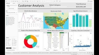
Hello, As you have created separate sheets for each visualization and selected the required ones to create the dashboard, why don't we do same approach on Power BI (there we create all visuals on same page itself)???
Thanks for the video! Great stuff! Liked! @31:37 - is there any way to format the YoY so that when it is positive it is green and when it is negative it is red? The way you have it now is just red, but red usually means negative so it can be confusing for people. *Update* - the answer is you just duplicate the field and carry it into the color marker and then choose the color you want. @54:10 - I notice that there is a "New Story" button, what does that do? Can you also do a tutorial project about "New Story" please.
Good content thanks ! In my tableau use case I have 4 filters in the main page. I would like to optimize it : add a feature so that the user can select one filter --> the filter is appearing, the user is selecting the value for that filter and so on. Is that possible to do that with tableau ? Any idea of how to achieve this ?
i have entered the same layout size of dashboard container but i am getting vertical scroll on tableau desktop as well as after publishing on server. is that expected ?
Its a great video for making a dashboard. I have one question. Whenever i am making a dashboard and playing it in presenter mode it is not occupying full screen, instead showing white lines around the dashboard. How can i make sure that it shall occupy complete screen on every display size? I shall be grateful if you please let me know this asap
Hii . Im facing an issue with layouts. When im uploading the kpis they show ----- fig though removing the header nd experimenting with width and breadth. Can u solve this
is there a way to change Previous Year filter dynamically with respect to the current year? e.g. if the current year is selected as 2022 then previous year drop down value should automatically change to 2021
hey can we connect tableau with sql server,bcoz im not getting the option to connect sql... its only showing these options 1. google drive 2. ODATA 3. web connector....
sir i am having an issue, while changing YOY Accidents to percentage, after right click, there is no option for default properties appearing, can you please solve this. I am using Tableau Public to make this dashboard.
your files are not working properly. for example i can see dates but the longs and lats dont show up in tableau when i drag and drop them to rows/columns
Hi, great video. Is it possible to make YoY value green & red based on their value like positive and negative? In the video 26:20 we selected it manually. Thx
@@datatutorials1 I did it by creating two different calculated fields and adding both to the text. One for positive value and other for negative value. if its value >0 showing it else NULL. Since ı have two fields it shows one or the other (ofc selected diff colors in text for those two calc fields)👍
@@tariqtalat8106 So basically you need two calculated fields for positive and negative. And you need to put both of them in the text box with regarding format coloring. Here is the negative one: "IF([YoY Accidents])


Background Design Full Video - th-cam.com/video/IOzvRueiYi8/w-d-xo.html
This Tableau playlist is the best available on youtube, keep doing this great work:)
That's really great, I learned most of the tableau from Your dashboard tutorial only.
And it will be really great if you include data cleaning and modifications as well before making Dashboard
Thanks, definitely will include the cleaning process in the next video
Great video as always! I really enjoy creating unique and different dashboards. Feel like I learn something new everytime!
Thanku soo much for this wonderful vedio... have all things i want love from pakistan❤❤
My pleasure 😊
Very detailed one! Much appreciated your hard work and competency in making it very easy..Thanks a lot. 👍
Well explained best tableau playlist.
It is a wonderful work. Thank you for presenting information very clearly.
Glad it was helpful!
That's wonderful for the effort so much put in.. great and thanks a ton.. keep rocking
Nice choice of background color. The explanation is also good.
Eagerly waiting for part-2.
Thank you🙏
Really vedios are very informative and productive
Glad you like them!
Great Work. This one also i have tried. you deserve more Subscribers.
thanks a lot, one day you will proud on me sir. from today i am your student . aapka chela vikram
you are doing wonderful job. Plz continue
Thanks for your support ✨
man... how can you make tableau so well-designed!!!
AT 20:36 , Why don't you use number of casualties for total accidents of current year? That will show accurate values right?
Perfect video for learning tableau. Can you please share the kaggle link for the dataset??
Just search road accidents in kaggle u will get ot
finished watching
Great job. How did you clean the data ? I got similar data from keggle. Appreciate if you make the videos on structuring the same dataset in tableau. Amazing work😊
Hi bro.❤..its tooo useful...and one doubt.....
How do u know the cy,py calculated feild farmula??? How do u learn these things....? Please say
Thank you so much! I learnt a lot. Can you teach on tableau prep too?
Hello,
As you have created separate sheets for each visualization and selected the required ones to create the dashboard, why don't we do same approach on Power BI (there we create all visuals on same page itself)???
Thank you very much!! 🙏
Which Tableau are you using? I have been using Tableau Public, but some features are missing.
Its desktop version, shapes won’t available for you in public.
Do you mind if viewers post their versions on their Tableau Public and Github portfolios?
1:03:30 i got a problem as third KPI would not bi fit correctly and it show #####, i already did fit option but its shown this only.
Thanks for the video! Great stuff! Liked!
@31:37 - is there any way to format the YoY so that when it is positive it is green and when it is negative it is red? The way you have it now is just red, but red usually means negative so it can be confusing for people. *Update* - the answer is you just duplicate the field and carry it into the color marker and then choose the color you want.
@54:10 - I notice that there is a "New Story" button, what does that do? Can you also do a tutorial project about "New Story" please.
The colour can be changed with respect to the sign of the number, I have not used it here but you can if you want
@@datatutorials1 Hi, thank you so much for your video! In this case, how can I please automatically configure the color by the sign?
Good content thanks ! In my tableau use case I have 4 filters in the main page. I would like to optimize it : add a feature so that the user can select one filter --> the filter is appearing, the user is selecting the value for that filter and so on. Is that possible to do that with tableau ? Any idea of how to achieve this ?
Yes you can do that but needs some calculation to show hide filters using sheet swapping
Hella Classy Bruv
i have entered the same layout size of dashboard container but i am getting vertical scroll on tableau desktop as well as after publishing on server. is that expected ?
Its a great video for making a dashboard. I have one question. Whenever i am making a dashboard and playing it in presenter mode it is not occupying full screen, instead showing white lines around the dashboard. How can i make sure that it shall occupy complete screen on every display size? I shall be grateful if you please let me know this asap
The size of dashboard you choose will be displayed differently on different devices as per the screen size and resolution. Try using automatic size
Hii . Im facing an issue with layouts. When im uploading the kpis they show ----- fig though removing the header nd experimenting with width and breadth. Can u solve this
Thank you for your video
is there a way to change Previous Year filter dynamically with respect to the current year? e.g. if the current year is selected as 2022 then previous year drop down value should automatically change to 2021
Hello Sir, I am facing an issue where default customer icons, specifically the up and down arrows, are not displaying on my dashboard.
Try to find on internet you don’t need to do on excel
Great Video! How do you set parameters if you want MOM change instead?
Hi there, great video! Is there a link to find this demo dataset on kaggle website or do you have a page where you’ve submitted it? Thanks!
Hi, how do you make it dynamic for +ve & -ve value in red & green?
How u found any solution?
Please make this analysis in excel😢
Already done and available on my channel
Please make one on POWERBI+ EXCEL
And something on sql too
Coming soon!
hey can we connect tableau with sql server,bcoz im not getting the option to connect sql...
its only showing these options
1. google drive
2. ODATA
3. web connector....
Yes we can connect tableau to server and database. What version you are using
Can u please provide the kaggel link of this data
why it is not showing any live or extract label in my book?
42:25
sir i am having an issue, while changing YOY Accidents to percentage, after right click, there is no option for default properties appearing, can you please solve this. I am using Tableau Public to make this dashboard.
facing the same problem. Did you find any solution to this?
your files are not working properly. for example i can see dates but the longs and lats dont show up in tableau when i drag and drop them to rows/columns
They are working now
time stamps would really be usefull !!
Bisakah tableau di koneksikan ke halaman web yang datanya selalu berubah atau real time ?
Can't understand, English please
@@datatutorials1 Can tableau be connected to web pages whose data is always changing or real time?
Hi, Can you please share the Kaggle link?
Hi It seems that theData zip file is corrupted, please post it.
Bhau tu Marathi ahes ka? My Shared passion and similar interest with data viz... Contact karayla avdel.
Good but slow down.
You have cleaned your data before downloading on tableau
sir how to publish this dashboard to public..
Make a account on tableau public and publish
Hi, great video. Is it possible to make YoY value green & red based on their value like positive and negative? In the video 26:20 we selected it manually. Thx
Yes we can change the colour, you need to write some logic for the same
@@datatutorials1 I did it by creating two different calculated fields and adding both to the text. One for positive value and other for negative value. if its value >0 showing it else NULL. Since ı have two fields it shows one or the other (ofc selected diff colors in text for those two calc fields)👍
@@cemalettinorkcu9976 Can you share the calculation you did?
@@tariqtalat8106 So basically you need two calculated fields for positive and negative. And you need to put both of them in the text box with regarding format coloring. Here is the negative one: "IF([YoY Accidents])
Please Add Time Stamps. Please Brother.
Sir i don't like tableau 😢
Power bi >>> tableau
Already video of same project available on my channel