THANK YOU, Eric! It helped that you taught how to reposition the horizontal labels to a lower position so they're distinguished from the more visual parts of the graph (vertical bars and horizontal % line). LL
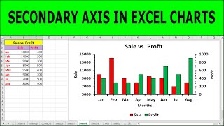
how did you get Sales and Net Profit to show side-by-side? No matter what I do, the bars overlap. All I want is 2-axes both sets with separate bars (no lines) and then, ideally, somehow show it in 3D (though it looks like 2 axes aren't supported in Excel 2013)
nice video, is it somehow possible to overlay both X axis? I mean, that when I set up overlay 100% I will still be able to see orange over the blue vertical line.
Hello Eric, your videos really helps, thanks for uploading. Could you please do the video of how to do an animation with powerpivot, I couldn't find any videos on the internet.
I'm trying to put together a line graph comparing five different teams performance on one of our priority metrics. I have a graph depicting their daily performance throughout the month. I would like to add their current average displayed as a dot on the far right side of the chart with the color corresponding with that of their line. I have not found a video with this information so I was wondering if you have a video you could direct me to or any ideas as to how to accomplish this something of a similar effect.
Thanks for the insightful video. I will like to ask if it it possible to have one of say five series to be on the secondary axis (line graph) while the remaining four series remain in a starked column not clustered as you have brilliantly shown in this video. Thanks
Hey Babatunde - yes, you can have as many series as you want as long as they either correspond with the type of data either the primary or secondary vertical axis. Hope that helps!
Hey Eric, I have a graph with historical data and projected data. I currently have this as a scatter plot with two sets of data. My boss would like the historical data to be columns, but when I convert the historical data to columns, the historical and projected data overlaps. Anyway to have column and scatter on two separate sets of x values?
Hi! What you would need to do in this case is add a secondary horizontal axis instead of a secondary vertical axis. It is not super common but it is possible!
Hi jsrockin - that's easy. At 2:14, just click the "Secondary axis" box for Sales and Net Profit (money) and leave the Conversion Rate box unchecked. That would swap the axis.
Hi Eric! Great video! Question: Instead of manually setting a value in "Minimum Bounds" under Axis Options (referring to timestamp 6:43), is there a way to make it automatically adjust properly? Because I find that this method works only if my the data in the combo chart doesn't change.
@@patrickcordero6673 so I just googled "combo chart excel 2010" and it looks like your version should have the feature. You'll need to try to change the series type from primary to secondary. Maybe just google it, as I think that version of Excel might have a slightly different layout, and make sure to include either "windows" or "mac" when you search. So I can't be of more help!


thank you very much for mentioning the axis title part!!! 💓💓💓💓💓💓💓💓
THANK YOU, Eric! It helped that you taught how to reposition the horizontal labels to a lower position so they're distinguished from the more visual parts of the graph (vertical bars and horizontal % line). LL
Cheers - glad it was helpful.
Thank you very very much for such clear and concise explanation 👍!!!!
Very helpful. Thank you.
Super helpful! Thank you for this video.
I was looking for scaling... thank you!
Glad I could help!
Exactly what i needed today. Thanks 🙌
Great to hear it 👊
Thanks very much... very useful...
🙏🙏🙏
My pleasure - thanks for checking it out!
thanks for teaching me how to put the label low!!!
You're welcome!
Thanks alot Boss, very informative
you got it, glad it was helpful
Very good Eric
Hi @Curso de Excel Online - my pleasure. Glad it helped!
For some weird reason, the dates don't show up at the bottom of my chart which messes up the chart and i don't know how to fix that..
so helpful
Thank you, for helping.
My pleasure edwin!
This helps, thanks a lot.
PS Pleasant to listen to.
Haha, you are very welcome!
Thank you, Thank you, Thank you!
You are so welcome!
how did you get Sales and Net Profit to show side-by-side? No matter what I do, the bars overlap. All I want is 2-axes both sets with separate bars (no lines) and then, ideally, somehow show it in 3D (though it looks like 2 axes aren't supported in Excel 2013)
nice video, is it somehow possible to overlay both X axis? I mean, that when I set up overlay 100% I will still be able to see orange over the blue vertical line.
Hello Eric, your videos really helps, thanks for uploading. Could you please do the video of how to do an animation with powerpivot, I couldn't find any videos on the internet.
Hey - really appreciate the suggestion. I'll look into creating a tutorial. Cheers!
@@eric_andrews thank you 🙏🏻 let me know if you create it 👩🏻💻
Thank you so much
You're most welcome
I'm trying to put together a line graph comparing five different teams performance on one of our priority metrics. I have a graph depicting their daily performance throughout the month. I would like to add their current average displayed as a dot on the far right side of the chart with the color corresponding with that of their line.
I have not found a video with this information so I was wondering if you have a video you could direct me to or any ideas as to how to accomplish this something of a similar effect.
good video of graph
glad to hear it keyur! cheers!
can you give me advise how to compare two graph as an example like one for company occupancy % and second is that occupancy change in %
i need one more support if need to involve more axis hand
there is no combo chart type in my chart6. What can i do?
hey how do you get to all charts in the new excel
Thanks for the insightful video. I will like to ask if it it possible to have one of say five series to be on the secondary axis (line graph) while the remaining four series remain in a starked column not clustered as you have brilliantly shown in this video. Thanks
Hey Babatunde - yes, you can have as many series as you want as long as they either correspond with the type of data either the primary or secondary vertical axis. Hope that helps!
What if we add a fourth axis about temperatur (celcius)for instance.
I'm not sure! I don't think it is possible in Excel, or at least I don't know a way. Would be useful!
please i have urgent question in charts that stops my work could you help me please
but how i can create chart if i have more than 500 rows ???
Hey Eric, I have a graph with historical data and projected data. I currently have this as a scatter plot with two sets of data. My boss would like the historical data to be columns, but when I convert the historical data to columns, the historical and projected data overlaps. Anyway to have column and scatter on two separate sets of x values?
Hi! What you would need to do in this case is add a secondary horizontal axis instead of a secondary vertical axis. It is not super common but it is possible!
What if I want conversion rate axis on left and money on left side
Hi jsrockin - that's easy. At 2:14, just click the "Secondary axis" box for Sales and Net Profit (money) and leave the Conversion Rate box unchecked. That would swap the axis.
Hi Eric! Great video! Question: Instead of manually setting a value in "Minimum Bounds" under Axis Options (referring to timestamp 6:43), is there a way to make it automatically adjust properly? Because I find that this method works only if my the data in the combo chart doesn't change.
my 2010 excel doesn't have this deature? what is your version?
which feature specificially? I was using excel 2016
The combo chart
@@patrickcordero6673 so I just googled "combo chart excel 2010" and it looks like your version should have the feature. You'll need to try to change the series type from primary to secondary. Maybe just google it, as I think that version of Excel might have a slightly different layout, and make sure to include either "windows" or "mac" when you search. So I can't be of more help!
@@eric_andrews oh i see. Thanks
I don't understand
Hi do you have a specific question?