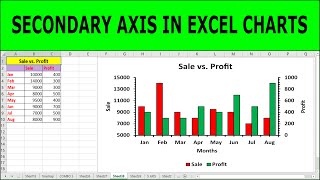
How to create a secondary axis in Excel charts

ฝัง
- เผยแพร่เมื่อ 7 ธ.ค. 2020
- In this video, you will learn how to create a secondary axis in line, column, or bar graphs in excel.
#secondaryaxis #excelgraph #excelchart #teachingjunction
Combo Chart and Conditional Formatting
• How to Create Combo Ch...
Multiple Bar Graph and Conditional Formatting
• How to Make Multiple B...


To generate standard curve and determine concentration of unknown solution, watch this video: th-cam.com/video/oevOjgnLWks/w-d-xo.html
You just saved my life. I spent four days figuring out how to get the secondary axis. Thanks.
Great to hear!
I was struggling. Thanks
You are welcome
Very helpful
My pleasure
7:01 for Bar graph
You are doing God's work out here my man. Thank You!!!
My pleasure
You are AWESOME! Thank you!!
Thank you so much! only guy on the internet who could help me create this type of graph!
You're welcome!
this man is a genius!
thanks
I struggled for 2 days before I found this video. Thank you much man
You're welcome!
Thank you so much ...was searching for this since 2 days ...after discussing with my senior got to know about it ....and here I am
You are most welcome
Thank you so much! Vrazy that we need such work-arounds in Excel!
Glad it was helpful!
THANKS A LOT
You're welcome!
Thank you ❤!
You are welcome
Thanks a lot buddy! I already knew Secondary axis and Combo charts. Yet, got stuck trying for Bar chart on two axes. Thanks thanks thanks!
Glad it helped!
Awesome trick.Thank u somuch.
Welcome 😊
Thanks. It was a time saving !!
Glad it was helpful
hi i just found you channel amazing tutotial and teaching style i really liked it. can you please make the same tutorial with 4 data column
Thanks. I have noted your suggestion.
Very helpful nicely explained
Glad it was helpful!
Really a very good lecture.
Glad it was helpful!
Thank you very much. indeed it is really helpful
Glad it was helpful!
It was very helpful! It's so cumbersome though, really weird that Microsoft did not think about this option. Thank you very much!
Glad it helped!
thanks
You're welcome!
Very useful 👌👍
Thanks a lot
Thank you very much! How to make 2 Y-axis graphs charts with clustered column chart where in Temperature and Rainfall would be separated and not intertwined?
Thanks for your feedback. Unfortunately, I do not have idea about that. However, you can avail the option of waterfall chart or stock charts to display your data conveniently. These videos are available on this channel.
Thankyouu sirr
Most welcome
what a legend
Thanks
What if I need to add more data like "Data"?
how to do three bars instead of two?
how to remove the legends for the two added columns after that?
You can easily edit the legends by watching the whole video. Another useful video for editinf legends: th-cam.com/video/QHbFsLEpKTg/w-d-xo.html
Bhai ye android mobile me possible hai data ko line chart me badalne ka
I have no idea about that