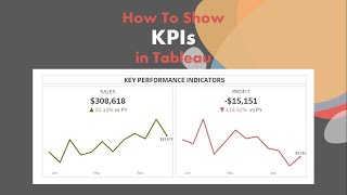
How to Create KPI and Sparklines in a Single Sheet

ฝัง
- เผยแพร่เมื่อ 26 ก.ค. 2024
- Typically I see people creating one sheet for their KPIs and another for a sparkline. In this tip, I show you how to combine them into a single worksheet. Less worksheets equals less maintenance!
Download the workbook here - www.vizwiz.com/2020/01/kpi-sp... - วิทยาศาสตร์และเทคโนโลยี


Hi Andy, I just wanted to say thank you for being so diligent in taking time aside from your day to give us good quality content. I appreciate you and I wish you many blessings.
I appreciate that!
I’ve been banging my head against the table trying to figure this out on my own. I saw these cards in a dashboard and it has driven me nuts not knowing how it was done.
Thanks for the quick explanation and work through. Definitely for power users and not like the other beginner stuff that is so prevalent.
I try to provide a mix of all levels. This certainly not basic as you said. 😊
my favourite tableau channel on youtube. You've helped me heaps in creating my work dashboards. thanks bro!
Thanks James! That’s very kind of you. Pass along the word to others. 😊
thanks Andy for sharing your great knowledge with us. I have watched many tutorials but yours are my fav.
Nice!!!! This video cover themes that i have looking for so many time... Thanks!!!
Great content! Also, thank you for recording at 1080P
Thanks, Andy! This demo was fantastic!
My pleasure!
it's like an art, Andy, it's just wonderful! thanks for sharing it.
My pleasure
The calculations here are way above my current level, but I'm working hard on developing KPI's and watching Andy at work is amazing.
Thanks for taking the time Andy!
If anyone can help on this.....I'm doing a lot of online courses and watching as many tutorials as I can but I still can't find how to fill the gap to go from basic calculations to more complex calculations and understanding the functions and syntax used for the latter. There always seems to be a considerable leap in knowledge and although I know you just gotta keep going and practice/research, sometimes it's a little crushing. Any recommendations? Thanks in advanced!
I am learning a lot from you. Your videos are great! Keep it up!
Estamos en la misma colega, placer de verlo por aca. Luciano Cossu
This is just amazing! Thanks for sharing..
This was what i was looking for. Thanks man!
My pleasure. I’m glad you found it helpful.
this is amazing!!!
Nice , thanks for Calculations and Spark line
Very nice video sir!
You are my hero. Suscribed!
Wow wow I needed it thank you!!!!
Fantastic. Thanks for the comment.
Awesome explanation with steps
Glad you liked it
Great video it's wonderful explanation and it's helpful for creating KPI i would like see more videos on LOD Expressions
Here's a bunch of videos www.youtube.com/@vizwiz/search?query=level%20of%20detail
It's awesome ❤️
Great! Thank you for guide
This was great. Thank you! For the CY/PY comparison - how would I go about comparing the monthly average for the CY/PY?
great video thank you
Very welcome
Hi Andy! Your videos are great and it helps me a lot on my learning!! I'm trying to show current month (By Parameter) as bar chart and last 12 months (used as true or false in filter) as line chart in the single sheet...But due to the last 12 months filter (Set true in filter), the current month value shown zero... Can you please help me how to show both the visuals in the same sheet... Or please make this one as a new video... Thanks in advance...
where is the border update that you were talking about?
Fantastic! How can I add an "All years" option to the parameter, so the user can see the value for all years combined or they can input a date and compare to previous year? Happy to pay for this advice Andy. Thank you
Excellent video. Please keep it up. I was wondering if we can add a green or a red triangle to show performance you?
Yes. You need two calculations. One for positive and one for negative.
Great video! I'm new to Tableau but I wonder if you can get rid of this duplication of sheets (Profit CY and Profit PY is more or less just a duplication of sales as you showed). So is it possible to have one sheet or even two but a kind of parameter so that you can use this parameter (Profit or Sales) which even could be selected by the user. Is this possible,too?
Yes. Create a parameter that lists the metrics, then use the metric they select in the calculation.
for those who wants to do FISCAL year, you can use the dateadd function. For example. I want my year to start on October so it will look like this
{ FIXED : sum(IF YEAR(DATEADD('month',3,[setdatetime])) = {MAX(year(dateadd('month',3,[setdatetime])))}
then [Appointment Count]
END
)}
Great tip! Thanks for adding it.
Hi Andy,
Hopefully you will be doing well!
I need help regarding one issue suppose if someone wants to change year and he wants to see the growth of that particular year with respect to prior year then what will be procedure of calculation??
Suppose i need the dynamic filter on my KPI for YoY growth so that i can see growth of sales in 2018 WRT 2017 similarly growth of sales in 2019 WRT 2018 with dynamic current year selection.
Great video! Curious why you used FIXED vs. just SUM for the Sales CY Calculated Field? Also, do you have another video showing the dynamic selections you created at the top in the visual at :17? To me, that might be the most powerful aspect of this KPI/sparkline tutorial.
If I used Sum, I would get a range of values in the title.
@@vizwiz I was using this amazing trick and stumbled upon the range of values in title. Glad that my wisdom served well in time which made me scroll through the comment and eventually find solution to the problem. I am a big admirer of your content. Please continue to post them and help our learning journey. Thank you.
@@p2sharri Thanks for the feedback!!
Hi Andy - Great video as usual. Do you know if there is a method to change the colors of the % change within the tooltip? So red if negative and green if positive.... Many thanks
Yes, you have to create two calculations, one for positive and one for negative. Here's an example. www.vizwiz.com/2020/11/social-media-kpis.html
Hi Andy. Excellent video to begin with. I have a question, I would really appreciate your help with. I am attempting to construct a dashboard, displaying high-level figures and want to avoid parameters and filters for the end-user, as the data coming into Tableau, is refreshed each month. I wanted to show about 6 small charts representing KPI’s. I will dual axis the charts, putting an area chart to the background for prior year and a line chart in the foreground for current year trends. Your LOD’s will solve the issue to ensure current and prior year on the dual axis charts. How do I ensure Tableau calculates the most recent month and prior month for percentage variance for current year? I’m trying to have Tableau do the “heavy lifting” by automatically updating percentage variance as the data is updated, without a parameter where end-users have to choose current month in order to display correct percentage variance. Many thanks
A better way to explain it would be, how do I change your LOD calculations to make this month-over-month, as opposed to year-over-year and always ensure it’s for the most current year? Regards
Thanks once again Andy!! So Andy, if I get you right, the most important part of using the calculated field to get our last 12 months is to make it dynamic right? I would like to know if there are other reasons please.
If you want it to update automatically when you get new data, then you absolutely need to make it dynamic.
Hi Andy,
Can we do develop the same dashboard with date range filter?
Great video! What happens when I want to look in to specific region eg. Asia
Add Region as a context filter.
nice
Hey Andy, Great stuff
I need some help on similar context but with planning weeks on x axis for Year over Year comparison. Let me know the best channel to communicate with you
I don't provide 1:1 support like this. I'd recommend you post your question on the forums.
Hi Andy, great video and teaches a lot of things. But i dont want to do this as a single tile, but have it on a separate tile. Also i want to use a Date parameter which does not work in a similar way as a Date field. Can you share a video where you are doing this using date parameter and a separate tiles
@andykribel
great question for the forums
Amazing work. Can someone please tell me the calculations to compare with previous month?
Same. Just swap out years for months.
th-cam.com/video/ViD3vclgNv8/w-d-xo.html
Hi Andy, thanks for the tutorial, super helpful. I have a question at 7:47 when you bring/insert calculation in the title. In my case, after inserting the calculation, say revenue, the actual run out is the revenue from my order start date to end date, rather than the total average like yours. Any help please.
If you're getting a range of numbers, then your LOD is not correct. You need to ensure it only bring back a single number.
@@vizwiz Thank you Andy for reply. May I have your help again since my order date range is over one year, and I will to report all date data without showing current year or past year. The date filter is flexible, so how to fix the order date then?
In that case, remove the dimensions from the LOD. You would end up with something like { FIXED : SUM([Sales]) }. That will give you the total sales.
@@vizwiz Cheers mate, would possible to show the revenue according to the reporting date/period? As said, there is a filter working on my order date period, so it would be ideal that this calculation can return corresponding revenue figure exactly same as my period filter selected. Your reply on fix the sales, can return total revenue for your information, if can return the data with period filter, then it is perfect.
Right click on the field in the filter shelf and choose Add to Context.
Thanks Andy! Just one question, instead of + and - I was trying a top down indicator but doesn't work. Can you help please
In the custom number format, use the up or down triangle in place of the + and -
Hey @andy, thanks for sharing the details. I'm trying to create something similar view with the rolling period (1 day, 7 days, 30 days). When I'm trying to put the KPI (selected period) in the title it's showing me the range instead of the whole number for KPI and for previous period % difference same thing is happing, would you be able to suggest me a way out here?
That means your calculation is returning more than one value. Your LOD needs to only return a single value. So something isn’t correct in the calc.
@@vizwiz I need to change the KPI value and sparkline based on the rolling period selection (1d, 7d, 30d). If select 1d, the KPI value in the title is reflecting correctly but for 7d and 30d, it is showing me range i.e. lowest value and the highest value on sparkline instead of the total value on KPI. I would love to share the screenshot with you but it's not possible here.
@@gujarmahesh21 Yes, I understand. Again, your LOD is not calculating correctly. Check the dimensions that are in the calc. You shouldn't have any after the fixed. For example, it would be something like {Fixed : Sum(Sales)} and not { Fixed [Order Date] : Sum(Sales)}. Since the first calc doesn't have any dimensions, it'll return one value. The second example will return sales for each date and would display a range in the title.
@@vizwiz thank you so much,👍
This is a great video! I have been looking for this. The only question is what would be the formula change if I wanted Prior Month instead of year. Trying to figure it out but haven't cracked it yet...
Where I use 'year', you would use 'month'
@@vizwiz Thank you for your reply. I had tried that earlier but I believe when it gives me the previous month, lets say 'Jan', it gives me all the 'Jan's' in the data set, not just 'Jan 2023'. Do you think that should be the case?
@@idahopainclinic8762 make sure you are using the datetrunc function.
Great video! i learnt alot from ths just couple of Question ..if my period is from 2019-22 and cy is 2020 how to do single spark line and second one if I am doing balance sheet data i have qtr data but need to show annual data how can i do?
I do not understand your question...sorry.
@@vizwiz If my period range is 2019-2022... but my current year is 2020 can i use same formula ? and balance sheet data are 'as on date' whenever i try to put data on tabelua it take as sum instead of as on date.
hope u got my question sorry my english is not so good
Hi Andy, this is very helpful. While trying to recreate this for a business case I am getting an annoying error since my measure (# Jobs Completed) is a calculated field that include an Iff statement. Then the error that I get is: Cannot mix aggregate and non-aggregate comparisons or results in IF expressions. Is there a way out of this?
That means that one of your fields is already based on an aggregate calculation. Both parts of the calc need to match. Are you able to share the formula?
I think I have the same issue, when trying to replicate a second KPI with number of clients, using the COUNTD formula to count for the distinct names of clients, I see that the pill when placed into the Marks card already has the AGG in front of it. Below is the formula in case it can help.
Clients CY
Role:Continuous Measure
Type:Calculated Field
Default aggregation:Sum
Status:Invalid
Formula
{fixed:SUM(if YEAR([Month new])= {MAX(YEAR([Month new]))}
THEN COUNTD([Ult Parent Name])
END)}
How do you account for fiscal year, when creating the calculated field? Also how do you do month instead of yearly?
For monthly, swap out where I have year to month. As for fiscal, I don't know. I'd recommend you check the forums. Tableau doesn't make working with fiscal dates in a calc very easy.
Hi,Thanks for this video. I have a doubt on how we can add a calculated field into this latest month sales KPI as i am getting error saying "Cannot mix aggregate and non-aggregate function"
That means one of the fields is aggregated and one is not. The LOD needs a SUM around it. Have another look at the video. 👍🏻
Hey, great video. How would I adjust this for Fiscal year?
Change the date properties for the data source to fiscal years.
@@vizwiz Fantastic! Thank you for your quick reply. How about % change YTD vs Previous YTD? (am I asking too many questions lol)
@@vizwiz I followed your similar video for YoY without the sparklines, and changing the data source to fiscal year did not have any impact on the date functions. Specifically, the DATETRUNC still returns Jan 1st, not the fiscal year default (April 1 was my test date). Both are incredibly useful if I can figure out how to start it on April 1st (or any other start for a fiscal year). Thanks
@@vizwiz Thank you! Never noticed this option! This is a game-changer for me!
Can we have a video on KRIs analysis?
I have no idea what KRI analysis is.
This is great. But what if I'm using other columns as filter? The FIXED calculations won't change. At least my current understanding. What are my options when filters are needed to change the KPI values?
Add those filters to context if you want them to affect the FIXED LOD.
Hey Andy, what should i do if the sales is for 2 companies and i want to use only one company's sales? Do i put an extra "if" function in front of the formula you showed for sales CY? e.g. IF (Company = "(name of company") THEN {fixed.....
I would add the company to the filter shelf and then add the filter to context.
@@vizwiz Thanks for the advice, but what if i want to create sparklines only for the years, do i still have to create the "Last 12 months calculated field" using the "DATETRUNC" function?
Hi Andy, I was wondering if you could explain the difference between MAX(YEAR([Order Date]))-1 and {MAX(YEAR([Order Date]))}-1. Thanks
Great question Neil! MAX(YEAR([Order Date])) get the year of each individual row in the data set. Wrapping that in { } turns it into a Level of Detail expression, which, in Tableau, the calc runs BEFORE the row level calculation. Therefore, it runs the overall maximum year. In other words, it looks across all of the rows and then brings back to largest year. The minus 1 simple subtracts one from that result.
Here's an article on Tableau's website about the Order of Operations - help.tableau.com/current/pro/desktop/en-us/order_of_operations.htm
Here's a nice diagram of the Order of Operations on The Data School blog - www.thedataschool.co.uk/harry-cooney/tableaus-order-of-operations
There are also lots of blogs on The Data School website with LOD examples and explanations. Go to www.thedataschool.co.uk/blog and search for Order of Operations.
Hi Andy I realised the CY sales was static and the %change too. That’s understandable since we considering months and those values are looking at years.
Assume I am using the last 12 years instead of months in my viz and I have my CY sales and % change calculated, I expect my sheet names to changing (dynamic) whiles I jump from one year to the other on the line chart. How can I make these figures dynamic to reflect in the sheet name and even in the tooltip please. Thanks.
The CY sales is not static. If data gets added for the next year, the data will update automatically.
@@vizwiz Thanks but it’s not working out for me .
Is there a way to make the title change color conditionally based on the YoY comparison? If it is negative, make the chart title red. If it is positive, then make the chart title green.
Yes. You would need one calc for a positive value and another for negative. They should each return null for the opposite condition. Place then next to each other in the title and color the font.
@@vizwiz Am I creating two separate calculated fields and using them in the Title?
Yes
Done. Thank you!
Hi, this is great! I have an issue trying to replicate this in table view in detail for specific regions, for this case all calculated measure shows same values, seems that is it ignoring slicing by regions, is there any way how to adjust calculations to account for slicing by different dimensions?
You need to have the Region field in your LOD if you want to slice it by region.
How to download dataset?
It uses Superstore that comes with Tableau.
urgent help needed.
i want to calculate these for number of bookings and total revenue, but these are calculated fields not the ones coming from data base. it is not showing correct answers for calculated fields. I am unable to fix Sales CY with this formula
Aren't total revenue and sales the same? As for bookings, replace sales with bookings.
Our FY year starts in Apr and ends in Mar. in this case do I need to do anything specific to avoid data picking up from Jan to Dec ? I have explore right and not creator rights
You can change the default month start of the year for any date field. Right click on the date field and choose date properties. The setting is there.
I tried to put some variables in the title of a plot/graph ,but those variable's values are displayed as a value range , but your video shows only one number, why I am not able to replicate your results ?
That means your calculation is returning more than one number. In the video, I show you how to use a LOD to return it as a single number.
@@vizwiz thanks a lot
How does this work with months when they cross a year? FIXED : SUM(IF YEAR([Date]) = {MAX(YEAR([Date]))} would return 202012 as true instead of 202101
The function you have written will always return the latest year that exists in the data set. If you wanted it to always be the current year, you would write it as {MAX(Year(Today())}.
@@vizwiz Thanks! The issue is that I have multiple years in the dataset and I'm trying to display a monthly sparkline. If I write the function as { FIXED : SUM(IF MONTH([Date]) = {MAX(MONTH(TODAY()))} then it will sum all January data rather than just 2021/01. If I write it as { FIXED : SUM(IF MONTH([Date]) = {MAX(MONTH([Date]))} it will return December as it does not have context of the current year. Any pointers are appreciated.
@@tomericsson3379 ah yes! That's because you're using MONTH([Date]) which only returns the month number. If you want the latest month, use the formula:
DATETRUNC('month',[Date]) = {MAX(DATETRUNC('month',[Date])}
The datetrunc returns the month and year, whereas MONTH only returns the month number (i.e., 1 through 12).
Got it. { FIXED : SUM(IF DATEDIFF('month',DATETRUNC('month',[Date]), {MAX(DATETRUNC('month',[Date]))})=0