J.C. Leyendecker - A Close-Up Look at His Paintings - LiveStream #22

ฝัง
- เผยแพร่เมื่อ 25 พ.ค. 2019
- J.C. Leyendecker - A Close-Up Look at His Paintings. In this livestream, I go through some close-up photos I took of J.C. Leyendecker's oil paintings from the Haggin Museum in California. Hope you enjoy :)
My Music: schaeferart.bandcamp.com/
SchaeferArt T-Shirts: schaeferart.threadless.com/
Support the Channel: www.paypal.me/SchaeferArt
Social Media:
My Art & Blog: www.SchaeferFineArt.com
Instagram: / schaeferart
Facebook: / schaeferart
Twitter: / artschaefer
Useful Art Books:
Carlson's Guide to Landscape Painting: amzn.to/2HPMmOX
Fill Your Paintings with Light & Color: amzn.to/2rj9Em2
Mastering Composition: amzn.to/2jv8boj
Sargent Portrait Drawings: amzn.to/2KEFfqe
Masterful Portrait Drawing: amzn.to/2KBrdFC
Lessons in Classical Drawing: amzn.to/2jugxfK
Video Gear & Other Useful Links:
DSLR Camera: amzn.to/2KCI4I9
Sony Action Cam: amzn.to/2NiyM5z
Tripod: amzn.to/2rkIaME
SD Card: amzn.to/2HUceVJ
Camera Bag: amzn.to/2jt3T0G
SchaeferArt ► / schaeferart
With this Channel, I explore a variety of concepts regarding learning to draw or how to draw almost any subject, learning to paint landscapes & still lifes in acrylic paint or oil paint, and many other topics involving art, painting, technical aspects, and life.
Disclaimer: Some of the links above are affiliate links. Purchasing anything through these links helps to support this channel with no additional cost to you. - แนวปฏิบัติและการใช้ชีวิต


![[#SHORTS CLIP] ครูอึ้ง กรรมการอึ้ง ฮ่าๆ l ซานิเบาได้เบา l One Playground](http://i.ytimg.com/vi/qeBTuMJs4t0/mqdefault.jpg)


Leyendecker was truly a master of cloth. He was able to perfectly illustrate the pull points, and how the cloth would drape and stretch around the subject. His works look slightly stiff, but that’s what I love about them! Such a gorgeous nostalgia for a time none of us know.
After his death in 1951, his sister, Augusta, and his lover Charles Beach, who is also a model that he met in 1904 and appears on hundreds of his paintings, held a yard sale in their home in New Rochelle, New York. They sold his canvases for $75 each.The curator at the Haggin in the 1970s contacted the sister and started a correspondence with her. As she vlbegan to trust in Meyer him, she sent him many paintings that she didn’t sell. That’s how the collection began.
I know a guy who went there and bought some with his art school pals
@@joespadaford8736 that’s so cool😲
I love his art so much especially how glossy they look :3
Nice. Do you have any of those close ups where people can zoom at them close on line some where? I saw his book back in 1999. our class went to the Norman Rockwell museum and his stuff was displayed in the back. We sort of stumbled on it after having spent a few hours just looking at Rockwell’s. However when we got to the lyendecker stuff most just never went back to look at Rockwell. I remember guys going back to thier studios trying to crack the code of what medium he used. Funny. For me the big take away was how it was easy to see how he sculpted the form. When he would go with the form and when he would go against it. Many times highlights or core shadows he would go a counter direction to the hatch type lines he made. Not always but many times. it was really a clever way to pop the highlight or cut an edge. I loved it. it changed me as an artist to see the stuff I painted as a message i was communicating with brush strokes that actually tell the viewer what the plane changes were. I love his work.
For the Saturday Evening Post, the printing process only allowed for black, red, green, and white, which is why the skin tone values are so "weird" as you noted in your video ;) If you study commercial artists, specifically from the very beginning of the 1900's, you'll see them break their values down to what was accessible to those four colors. Maxfield Parrish also worked in a similar method, laying down yellow values first, then magenta, cyan, etc.
As for his 'secret' formula, part of that is less about the paint and more about how many studies he created per painting to essentially memorize his strokes. He most likely created formulas for his colors that he would have known by heart to mix that exact skin tone knowing how it would reproduce well in print. They were all intensely masterful for that time period. I'm still in awe.
I love J.C. Leyendecker. I have a huge book about him that I keep on my coffee table. I bought it on Amazon. I think it was over $50.00. He was a genius. I really enjoyed this video.
Leyendecker did 322 Saturday Evening Post. After World War II, the SEO was looking in different directions for their covers, and discontinued hiring Leyendecker. Rockwell, who was still in tremendous demand at SEP, refused any commissions after he reached his 321st cover because he wanted Leyendecker to hold the title of the artist who did the most covers. This demonstrates, not only what a noble man Rockwell was, but how greatly he esteemed Leyendecker.
A nice introspection into some of JC Leyendecker's work. My artist sister introduced his works to me in 1974 and I've loved his work ever since and took note to his Chesterfield cigarette ads on the NYC subways back in the day. Saying JC Layendecker was a brilliant artist / illustrator is an understatement...
Pure Genius ))) )) How I envy the fact you are 1 hours drive away from such a collection . Here in northern British Columbia we have only lovely trees .... I mean the ones that have not burned yet . Thanks for this very intimate portrait of Leyendecker ..... stunning eye popping beauty .............
I enjoyed your video very much!
I was hoping to see some of the
"High society" couples dressed in evening wear. I love the women's expressions and the look of the dashing young men in his clothing ads. I think that his liver was the model for many of these paintings.
Thank you and I hope you will do another video!
Really loved your color chart it was awesome! ♥️🌟🌟🌟🌟🌟
Wow! Thanks for sharing this. I watched it on my 65' TV. Blew me away. This really inspires me.
Oh that's awesome :) You got SUPER close-ups! haha.
Thank you so much for the close ups.You can always tell an artist at a museum-the're the ones with their face two inches from the canvas :D If your looking to do a few master copies I found that Gouache works very well for this type of 'tile' method and on the smaller scale.
Haha very true and good idea about the Gouache! I might try them with gouache first and then do more finished ones in my sketchbook with oils :)
I am studying painting with gouache and when I saw his work I immediately thought they were done with gouache not oils! The paintings have that opaque quality to the brushwork. I don’t live too far away from the Haggin Museum and love going directly to see the Leyendecker paintings. His style of drawing the figures also remind me of Gibson who painted and drew the Gibson Girls series.
Love this format. Thank you for sharing!
I really enjoyed your explanation of Leyendecker's amazing work. Thank you.
Glad you enjoyed it!
I had never heard of this artist thanks for sharing. Beautiful work for sure!!
Another influence on Leyendecker's work would be the Florentine *Luca della Robbia* (1400-1482) and his nephew Andrea.
Leyendecker sculpts his figures through paint as if they were a glazed terra cotta bas-relief. The secular white highlight gives them a plastic sheen. The warm reddish tone comes off as terra cotta. Plus, he uses architectural elements Robbia used, i.e. decorative carved frame, columns, pedestals.
Frans Hal brushstrokes, yea, in addition to Van Gogh (33:00 woman looks roughly similiar to Gogh's "Potato Eaters) and Toulouse Lautrec's loose brushwork.
Interestingly, J.C.L. attended Academie Julian in Paris as did John Singer Sargent.
Thanks for the close up views and more.
P.s. appears, not sure, Leyendecker similiar to his Old English Gothic lettering (9:04 golden medallion or halo around women's head) painted a dark and light side to an area to give an embossed effect to pop out a figure from the larger flat background. Then, adding a cartoonish black outline to further differentiate it from the ground for quick easy readability. It was advertising.
Amazingly, his lettering was very good.
One thing that sorta interests me is how the clothing folds if isolated by themselves look like crumbled metal or machinery parts. Guess, his later over laided pencil triangular grid effected where he placed certain features. 33:00 the women's face, again, eyes, cheekbones, appear to line up with the grid.
This is awesome. Leyendecker is my favourite artist
Excellent video of such an amazing illustrator-artist! Thank you. ❤️
Man, what a legend. So recognizable. Great video, I'm blown away by Leyendecker's work. Very inspiring!
I love your channel! Very informative for fine art students
His brushwork are rally sprightly and charming!
Great presentation. I also thought of Franz Hals as soon as you showed the amazing bold brushstrokes. As a hobby artist I made the mistakes of over-working a picture. A watercolor illustrator and teacher I had years ago would always let the white paper show through in parts of the whole picture to give it a crispness.
thank you for the higher learning, i love how you analyzed the fluidity... what is uncle sam's neck, lol. i'm glad that you're able to use this in the future.
No problem :)
Very interesting. I'd never heard of him. Loved the expressive marks he used. To me, it depicts a sense of movement, of capturing a spontaneous moment in time. Painting a picture of Elissa taking over the world in her cap and gown would be great!
Yes he was quite good :) And yes, it will be cool haha!
I really like this type of video. I studied art history in college. Any art museum analysis of work will interest me. It was a great idea you had to bring a color chart!
Glad you enjoyed it!
Thank you so much for sharing this!
Very interesting! Thanks for sharing so many paintings and their close-up views. Enjoyed the palette color comparisons. So glad the museum allows you to do this.
No problem :) Well, I didn't really ask anyone, so I figured I'd just do it and ask for forgiveness if anyone said anything lol, rather than ask for permission.
I greatly enjoyed this. Not many videos that go in depth on Leyendecker like this.
Glad it was helpful!
Most oil painters from 19th- early 20th century used sun thickened drying oils (before stand oil was invented). When exposed to direct sunlight the oil would thicken and the UV rays would bleach raw darker oils so they wouldn't yellow (as much) later on after being applied to the canvas or mixed with oil paints. Many drying oils used (walnut, poppy, and linseed) were placed in shallow lead plates out in the sun and the oils would dissolve some lead into it which would allow the oil to dry even faster on the canvas (Sun bleached, sun thickened, leaded drying oils). Many painters would also make their own varnishes/mediums with the thinners, waxes, thickened drying oils and tree resins that were available at the time.
They also would have to be done fast to meet printing deadline remember the seperation process took a long time it was done on film no digital
Thank you for this - it's a rare treat to see his work this close up so I definitely learned a few things. Inspired to break out my oil paints..
Awesome, glad to hear :)
Thanks for the close-ups!
first off, thank you for the video. long story short, I was in the US studying art and he was my best inspiration back in late 90s. but I was dumb enough to not even get to see his artwork in person when I truly had a chance. now I am in Korea and you gave me a great experience to even get to see it in detail through the video. so thank you so much. I used to call him Michael Jordan of oil painting. becuz obviously he took paintings to another level n he had extra gears to even do all those crazy things. I remember I spent days n nights to even figure out what medium he would've used to be that smooth and different! just like what u said "it way too good as if him being on a steroid". his work is beyond just oil paintings. thank you buddy!
I absolutely love his work.
Thank you for showing his paintings. Your comments were informative and I liked how you described what you loved about his paintings.
Glad you enjoyed it!
Thanks for the great lesson
My favorite illustrator of all time! If ever you find yourself in the Northeast, go to the Museum of American Illustration in Newport, Rhode Island. Amazing Leyendecker collection there.
Thank you, I hope to get to the northeast eventually. I will keep it in mind
Thanks for sharing your valuable insights into this artist. I am a portrait artist myself and was amazed to discover Leyendecker only today (to my shame). His work is stunning and the influence on Rockwell is screamingly obvious.
My pleasure!
These painting where made for printing so the lines edges are hard to compensate for the printing process which in those days was done with a photo screen technique a very complex process to get the 4 color seperation
Thanks for the info! Yeah that makes sense. They also seemed to remove his white painted background as well, so that would explain hard edges as well.
Me descubriste un gran artista... Sus pinceladas son hermosas
I really liked this presentation.
Thanks for making this. It helped me get into a good painting zone!
Great to hear!
He lets every shape be as beautifully simpl;e as it should be. Every fold and crease has its own beauty and all comes together to work.
It would be great if you could upload the photos for people to download and study!
Great share. Many Thanks!
Whoa, Stockton is my hometown. Never thought I'd hear anyone mention it.
super cool! thanks for sharing!
No doubt
I thought of Norman Rockwell straightaway. This guy is amazing, love his white backgrounds with the strokes showing, very original. The temptation for me is to blend it but his way is so striking. His negative painting is amazing too and interesting the yellow ochre base skin colour. Will try that for sure. The grid makes me think he used photo refs gridded up and was sizing it up.
riteasrain from what I read and saw, he would draw the grid once he finished the painting as a sketch. So no grid before hand.
@@SchaeferArt yeah
Because those are his studies
He needs to transfer it to a larger canvas and stuff
I agree. Looking at his work here I think the grids are in fact under the paint in the finished paintings shown, but the paint is so thin that the pencil appears to be on top in many places. He clearly painted the study and then gridded it up to the final canvas.
This was great! Very interesting!
Glad to hear, hope you enjoyed it :)
I hadn't heard of Leyendeker before, but I'm beginning to become a fan. I think I am going to look into him in more detail
lovely
I discovered this artist yesterday and I’m currently obsessed.
You'll enjoy this album of photos I took of his work then: photos.app.goo.gl/H8EKGDHvxGjtkL3V7
Thank you soooo much!!!!!!!
No problem
Thank you!
I think that everything looks darker because he started out with a beige stained canvas.
He is definitely playing with a base shade.
Good observation!
Yes! The comparisons to Sargent and Hals are very accurate.
This style of painting is basically the product of deadlines. He had to paint pretty briskly and methodically to meet the magazine's deadline. He doesn't have the time to refine and blend the way commissioned painters have in theirs. His brushstrokes are evident he worked efficiently and fast.
Oh yeah good point! Thank you for that
The linework contours makes subject pop out, Alphonse Mucha did that in his works too.
15:00 I was looking for this information, TYSM!
NP
Thanks from China~
great video.
Its simply amazing, also, its also amazing how it inspired tf2 artstyle
Yes his art is awesome
Excellent video,
:)
Thanks.
GOLD
:)
Frans Hals but also Velasquez, I think. Because of his attention to detail and ability to make them shine in the dark.
What a GREAT VIDEO !!! You have a blog, page or something like that … where i can see this photos one by one ??? 😍🤯🤯🤯🤩🤩🤩🥰🥰
I REALLY LOVE THIS VIDEO !! Thanks for sharing !!!!
Sobrang napagaling ng mga gawa ni Leyendecker sobrang hanga ako sa kanya saan pede makabili ng mga libro nya
This helpful im doing oil study of his paintings rn
Awesome
There is a documentary called CODED which talks about JC and his 50 yrs relationship with the model Charles Beach and his protégé Norman Rockwell
Sounds cool, thanks for sharing!
Lighting! Sir Lawrence Alma Tadama /Tadema.
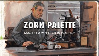
Hello, what you are describing with your color chart looks like the zorn pallete, consisting of yellow ochre, cadmium red light, ivory black and titanium white.
The color where used because of the inks used in printing the cyan, magenta, yellow and blacks where not as pure in those days
Leyendecker's work at the Haggen is worth the trip, but not his best pieces. If you are interested in his technique, you can get a fair idea of how he, Joe, and his brother, Frank, worked by studying a bit of their early history, using some of the methods learned in Europe and then applying them to commercial work in the US. Primarily they used a medium of stand oil, turps and damar varnish. I don't doubt that he added a siccative, or dryer, into the mix for his whites. This would usually set up overnight, but the ideal was to get the paint sticky so that overlaying thin strokes of color, with the syrupy medium, enhances the pull, or tactile quality of the paint, so they could lay on a second coat without smearing as much. In this way they, and other illustrators at the time, could drop in those juicy lines and highlights, or draw into wet paint with more effect. They also used long sables and riggers to lay paint on where most brushes would smear it.
I studied these guys when I first started illustrating 40 years ago and was always impressed by their ability to draw over wet paint. Rockwell picked up some of that technique, as did many others, and I bet they saw enough of Sargent, Boldini and other fine artist's work at the time, to be impressed by the techniques, applying them in their own way to commercial jobs.
We have a new generation of illustrators, or illustrator want-to-bes, that are just now discovering these early masterful artists who trained as fine artists, but had great success as commercial artists. Back then, the profession was highly regarded because of the huge amount of print, where covers for the Post and hundreds of other periodicals showcased their talent and made some household names.
If you get the chance to see any of their best originals, as I was lucky to do over time, and you are interested in remarkable, even gifted ability, you can learn a lot about color, line and design. The masters of commercial work influenced decades of illustrators because they brought work ethics and training in what might be considered lost techniques today.
I feel the yellow ocher color skin appears a lot in classic painting I see in Wikipedia, and they all kind of having dark background
It's marvelous that you did this. Maybe too many "really cools", but we can blame the trends, I suppose. Just don't let someone get away with saying aireodite when they say erudite....that crosses a line.
Well, maybe Da Crafsman can say it..
My vocabulary is horrendous haha. I've said really cool and pretty cool since I was a child :P
I loved Rick griffin’s gospel of John series incorporating the psychedelic era work (grateful dead covers, family dog posters etc.) and obviously referencing Leyendeker’s style. Magicians don’t like revealing their tricks but it’s obvious griffin owes a lot to leyendeker.
I do believe the emerald green on the kiss painting are hand beads, hence the spaces in between. what do you think?
Speaking of that Hals influence, I feel like it's a common thing amongst both visual artists and thinkers/philosophers etc., that people come up with a similar thing at different times and might be completely unrelated. In this case I'm pretty sure Leyendecker did study many other artists and took a lot from it, but it might've been the contrary. It's like, when you get a thought, you can't guarantee that no one has ever thought the same thing before. It does not imply that nothing is unique, but it's like a constant rediscovery we're up to.
I agree. Also after looking more at his work, a lot his brushstrokes resemble impressionists (just not in color). And his backgrounds remind me of Edgar Payne, when thinking of strokes as well. But I agree and I said that as well that I really have no idea, it's just my thoughts :) I'm sure he did his own thing for the most part - it's just fun to recognize similarities - whether they were knowingly or unknowingly done.
@@SchaeferArt Absolutely. It's pure speculation on my part as well, and it's truly mesmerizing :)
could you do a video about JC painting process? that would be really helpful
I really don't know much about his process unfortunately :(
I could not find a hard edge anywhere in his art. I am puzzled how every edge is softened. The medium may explain it.
If you like Sargent, check out "Joaquin Sorolla".
Definitely know of him :) Have a book on him as well.
@@SchaeferArt aww great. I hope you continue to do more artist appreciation vlogs. Your location surrounds you with incredible work. Have you thought about viewing collections at Universities? Stanford has more contemporary works.
What is the painting at 8:16 called?
i think you are spot on with Frans Hals comparison, but, i disagree with some of your comment about unfinished, such as the strawberries, also, Leyendeckers draughstmanship is equal to any of the masters, imo.. anyway, thanks for posting , its a great vid
Интересная техника и исполнение
Thank you
like Norman Rockwell
could it be egg tempera mabr He reminds me of Sargents brush stokes.
.
Also not many illustrator painting survived because there was no steps for lasting a long time, they where made for printing not for galleries
would you be willing to upload the photos you took?
photos.app.goo.gl/H8EKGDHvxGjtkL3V7
Download what you want :)
I'll hazard an uneducated guess that the green on that sleeve might be emulating embroidery???
Possibly, I'm not sure
Oil paintings??!!,,,
I really wanted to be an artist... But I think the world is taking me to the other path
Rj Delacruz is the world taking you on another path or did you figure out something you love to do rather than art? Nothing wrong with that.
He was using only gouache I’ve think
Does anyone know if Leyendecker was religious in any way? A lot of his work seems to imply he might have been Christian but I'm not sure.
Compare J.C. Leyendecker's work to the Florentine sculpter *Luca della Robbia* (1400-1482) and his nephew Andrea religious church pieces. Appears Leyendecker used Robbia's architectural elements plus sculpting with paint to give a glazed terra cotta bas-relief effect.
Perhaps, that might give his work a Christian look, i.e. halos around figures head, cupids.
Leyendecker: 11/10 on technique. 4/10 on storytelling.
Lots of successful artists today are equally selfish with their technique. I could name a dozen exceptionally well known current artists (all realist artists) who refuse to divulge anything. One of whom is, to be frank, an egotistical prick. And then you’ve got wonderful artists such as James Gurney who give all the info away for nothing. I’ll never understand it, especially from painters who’ve already made it big!
Very poorly narrated video, you need to know more about the man your talking about.
I just enjoy his art from a show I went and saw. Just sharing what I saw.