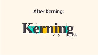
How to Kern Logos | Illustrator Tutorial

ฝัง
- เผยแพร่เมื่อ 21 ก.ย. 2024
- In this Illustrator tutorial, learn how I approach kerning letters in logos and words. The letter spacing isn't mathematical 90% of the time, and you must look at the volume between shapes to optically kern logos.
MY TUTORIAL CHANNELS //
• Main Channel - bit.ly/PixelAnd...
• Illustrator - bit.ly/PBIllust...
• Photoshop - bit.ly/PBPhotoshop
• InDesign - bit.ly/PBInDesign
• Premiere Pro - bit.ly/PBPremie...
• After Effects - bit.ly/PBAfterE...
TAKE MY CLASSES //
• Illustrator for Beginners: bit.ly/Illustr...
• Photoshop for Beginners: bit.ly/Photosh...
Download project files and other resources from the Pixel & Bracket Vault on my website: pixelandbracke...
Get Skillshare Premium for free and learn from myself and thousands of other creators: bit.ly/PBSkill...
My favorite place to get music for my TH-cam videos: bit.ly/PBEpide...
I love using StreamYard for my livestreams, video recording, and podcasts with guests. You can try it for free and get $10 off when you sign up with my link: bit.ly/PBStrea...
My two favorite TH-cam browser plugins and keyword research tools are VidIQ (bit.ly/PBVidIQ) and TubeBuddy (bit.ly/PBTubeB.... I use each and HIGHLY recommend them if you want to grow a successful TH-cam channel! (btw just pick one, having both is probably overkill... 😅)
MY TH-cam GEAR //
• Work Camera - geni.us/Dg20
• Work Camera Lens - geni.us/A06gBf
• Personal Camera - geni.us/lAgB
• Personal Camera Lens - geni.us/JkCngL
• Webcam - geni.us/6BVc
• My Favorite Tripod - geni.us/hwfntp
• Camera Mic - geni.us/mobx
• Desk Mic Bundle - geni.us/5mv8s4o
• Mic Arm - geni.us/TB8zg
• SD Card - geni.us/nURBUAp
• Card Reader - geni.us/CtuA
• Desk Lights - geni.us/KV3yb
• Studio Lights - geni.us/rFZK5
• RGB Lightstrip - geni.us/WLdfn
• RGB Bar Light - geni.us/U1hNTJm
Some of the links above may help support this channel through a small affiliate commission at no extra cost to you!
COME SAY HI //
• / pixelandbracket
• / pixelandbracket
• / pixelandbracket
• www.pixelandbra...
SPONSORED BY //
RFclipart: rfclipart.com/
Use the promo-code PIXELBRACKET to get a 10% discount. Discount is valid until December 31, 2019.


Try Skillshare Premium for free and watch my classes here: bit.ly/PBSkillshare
Very useful 👌 Kerning is definitely something to watch out for in logo design!
thanks Dan!
Made in 2018, and it's still helping so many designers out here!
Kerning made in 2018?
I did know about adjusting kerning depending on space between letters for better balance but i didnt know the align tool could distribute like that, thanks!
ya super helpful!
Some amazing tips in this video, 5 mins of kerning gold! Great job
Best video on this Topic Bro, Keep it up with The value
Initially you forgot to adjust the space between O and X. You adjusted the space 10 pixels between B and O and then only 5 pixels between O and X, which should have been like 15 pixels. But later on, when you were showing the measurement, they were 50 and 45 pixels respectively. The idea of 'volume of space', however, was interesting.
Good eye sir! Finally someone notices, forgot to shift nudge the X over 10px plus the 5px nudge. The final 45 is the right measurement (you can see my final layer is different than the first because of this)
I noticed! But I had to watch it again.... Very mysterious stuff there@@pixelandbracket
Nice! Can we get more content about typography and kerning please?
Brilliant way of explaining. Thank you!
Awesome, I'm getting a lot from this channel, Thanks Man!
Wow! Very useful Kerning is definitely something to watch out for in logo design!
Awesome tutorial, thank you!
This was a very good quick hack. Thanks a lot
Super helpful video. Great job. 👏🏻
Such a great tutorial man. Thank you!
Very helpful and nicely visualized.
Thanks for the great video :)
What did you do to show the volumes?
short and nice
Please can go do more examples. Also how did you get that pink background to show the volume of the spacing after you distributed them evenly. That was super useful ...
Agreed, any updates on how that was done?
@@jameslynch7786 Just put another colored surface at the bottom of your font(must be an outline) and use the shape tool to delete the font (alt and click)- after that you get the silouette
Would it be useful to think in terms of diagonal spacing? Say if the closest points between the O and X diagonally were about the same distance apart as the closest points between the M and the O horizontally?
Thanks.
Thank you so much for this!
How did you get the volumes between the letters?
He just created a rectangle behind the logo, select them both and divide them using pathfinder. Nothing magical :)
Shape builder tool works well too
@@pixelandbracket Yes, it's my favourite, Pathfinder is so complicated 😂
Nice! My channel logo needs some serious help too! I spent ages trying to kern mine and ur video is totally helpful for when I try to attempt to kern it again.
haha for sure man! keep working on your channel little by little, just watched a couple of vids, you've definitely got a personality - it's a grind but keep it fun 👍
Thanks! I'm taking a break to finish my last sem of college but will get back to the grind after! Did you get a chance to see the logo I'm using? How on earth do you kern a minimalist font style like that? haha
the most important thing is that the viewer reads it correctly. so first make sure that April, May, and Rain are distinguishable. i might remove the dot on the i and bring both i's up to the height of the rest of the letters. I understand the significance of the drop, but you've got enough going on with your text that it's probably best to simplify things a bit. I would also bring back the stem on the R in Rain, you don't chop any of the other capital letters and that would help the legibility. after all that, maybe a little closer together overall, that's hard for me to tell without seeing it but i'm just guessing there. and then use some of the techniques in this video when analyzing the spacing between letters. don't hesitate to reach out!
I was looking for this many many thnx
many many welcomes!
Great
Brilliant ;)
Said its big space between B and O and even bigger between O and X.
Then decrease the space between first one for 10 px, and the second for 5px) I’d still remove 5 px more from the second
Yea I adjusted it correctly in the end measurements but not at first, I agree!
The M and the B make the O and the X look tapered off smaller.
true, that's why generally letters that are rounded at the top or bottom extend above/below the baseline and cap height
I subscribed I love the video. I'm going to check out your website and I will be in touch with you.
I feel like o and x are bit smaller compared to M and B
OX still needs tighter kerning...
I know, I messed up that part, you can see it adjust at 4:25. The numbers are correct tho. The end result is what it should be
which font is this
I wouldn't speak of "volume" but of "surface" (I'm finicky, I know) but great point nontheless! Thank you.
haha, let's compromise and call it the "amount of negative space"
why 46 in the last ? i mean it should be 60 like other 3.
It’s 60 60 50 45, the whole point is when the volume of space between the letters is greater, you need to kern them closer together. Mathematical is not always better than optical
optical adjustments matter here not mechanical or mathematical
I love how he never explains how he got the volumes
It’s a visual reference for what I look at when I’m spacing out letters. I had to actually make shapes to highlight them for you, there’s no automatic way to see it
You know the theory, but that logo is still appallingly spaced.
I need your help... How can I contact you?