Create a Heat Map using Conditional Formatting in Excel

ฝัง
- เผยแพร่เมื่อ 27 ส.ค. 2024
- Create a heat map using Conditional Formatting to visualize a pattern in your data set.
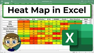
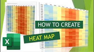
In this video tutorial, we have a table of rainfall data. Just looking at a table of numbers does not show us much, without intense eyeballing.
By applying a heat map and using a typical RAG status the data comes alive and we can see the when and where rainfall was at its heaviest and lowest.
You do not have to use the red, amber and green colours for a heat map. You may decide to use your companies colour scheme as it is the identity of your company. You can also modify the default scale of values to suit your own needs.
Find more great free tutorials at;
www.computerga...
** Online Excel Courses **
The Ultimate Excel Course - Learn Everything ► bit.ly/Ultimat...
Excel VBA for Beginners ► bit.ly/37XSKfZ
Advanced Excel Tricks ► bit.ly/3CGCm3M
Excel Formulas Made Easy ► bit.ly/2ujtOAN
Creating Sports League Tables and Tournaments in Excel ► bit.ly/2Siivkm
Connect with us!
LinkedIn ► / 18737946
Instagram ► / computergaga1
Twitter ► / computergaga1 - แนวปฏิบัติและการใช้ชีวิต


Thank you for clear explaination
You are welcome
Very well explained. To the point and perfect. Thank you.
My pleasure. Thank you Parthesh.
Thank you very much for the new lesson.
Your welcome Irshad
Thank you so much. We want more interesting examples of conditional formatting in your coming video.
Not a problem, Thanks Sanjay.
Thank you SOOO much !!
You're very welcome 😊
Thank you, it helped
Excellent! Thank you, Jeet.
Thanks. Very much useful.....
Excellent!
Great video! Thanks.
Thank you 😊
Is there way to apply 3 scale conditional formatting to odd cells only or even cells only of a range?
Sure, but not with the Color Scales feature I do not believe.
We could do it by creating three separate rules (one for each colour). We could include the condition such as
I love the accent, man
Thank you Luke.
is there a way to do it directly in a pivot that keep working after filtering a town for example
Hi, is there a way of adding a legend to identify what each allocated colour should represent?
There is not a setting for this. It would need to be added manually by formatting a cell in that colour and typing what it represents beside it.
@@Computergaga OK, thank you.
Thanks for the video. I just have one question: Do you know how to use the heatmap on other cells that display a different value? For example on sheet one I have a row of 4 different numbers (For example: 2, 5, 6. 3) and I can make the heatmap there using conditional formatting with red being 0 (under target), yellow being 6 (on target) and green being anything higher than 6 (over target). But my problem is that I want to make a heat map on sheet two (related to sheet one) but if I use the same conditional formatting on sheet one with sheet two, the row of 4 which all display the number 6 will just show as yellow which is incorrect. I'm hoping you can help! thanks.
You sound like Arthur Shelby mate
I don't know who that is, but thank you 😊
Has anyone told you that you sound like bear grylls.
Don't think so. But I'll take it 😊