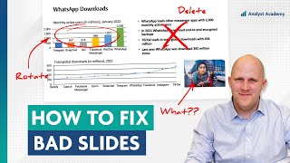
Thoughts... Slide 1: Overall an upgrade, but then my eyes are drawn towards the uneven icons and descriptions. Slide 2: Nice. Slide 3: Amazing! Love that Index Chart! Never used one of those before! Makes sense to show drastic increases. - Fellow Analyst :)
Paul, I subbed to this channel because of its informative and insightful videos. The comments section also deserves praise for its intelligent and perceptive discussions. I specifically like these videos where you take existing presentations, reimagine them, and then show why and how you did it. I find them the most helpful and engaging. I hope you and your team continue to produce these videos (I think you are the only channel on TH-cam that produces these kinds of videos).
I love these videos. I work in a small consulting firm as head of data and analytics and always recommend this channel to new team members. they are usually great at analyzing but have a lot to learn at how to present their findings and these videos are always an entertaining way to put some new ideas in their heads.
This is so good and insightful! I have your cheat sheet on charts and I'm currently preparing a report on a research project, and I'm challenging my senior group expert on his opinion about the chart choices and he agrees often with me that what you would recommend is actually a better way. It's great that my colleague has an open mind to change his opinion when I explain the reasoning behind what chart and what elements I choose.
This is a great rework! One thing to note on the color choices for the first slide, we have a progressive color pallet we are expected to use. I think that's why they had the grey to blue in the original. Not necessarily an active choice of those colors
I have always a dilemma whether I should focus on delivering only the insight that I found meaningful (so I'd limit the data on the chart, e.g. show only the indexed values instead of absolute numbers, focus on the major categories etc.) or should I stimulate the stakeholders to think as well and show them more data than necessary and by doing this let them spot other interesting points which I could not notice.
Insightful Please make more of these Would appreciate a video on how to make the best slide possible when you have a constraint of using only 1 slide That’s an extreme example, but basically, when you have limited amount of time to present or there is a constraint on the number of slides you mustn’t cross, what are the key things to look out for and be aware of? An example video of the above question would be much appreciated 😊
As someone who frequently creates PowerPoint presentations, I found this video incredibly helpful. Before hearing your insights, I had my own ideas and was curious to see if they'd match up with yours. Turns out, they mostly did, which is really reassuring since I've gained so much from your content.
I just discovered your channel and I LOVE IT!!. I've taken a few courses on data viz and this is helping me take it to another level. Looking into Ampler Charts but was wondering why you use it in PowerPoint vs Excel?
I've read some Bain workshop decks at work, and noticed they use this one graphic/visual feature in their presentations: Red underlines, dashes, or circles, around impact items which are deliberately made to look like they've been made by hand with a marker. The rest of the slide looks MBB-polished (almost sterilized) clean but the red dashes stick out, in a good way. It somehow brings the presentation "down to earth" and reminds you of ad-hoc brainstorming sessions on a whiteboard or notes on a notepad. Have you noticed these and what do you think?
thanks for the videos, the reworked slides are clear and concise. have learned much for your channel. any chance you could share how to make financials reporting more engaging and less suffocating with numbers.
I would appreciate a video (either here or on the website) or a comment back that clearly explains the differences in the 3 courses. If all three are purchased, is there unique value being obtained from each or is the information largely repetitive? Great content and would love to support more.
That's a great idea for the website, thank you. The short answer is that there's actually minimal overlap between each of the courses, and they actually complement each other really nicely. The PowerPoint course focuses on PowerPoint as a tool (i.e. how to use it most effectively), but doesn't cover design or slide structure at all. The Presentations course is about what makes a presentation effective and how to design good slides, but doesn't really cover charts and visualizations (only briefly). Then the Data Visualization course is about telling stories with your data - how to choose the right chart for your message, and how to design that chart for maximum effectiveness. Hope this helps! Feel free to reach out if you have more specific questions.
What is the difference btn Dashboard and report interms of visualizations? Are the way charts are shown in Dashboard different from a report, say monthly HR Report?
This is not a criticism, just an honest question - when/where do you see a place for aesthetics in a slide? Not that your slides aren’t clean and beutiful in their simplicity, but it feels like you tend toward simplicity whenever possible, and I just wonder if there’s potentially a tradeoff in audience engagement if the slide isn’t as “pretty”? To be fair my perspective is a little different as my presentstions are to “lay people” on financial concepts like planning for retirement. If I simplified all of my charts in a similar fashion I can’t help but feel like they’d just feel stodgy and disengaging.
It all depends on the audience. For a business audience (especially executives) I would tend towards a more to-the-point (i.e. less aesthetic) approach. For an audience like yours, something more visually exciting is entirely appropriate. But I also think you can have something nicely designed that also communicates information effectively. In my experience people stay most engaged when they can follow along, so as long as your design doesn't prevent people from understanding what you're trying to say, you should be good.


We read every comment so please let us know what you thought of the video!
Thoughts...
Slide 1: Overall an upgrade, but then my eyes are drawn towards the uneven icons and descriptions.
Slide 2: Nice.
Slide 3: Amazing! Love that Index Chart! Never used one of those before! Makes sense to show drastic increases.
- Fellow Analyst :)
Great feedback!
Paul,
I subbed to this channel because of its informative and insightful videos. The comments section also deserves praise for its intelligent and perceptive discussions.
I specifically like these videos where you take existing presentations, reimagine them, and then show why and how you did it. I find them the most helpful and engaging.
I hope you and your team continue to produce these videos (I think you are the only channel on TH-cam that produces these kinds of videos).
Really great feedback, thank you! Glad you’re enjoying the videos.
I love these videos. I work in a small consulting firm as head of data and analytics and always recommend this channel to new team members. they are usually great at analyzing but have a lot to learn at how to present their findings and these videos are always an entertaining way to put some new ideas in their heads.
Love hearing that! Let me know if there’s a specific type you’d like to see.
Excellent!! Thank you for showing how index charts are made.
You're welcome! They can be really useful, and they're not that hard to make.
This is so good and insightful! I have your cheat sheet on charts and I'm currently preparing a report on a research project, and I'm challenging my senior group expert on his opinion about the chart choices and he agrees often with me that what you would recommend is actually a better way. It's great that my colleague has an open mind to change his opinion when I explain the reasoning behind what chart and what elements I choose.
Changing the world one chart at a time... great work!
Imagine working until 2 AM while your manager is yelling at you only to have your slide roasted on youtube
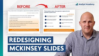
This is a great rework! One thing to note on the color choices for the first slide, we have a progressive color pallet we are expected to use. I think that's why they had the grey to blue in the original. Not necessarily an active choice of those colors
Definitely makes sense. Thanks for the extra insight!
I have always a dilemma whether I should focus on delivering only the insight that I found meaningful (so I'd limit the data on the chart, e.g. show only the indexed values instead of absolute numbers, focus on the major categories etc.) or should I stimulate the stakeholders to think as well and show them more data than necessary and by doing this let them spot other interesting points which I could not notice.
Insight only and keep additional detspail in the appendix
No one wants to think.
Learning so much from each video. Keep up the good work. Thanks 🙏
Insightful
Please make more of these
Would appreciate a video on how to make the best slide possible when you have a constraint of using only 1 slide
That’s an extreme example, but basically, when you have limited amount of time to present or there is a constraint on the number of slides you mustn’t cross, what are the key things to look out for and be aware of?
An example video of the above question would be much appreciated 😊
Great idea! Thanks for the suggestion
Great video!! For the first example, I’d use a dumbbell plot and show the change to the right of the plot for each category.
Incredible video
As someone who frequently creates PowerPoint presentations, I found this video incredibly helpful. Before hearing your insights, I had my own ideas and was curious to see if they'd match up with yours. Turns out, they mostly did, which is really reassuring since I've gained so much from your content.
Nice! Really happy to hear that.
Thank you for breaking down indexing.
You’re welcome! It’s a very useful chart.
This video just sold me to sign up for an advanced course. Simply outstanding content!
Awesome... enjoy the course!
Great work. Thank you!
Thanks!
Inspiring - your videos make me strive to improve my own slide-making skills. Thanks from a Danish viewer.
So happy to hear that!
Great video. Keep more of this type of videos coming.
You got it!
Paul - I have learnt a tremendous amount from watching your videos. Keep up the great work!
I’m so glad! 👍
I just discovered your channel and I LOVE IT!!. I've taken a few courses on data viz and this is helping me take it to another level. Looking into Ampler Charts but was wondering why you use it in PowerPoint vs Excel?
Glad it was helpful! If the chart will eventually be copied to PPT, it’s best to create it there from the beginning. Otherwise, Excel works great.
Thank you. Very helpful content
Building slides right now and applying the things in this video directly! The effect is immediate and very much positive :)
So glad. Good luck!
I've read some Bain workshop decks at work, and noticed they use this one graphic/visual feature in their presentations: Red underlines, dashes, or circles, around impact items which are deliberately made to look like they've been made by hand with a marker. The rest of the slide looks MBB-polished (almost sterilized) clean but the red dashes stick out, in a good way. It somehow brings the presentation "down to earth" and reminds you of ad-hoc brainstorming sessions on a whiteboard or notes on a notepad. Have you noticed these and what do you think?
Yes! I haven’t always noticed the “made by hand” look, but I definitely think they add red accents to their slides in a way that’s very effective.
Thanks, this video was insightful
You're welcome! Thanks for watching
thanks for the videos, the reworked slides are clear and concise. have learned much for your channel. any chance you could share how to make financials reporting more engaging and less suffocating with numbers.
That's a great idea, will add it to the list. Thanks!
Paul what software are you using to create these slides? Only Ambler? Thanks
Ampler and PowerPoint! That is all.
I would appreciate a video (either here or on the website) or a comment back that clearly explains the differences in the 3 courses. If all three are purchased, is there unique value being obtained from each or is the information largely repetitive? Great content and would love to support more.
That's a great idea for the website, thank you. The short answer is that there's actually minimal overlap between each of the courses, and they actually complement each other really nicely. The PowerPoint course focuses on PowerPoint as a tool (i.e. how to use it most effectively), but doesn't cover design or slide structure at all. The Presentations course is about what makes a presentation effective and how to design good slides, but doesn't really cover charts and visualizations (only briefly). Then the Data Visualization course is about telling stories with your data - how to choose the right chart for your message, and how to design that chart for maximum effectiveness. Hope this helps! Feel free to reach out if you have more specific questions.
Please do a video on designing visual appealing excel sheets!!
Great idea!
Is ampler available for mac? If not, do you have any alternative that is available for mac? Thanks!
Nice move with the index chart - that’s was really good. Ampler appears to have a similar structure as think-cell. Is Ampler easier to use?
Thank you! It comes down to personal preference, but I prefer Ampler. In my experience it tends to be cheaper as well.
@@AnalystAcademy makes sense to me. think-cell is expensive tool.
What is the difference btn Dashboard and report interms of visualizations? Are the way charts are shown in Dashboard different from a report, say monthly HR Report?
Perfect !!
Thanks!
Thanks
This is not a criticism, just an honest question - when/where do you see a place for aesthetics in a slide? Not that your slides aren’t clean and beutiful in their simplicity, but it feels like you tend toward simplicity whenever possible, and I just wonder if there’s potentially a tradeoff in audience engagement if the slide isn’t as “pretty”? To be fair my perspective is a little different as my presentstions are to “lay people” on financial concepts like planning for retirement. If I simplified all of my charts in a similar fashion I can’t help but feel like they’d just feel stodgy and disengaging.
It all depends on the audience. For a business audience (especially executives) I would tend towards a more to-the-point (i.e. less aesthetic) approach. For an audience like yours, something more visually exciting is entirely appropriate. But I also think you can have something nicely designed that also communicates information effectively. In my experience people stay most engaged when they can follow along, so as long as your design doesn't prevent people from understanding what you're trying to say, you should be good.
@@AnalystAcademy Makes perfect sense, and I really appreciate the response!
slide making GOAT damn
🤣🤣
Anybody has a Ampler alternative for mac (except Think Cell)?
Small typo on the word enabling on second slide redo
Nice catch!
wowww
Ampler…