Let's Talk About Banjo-Kazooie Redesigns...

ฝัง
- เผยแพร่เมื่อ 19 ต.ค. 2024
- FULL VIDEO: • Banjo Ka-Zelda: Nuts o...
The Legends of Zelda: Tears of the Kingdom and its peculiar crafting system put a spotlight back on Banjo-Kazooie: Nuts and Bolts. I'll glady take that opportunity to ramble about both! ; )


Ngl he looks like a Chuck E. Cheese animatronic.
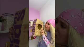
"Who Is Boggy?"
- A Silly Hippo
- A Polar Bear
- A Toilet
yeag
“Spoiled, boiling applesauce”
My thoughts exactly!
I think the only bad decision here was not giving every character bulging eyes
Why was Kazooie secretly judging us by side eyeing us in Nuts and Bolts 😭
honestly I like it because it has that low poly feel akin to the ingame models from the n64 but with nicer details
Best glow up goes to Humba, in my opinion.
Not the papa bear 😭
Yeahh 😭 this game had some pretty good redesigns, others are HORRENDOUS
They fucked up Boggy so hard
I love all the banjo games
Gruntys revenge was pretty sweet, not nuts and bolts tho :(
Agreed 100% bro.
I mean.... banjo's design is ok (for the most part), it's just his eyes that rub me the wrong way, they just need to be bigger tbh. And the same applies for kazooie.
I actually once did a photoshop on the design where I replaced the eyes with ones from some N64 promo art, and it really does make a difference.
It's the eyes plus those weird teeth/smile. He looks creepy as hell in the Xbox360 game. Had he had a different colour palette on his clothes and someone told me it's just a bizarre version of Banjo (like what Wario is to Mario) I would've totally believed it!
Mumbo Jumbo looks amazing in this game
OK but aren't we forgetting something? Mumbos skull face is a curse Grunty put on him, according to the original hame manual the curse will be broken when she has been defeated. Meaning shes gonna escape from logs factory because mumbo is still cursed. She ain't been beaten yet according to established lore 😂 banjo threeie confirmed
That's because his skill head is easy to make look good in the cartoon style thanks hundreds of years of art.
@@charmedrools1 Banjo-Kazooie: Nuts & Bolts 2
nuts and bolts was one of my first ever video games so maybe i'm biased, but i love the new designs just as much as the old ones!
They're neat in their own way!
I like a good bit of the designs
But the polar bear-
Maybe I'm just nostalgic, since this is the Banjo Kazooie I grew up with, but I can't hate any of the designs even compared to the originals. At worst, they're good in their own rights.
At least Humba got a real glow up
Not surprising. Follows the trend that Shrek pioneered. "The cute Disney character designs are childish and one-dimensional. Edgier is better and more mature."
Hopefully the remaster won't look that bad
at least they kept their old voices
I love all the redesigns more(sue me)
its like they tried to keep the blocky art style from the n64 era and it just doesn't work because those original designs were only so blocky because of the limitations.
It could've work had they not made the redesigns so creepy looking. Both Banjo and Kazooie look like a psycho version of themselves.
@@georgezee5173 meh. you look at the smash version of banjo and it's a faithul adaptation of the original without being all blocky.
They turned the mystical gingos into a damn prey species 😭
Tell me you're dutch without telling me you're dutch
🧀
I still can't believe Microsoft Green lit this and not the two pitches rare gave them for a conkers sequel.
Well.... we did get a Conker Sequel made by a now Defunct Gamedev Tool....
Im really sad the original banjo kazooie franchise died after the sequel and his addition in smash is like a tribute like lucas
One word: STAIL
Mumbo left the chat
Should I be proud to not play Banjo Kazooie Nuts And Bolts and only playing Banjo-Kazooie And Tooie especially someone like me who was born in 2003 and only now played the games since 2023
Yes
I like the designs
Good for you 👍
@@RamblePrism what's is this irony? Gonna cry?
I would rather stick with their old designs and their promotional art renders
Well, the graphics are meant to be gritty, right?
What the hell did they do to Jinjo? Mf looks like a plague doctor mask now…💀
True
The redesign nobody asked for. Very weird decision. I don't think they would have looked like this had it been released on the Wii. Always felt to me like a way to "reimagine" the franchise for a new publisher. And they skipped an entire console gen to do it as well. Very sad.
I never played this one yet i atill play the old one and its generally better💀
It does look like they have grown but holy shit what is wrong with Boggy??? The color inconsistencies, the fact they made him fatter, i know this takes place after tooie but WHY why this design THEY SHOULD HAVE TAKEN MORE FROM THE OLD ONE.
His teeth too, I feel like if you make the image quality darker and have a b&w color to it it will become a creepypasta 💀😭
This might be a hot take but Rare games have always been pretty bad in the character design department
Yeah, it was a strange game
But a fun one!
As opposed to a boring normal game? I'll take strange any day.
Bad strange or good strange?
@@nakedpear3558 Both?
I'd like Kazooie's new look, if her feathers were more vibrant, and they restored Kazooie's red beak tip. Besides that, I'll never play this betrayal. Jon Tron explained it best.
You are dutch i here your accent
Woah cool I didn't know I was Dutch
Ewwww boggy 😨
ALL DESIGNS ARE STOOPID