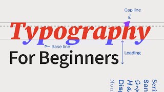
SMART TYPOGRAPHY = AWESOME POSTER DESIGNS

ฝัง
- เผยแพร่เมื่อ 18 ต.ค. 2024
- Learn how to make a neat and clever typography poster in Illustrator, with todays tutorial.
Sign up to Skillshare for 2 months TOTALLY FOR FREE:
skl.sh/satorig...
Todays Illustrator tutorial is not to show how to make these techniques, but more to showcase different ways to use typography in poster designing. I walk you through 5 different instances where typography is used, in poster designs that I have created myself. If you want to see a tutorial based around a specific technique shown today, maybe how to make the knockout effect in Illustrator, then I will make a video tutorial on that in the near future.Typography really can make or break a design, and so todays video will help you understand how to use typography effectively on your poster designs!
If you found todays poster design tutorial in Illustrator enjoyable or useful, let me know in the comments section and drop a like on your way out. Subscribe to stay updated to all of my uploads and until next time, design your future today, peace
🔴 JOIN MY EMAIL LIST For Weekly Updates & Exclusive Content:
➤ www.satorigrap...
📢 📢📢 SUBSCRIBE TO MY CHANNEL
➤➤ / @satorigraphics
.........................................................................................................
Join Me On Twitter!
/ satorigraphic2k
Here's My Instagram!
www.instagram....
7 FREE SCRIPTS FOR ILLUSTRATOR:
• 7 FREE Illustrator Scr...
My LONGEST ever tutorial on an isometric design
• ISOMETRIC Illustrator ...
Create JAW-DROPPING design by using graphic design principles
• Make JAW DROPPING DESI...
**************** MUSIC ****************
JULIAN AVILA - VIBE / Pineapple Paradise
Soundcloud: / julian_avila
TH-cam: / @juliangavila
▶ Copyright
The work is protected by copyright. This is applied to the video recording of itself as well as all artistic aspects including special protection on the final outcome. Legal steps will have to be taken if copyright is breeched. Music is used from the TH-cam audio library and thus copyright free music.
FTC: This video is sponsored by Skillshare Resources Used:
www.freepik.co... Business vector created by pikisuperstar - www.freepik.com
www.freepik.co... Background vector created by freepik - www.freepik.com
www.freepik.co... Infographic vector created by freepik - www.freepik.com
• SMART TYPOGRAPHY = AWE...


![⭐ฮิตในTikTok!! ( มะมะมะหมูเด้ง MooDeng ) Ver. แดนซ์ ReMix BY [ ดีเจกิต รีมิกซ์ ]](http://i.ytimg.com/vi/4noyAoMa7bQ/mqdefault.jpg)
![[DRIP] ‘Woke Up In Tokyo (RUKA & ASA)’ PREVIEW](http://i.ytimg.com/vi/QN44lcR_VkI/mqdefault.jpg)

I’ve really grown as a designer since watching you, appreciate your work so much, I implement what I learn from you every week. My poster designs have improved dramatically this week, thanks to you man. Keep up the great work. 👌🏽
Your tutorials are really changing my points of view about design, concepts and how to use the elements to create dynamic compositions! Really great! Thank you master Satori ;)
totally loved the presentation of the video rather than being another tutorial. would love to see these kind of videos all day long. looking for some more good videos like this man. just loved it !
👏👏👏 Bravo! Great design ideas! Thank you for sharing 🥰
I love the knockout techniques
Your hip hop music selection is pure 🔥🔥
Great overview of the techniques!
Thank you from Ukraine! Your tutorials are great!
Beautifully created posters...
All were good..
The most beautiful one was onynx.. where u used clipping mask...
Very minimal n attractive poster...
Thank u for showing us how the typography can be used on the poster n where can we place the type...
Brilliant stuff mate -- love it!
Awesome And Full Of Information As Always!!!
Yes we want that detailed video.
all the posters are awesome
Love all of them. Thanks bruv.
Thank you for the link to the skillshare trial. Drinks on me if you wanna stop by the Seychelles.
Thank you you're the best
I'm new to your channel, and you have some really quality content. I look forward to integrating these concepts into my own work, thanks!
Great vid!! Give us more
Pls make a video about the knockout effect in more detail, it's damn good, I want to know more how and where we can use it
@@SatoriGraphics Plz do...🙌
As always, amazing content. Even if you cover techniques I already know you help further understanding or inspire new ways of using them.
There are a few upcoming projects that I will employ some of these techniques.
I really love typography too 😉
3:25 Mounatins, I think readability also should be considered when designing
@@SatoriGraphics Yeah I know that feeling, sorry I'm just used to point out flaws 'cause art direction hehe, keep up the good work mate!
This is amazing.
KnockOut & Hierarchy ✨🔥✨
I agree ❤️✨
May I know, when and for what (i mean product or etc) we can use scatter typography style to our design satori?
Hi any good links to online resources. Thanks for some great videos, I've really enjoyed them.
Satori Graphics = Awesome Tutorials
bro.. please tell me, how important the drawing tablet for vector works?? is mouse enough?? tablets better than mouse?? please share your thoughts...
@@SatoriGraphics i'm facing difficulty in freehand drawing while using mouse... what you suggest bro?? practice??
Awesome
Great as usual!
I'm still confused, what is the difference between knockout and clipping mask?
Clipping mask only places the image within the text.
Knockout effect cuts out the letters from an object and shows whatever is behind the cut object.
OK I understand now, thanks a lot for answering my question.
Would like to know which font you used in 2one?
what typefaces were used in this video?
If I recall mainly Bebaus and also Aileron
How do we get rid of the excess of an image when we clipping mask it?
Been getting invisible (but still there) lines..
Poster 3: Why did you add the line that goes from the S to the bottom of the poster?
@@SatoriGraphics Aha, I actually really like it. It reminds me of a ladder, I just wondered if that was what you had in mind. Keep up the inspiration video's! :)
I've stopped getting your notifications, don't know why, the bell is ticked.
Poster 2 reads zero, not O.
@@SatoriGraphics yeah, but it looks like a zero 🤔
@@SatoriGraphics this is because zero is narrower and O is more circular... Likely the one who made this font didn't make this distinction. Like other typeface for Ill
1