Why no White Balance in Photoshop? - Color Balance!

ฝัง
- เผยแพร่เมื่อ 31 พ.ค. 2024
- Have you ever looked for a White Balance tool or Adjustment Layer in Photoshop?
Were you shocked to find that there wasn't one?
I, after 22 years of PS experience, am still quite shocked that there is no White Balance tool We have tons of tools to control color in our images in Photoshop from Curves to Levels or HSL and Selective Color, but those aren't tools that target White Balance specifically.
Sure, Lightroom and ACR have White Balancing tools, but there are times that you need that power in Photoshop. So where do you go?
The answer lies in the Color Balance adjustment layer, but it's not the easiest tool in the world to understand. Well, until today!
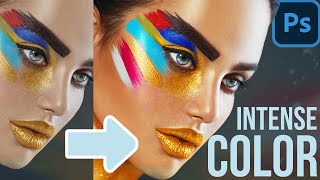
Today I will share how to use the Color Balance tool to both Correct and Exaggerate the colors in your images.
Chapters
00:00 Introduction
00:36 White Balance and Color Grading Example
01:21 Understanding Color Balance in Photoshop
02:49 Color Balance for Color Correction
05:56 Understanding Tonal Separation
08:04 Using Color Balance for Color Exaggeration
11:02 Why use Color Balance
11:49 Key to Warm and Cool Colors
___________________________________________________________
Do you like the videos I make on TH-cam?
Want to grow your photography exponentially?
1. Subscribe! subscribers see the content first and are the most likely to succeed in Photoshop
2. Head to the f.64 Academy website and get registered on my subscriber list. I deliver all kinds of extra tips and subscriber-only live events!
f64academy.com/sign-up/
3. Become an Elite Member! I take Photoshop to levels you will never see on TH-cam for the members of f.64 Elite with courses, critique sessions, members-only events, a community forum, and big discounts on my most premium courses.
http:/www.f64.co/elit


![[4K] TREASURE(트레저) “KING KONG” Band LIVE Concert 킹콩은 라이브를 찢어🦍 [it’s KPOP LIVE 잇츠라이브]](http://i.ytimg.com/vi/p8bLLOxPDD8/mqdefault.jpg)

This video was a perfect compliment to Blake's Creativelive Color Theory class. There is so much to learn about color in Photoshop and he makes it easy to understand and easy to follow along with my own images. Excellent.
Color theory is critical to understand if I want to create instead of just make. 😎
Accurate!
Blake you truly are a master. Your videos have greatly allowed me to understand and utilize the various tools you explain of photoshop in my workflow. Adobe should hire you. Thank you for the great educational videos you present.
Thanks, Michael 😁 I'm doing alright without Adobe, they couldn't afford be more 🤣🤣🤣
and thank you for all these videos on color. I am just beginning now to understand/ comprehend colors.
I always love your videos. You are a great instructor, very clear instructions.
Thank you.
Glad you like them!
In addition to using Color Balance, I recently learned there is an "unofficial" option under Curves. Hold down the Alt key when you hit the "Auto" button. A window will pop up titled "Auto Color Correction Options". Select "Find Dark & Light Colors" and check the box "Snap Neutral Midtones". If the image colors look off you can use the gray eyedropper to adjust. I do both this as well as adjusting the Color Balance.
you can also use the colour channels in curves,select a channel from the drop down menu,hold alt,then move the sliders in(like adding contrast) until some colour shows on the black/white screen.repeat for each channel.this method also helps minimise any colour casts
Thank you! This helps a lot!
@@derekbell-jack9929 This is something that I actually prefer over other methods described here. One can also use the handy white balance pipette in Camera raw from Photoshop using the Camera raw as filter
In the English language my favourite word is colour (color to you). There are so many things one can express through use of that word and you've nailed it again, Blake.
Thanks Robyn! I like your spelling better :)
Blake, maybe you'd better think about packing some parachutes so your can drop in with your family sometime. Oz has a lot of colourful characters waiting to interact with you in this vast landscape. We're a multicultural nation so a little spelling difference will be accepted!
I loved your explanation of what warm and cool does to a viewer.
Glad it was helpful!
color bal in levels by setting highlite and shadow on end points of each RGB channel separately. Paint, but if don not use raw it works every time that I tried.
concise & to the point.. truly an excellent video.. thumbs up 👍
Excellent demonstration of the Color Balance tool, thank you.
Glad you enjoyed it!
Thanks for the info! :)
Just watched your UNEQUIVOCAL Power of Blend If course. I could feel your passion flowing from my screen, could not resist to write you about it. Sorry it does not have to do with White balance....but I am passionate too. Thanks for your art!!
No problem 😁 glad you liked that lesson!
Hey Blake, I have always color correct using Curves. I don't use the eyedroppers (never seem to get me quite there), but I go into the independent RGB channels and visually see what is lacking in the graph and make the individual adjustments to taste. I find that fixing the colors through the individual RGB channels get what I want most of the time.
It never occurred to me to use color balance to correct color. However, after seeing the control you have in the highlights, mid tones, and shadows during your color grading segment, I will have to give this a try. I really enjoy seeing your workflow on the color grading segment and made the same adjustment you did as you (I like to play along). Great technique and example. Thank you!
I agree with you about the use of 'Color Balance' but I use the Luminosity masks for Shadows, Midtones and Highlights.
I agree as well, but those are used at different times for different reasons. This is strictly for color grading and balance. So you can use the Color Balance tool AND luminosity masks or blend if.
Thanks Blake
You bet
Hi Blake, great video, thanks. Good of Adobe to include a Colour wheel as an integral part of the colour balance slides (first time I put that together in my mind). Thanks always for sharing.
Your recent video on color painting with Curves, it seems like you could do the same with Color Balance.
For sure!
Great job Professor “C”
Thanks 😉
Great video! Ya know, I never really thought to ask this question or look for the adjustment. I do my first pass in ACR and then use tools like this after. But for a JPG, this probably makes more sense?
Yep, pretty much. I try to get the WB right in ACR for my Raw files. Then in PS I use this for color grading.
@@f64Academy Do you have a video on correcting WB in ACR? Getting it 'right' has eluded me thus far... ;-) TIA
Hi Blake! Excellent as ever! I hope you don't mind me asking: What about selective color? It takes a little bit longer but you work every color in its own channel and give you so many options of final results. Anyway, maybe using what I just learned here with you and the selective color I'll achieve the perfect result. Thank you very much :)
Selective color is more for individual color changes, this is for tonal range color changes. So color balance is more for huge shifts in color within a tonal range and selective color is for shifts in color with a given color.
I wouldn't recommend selective color for color correction in terms of white balance.
@@f64Academy Oh, I see! Two different things... Thanks for your time Blake :)
Great 👍 please make a skin grading video ❤️
Color "exaggeration" feels better like "color grading", the highlights, shadows, mids. Used with blend if and masking is a good way to apply this on an image.
yeah, either way you look at it, it's the same idea. You are exaggerating the colors to create or provoke a certain mood.
That is literally semantics here. Regardless of the wording, focus on the technique.
Hi Blake, I love photography but unfortunately I'm red-green colour blind. I don't just want to stick to monochrome so is there a 'technical' rather than judgement way to colour balance? Currently, I tend to use the colour balance dropper in Lightroom and try to find something I hope is neutral, like a white shirt, but that's not always possible.
I wish I could help, but it's hard for me to so that when I don't see red green deficiency. I have tried so hard and put countless hours into researching this very topic because I have a lot of photo buddies and subscribers in the same boat.
@@f64Academy Thanks, I appreciate your input.
Beginner question: is ACR and Lightroom basically the same thing? I mean, Lightroom also works on raw level when using RAW files? The reason I'm asking is that if I remember correctly, Lightroom also uses ACR on import. So what's the deal with that?
Yep, Lr's develop module = ACR.
What Roelson said. The catalog side of Lightroom is Adobe Bridge and the develop module of Lightroom is ACR. Very little differences between ACR and LR.
Wow, that is actually mind blowing to me. A million thanks for the answers.
The raw does have a red slider, if you increase red and yellow at the same time that equals red, which is why you don’t have it.
That's in the Color Mixer if I am following you correctly. That area is not the same as Balancing the color as it is targeting a different area of color.
@@f64Academy RGB makes up white light. if you control two of the three sliders you have total control. If you move both of the sliders up you are in effect moving the third slider down. This is why you only need the two sliders for white balance.
White balance is different to every other colour balancing tool as it gives the starting point for the conversion from the RAW data to a pixel colour. After that every decision compresses or changes the data. Which is why white balance is so important to get right from the beginning.
What is the name of the software you are using and where can I download it?
Adobe Photoshop CC 2021
@@f64Academy thank you
There are 3 white balance options in curves.
Not exactly the same though as it targets RGB channels. Our typical White Balance adjustments leave out the Red channel. So the White balance tools in Curves are not the same as the white balance tools we find in ACR or Lightroom.
Color balance is a simplified version of the curve
Maybe, but it's definitely easier to correct color with.