You are such a help!! Thanks :) Every time I forget a step I just go back to this video. You don't understand how helpful this is for work and in general
I am just shocked. This makes me so happy. You explain things so well I go.. AHH after you teach it. It is so very good. Best of luck to you. Thank you
Excelente amigo maestro estoy realizando un trabajo utilizaré este gráfico de anillo muy padres muy dinámico saludos desde León Guanajuato México 🇲🇽🤝👏👏👏👏👍
Hi PK, great tutorial, as always! Here's an idea on how to shorten the data label conditional formatting. Instead of having 3 helper cells with 3 text boxes, what I usually do is link the Service Level percentage number to one cell only, format the size and font, and conditionally format that cell (by using Conditional Formatting). Then, copy that cell and paste it as linked picture on the graph. The outcome is same as yours, just with couple of steps less :) Once again, always a pleasure watching your videos my friend :)
I have many spreadsheets to be used by many user. In a cell they have to put a folio consecutive number as each user do something. I think if there be a file with de consecutive folio number on it, and the spreadsheet of the user look what number is unused, take this number and mark (or flag it) this number so when other user (or de same user) has to have other folio number the spreadsheet looks what is the next folio available and so on.....obviusly all the spreadsheets are shared via one drive or someone else cloud service Is it possible in excel?? Thank you
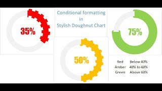
Hi is it possible to click the % value using a mouse which will then take me to my data source workseet and show me a filtered data? Example if the Rag was for sales then on click it should take me to main data source with only sales daya been shown.
Hi PK Sir, need your help... I have seen in many of your videos that you have added a data label in a text box, like in RAG... Is this option available in Excel 2010 ??? I am unable to do so... Please assist...
Hi, Pk, Gr8 part you have covered in this session. I will appreciate the essential aspect you covered very brilliantly and it's very handy to use and a commendable. Just a request , in your every vedio please give a solution on features which aren't available in Excel 2010 but easily can use easily in Excel 2013 and above version like in this vedio, Secondary Axis option not available in 2010 version and many of the peoples may using 2010 version only thus far, Hence please always give solutions by keeping in mind both versions. Also , Please tell me if anyway I can use Error Bar in Excel 2010 Lastly, No doubt your every vedio has mind blowing tricks and connecting us with advance level. Keep sharing !!
i followed all the steps and could create exactly what u have created. Now i want to place only the chart on different sheet (within same workbook) and everything else remains on a diff sheet. Now if i change the %age value on the original sheet ... The donut on diff sheet is changing color etc ... but the data label (number inside donus) is not changing as per RAG status. what could be going wrong ?
Hi, I solved this. When you copy the formula over from another cell it automatically changes the first value in the sum to match the name of the cell you have pasted into. Once you have pasted it, just change the first value back to what it should be. Then the colour changing of the numbers will work fine.


You are such a help!! Thanks :) Every time I forget a step I just go back to this video. You don't understand how helpful this is for work and in general
Happy to help!
Thank you for taking the time to share this. It makes a boring pie chart a lot more dynamic and interesting!
I am just shocked. This makes me so happy. You explain things so well I go.. AHH after you teach it. It is so very good. Best of luck to you. Thank you
Thanks for your valuable feedback
Excelente amigo maestro estoy realizando un trabajo utilizaré este gráfico de anillo muy padres muy dinámico saludos desde León Guanajuato México 🇲🇽🤝👏👏👏👏👍
Gracias por sus valiosos comentarios
PK well done! Enjoy your creative instruction! Keep up the great work regards ( A south African)
Thanks for your valuable feedback
I ove your videos. Thanks for sharing
Most welcome
I really like your videos bcoz it is very helpful for me
Thanks for your valuable feedback
@@PKAnExcelExpert i have also create a dashboard for my company with the help of your videos
Fantastic, congratulation again for the explanation and rich in details.
Thanks for your valuable feedback
Excellent video
Thank you very much!
Hi PK, great tutorial, as always! Here's an idea on how to shorten the data label conditional formatting. Instead of having 3 helper cells with 3 text boxes, what I usually do is link the Service Level percentage number to one cell only, format the size and font, and conditionally format that cell (by using Conditional Formatting). Then, copy that cell and paste it as linked picture on the graph. The outcome is same as yours, just with couple of steps less :) Once again, always a pleasure watching your videos my friend :)
Thanks for your valuable feedback and suggestion. Yes it could have been batter. Thanks for highlighting this.
This is great. Lots of fun to build it along with your video. Thanks so much.
Thanks for your valuable feedback
As always your fantastic, really appreciate
Thanks for your valuable feedback
I have many spreadsheets to be used by many user. In a cell they have to put a folio consecutive number as each user do something. I think if there be a file with de consecutive folio number on it, and the spreadsheet of the user look what number is unused, take this number and mark (or flag it) this number so when other user (or de same user) has to have other folio number the spreadsheet looks what is the next folio available and so on.....obviusly all the spreadsheets are shared via one drive or someone else cloud service
Is it possible in excel??
Thank you
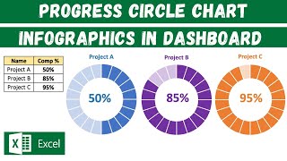
Is there any video charts for project Accountant to determine their project progress?
Hi is it possible to click the % value using a mouse which will then take me to my data source workseet and show me a filtered data? Example if the Rag was for sales then on click it should take me to main data source with only sales daya been shown.
Hi PK Sir, need your help... I have seen in many of your videos that you have added a data label in a text box, like in RAG... Is this option available in Excel 2010 ??? I am unable to do so... Please assist...
Very cool. Great tutorial
U have wonderful creativity thinking Pk keep it up 👌
Thanks Ragu
Very good pk
I was excited for this video.
Thanks
Hi, Pk,
Gr8 part you have covered in this session. I will appreciate the essential aspect you covered very brilliantly and it's very handy to use and a commendable.
Just a request , in your every vedio please give a solution on features which aren't available in Excel 2010 but easily can use easily in Excel 2013 and above version like in this vedio, Secondary Axis option not available in 2010 version and many of the peoples may using 2010 version only thus far, Hence please always give solutions by keeping in mind both versions.
Also , Please tell me if anyway I can use Error Bar in Excel 2010
Lastly, No doubt your every vedio has mind blowing tricks and connecting us with advance level.
Keep sharing !!
Thanks for your valuable feedback. I will take care of this in upcoming videos.
Brilliant as usual. Thank you
Thanks for your valuable feedback
Great and thank you.
Thanks for your valuable feedback
excellent help amazing ideas for my reports
Thanks for your valuable feedback
excel sheet are not getting download please help
can you make the graph for lost analysis report
Show! Muito bom. Parabéns!
Thanks for your valuable feedback
Great job!
Thanks for your valuable feedback
Amazing Job! Thanks :)
Thanks for your valuable feedback
At 7:18 when u changed the service level to 75% u got new doughnut but i did not. M using 2007 version can u help me
i followed all the steps and could create exactly what u have created. Now i want to place only the chart on different sheet (within same workbook) and everything else remains on a diff sheet. Now if i change the %age value on the original sheet ... The donut on diff sheet is changing color etc ... but the data label (number inside donus) is not changing as per RAG status. what could be going wrong ?
Hi, I solved this. When you copy the formula over from another cell it automatically changes the first value in the sum to match the name of the cell you have pasted into. Once you have pasted it, just change the first value back to what it should be. Then the colour changing of the numbers will work fine.
Nice video sir
Thanks Prabhakar
My friend
The list do not show
Format shape
And chang chart type
Office 2010
Can u let me know the link where i can download 2013 Microsoft
Dear friend,
Pls share something on export shipment tracker
Regards,
Ashok Kumar
Super sir
Thanks for your valuable feedback
awesome...
Gr8!
can you pls respond my query ..
Very difficult