Info-graphics: Group of Circle Charts in Excel

แชร์
ฝัง
  • เผยแพร่เมื่อ 18 ส.ค. 2019
  • #KPICharts #ExcelInfograhics
    Hello Friends,
    In this video, you will learn how to create a beautiful Group of Circle Charts. In this Group of Circle Charts, we have displayed Market level and Over all service level. You can use it in your business dashboard or prestation.
    Click here to download the practice file:
    www.pk-anexcelexpert.com/grou...
    Download our free Excel utility Tool and improve your productivity:
    www.pk-anexcelexpert.com/prod...
    See our Excel Products:
    www.pk-anexcelexpert.com/prod...
    Visit to learn more:
    Chart and Visualizations: www.pk-anexcelexpert.com/cate...
    VBA Course: www.pk-anexcelexpert.com/vba/
    Download useful Templates: www.pk-anexcelexpert.com/cate...
    Dashboards: www.pk-anexcelexpert.com/exce...
    Watch the best info-graphics and dynamic charts from below link:
    • Dynamic Graphs
    Learn and free download best excel Dashboard template:
    • Excel Dashboards
    Learn Step by Step VBA:
    • VBA Tutorial
    Website:
    www.PK-AnExcelExpert.com
    Facebook:
    / pkanexcelexpert
    Telegram:
    t.me/joinchat/AAAAAE2OnviiEk5...
    Twitter:
    / priyendra_kumar
    Pinterest:
    / pkanexcelexpert
    Send me your queries on telegram:
    @PKanExcelExpert
    ************ Suggested Books ********
    VBA: amzn.to/2TMMikX
    Excel Dashboard: amzn.to/2WZi2Fj
    Power Query: amzn.to/2Ibd7xR
    Power Pivot and Power BI: amzn.to/2DCg8BB
    Exam Ref 70-778 (Power BI): amzn.to/2GnWYTN
    ************ My Stuff ***************
    Mic : amzn.to/2TLnF88
    Video Editor: screencast-o-matic.com/refer/...

ความคิดเห็น • 136

  • @ruginathomas3873
    @ruginathomas3873 3 หลายเดือนก่อน +1

    Good Job Brother! You made my day

  • @hiteshpandey8370
    @hiteshpandey8370 4 ปีที่แล้ว +2

    No crap in between. Pure skill in every step.

  • @josharroyo7920
    @josharroyo7920 4 ปีที่แล้ว

    Lo usaré en mis reportes, gracias PK

  • @OscarGarcia-rn7wy
    @OscarGarcia-rn7wy 4 ปีที่แล้ว

    Excelente Gráfico, muchas gracias por compartir tus conocimientos, podrías subir algún ejemplo tipo radar.

  • @Sss7277
    @Sss7277 4 ปีที่แล้ว +1

    an amazing chart....thanks for creating such a good chart...

  • @wojciechwisniewski2510
    @wojciechwisniewski2510 4 ปีที่แล้ว +1

    Thank you for another brilliant movie

  • @yulinliu850
    @yulinliu850 4 ปีที่แล้ว +1

    Excellent! Thanks!

  • @tienngotk
    @tienngotk 4 ปีที่แล้ว +1

    An amazing chart, thank you for your effort. Well done sir.

    • @PKAnExcelExpert
      @PKAnExcelExpert  4 ปีที่แล้ว +1

      Thanks for your valuable feedback

    • @tienngotk
      @tienngotk 4 ปีที่แล้ว

      @@PKAnExcelExpert i have learnt from you so much idea for my work. Keep going sir.

  • @brighnquisitive6217
    @brighnquisitive6217 4 ปีที่แล้ว +1

    Nicely done, as usual PK

  • @Saatt79
    @Saatt79 4 ปีที่แล้ว +1

    Great creativity sir👏👏👏 awesome one...

  • @FAlqahtani
    @FAlqahtani 4 ปีที่แล้ว +1

    Wow!! You are the best

  • @lukev730
    @lukev730 4 ปีที่แล้ว +1

    Wow PK great chart
    Thank you

  • @upgradetechnicalskills3392
    @upgradetechnicalskills3392 4 ปีที่แล้ว +1

    Great job sir it's amazing

  • @anbaabdellah8022
    @anbaabdellah8022 4 ปีที่แล้ว +1

    Excellent PK 👍👏👏

  • @shoryaarora1464
    @shoryaarora1464 4 ปีที่แล้ว +1

    Awesome 👏🏻

  • @poderdeexcel7428
    @poderdeexcel7428 4 ปีที่แล้ว

    Hi Pk, thank you very much for sharing your knowledge, a query, as it would be in the case that you would like the highest percentage to be placed in the center depending on how the data changes. For example if India is the highest value go in the center, if you then switch to Uk let it go to the center, etc. Thanks.

  • @vikaspatil06
    @vikaspatil06 4 ปีที่แล้ว +1

    Thanks for making videos

  • @pgkannan
    @pgkannan 4 ปีที่แล้ว +1

    Excellent PK

  • @david4ever160
    @david4ever160 4 ปีที่แล้ว +1

    GREAT JOB

  • @durgesh91tomar
    @durgesh91tomar 4 ปีที่แล้ว +1

    Awesome.......

  • @pattaraponsukaew3349
    @pattaraponsukaew3349 4 ปีที่แล้ว +1

    alway amazing

  • @ericiriarte2880
    @ericiriarte2880 4 ปีที่แล้ว

    Me encanta

  • @user-hw7ci5ed7x
    @user-hw7ci5ed7x 4 ปีที่แล้ว +1

    Great thanks

  • @sunilkumar-jl7uf
    @sunilkumar-jl7uf 4 ปีที่แล้ว +1

    very beautiful

  • @anandsdasnanda2960
    @anandsdasnanda2960 4 ปีที่แล้ว +1

    Is it possible to make the colors change automatically as per percentage

  • @xtroll4326
    @xtroll4326 4 ปีที่แล้ว

    Sir can you make a video on making bills on Excel including gst .

  • @yuvarajkrishnamoorthy
    @yuvarajkrishnamoorthy 4 ปีที่แล้ว +1

    Great job.. one observation.. India chart's value and pie does not match.

    • @PKAnExcelExpert
      @PKAnExcelExpert  4 ปีที่แล้ว

      Thanks for your valuable feedback. I think it is connected with UK data point by mistake

  • @lakshyacomputerbayana
    @lakshyacomputerbayana 4 หลายเดือนก่อน

    Sir ye course Hindi language mei nhi hai kya

  • @beniezung4611
    @beniezung4611 7 หลายเดือนก่อน +1

    excellent. thank u

  • @jordividal7804
    @jordividal7804 8 หลายเดือนก่อน +1

    Always enjoy your videos and tutorials PK.

  • @hassanelfakey4708
    @hassanelfakey4708 9 หลายเดือนก่อน +1

    thank you very much, it's amazing.

  • @AJ-oe7ez
    @AJ-oe7ez ปีที่แล้ว +1

    Awsome chart, explained with ease!

  • @karuppusamichandran6479
    @karuppusamichandran6479 2 ปีที่แล้ว +1

    Thanks Bro , Exactly this is wat i was looking for ... perfect.... sharing the knowledge is very powerful attitude.

    • @PKAnExcelExpert
      @PKAnExcelExpert  2 ปีที่แล้ว

      Thanks for your valuable feedback🙏

  • @SanviPatil2019
    @SanviPatil2019 2 ปีที่แล้ว +1

    superb

  • @MadanKumar-uy4iu
    @MadanKumar-uy4iu 2 ปีที่แล้ว

    Zero hater 👏

  • @CUBING116
    @CUBING116 2 ปีที่แล้ว

    Iam a 11 years boy I do your 3D circle chart I like your channel

  • @yasi4011
    @yasi4011 2 ปีที่แล้ว

    🌱

  • @pandharinathjoshi6565
    @pandharinathjoshi6565 2 ปีที่แล้ว +1

    Sir i have seen this 10 times…🙏🙏

  • @nitinnaykodi
    @nitinnaykodi 3 ปีที่แล้ว

    VDO blurred

  • @neerajbelwal8752
    @neerajbelwal8752 3 ปีที่แล้ว

    Your Practice files are not getting downloaded

  • @danielkinyanjui170
    @danielkinyanjui170 3 ปีที่แล้ว +1

    Can somebody help how I can subscribe twice......this tutorials is unresistable. Thanks bro

    • @PKAnExcelExpert
      @PKAnExcelExpert  3 ปีที่แล้ว

      Thanks for your valuable support 👍

  • @AmeeraHazmar
    @AmeeraHazmar 3 ปีที่แล้ว +1

    Amazing bro

  • @dhananjaypinjan2643
    @dhananjaypinjan2643 3 ปีที่แล้ว +1

    Great creativity and extraordinary efforts as always.. Well done PK 👌

  • @pandharinathjoshi6565
    @pandharinathjoshi6565 3 ปีที่แล้ว +1

    Sir., beautiful video sir... 🙏🙏🙏

  • @victoriaabba8722
    @victoriaabba8722 3 ปีที่แล้ว

    not well explained for a beginner and very fast speaking. not helpful to me

  • @thakuranujsingh4419
    @thakuranujsingh4419 3 ปีที่แล้ว +1

    Very beautiful 🙏..

  • @rukshik
    @rukshik 3 ปีที่แล้ว +1

    Subscribed to your channel, your efforts are commendable

    • @PKAnExcelExpert
      @PKAnExcelExpert  3 ปีที่แล้ว

      Thanks for your valuable feedback and subscription 👍

    • @rukshik
      @rukshik 3 ปีที่แล้ว

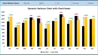
      @@PKAnExcelExpert i tried searching a lot for some actual vs budget dashboard for expenses on your page, could not find it.. if you can hep me with the link here please..

  • @taufiqsahabuddin5151
    @taufiqsahabuddin5151 3 ปีที่แล้ว

    When trying to input % into text box by typing "=" then click on the cell in the pivot table then enter, somehow it is not success (warning box appears)
    I see your video, it will be similar "=$B$4" (for example). However when I try the same step, it is such "=get from the pivot xxxxxxxxx"
    Please advice

  • @nadeemjohn6126
    @nadeemjohn6126 3 ปีที่แล้ว

    Excellent Effort. Sheer professionalism. Keep up the good work

  • @najaybsaidhadji3123
    @najaybsaidhadji3123 3 ปีที่แล้ว

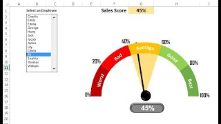
    How does the overall become 47%? Any one can guide me please! Thanks

  • @TerrY9048
    @TerrY9048 3 ปีที่แล้ว +1

    Thanks for stunning chart , Great! to see it

  • @midixon11
    @midixon11 3 ปีที่แล้ว

    Will you pls give a session on how to create the circles to auto populate into a 2nd sheet. Once date change on 1st sheet

  • @rajeshsureshrajput
    @rajeshsureshrajput 3 ปีที่แล้ว +1

    Excellent!

  • @KhalilAhmad74036
    @KhalilAhmad74036 3 ปีที่แล้ว +1

    Extraordinary effort. Well done Sir!

  • @aydneroglu7908
    @aydneroglu7908 3 ปีที่แล้ว +1

    Wow.. This is Perfect. Can you send me this project pls? aydin_eroglu@hotmail.com

    • @PKAnExcelExpert
      @PKAnExcelExpert  3 ปีที่แล้ว

      Thanks for your valuable feedback. Please download this excel file from the link given vedio's description box

  • @kathimills7699
    @kathimills7699 3 ปีที่แล้ว

    Just noticed that the 2 smaller charts at 89% aren't filled the same, although I understand why I wanted to make sure no one got confused by an incorrect reference

    • @kathimills7699
      @kathimills7699 3 ปีที่แล้ว

      I can spend days watching your wonderful videos, thank you so much and please keep them coming!

  • @sinakeyhanian6034
    @sinakeyhanian6034 3 ปีที่แล้ว +1

    Amazing. Thanks

  • @martacasanova2329
    @martacasanova2329 3 ปีที่แล้ว +2

    Great!!! Thank you so much, it was exactly what I was looking for.

  • @sharvari.s.vichare
    @sharvari.s.vichare 3 ปีที่แล้ว +1

    Thank you so much.
    Your video is helpful for us. Thanks for sharing your knowledge to excel

  • @ritwik513
    @ritwik513 4 ปีที่แล้ว +1

    can a feature like if data is added further then a chart is made side by side and colors also changed, can it happen?

    • @PKAnExcelExpert
      @PKAnExcelExpert  4 ปีที่แล้ว

      Thanks is not available in this chart. I will try to make another video on this topic

  • @TGENC-ls8nz
    @TGENC-ls8nz 4 ปีที่แล้ว +1

    thank you veryyyyy much. this video perfect

  • @kumarkusalakumar9651
    @kumarkusalakumar9651 4 ปีที่แล้ว +1

    Thanks for sharing excel tips and tools for graphing, so creative appreciate your effort

  • @santoshkr.gautam1982
    @santoshkr.gautam1982 4 ปีที่แล้ว

    Yah kaise dikhega ?

  • @santoshkr.gautam1982
    @santoshkr.gautam1982 4 ปีที่แล้ว

    chart jo insert karte hai uske baad chart element nahi dikhta hai.

  • @MohanYGK
    @MohanYGK 4 ปีที่แล้ว +1

    🙏🙏🙏

  • @excel-k-sir
    @excel-k-sir 4 ปีที่แล้ว +1

    👍

  • @alhassanabuelkhair
    @alhassanabuelkhair 4 ปีที่แล้ว +1

    Thanks
    that is amazing

  • @gokulkannan90
    @gokulkannan90 4 ปีที่แล้ว +1

    thank you soo much, your video was very useful for me, tomorrow i'm going to apply this on my office work .

  • @nabilalquqa9019
    @nabilalquqa9019 4 ปีที่แล้ว +1

    You are the best one my friend go ahead

  • @mymatemartin
    @mymatemartin 4 ปีที่แล้ว

    Great content but waaaaay too many ads. It's extremely annoying and detracts from the lesson.

  • @sirajsiraj7088
    @sirajsiraj7088 4 ปีที่แล้ว +1

    Thanks for your kind explanation!
    Pls if you don't mind send me the vba code to my email. sirajdocum@gmail.com

    • @PKAnExcelExpert
      @PKAnExcelExpert  4 ปีที่แล้ว

      Thanks for your valuable feedback. Please download this excel file from the link given vedio's description box.

    • @sirajsiraj7088
      @sirajsiraj7088 4 ปีที่แล้ว

      PK: An Excel Expert
      my dear it's showing some error msg like path not found
      pls advice how to fix it

  • @AashishVaghela
    @AashishVaghela 4 ปีที่แล้ว

    Dear Priyendra,
    Since you seem to be from the Call-Center/BPO Industry, here is a little Problem with VBA code, that I think I can discuss with you. As you must be aware that in a BPO environment, there are lot Performance measuring matrices. One such is NPS or Net Promoter Score. I am not sure if you are already aware of this or not, but I shall mention it here for everyone's enlightenment. This new measure of NPS is one step ahead of the conventional CSAT that we have as the customer's feedback from the Survey that was sent to them. Here's the detailed explanation of NPS.
    ' NPS is the Acronym for Net Promoter Score, a measuring unit of overall customer satisfaction and loyalty.
    ' It is calculated based on the quantum of surveys received to gauge the loyalty and retention of customers.
    ' The Customers giving positive response to a Feedback Survey are called Promoters.
    ' The Customers giving negative response to a Feedback Survey are called Detractors.
    ' The Customers giving balanced response to a Feedback Survey are called Passives & are ignored for calculations.
    ' NPS is calculated by Subtracting the Detractors from the Promoters, then dividing the outcome of that by the
    ' total number of Surveys with feedback (Count of Surveys) received back from the customers, multiplying that
    ' number by 100. The final outcome should be between +100 and -100. Depending upon the Agreed Service Level with
    ' the Client, the acceptable value could range anywhere between +20 to +40. A negative NPS would indicate very
    ' poor level of customer service and matching responses from the customers.
    I tried searching Google for a VBA code for an Excel Function that can take the Promoters, Detractors and Total number of Surveys as an input and calculate the NPS value and return it to the CELL from which it was initiated.
    Unfortunately, I couldn't find much except some large and confusing code on StackOverFlow site which somehow did not meet my requirements and expectations. I wanted to keep it real simple. Here's that Code that I have written myself, a couple of days ago, but getting a #VALUE error in the Cell where this function is called.
    ================================================================================
    Public Function CalcNPS(Proms As Integer, Dets As Integer, Totals As Integer)
    Dim Pr As Integer
    Dim Dt As Integer
    Dim Tot As Integer
    Dim NPS As Single
    ' Assign Values to local variables from the parameters received while invoking the function
    Pr = Proms
    Dt = Dets
    Tot = Totals
    ' This is the actual Math Calculation or actual Logic
    NPS = (((Pr - Dt) / Tot) * 100)
    MsgBox "NPS is " & NPS, vbInformation+vbOKOnly, "Calculated NPS is : "
    Return ' Return the value of calculated NPS to the Cell
    End Function
    ================================================================================
    As mentioned above, this formula returns a "#VALUE" error in the Cell from where this formula is initiate.
    For example, if Cells C4 is Promoters, C5 is Detractors, C6 is Passives and C7 is the Total of all these, then this function is called in the Cell C8, but it shows ERROR. However, as you can see, there is a MSGBOX function called inside this function, which actually displays the value in Decimal, like 27.3333333 or 41.666666667, etc.
    My question is, if the function and calculation is simple enough, for which the MSGBOX even shows the calculated output, why does it return a #VALUE error in the Cell C8.
    Kindly Help !! Thanks in advance !!

    • @AashishVaghela
      @AashishVaghela 4 ปีที่แล้ว

      Priyendra .... Some help on this would be really helpful. MSGBOX shows the calculated value of NPS, but the Cell from which this function is called, returns a #VALUE error. I believe it could be data type mismatch. Kindly review the code above and suggest modifications. Thanks in advance !!!

  • @frankling.zevallosestrada5965
    @frankling.zevallosestrada5965 4 ปีที่แล้ว +1

    Excelente grafico. Flicitaciones muy bien explicado.
    Un saludo desde Perú.

  • @grahamparker7729
    @grahamparker7729 4 ปีที่แล้ว +1

    That was great 👌🏻

  • @MrSaqr98
    @MrSaqr98 4 ปีที่แล้ว +1

    wonderful

  • @janerravelo9187
    @janerravelo9187 4 ปีที่แล้ว +1

    Excelente... Gracias por sus aporte...