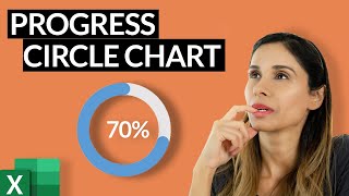
Progress Circle Chart with Conditional Formatting - Part 2 of 2

ฝัง
- เผยแพร่เมื่อ 22 มี.ค. 2017
- Sign up for our Excel webinar, times added weekly: www.excelcampus.com/blueprint...
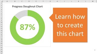
The progress circle (doughnut) chart displays the percentage of completion on a single metric. In this second video in the series, we learn how to apply conditional formatting to the chart so the progress bar color changes as the percentage of completion value changes.
DOWNLOAD the file: www.excelcampus.com/charts/pr...
This will make the chart stand out even more on our dashboards. The reader will be able to quickly see the level of progress and determine if the metric needs attention based on the color of the bar.
The conditional formatting is created using a few IF statement formulas in the source data range for the chart. The IF formulas create the different progress levels. When the actual progress level is within the level range, the cell displays a value and its bar is displayed in the doughnut chart. We use 3 levels in this example, but you can add as many progress levels as you'd like.
In part 1 of the series, we learned how to create the basic Progress Doughnut Chart. Both of these solutions just require 1 Excel doughnut chart and a few formulas. They are pretty easy to set up and implement in your reports and dashboards.
Watch Part 1 - • Progress Circle Chart ...
Article on the IF Function in Excel: www.excelcampus.com/functions...
FREE video series on Pivot Table & Dashboards: • Introduction to Pivot ... - แนวปฏิบัติและการใช้ชีวิต


![[ไฮไลต์] แบดมินตันหญิง ไท่ ซือ หยิง vs เมย์ รัชนก อินทนนท์ รอบแบ่งกลุ่ม | โอลิมปิก 2024](http://i.ytimg.com/vi/LUCG0H5qkpQ/mqdefault.jpg)


Jon, truly your videos are great... it is just the way the presentation you do, it makes things easy to understand and follow. Thank you!!
I totally fascinated with this Doughnut Chart. Thank you, and Blessing.
Beautiful!!!
Thanks Mike! :-)
Great tutorial. Love your videos, always makes me excited to try them out.
Jon, this is a great job!!!! Thanks for sharing your knowledge with us
I have unsuccessfully tried progress doughnut charting before; this time because of your TH-cam explanation I was successful.Thanks.
Very cool mate. Especially the apparent conditional formatting stuff. Thanks!!
The VP will like this on his Dashboard. Thank you!
Jon you have a gift of sharing. Thank You
I agree, excellent video!
You have no idea what your video's have done for me so far. Thank you for that! It's always interesting to watch your video's and experiment more and even though it can be frustrating, especially when vba is involved and I want things that is so unique you can't find it on the internet, I get there step by step and every little step is a step forward. At the end I did it!! Thank you!!
Thanks Mariska! ;-)
Excellent work as usual, keep up with the informative uploads to TH-cam , thanks heaps
I love this video.
Another great video.
This helps for reporting comparison data. Today's world it is very important to know this feature.
Thanks for educating the community and appreciate your volunteership in teaching the public.
Thanks a bunch
Thanks again for your support Kris! :-)
Thank you Jon for this wonderful video. Very well explained and an excellent dashboard technique
Excellent content Jon! This will come in handy for a possible project my boss will give me to set up a dashboard with company metrics on it! 😊
Nice an clean, as usual. This is great for KPI reports!
Thanks Jon, This helped me make a profit and loss sunburst chart that uses the ABS() function when negative to make the data work with the chart and I color it red or green when positive using your formulas, i only had to change " " to a 0 instead, i might even use your tutorial for it's intended purpose as well, great work!
Great presentation.........very clear instructions. Thank you
Very useful. I was looking for this. Thank you!
Wow Jon, that's exactly what I want to do except within a pivot chart with slicers. Thank you!
Thank you so much Jon , this is really valuable ❤
Thanks Jon for your kind efforts ❤
Excellent tutorial, thanks!
I come to this tutorial time and time again!
Very well presented and useful tutorial. Many thanks!
The 'Ingredients list' :D! Sometimes the small things just make you smile on a rainy friday morning in the office. Thak you for the informative video.
Thank you for sharing. Super simple and useful.
thanks.......... i think
this types of video all-ways helpful for our kind of people............. thanks again...
This is awesome. Thank you Jon. Great.
Very well explained and easy to duplicate!
Thank you, Jon! Your instructions are so easy to follow! I've created a "cheat sheet" for myself with all of the formulas you typed in (I'm not that good with Excel, yet), and my team and I can put this to use right away. I don't know if it's a tip, but if you position the inside label where you want it, and then Ctrl-D to duplicate it, before connecting the label to another cell in the Data Series, you can line up the new label with the existing one. This way, as your results change, the labels won't look like they bounce around quite so much. Cheers!
cool tip
Very useful and well shown on screen, thanks.
Keep up the good work!!!
Great tip - Clear and easy to follow, thank you!
You're welcome, Alasdair!
Really easy to follow instructions great stuff
Thank you very much!
Nice presentation. I might try that for work. Cheers!
It was very helpful... thanks a lot!!!!
Thanks John!
Excellent and thanks for giving free file.
Thanks for sharing!
Awesome video. Thanks for sharing.
Thank you jhon
Perfect, helped me out :)
Great job!
Simple but impressively useful
Thanks a lot Jon
Thanks Jon for the videos they are clean informative and very much appreciated
Thanks Ian! ;-)
Thank you very much,
It was super helpful for my reports...
Awesome Jon
Thanks again!!
Thanks for such a nice and simple video instructions.
I need to create a line chart where the target value is shown at the end and as the value changes it changes the colors (tricolor).
Wonderful
Great thanks
Super helpful video, I'm curious to know how your chart movements look so smooth and animated?
Thank you
Nice!
Excellent :)
Great brother
Thanks, I needed this tip :D
Glad I could help! 😀
awesome!
very nice
Awesome
Wow!
Nice
Wish you went more into detail about the numbers part like how to use equations to get the answers for the pie chart in case you want the pie chart to run by intself based of values you have input from another sheet.
EASY CLEAR MANNER
This is great. thanks for the explanation. Do you know if this is possible w/in a pivot table & pivot chart? I am using PowerPivot to create the Remainder field. It's the charting that is the challenge.
This is very helpful, I have a question though it sounds like there is some sort of transitioning effect on the colors when u switch from a specific % to a different one.. how can I apply this to my chart colors?
Hi there! Great tutorial! Thank you.
Do you happen to know if the same is feasible with Google Sheets?
How did you copy each pie chart to have the same color settings including the text box, or is it that you formatted each chart individually?
Sir, Your Tutorial is great
But we are working on Test Plan on which we have to prepare various Test-Case's, for which we face Difficulties .
Sir, can you make some Tutorial for this topic.
It will be great Help
Hi,
great video. how can I do the same thing if I divide the data into four quarters? Thanks
Cool
HI Jon, if I was doing a chart for progress towards a monthly total goal, would you be able to add a mark for the "month-to-date" point? I.e., monthly goal = 100, current actual = 60 (60% of goal), and we are at day 18 of 31 days (58% through the month). I'd like to have a mark at 58% to show that we are 2% ahead of our month-to-date goal. How would I do this?
Hi there. I followed the color formatting of the doughnut but it doesn't change color as I change the Actual value. How do you create the conditional formatting of the segments of the doughnut?
Hi Jon,
Appreciate sharing this useful donuts!.
I used same technique to get my first donut and duplicate 12 of them and I was very careful to change the labels and series for each one. Unfortunately, when tried later to copy and paste my percentages I started getting duplicate text boxes for no reason. Please, need some help. Thanks in advance.
This is amazing. Sorted the doughnut and formatting and all formuals. The issue i have is with the text part - When i press equals and then click on a cell to bring in the data it comes up with ='T1 (2)'!$E$31 as opposed to the conditional example you have. Please help?
Awesome, could you please share this workbooks in sites
this is very helpful, however as an excel newbie, I need help with the set up before you started the video. I got through video 1 and went to this one and missed the in between set up, I am trying to figure it out. Thank you
I have been having challenges in inserting the formula, I have followed the instruction in the video but facing difficult when inputting the formula which didnt work for me. Your formula has a this $ how can I include this sign in the formula, please advise.
can I make doughnut chart from two data sheets? for example, i'm making pivot chart that has a slicer for 2019 and 2018 scores. the doughnut chart shows the current average score (average from the pivot chart). when 2019 and 2018 tabs are select from the slicer, the doughnut chart shows 2019 score. However, when ONLY 2018 is selected, #REF code is shown on the doughnut chart. How can I add a condition for this chart which makes the excel sheet understands that if 2019 is not selected, take another data from another table. but, if 2019 tab is selected, take the (like what is happening currently) from 2019 table. I hope it is clear :)
do you have a Video with a horizontal bullet graph?
What if you need Level 4. Start with Red followed by Orange, Blue and Green in that order?
Can someone help me why my data series input is in decimal form not in percentage form?
Thank you for this excellent video. How can we show the progress over 100% ? 120% is shown like 80% ...thanks a lot in advance.
Nice tutorial. How about if the percentage exceeds 100%?
Brilliant Tutorial! Thanks John. Just from curiosity, if i input "110%" in actual cell, what will happen? or how it will be shown?
Heyy , Did ylou find the answer for that ?
Actually , when the cell value is coming as 100% but then the doughnut graph simply disappears
Would really appreciate to know if you got the answer
not sure if i did something wrong but chart is not keeping color formatting :(
Jon,
I’m still getting the decimal in my chart. How do I get it to go back to the way you have it on this tutorial?
Use the formatting under the %age drop down box
Hi - Great video but I have a question please - I've transferred the charts on to word document however the text in the middle transfers over but doesn't update can you help?
Good job on the donut explanation. Do you have dashboard instructions for Excel 2011 for Mac?
Thank you Kyle! I do not have any tutorials for the 2011 version for Mac. I do have a series of videos on pivot tables and dashboards. Unfortunately, the Mac versions of Excel do not have pivot charts yet. Pivot charts are a great way to create interactive dashboards with pivot tables and slicers.
On the Mac version you can still add slicers to your pivot tables, there is just more setup work involved in using the pivot table as the source of a chart. Therefore, I recommend using the Windows versions of Excel for dashboards when possible. I realize this is not always possible, as some companies only use Macs.
Here is the link to the video series on pivot tables and dashboards. th-cam.com/video/9NUjHBNWe9M/w-d-xo.html
Even though you won't be able to use all the techniques taught in those videos, it will still provide training on pivot tables. Pivot tables are the best way to quickly summarize your data for dashboards. On the Mac versions, you can still use the pivot tables as the source data for your charts. You will just need to create dynamic named ranges to use for the source ranges of the charts, since you can't create linked pivot charts. I don't have any tutorials on that yet, but will add it to the list.
Thanks again and have a nice weekend! :-)
I can do the formating on same chart, but 3 different chart with all same linking, i wasnt able to do it.. :(
the color of my progress (i.e. completed section) stays the same even though I change percentages. I followed your instructions. What do you think I'm doing wrong? Are there common errors?
I have the same issue
Hi Inarkamal, You can download the file with the example at the following link. www.excelcampus.com/charts/progress-doughnut-chart/ You might want to compare that file with the one you created. It's hard for me to tell what might be missing.
very nice
kindly share the school management system dash board video who to mak it
This is great. I am sure I will impress my colleagues. However, I am not getting the % symbol in my text box. The cell value is a percent. What am I doing wrong?
got it
Instead of using multiple text boxes, we can do this with one text box. But have to go with one color text
Hi Jawad, that is correct. You could use one textbox if you don't want the color to match the bar.
@@ExcelCampus It seems he didn't get your concept... ;-)
if the cells colours is red , we need text as no. and the cell is green , the text shold be yes. how to do it
Hi Prakash, you can use an IF formula for that. Here is an article on the IF function. www.excelcampus.com/functions/how-to-write-if-function/
Tnx for nice video just i couldn't understand time of 4:10 video when you dragged c5 till c8
And when I dragged icon down all cells turn to 55%
For representing >100% actual numbers, make sure you change the Level 3 to something like 150 or 200. Keeping it at 100 won't work!
thanks awesome