Elementor Responsive Not Working (Elements Alligned To Left)? Solution Explained!

ฝัง
- เผยแพร่เมื่อ 2 มิ.ย. 2022
- Do you have problems with the responsive mode in Elementor where the columns and widgets are not displayed properly aligned for tablet and/or mobile devices?
In this tutorial I explain to you why Elementor Responsive is not working.
I also explain how you can make sure that the widgets and columns are displayed properly in the elementor editor.
You might have experienced the situation that in the Elementor editor responsive mode on some device sizes the design is not being displayed correctly, even when you adjust things in the editor.
I will explain what the solution is and how you can make sure that everything is being displayed correctly in the Elementor editor. So make sure to check out this tutorial because it really can save you a lot of time and frustrations.
Show some support and hit the like button if you like this content! Also subscribe to the channel I would appreciate that.
Check out the blogpost for this tutorial over here: websitelearninglab.com/elemen...
Subscribe: / @websitelearninglab
► websitelearninglab.com
📢 Recommended resources:
► websitelearninglab.com/sitegr...
► websitelearninglab.com/elementor
► websitelearninglab.com/semrush


thank you man I was feeling defeated I didn't know what was going on.
Thanks man much appreciated and great that my video helped you out 👍
Same here, thanks man!
Thank you so much. I wasted so much time finding the problem that was so simple yet.
Much appreciated! Haha I also wasted so much time on this...been there done that 😅
thanks men this video is helpful and increase my knowlage
Thanks for sharing that!
I have been looking for this solution, thanks man
Thanks! Glad it helped 👍
You are my hero. Thanks a lot 😀
Great! 😇 Thanks Louis 👍
Thanks man that issue was driving me nuts!
Haha been there done that! I know how frustrating it can be sometimes…Glad it helped 👍
Hi bro.,There is a problem in Mobile and tablet header.They are right when I am editing only header.When I see with complete website mobile and tablet elements shift left.There is no effect of resolution
Hey man, question.. if you visit the site as a visitor is the allignment then OK on all devices?Or also shift to the left on mobile/tablet. A few tips: Make sure the zoom is 100% for the browser. If thats the case check if the responsive settings are ok and try to open in another webexplorer for example of you use google chrome try it with firefox for example. In some rare cases the type of browser can impact it.
@@websitelearninglab thanks for reply I will check again I have seen in two browser microsoft edge and Google chrome problem is same
Thanks 100% working for me
Great!
Hey man, great video. I had a question. I am currently experiencing a very tough time trying to fit the page hero banner title, which is 'webdesign made so EASY that EVERYONE can do it.... ' in your case, to the full width in my responsive view for mobile. Somehow, my column placed in the hero banner does not allow resizing to the full width for mobile view. I have disable all padding en margins and put my width on 100% but it still does not work. Can you PLEASE help me?🙏
Hi man, im not farmiliar with Hero so i cant help you with this. I hope you already have found a solution to solve this issue!
keep going man , thanks
Thanks 🙏 appreciate your comment
Mine still is false represented, and has all kinds of difference proportions. It changes drastically with every zoom.
Is there more going on?
Great tutorial though.
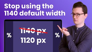
Hi make sure you set the size of widgets to Px instead of % (if you set it to % the size will adjust to the screen size and if you use Px that wont be the case) let me know if it helped!
@@websitelearninglab It's always on px 100%. Trying vh, hv, %, REM and it's the same. Thanks for the reply. People are mentioning zoom in and out with the browser, but it doesn't change anything. The section top bar icons are also gone.
thank you man
Thank you for letting me know it helped you out 👍
Thanks a lot
Thank you for the nice comment! 👍
You are a genius!!
Haha thats a great compliment my man! Thank you so much bro 👊🙏
Oh my god. 😯
i hope you are surprised in a positive way 😄
Yeh but what if a customer has there browser on 90%? I'll try thi but don't it will fix my issue when I set all the padding etc and margin to how I want it looks all over the place on tablet
The problem only occurs in the Elementor editor so customers won't have the issue.
This was a bad video
Your comment even worse, next time give some more feedback and practical advice buddy🧐