Making Your Sites Tablet and Mobile Friendly With Elementor

ฝัง
- เผยแพร่เมื่อ 29 มิ.ย. 2024
- Join Ziv Geurts, Designer & Elementor’s Lead Educator, for a step-by-step walkthrough on how to use Elementor’s responsive settings to make sure your sites look great on tablet and mobile devices. The demo site is built with Elementor Pro, but the webinar will cover many topics relevant to all users.
6 Takeaways:
✓ Optimize and style navbar hamburger menus for tablet and mobile [PRO]
✓ Use Elementor’s responsive settings to create device specific designs
✓ Control column width and alignment per device
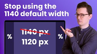
✓ Use relative units that scale better on devices, such as EM and %
✓ Optimize your Global Fonts for different viewports
✓ Manage Motion Effects for tablet and mobile devices [PRO]
Links mentioned in the Webinar:
1. How to Use Column Alignment: • How to Use Column Alig...
2. How to Use Motion Effects Viewport Settings: • How to Use Motion Effe...
3. Global Colors & Fonts Webinar: • Global Colors & Fonts:...
Don’t forget to subscribe to our channel!
Get Elementor: elementor.com/
Get Pro: elementor.com/pro
TIMESTAMPS:
00:00 Introduction
01:52 Site overview on tablet & mobile devices
03:30 Optimize & style the navbar hamburger menu for tablet and mobile
06:51 Tweak the header for mobile, device icons & alignment
09:30 Create device specific layouts using column width & responsive visibility
12:50 Optimize your global fonts for different viewports, understand default behavior & use EM to save time
18:28 Build a simple 2 column, text and image design & apply motion effects with mobile in mind
24:28 Tweak your buttons per device & understand the impact of changing values with settings that don’t have device icons
26:04 PX vs. % use relative units that scale better on devices
27:37 Applying Elementor’s responsive settings to create a custom footer layout for tablet and mobile


![[UNCUT] ฝันรักห้วงนิทรา | EP.8 (4/4)](http://i.ytimg.com/vi/RDYJYiDwsj0/mqdefault.jpg)


Ziv, you do a great job with these tutorials...nice teaching style, and you don't skip over important steps. Thank you.
Outstanding! I like the pre-recorded format of your presentation. I also found it helpful when you showed a pop-out of the customizations you were selecting.
May i commend you Ziv on one of the best and informative video i have watched. Having worked on avada themes for nearly 10 years now I am starting to see the benefit of elementor 🙂
This is very helpful. Thanks for making sure we can follow your pointer. I usually have to do multiple rewinds to figure out what just happened. Thank you.
Very helpful video. Have finally gotten to the point where I can ride comfortably with this video. Thank you.
This is incredibly helpful and thorough. Thank you guys for your fantastic work!
This was helpful to me as I only now begin exploring what Elementor can do for my website. I will have to watch this more times as I work through trials of creating my website.
I have enjoyed the webinar. Few gold nuggets, which I will probably use, on my website.
Thank you for the great information! I learned about some features that will help me with my desktop design in addition to the mobile/tablet responsiveness options.
Hi Ziv, Thank you for slowing down your instruction. I love how exciting and energetic your website and some other tutorials are. However, for those of us who are still learning, the music and fast pace can be just too much. Everyone learns at their own pace to be sure...I personally like this style best! Thank you!
Thank you for these great videos. I've struggled for 8 years with a different theme. But with these vids I'm blazing my 3rd website and it happy and excited rather than hating working on my websites. Setting the sites up right from the start is making a huge difference. 🥰🥰
8 years ,,,,,??
Thank you for walking us through the process. It's so helpful!
Wonderfully presented. Very concise and relevant. Thank you, sir.
Excellent webinar! I have been pulling my hair out with this responsive issue. Now I can finish this project! Thank you!
Thank you so so much for sharing this masterclass with us. I really appreciate your effort, job and I so needed this... thank you so so much ... 🌙
Thanks Ziv. Very helpful.
Thank you so much for doing this tutorial.
Ziv is such a great instructor :)
Always something new and helpful. Thank you
Thank you so much ! Very clear and informative.
Very clear and concise - thanks
Such friendly and informative stuff.
Thanks
Phenomenal tutorial Ziv!
Thank you so much. Great video tutorials!
Great tutorial! You went slow enough that I could easily follow. Will need to rerun a few times…LOTS of good info to absorb. 🙃
Thank you! I learned a lot.
this webinar was informative and enjoyable
You were a huge help with a school assignment! I have designed websites but making it for mobile was a little tricky for me. THANK YOU!!! Shout out to Academy of Art University! :)
Wow! I'm happy we were able to help you with your school assignment 💯🤩🙌!!!!
Thank you. Excellent help.
I loved this seminar
AWESOME. THANK YOU!
Thank you for this video! I just got a job as a web designer and they use this. This is a great video for beginners.
very nice brother from Pakistan
You the best teacher ever
We're waiting 💜💙
Thank you !
Just excellent! Thank you.
I'm glad it was helpful Jim!
@@Elementor can I do all this in the free version? please reply.
Ready!
Thank you very much 🎉
you're a legend!!!
Putting it out there to elementor, it would be an amazing feature if you could set multiple breakpoints not just a predefined three: desktop, tablet and mobile ( ie. 4 or 5 even 6 different media queries for increased control of media breakpoints.) . It would give us a lot better control over absolute positioning of elements in a design
@Gary agree with your thoughts, if you good with media Queries and you good with CSS couple of good hacks can save your time, like using %, not keeping width fixed. if have specific problem or issues will love to hear
Yes I agree the screen size of a desktop and laptop is very different!
@@jameseddithor2000 Thanks for the reply, I find that media queries in in the custom css gets a bit buggy with elementor and page builders. I am a mern stack programmer and from time to time when I get a wordpress dev, time is of the essence as clients are not prepared to pay for the development of a WP site, so speed and ease of use is imperative, its nice to have a straight forward control of media queries over all screen sizes and not having to get stuck into hacks.Biggest issue is the control as previously mentioned with the control of absolute positioning
@@gct2023 100%, I agree about position absolute, but there are ways to counter it, if you know your element is position absolute you should be able keep at centre of screen this requires skill set and experience, recently I created 100%=responsive site with custom shapes, like for which you can use clippath, or skew transform properties.
More important is that is double if you look, if you need any assistance will love to help you ought 🙏
@@jameseddithor6260 thank you I will definitely take you up on that
Awesome :)
Glad I found this. Really adds to my understanding of responsive editing. Wondor if you can comment on one thing: I am using free Elementor and Astra with its starter templates. First section on the homepage is a 2-column section. Columns are 50% each. Left col. has 3 headings. Right has an image. Image is fine on Laptop but both tablet and mobile squeeze it in left and right and up and down top and bottom so the 3 people have tall skinny faces. So far I can't fix it? There is also a background image for the section with an overlay.
Thanks
Brewster
Vídeo de tirar o chapéu
Great 😊
Hi, thanks for the video. Some questions I have:
1. Which is better/ easier for newbie? To make header and footer with the theme template (eg: Astra- Customize) or build them using Elementor?
2. I am playing around with Elementor, just curious how to make the menu like what you are showing in 03:50? When you click the Humburger Menu, the top section expends, Menu drops down and pushes the content bottom down too. Because I tried, it doesnt push the content down, instead the menu will cover the content below. What settings need to be done? Or how to do it? Appreciate the help, thanks =D
Saying that there are "no tweaks needed" to every section, "because it looks good" doesn't help that much as for many of us it just doesn't look good and we'd love to see how to fix stuff. That's why we're here ...
excelent
Please solve the header issue also, I made header menu and search it is ok with desktop mode, but it's not Mobile friendly
i second this! the header is huge on the mobile site and takes up half the page
The video is simple to understand and thank you for that.
When I do what the video says on mobile or tablet mode it also changes the desktop version. I wonder if it is a bug in the new update or is it user error?
Or is it because I do not have the pro version?
did you find your answer ?
Hi Ziv, I love this video, Thank you so much for creating it. i was hoping you could tell me, is there a particular theme / template you used for this video?
Hi Our Sacred, we used the Hello theme.
Thanks for this, Ziv! I do have a question though: when I turn the iPhone on the side ("widescreen"), the layout goes random. There is no option to control this, is there? Thx again for the tutorial (I know that they have upgraded the options meanwhile ; )
Nice tutorial! Does Elementor account for mobile devices being viewed in landscape mode? Particularly fixed header images become displaced in landscape view and there is no apparent option in the preview and editing to detect this. How can one check the landscape view when previewing and editing in Elementor? Are you able to advise on this?
amazing
i'm having issues with making it work for different types of tablets. Ipad looks great, samsung galaxy tab a7 lite looks horrible and I don't know how to adjust to it without ruining it for other resolutions...
thankyou
ty, i was struggling to find the way to fix my mobile adaptation
Elementor has this issue. What I set for desktop doesn't work on tablet or mobile. Especially if it is posts widget and I align the image of the post to the left and the excerpt to the right then the design will break on a tablet or mobile view. Please specifically include in your live session how to make posts widget responsive with different image and excerpt alignments.
@Andrew Haberman hello Andrew if you good at css this should be very easy for you, lets say you are making multiple footer, just use diffrent classes parent one, based on that you can write css so it does not conflicts with other footer css.
Can I use different menus for the mobile and desktop? Have a main menu on the mobile with all pages? While having two different menus using the same pages as the mobile?
GOOD AND BAD
GOOD:
You have exact control over padding and margins with Elementor to build your design on desktop, tablet, mobile
BAD:
1. It takes three times as long to build a page using Elementor compared to other page builders who's columns and grids resize automatically and
2. Elementor needs more breakpoints
3. Elementor menu styling is lacking, needs to have the text Menu with the hamburger icon, needs to have slide in from side option for mobile devices like OceanWP theme does
Do you have a recommendation for other page builders?
@@momothevine Anyone leaving Elementor seems to go to either Oxygen or Webflow as less buggy and load much faster but learning curve involved
The main difficulty I find with responsive design using Elementor is image sizes. What image sizes to set in Wordpress settings so that I am not serving oversized images on mobile and images display correctly on post archive as well as post archive on laptop and mobile . Using Smush/Tools/ detect and show incorrectly sized images shows up multiple incorrectly sized images. Text is relatively easy but image sizes seems a lot more difficult.
@Dave, i have implemented solution to my client website and make sure that, these what ever image that they uploads fits in correct, I give client the min dimension to avoid, there is not higher resolution restriction
@@jameseddithor2000 but with an image format that only works on 1 device like pc. On the phone it shows a different size image
Do you design for mobile first and then add content as you work on larger viewpoints?
Very informative tut. Helped me fix a mobile responsive issue. What's the name of the theme you are working with ?
Hello theme
What I find difficult is issues with Smart Phones and Tablets, where the screen moves left to right and does not remain centered on the device when you thumb up or down the design moves showing white space. I have set media query correctly yet the screen on phones and tablets still move about.
Hello Ziv, thank you for the video.
I have a question: can Elementor be used on pages not created with Elementor? Out website has Real Factory theme and was not build using Elementor. When I try to edit the pages, I cannot display the different sections (I mean the different text, images etc surrounded by the light blue border). Is that normal?
Agil Ajith from INDIA 🇮🇳 waiting for the telecast
This tutorial was great. I do have an issue that I want to address. When I change the size for things on the mobile side for responsiveness. It sometimes edits the desktops version or can occasionally make it so the size won't change at all in one of the versions whether it be desktop, tablet, mobile. Is there a reason this is occurring. It's happening more often than not actually. Could this be related to the theme im using.
Hi Celestial, thanks for your question. This can happen with options that do not have a viewport icon next to them. Only options with viewport icons next to them can be adjusted separately for different screen sizes. See elementor.com/help/mobile-editing/ and th-cam.com/video/EqFxeluk4U4/w-d-xo.html for more information.
excellent. Can someone help how to make the CTA like his. With the picture and arrow on thop?
Does anyone know why Mobile shows grated out header compared to Desktop and Mobile view header. Also, why is it preview on Elementor and Google Chrome different?
I can't tell the difference between using pixel or EM on fonts.
I know the pixel is an absolute unit and EM is relative to default font (16px) but in you video still looks the same between devices.
When you set 60pixel (obviously) remain 60 pixel in tablet and mobile and when you set 3.6 EM remain the same dimensions in tablet and mobile. So how using EM reduces the need to tweak? It doesn't scale between devices, maybe you meant %.
Hi , is there a media query we can use in custom css to target only mobile or tablet landscape?
Thank you for this great video. It was very helpful. However, whenever I make changes to my desktop it changes my mobile - which doesn't look right on a mobile verse the desktop. Is there a setting I need to change?
Hi @user-sn4vz4mr4l, thanks for your comments and question. Only settings with viewport icons can be changed for specific sizes. If a setting doesn't have a viewport icon next to it, changes will affect all sizes.
hey, i need to make a video autoplayed for mobile device, it works until the iphone is on low power mode, is there's a way to keep the video running while the phone is on low power mode?
thanks for this video....I'm no web designer and new to this but
why when i change it to tablet or mobile mode mine doesnt automatically convert my buttons into that hamburger drop down button?
thats exactly what I want...plssss help :(
Here at 4:24 I don't see the alignment option in my version of Elementor. Is there a way I can center the drop down menu in the 3.6.7 version of Elementor? Thank you!
Great video, Thanks. The girl in your hotel site needs some Narcan. I hope she's all right
I have my fingers crossed that you'll help us with the mobile performance and speed scores. Swiper is killing me with not being able to preload too. 🤯 Desktop has outstanding scores, but mobile is loading in 7-10 seconds.
can you share url may be i could see and help you
@@jameseddithor2000 this is an issue on ALL of the Elementor Pro websites (I mostly use Hello theme). It's not on any specific domain, it's all of them.
@@LivingSeaSculpture I see why don't you use some standard practice that can help you, these will help you a lot. most of time for us its, like when fire catches in woods, we try to find water, if we take care of few thing while development this is going to help. I have learned form my mistakes, and added as these standards for development.
I believe in quality work if we solve problems during development we get better product
Thanks for this helpful vid. At 3:37 you're editing the Header. But what if that option is not available with my theme? I am using Nerko. I can't figure out how to access the header to tweak it properly for mobile. Also, when you have a row of images... how do you get them to not be like, left-justified? Having a bit of trouble. Thanks!
Hi MusicLessonsWithChris, if you're using your theme to control your header, you'll need to make adjustments to it from the Customizer (WP Dashboard > Appearance > Customize)
Hoping to find an answer here.... I am currently building a custom header with elementor pro but when i try to make edits to my mobile view (in Elementor), any changes I make there for some reason affects the desktop view and makes changes on there too. Is there a way to not let the mobile view edits create edits in the desktop/laptop/other view? Thank you
ugh! wonder why the regular one doesnt work,. atleast on different laptop sizes, keeping the mobiles & tablets aside.
The screen resolution is completely different on desktop, laptop, and different mobiles even after optimization. I am stuck at this. 😓
Please give us a tutorial how you built this site from scratch. there are many functions this site has and I would like to know how to do it
at 7:32 when you show on mobile, lets say I want the hamburger no under the 1st one, but 1 want them together in the 2st one. Logo on the left and hamburger on the right. How do I do that? Thx
when i hide in desktop to update banner for mobile, it alway be change. I can not update banner of web and mobile separate. Could you make a video how to update in mobile and web detail?? Thanks do much
❤
Hei guys ! Short and usefull videos = My kind of videos :D
So I have one issue that it seems that I won't be able to solve it. Problem is that when I check out my website on mobile, when I first open a page it is perfectelly normal, but from some reason I have the posibility to zoom out and the content of the site it is smaller than the full resolution of the monbile display. I've been looking into it from a couple of days and I can find anything like this.
Would appreciate any help I can get :)
Cheers everyone !
Thank for for sharing this, my quick question, how can i make the 3 images to show on one line in the mobile version
Hi Precious Sunny, check out this video for more information on responsive design: th-cam.com/video/EqFxeluk4U4/w-d-xo.html
Hi
Please make video about mini cart widget with popup in right or left when item added to cart in woocommerce .
It's so week
Why use the same computer, different browsers to view, the position of the element is not the same? How should this be solved?
Do I have to have Elementor Pro to be able to do this because I have the free version and I don't see the same things in the drop-down that you do?
same here. i guess we need the pro version.
thanks Elementor. Pro tip it would be good if you responded to your customer's comments 😁😁
Im having an issue when I try to change the formatting on mobile and tablet mode. Whenver I make a change on the mobile setting it also changes the desktop setting. Why is that? I tried it following your steps by switching responsive mode but it's not working.
Can u tell me how to solve this problem bcz the same issue with me😢
Why isn't there an option to add a link to a column??? I shouldn't have to add a plugin to do that
Video starts at 01:51.
Any tips for handling text overlays on full screen images so that they also work on tabletg and mobile?
can you give one scenarios ?
Hello, I've installed this plug-in and the style and design menu is lost, it say tou can find it in the "hamburger" menu, but is not, so I can't edit my wp site to be mobile friendly with this plugin, I decided to uninstalled
is this with elementor pro? because elementor free doesnt show the responsive button the same! and also when i make changes for mobile it changes things for desktop and vise versa. im getting a bit tired of it.
Any way to force the desktop view on mobile?
How do you fix vertical scrolling? My website doesn't scroll up or down in tablet or phone view. can someone tell me how to fix it? Tried elementor support but they are useless and this video doesn't really help me.
When I change view and edit its not saving. Any idea why? It was working. But now it's not.