Redesigning Subscribers Logos! (Insane Results) 😱 Ep6

ฝัง
- เผยแพร่เมื่อ 31 พ.ค. 2024
- Check out Printful here to learn more about print-on-demand:
www.printful.com/will-paterso...
If there's anything you would like me to cover in a video, then let me know by commenting down below!
🔗 Links
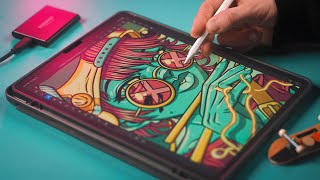
Original Logo: / mock_cyber_security_co...
Find out more about the Fibonacci Sequence here:
• How to Use the Golden ...
Check out my Iconic Logo Design class for free with a one-month free trial of Skillshare! skl.sh/willpaterson09211
Will Paterson: linktr.ee/willpaterson
Join the Reddit crew: / willpatersondesign
Become a member: / @willpatersondesign
If you would like me to design your logo and company branding, please check out my website for more information! www.willpaterson.design/
📋 Timestamps
00:00 Intro
00:48 Subscriber Logo (Fibonacci)
01:18 Researching
01:45 Mindmapping
03:20 Mood board
04:07 Sketching Logo Ideas
08:30: Vectorizing Logo Ideas (Adobe Illustrator)
12:09 Adding the Logo to Mockups (Adobe Photoshop)
12:26 Adding the Logo printed products (Printful)
13:24 What are your thoughts?
13:41 Outro - แนวปฏิบัติและการใช้ชีวิต


Did you enjoy the video? Let me know down below! Also let me know what video you would like to see next. :)
I find the shield one works best.
We have enjoyed the video we need more videos like that it helps us to think in a new way and also get different ideas about logos. Thanks for sharing this valuable content
yup :)
The fact you didn’t match the bottom curl of the spiral with the bottom of the “shield” is messing with my OCD lol! Love the redesign 👍
Oh me too! The extra thickness on the bottom right is all I see
I really wanted to! I still NEED to also haha. I had a deadline for the video to go live otherwise I would've spent even longer on it. :)
Yep yep YEP! 😳
@@willpatersondesign so you didn't just because you wanted us to leave comments about it!😂 okay, than there's one from me. you can now not answer that hahah
Both are great but I do prefer the eye logo a little bit more. The idea of a watchful eye, and seeing and understanding everything that is happening on your network appeals to me.
Ditto, I agree. The shield design is very attractive but the eye is simple. Also hard to compare a logo with text explainers to just a symbol. I like the eye because it represents what's in the text.
it's also related to eye scanning or facial recognition. It's just a touch neater, but I do like both designs
I think if you thinned the line weight just a little and actually trimmed the spiral at the point where it intersects the shield, rather than letting it sort of overlap into the bottom portion of the shield, it would look a little cleaner and sleeker. But great conceptual work! I love to see your process. Amazing work as usual! 👏 👏 👏
Great idea! Thanks so much for watching :)
Looks like an expensive logo design that a major security agency would have.
Love the redesign! Wish you make more videos like this so we can all learn more how to make our designs better and better! Thank you Willl!
I love comparing my design process to yours! seeing different ways that I could improve. for example you spend a lot more time on a mood board which is somewhere I lack. Awesome quality video as always Will!
I absolutely love when I take so long to find a design idea for a logo and then randomly it just, clicks.
It's so satisfying!
This behind the scenes video is what I needed! I got some insights on how to make a better logo design process from this!
Great seeing the process and actually gave me some ideas on how I can better show my process to clients, I’m not much of a sketcher but I can definitely see the benefits… I’m trying to get better!
Love your videos! Every time i'm watching any of those redesigns i'm like: Oh man, that's just a simple but great idea!
HI Will, another great video, thanks for spending the time making and sharing it. For some reason, your finished design made me think of the old British Leyland logo, may be the colour choice or the spiral arms
I liked the 11:21 version where the negative and positive spaces were interchanged, but of course, will have to check whether that's scale-able.
Thanks for elaborating on the process!
I think the Logo has too little negative space in the left upper corner but great redesign anyway :)
These videos are great! I could watch one every single day!
Glad you like them!
I liked the vintage font. Gives it an air of professionality, though maybe leans too much towards a bank's style. At least it would stand out from the rest
Will be glad if you can do a complete beginners series:)
superb,the second one is amazing though the printing on the shirt🤩😍
Thank you so much 😀
Chill-Hop radio! Absolutely clutch. And for any of my fellow ADHD sufferers, try mixing it with a nice 40hz binaural beat to really get focused in.
I listen to 8D audio to help me too :)
I would have liked to explore a snail shell: it has the Fibonacci pattern, is analogous to a protective shield, but would still be discernable enough from competitors, it's not a common shape. So, it could look cool and unique.
It might work visually but the image of snail might imply "Slow Service"
@@AmrBashaTohamy Or more of a bank logo, since the snail shell is generally seen as a safe storage kinda thing.
@@godofpoison6667
Mmm i could be wrong but i wouldn't use a snail on anything that need fast customer service
Good idea!
@@AmrBashaTohamy true.
the lower right curve of the shield is too bold because it's overlapped with the spiral. I know you can't change the spiral cause it won't follow the golden ratio in that case, but can't you adjust the curve on the shield? that way it would 1. make the overall logo look cleaner; 2. make the shield look more like shield
Love seeing your design process.
Glad you enjoy it!
The redesign is great, the design process is great too. :)
I really like the original logo and the name fibonacci. I think that it should be flipped horizontally so that the spiral starts on the left and leads to the right since thats how we view things and I like how the text is modern and sans serif and strong and somewhat bold and confident and some futuristic-ness with the barless A. I do think that the colour of the mug looks like a therapist's colour. I like that mockup that you did for the redesign.
I really like the video I would love to see more of logo design progress 🤯🤯
You got it!
Well the bottom curl of the spiral didn't matched the Shield Curv...
And I was like.. still waiting for You to edit that 😂😂. But i think... That's the final. Sometimes..we have to go beyond perfection, i think. Great redesign, Sexy concept 👌, you matched the shield, the Thumbprint, the keyhole.. yet so clean 🔥🔥. Hatsoff.
Keep growing ❤️
Great video! Thank you for showing the process.
Glad you enjoyed it!
Love seeing your videos pop up on my feed! I always learn something useful that helps me in my professional life. What program do you use for mind-mapping?
So glad!
do more of this!! this is amazing
Will Do!
Very good work on this one. Man i learn a lot :)
Glad you liked it!
Great work, starting my design career now and i aspire to be as competent as you!
You can do it!
Great Video Will, may I ask which apps you used for your productivity and sketching on your iPad?
Thanks
This is amazing!
What soft are you using on the iPad ?
Thx for the vid
Cool logo. Great process. I'd make the curves of the shield match the curve of the swirl so the line weight is consistent everywhere instead of thicker on the bottom right where the curves don't line up. To me anything tech or security has to be exacting. Just a personal preference though. Edit: I now see 20 other people made the same comment.
I think your concept was better, but the eye was a better logo. It was simple while still having nice detail and professionalism to it where I feel like your logo could’ve had the edges, refined, metaphorically, and literally.
I'm surprised you didn't mention anything about the top left corner whitespace being too small. I think the hat at 13:04 displays the problem well.
what was the mindmap software that was used?
I really liked the final result, great job man
What Font is used for the logo at 11:40?
What is that graph / mindmap application you are using (at 1:22) ? Thanks for putting up these videos. Learn a lot from them!
Milanote and Mindscape
Love these kinds of videos! 🎉
More to come!
On which platform you were making mindmap,that was looking good
I may have missed this but what was the app used for the mind mapping process? That would be great for our team to use. Cheers
Mind Node :)
I still have difficulty coming with ideas most times, it takes me 3 to 5 dey to come up with something. But I always get the work done. I feel the time I take is too much.
Sometime Time is the answern. Dont' worry about that if you have the result what you looking for :)
Give yourself more time, and don't compare yourself to others! That's the key :)
Also, it takes me longer than most to come up with a good idea. :) I bet you it takes me longer than it takes you!
i love the Final result 🔥
Enjoyed this
Just an idea it might not work but what if you add an arch above the shield to make it also look like a padlock, adding to the theme of security?
Good idea!
Waiting for any video from ur channel❤️❤️
🤩
In my opinion the result at 9:49 looks way better than the shield
SOS... Help How can I temporarily blur the art in illustrator to view the text for kerning issues?
Effect > Blur > Gaussian Blur
Amazing work
The speed was ulitmate
Hi
Brother can you please share mockup link
Btw love your content and watching your videos daily ❤
the redesign is nice but at the same time I think it looks like a logo for automobile too!
Reminds me of the old Airbus logo
What is the Mindmapping tool used?
Mind Node :)
I like to see the processs of making this logos, but i would like to see more how you make the subscriber logo better instead of making a complete new one.
Thanks for letting me know :)
Love it. 🤩🤩🤩🤩🤩🤩🤩🤩 Thank you.
I can't use the mouse pad while designing at all. Even if it was a small vectoration lol
I love using graphic tablets :) Need to get another
@@willpatersondesign in the video you were using your laptop's mouse pad.
Personally i use one way by wacom tablette or a mouse
I think the original one looks better. Cleaner and less cliched.
The part of the Logo where the end of the spiral doesn't fit with the outer shape on the bottom right and creates this uneven thicker line, makes me crazy.
Hi Will
Hey Hey!
I wonder what will my "Data Devils" logo be changed into, if you touch at it 🤩
10:10 TOBI!
I’m sorry but they didn’t even use the Fibonacci sequence in the logos aaaah
I used a representation of it in this design :)
Must say I preferred the original (sorry!) that being said, the bottom left corner of that spiral flattens out a little which bugged me. The redesign made me think of a combination of the Philips logo (the outer shield with a rounded shape) and a better version of the Ubisoft logo (for the inner). At 12:17 the weight in the bottom right corner bothered me BUT the blue projection type mockup made the whole mark look a lot better. I guess seeing the logo in full black makes it feel heavy. Loved the video all the same! 👍
don't you know your subscribers have made their logo by themselves after watching your videos? because it's not logo but the quality and price of products and services customer bothers about
I agree. The logo is only a small factor in identifying those products and services!
Hat.
but no hat thumbnail ... hahha
And beanie at 13:01 👀
how can we join the discord ?
Check your messages on Inst
Thanks dude!
Hey Will! cracking video again, am wondering if you have a Twitter?
channel 2! Then load edison on that channel and start recording! Super easy! If you need anytNice tutorialng else we can connect via socials, i run
This is amazing!