5 Impressive Visuals You Didn't Know Excel Could Do

ฝัง
- เผยแพร่เมื่อ 24 ก.ค. 2024
- Make 5 awesome advanced excel charts and visuals to impress anyone!
🔥 Take our Power BI course: www.careerprinciples.com/cour...
🆓 DOWNLOAD Free Excel file for this video: careerprinciples.myflodesk.co...
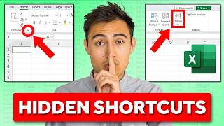
In this video you'll learn to make 5 awesome advanced excel visuals to impress anyone. First we'll make a waffle chart in Excel, where you can see the capacity out of the total. Then we'll make a line chart with markers, with some shapes to emphasize a general trend. Third, we'll make a radar chart to show how a restaurant is performing out of 100% in different metrics. Fourth, we'll make a variance charts to see the percentage change month over month. Finally, in fifth, we'll create a dumbbell chart which combines a scatter plot and lines.
LEARN:
📈 The Complete Finance & Valuation Course: www.careerprinciples.com/cour...
👉 Excel for Business & Finance Course: www.careerprinciples.com/cour...
🚀 All our courses: www.careerprinciples.com/courses
SOCIALS:
📸 Instagram - careerprinc...
🤳 TikTok - / career_principles
🧑💻 LinkedIn - / careerprinciples
▬▬▬▬▬▬▬▬▬▬▬▬▬▬▬▬▬▬▬▬▬▬▬▬▬▬▬▬▬▬▬▬▬▬▬▬▬▬▬▬
Chapters:
0:00 - Chart 1
3:21 - Chart 2
5:50 - Chart 3
8:31 - Chart 4
11:23 - Chart 5


🔥 Take our Power BI course: www.careerprinciples.com/courses/power-bi-for-business-analytics
could plz give me a grant have no enough to pay, and I am looking for a job in data analysis as"new graduate" thank you in advance
You are a true genius! Your videos have been extremely helpful. Thank you very much.
Really informative video!! Thanks Kenji
Great, thanks for sharing!
Thank you kenji, I am still on the line chart part of the video and I just remembered, Is there a video on combo charts that have the same x axis but different y axes? I am a geodetic engineering student and I want a video on such a chart for my mass haul and formation level chart. Thank you
Great collection and awesome explanation! Thank you for the video!
Briliant!
Awesome!
hello !
great video!
How do I enable this + sign for my chart?
Wow! Just wow!
Thank you for sharing your knowledge in such an easy-to-understand way! Your videos have been incredibly helpful. I really appreciate it Subscribe - Kenji
nice class
Kenji, what is the formula I can use to replace SORT and SEQUENCE (I am using Excel 2016 at the moment). The video was AWESOME!!!
Will I be able to connect it to a slicer??
thanks! Is there a way to do the waffle chart in another shape? Like lines instead of squares?
You mean like a wave chart?
Please create more videos of power BI to send to your channel
In the Second Line & Market Chart tutorial whenever, I click on the bring it to the front only the line chart appears and the text box doesn't show. Can you please help.
Nice
Thank you!
Please create the course of Power BI and MySQL for me. I would like to become a business analyst
I have data let's say only with starting number for example abc001 to abc009 I want all the number in transpose format any help?
If you have Excel 365 then there's a function TRANSPOSE () and if you want only the number part i.e. 001 from abc001 then you can use =TRANSPOSE(RIGHT(DATA RANGE, 3)). That should work 🤞
@@manthanmistry1205 👍
Hello Sir, I need your help.
I want a formula that if
• if A1=1, a list of any 3 unique random numbers between 1 to 10 should be generated
• If A1=2, a list of any 3 unique random numbers between 11 to 15 should be generated
• if A1=4, a list of any 3 unique random numbers between 18 to 26 should be generated
Please Reply Sir
.
That is great 😊 I have learned some tips to apply to my work. Thank you so much