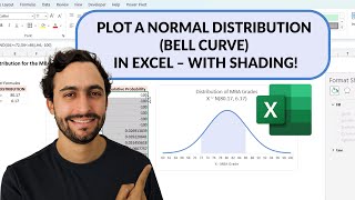
Creating a Graph of the Standard Normal Distribution in Excel

ฝัง
- เผยแพร่เมื่อ 15 ก.ค. 2024
- This video demonstrates how to create a graph of the standard normal distribution using Microsoft Excel. The standard normal distribution has a mean of zero and a standard deviation of one. The graph dynamically displays the area under the curve from the left of the distribution for a specified z-score.


Hello, in the scroll bar for the format control why is the minimum value 10 and why is the maximum 70? Also if we change the minimum and maximum in the format control we would need another formula for E6 other than =(D6/10)-4, will you be able to help me figure it out?
I liked learning how to create a graph of normal distribution because I think that visuals help people understand the data. Dr. Grande really broke down how to do it really well. He also explained what happens to the data if you change something
It was helpful that this video not only provided detailed steps as to how to create a normal distribution graph, but why the steps needed to be done in a certain order to create the graph which provided a better understanding of what exactly was being represented and how it was calculated
There are so many formulas that come up with the same answer in excel which makes it hard to keep track of which function is which. This one was particularly complicated. However, it has clear applications and numerous uses being a graph on the normal distribution that can be interacted with. It's great that the video even documents how to change colors.
Using SPSS can seem like a daunting task, however, Dr. Grande makes using this program, and particularly assessing standard normal distribution, a much easier process. I always enjoy Dr. Grande breaking down the particular equations one can use, as well as how to show them onto graphing and/or other functions one could utilize.
This was a neat and easy-to-understand way to graph normal distribution. I especially liked the way the scroll bar can easily interact with the graph showing the area.
As mentioned before, I don't have Excel products on my computer but I liked being able to see it done because it made it easier to understand statistics and how normal distribution looks on a graph.
The steps provided in this video were very easy to follow. I like having a visual element with an explanation because it helps me better understand how to use Excel.
Very easy to comprehend and to follow when learning how to create a graph of the standard normal distribution. I liked how you could manipulate the scrolls to find the areas for a specified z-score rather than having to figure this out manually.
I found this video to be very informative and definitely needed to bookmark it so I could come back to it later. While I learned to all of these analyses in SPSS, I never had any experience or even knew that it was possible to calculate them in EXCEL. Thanks for sharing!
The video is effective in showing how a graph depicting standard normal distribution can be created, and with step by step explanation makes it user friendly
Zuree Zee I agree! This video would be a helpful tool for the average person to use when creating their own normal distribution graph
The way you discuss it is very clear and easy to follow. Thank you. 👍😊
This was helpful for me to learn how to create a graph in Excel on normal standard distribution. I am learning so much from your videos.
I liked the scroll bar with the z scores. It was helpful for me to see them depicted on the normal distribution graph. I find visuals to be very helpful.
Another great and convenient way to use Excel. This video was easy to follow.
I really enjoyed this video. I really do like the graphing functions in Excel and the versatility and customization that come with it.
I really liked the graphing function too.
I am a visual learner and enjoy being able to see the data in graph form. I will definitely want to play around with the various types of graphs.
I love the visual aides. It helps me to better understand how to creat the graphs.
Very helpful video! Creating a graph of the standard normal distribution in Excel was done step by step! i learned that in a normal distribution that the same positive and negative Z-score will have the same value.
This video was very helpful in understanding how to create a standard normal distribution graph. Working with numbers in excel can be confusing for me, but having the graph to view is helpful. And again, I would need further practice before attempting this on my own.
+Jacklin Skibicki I agree. It does make it easier to view the data in graph form rather than a list of numbers.
Great demonstration and explanation of the process involved in creating a graph of the standard normal distribution. The simple steps were easy to follow and comprehend.
+Candace Fernandez I agree, the explanation was very easy to follow. I like having these videos to watch because it is a great reference to use in the future.
Excellent video thanks. by creating another column x reversed with 3 at the top and -3 at the bottom and a column for "area -" distribution and duplicating the slide utilizing the new columns , i have modified your worksheet to to have a shaded area moving in from the right as well as the left. simple cell calculations with the percentages show both the "area +" % as you did, a "area -" % and significantly by using (1-((area +)+(area -)) the % remaining blue in the middle. This is now an awesome Standard Normal distribution teaching and visualization tool . Thank you so much. Highly recommend video
Graphs are such a good visual, and help people like me who are visual learners!
I thought this was a great demonstration in excel! I've never made a graph before in excel and this video was great in showing the steps to create the graph.
Lucid explanation and excellent presentation of standard normal distribution. Thank you so much.
You are quite welcome - thanks for watching -
It seems very convenient to be able to create a graph for standard normal distribution. I really like how you can create a scroll to use to simplify changing the area within the graph. Dr. Grande broke the process down well.
+Rachel Foster Yes! I thought he broke down the process very nicely!
+Rachel Foster I also believe that Dr. Grande did a wonderful job breaking everything down in easily understandable bits
Yes, this video was very helpful for a beginner, like myself. I see the merit of creating graphs for the snd.
Great step by step presentation which gives me an even better understanding of normal distribution and standard deviation, however, I would like to try creating a graph.
I appreciate this video because I can see how useful it will be to be able to graph a normal distribution in Excel and then be able to manipulate the graph with data input for any number of research purposes to see how the graph changes with each data set.
+Melissa Clendaniel This process was very difficult for me to follow. I like the idea of being able to put the information in a graph, but I could not figure this out on my own in the future.
+Melissa Clendaniel I appreciated how simple it was to manipulate the graph as well. I do much better with visuals, so I can see how this would be beneficial to use.
Thank you Dr. Grande for the lesson! I learned a bunch!
You're welcome, thanks for watching -
Very neat to see how you can create a curve within an excel spreadsheet. The values entered convert very nicely to a graph. Great video!
I thought this was a great video as well! Really informative.
+Toniette Morda I loved how this video showed the steps in creating the graph!
I have created graphs in Excel but never for standard deviation. Very easy to follow and useful to know.
I agree that this video was very easy to follow.
Thank you so much, this is great video.
How do you deal with a scenario when X value is not between -3 and + 3? What is the logic of adding formulas in E6 and D6? Why D6 is divided by 10 minus 4? If you happen to reply me, explain every step and logic behind it?
This video was done very well and was easy to follow.
This video was really easy to follow. Although I have never had to create a graph of the standard normal distribution in excel, I am confident that I will be able to do it in the future.
I agree, this was a neat video to watch and see how the graphs could be made using the standard normal distribution in excel. I wasn't aware that this function could be computed using excel. This was great knowledge to come across. I appreciate having a visual like this to see the information. The video made it easy to follow.
Hugely impressive video. Thank you.
It was neat that you could move the scroll bar to set different x-values to find the area under the curve.
I thought the scroll bar tool was really neat. I also liked seeing the use of "if" functions.
Thanks for the video. I'm having a hard time adjusting the scroll bar to fit a data set with a mean of 100 and a standard distribution of 6. Can you help?
Thank you for this excellent video.
You are quite welcome - thanks for watching -
Thank you so much! It is very interesting!
Thank you very much for this video!
You're welcome - thanks for watching.
Why is the threshold between the two areas inclined? shouldn't it be vertical?
This video was easy to follow and very understandable, I just wish I was able to put it into practice.
This is a very informative video that is an excellent visual and example for using Excel in creating a graph for Standard Normal Distribution.
I agree that the visual graph was helpful while Dr. Grande was explaining terms throughout the video.
really thanks to this video... it's really help me! good job sir
You are welcome, thank you for watching
Very well done!
Dr Grande,
First off this is a wonder tutorial and i am trying to recreate you work. While recreating your spreadsheet at the 9:02 mark when i mess with the scroll bar and get to -1.1 it shows the proper area of.2.8 but when i move the scroll bar to -1 it leaves the area blank as a false but the formula says "
I found this video very useful.
Instructive. But please how did you create your scroller ?
I find the excel videos a bit hard to follow as there are so many steps. However, I also find them extremenly interesting and helpful. This one I thought was great because being able to show the area under the curve with the graph is really helpful to understand the data better. I like that with the scroll bar you can move the change the graph as well.
+Mandy Moore I agree that the amount of steps can be overwhelming, however I think Dr. Grande does a great job of going into detail on how to utilize each step.
+Candace Fernandez Dr. Grande definitely does a great job breaking down and explaining such complex concepts and steps.
thank you.
hello, when I enter false in the 2:35 argument, my excel gives me an error. I use windows 10. (=NORM.DIST(A2,0,1,) when I try typing false, it gives me a formula error, but when I leave the False out I still get the same number - is this correct?
Hi Dr Grande I need a further break down on you vid Creating a Graph of the Standard Normal Distribution in Excel
is there a way to contact you? please let me know!
I don't which version your excel, but mine doesn't have the area curve like what you have in the video. Mine can only do "bell curve" and no area. It doesn't have the "recommended chart" as yours.
Pretty cool. This is a convenient way to manipulate numbers in an incremental way.
+Jeff Pincin i also liked that too! especially if you had to document the data, you could easily scroll to find that value.
Awesome video! can we get one where the dist is non normal?
Unlike the other 2 videos where Excel was used, this one I was not able to follow as readily. These are good informative videos, but I feel that I will need in class help so I can do it at the same time as the professor. If I had 2 screens I would be able to do it but I do not, and I would still be confused at some parts anyway to where I would want to ask questions in real time.
please how do I author fill the value I am new to excel and need Help with my homework
very good lesson
Thank you!
I am having problems with my graph not showing area when I scroll, also my z number for area populate all the way down to #62. I must be missing a step. Something is wrong the scroll function for the area is not functioning.
There are many steps to create a graph to display the standard normal distribution. Once graph is completed it makes sense and seems easy to understand. The steps are slightly difficult to follow and there are many formulas to understand.
+Michelle Robinson I have to agree, this one was very in-depth and complicated. I see the value in it but it is also a lengthy process.
I prefer the color graph that we can move opposed to the bar graph. Adding data to the chart will take practice.
April, I also prefer the colored graph. This was another video of simple steps I appreciated. It's good to know how to make a graph on excel.
I think I found a little addendum that can be made, keep everything the same, except that for the cell E6 leave it blank, create a second graph and a second area that is the same as the one before. But instead name the cell Find Z, the formula will look like area=IF(A141
i need a tutor.
Maybe I have missed something because I understand why the normal distribution is important but what is the purpose for the area? Can I have an example of why they are used? Thanks!
It appeared to be the colored areas underneath that bell curve. He was able to adjust how much area was covered by each color.
The "area" is important as it represents the one area of probability the cell he colored green gives the percentage. sometimes the complement is what you are looking for eg at -1 st-dev it is 15.87% of the shaded"area" or 84.13 of un-shaded
I did not follow this video as easily as I would have liked. I wish there was an Excel course for fundamental information on the different functions available, that way every process wouldn't be so much of a new one
I would have to pause this video several times to follow. The explanation was helpful but doesn’t seem as simple as it’s made to be.
This video doesn't show us command by command. Largely unhelpful.
This video was very confusing. Knowing where to put the scroll bar, the if formula, and all other information used to create the graph was difficult to follow. Creating the scroll bar formula was hard to follow. If you have a background in Excel formulas it would be easier, but for me as a beginner I was overwhelmed by the steps and could not follow along to create my own.
+Bethany Elstrom I too was overwhelmed as I am familiar with Excel but all the steps were alot to comprehend.