How to Draw Clustered Bar Chart in Corel Draw. By Seekh Raha Hoon

ฝัง
- เผยแพร่เมื่อ 29 ส.ค. 2024
- Seekh Raha Hoon TH-cam Channel
#coreldraw
Clustered Bar Charts How to Draw in Corel Draw.
Clustered Bar Charts
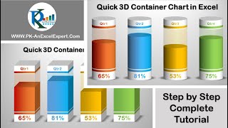
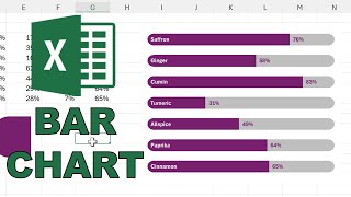
A clustered bar chart is similar to a simple bar chart the difference is that this bar chart represents more than one series of data for a given category. Where the simple bar chart represents one piece of data per bar or category (total sales), the clustered bar chart represents a series of data clustered together (one for each product sold).
diagram
The above graph is a perfect example of the clustered bar chart. It shows the representation of the unit of sales of 4 products in different business quarters. The clustered bar chart can either be a vertical or a horizontal representation, and it is best suited to represent multiple series of data in reports where you wish to compare values within quarters as well as across quarters. Here you can compare the product sales relative to each other in Q1 but also compare how drills sell between Q1 and Q2 for example.
Follow & Contact With Us
Facebook : www.facebook.c...
Instagram : / seekhrahahoon
Twitter : / seekhraha_hoon
Telegram : t.me/+7VDaSTTN...
Clustered bar charts CorelDraw
Clustered bar charts examples
clustered bar chart
stacked bar chart
clustered bar chart interpretation
clustered bar chart advantages
........................................................................
Copyright Disclaimer under section 107 of the Copyright Act 1976, allowance is made for “fair use” for purposes such as criticism, comment, news reporting, teaching, scholarship, education and research. Fair use is a use permitted by copyright statute that might otherwise be infringing.


👍
Next video ka wait kar rahe hai
Thanks sir❤
wait for the next video...