Could you please let me know if it is possible to not duplicate the data? I have a custom-SQL-query and I have done lots of calculations when I duplicate my data source it fails!! and it can not read my calculation and I get errors. :-(
This video is amazing. The issue I am facing is that the value I want to draw for the chart is an aggregated variable instead of fixed value like in the video. For example, the average speed or distance. Thus I am stuck from the beginning when you try to duplicate the data source.
Great tutorial. I have used this with my own data and am using it in production dashboards. I have one question. I do not seem to be able to control the thickness of the dial lines. I know it has been more that a year since this item was shared, but is it possible to get a hint on this question??
I was getting weird shapes after I changed from automatic to polygon, turns out I needed to create Path(bin) without moving Path up to Dimentions, worked like a charm. Thanks a million!
Hi - I have got this working but would like to have a background line behind each displayed line so it shows the 100% limit for each. So its easier to see what 100% is - if that makes sense? Ultimately it would be stacking what you have done on top of a duplicate version where each value is 100% - can't figure out how though?
Hi, tutorial was super but would you please help or give hind on the X & Y axis here and why 271 number is used with the Table Name, It could be anything. Thanks in advance, your tutorial and contents looks very promising.
Firstly thanks alot for this video. Question - I am using only 3 dimensions/categories so have only 3 lines. Is there a way to reduce the thickness of these lines ?
I'm struggling to get this to actually show anything as being over 75%. I have played with the formulas but can't get the polygon to show the percents as being 80%, 90%, or 100%. I would like to circle to close at 100%, but at the max they are all only 75% the way around. Any ideas on how to fix this?
Does this work with newer versions of tableau? I am able to open your workbook in a new version, but I am not able to recreate it even from your datasource and objects..
when I follow this, I can make the pie gauge, but it doesn't taper off into the arrow you have, but it darts sharply into the center which doesn't look too nice. Is there something I am doing wrong?
This is awesome, thank you! If I wanted to rotate the chart to run from 180 degrees to 450, rather than 0 to 270, would that be difficult to do? If not, could you tell me what adjustments I would need to make? I assume within the path, x, and y fields, but can't quite get it.
Thanks for your inquiry. To rotate the chart, you will need to change the calculations for the X and Y fields. I will check the solution to this request and update this thread.
Hello, this chart looks amazing. I have created one using the same data. But I am facing issues while I am trying to do it with another dataset wherein I am trying to consider Year as bin , I want to show yearly bifurcated radial pie guage . Can you suggest how to do it ?
Hi Suhel, Thanks for adding to this thread. Please see our radial bar chart tutorial where we work with date based radials: th-cam.com/video/d6-aptKLvgg/w-d-xo.html
Dears, It is possible to do this exercise with data from salesforce? i'm trying but i dont know how to duplicate data ( to create a union for it). can you please help with it? Highly appreciate your support :). Thank you in advance!
Hi Andrei. This is definitely possible with data from Salesforce, but you might first needs some data preparation. I would suggest to prepare the data as per the example, and use a Union to "duplicate" the data. If the Union is not possible, you could do this step also in your data preparation.
Thank you for your prompt reply. Regarding the preparation, i have direct connection to sfdc server which is more convenient for me i.e. automatically updates all the viz that i have. switching them to other source such as excel excludes this automation process. I know that its more easier to do it via excel as on example you show ( for which I thank you). Maybe you know another solution without doubling the data, because sfdc connection does not allow you to create custom query.
Hi Andrei. Unfortunately at the moment this is the only workable solution we have. Why not reach out to the Tableau Community to see whether someone has perhaps found a workaround.
Its exactly what I was looking for! Brilliant! however ... If you have data that covers 304 degrees of the first circle your formula doesn't work. How was that calculated?Could you please explain the 540 in the X and Y formulas.
Hi Beata, The example was created to work specifically with a 270-degree gauge as this allows us enough space for the labels and values. You need to ensure that your max value (I guess in this case the one that produces the 304 degrees), is "normalized" to the maximum allowed value) which will also then be applied to all the other values. You can see this put in place at 3:23 of the video.
I wanted to see a complete circle as well. In the Path calc, replace 271 with 361. In the X and Y calcs, replace 270 with 360 and replace 540 with 720. Also, my Percentage calc is Response/100.
Hi Can you please help me with the belwo two things 1. We have some items where the percentage exceeds 100%. But with this logic I am getting the circles only till 100% . Can you please let me know what calculation needs to be changed for greater than 100% (Our users wants to see something similar to Apple watch Activity tracker - where the circles go above 100%) 2. Can I show the second half of the circle in different color Ex: Python 76% in red, 24% in "Grey" R 59% in Blue, 41% in "Grey"
Hi Bindu, To implement both of these changes, you will need quite a bit of changes and further custom work to this approach. With this current approach you are limited to the current visual. If you do find an easy way to do this, please do share!
Hi When I am trying to use only Four Orders (Instead of 6), the lines are getting distracted. Can you please let me know which calculated fields needs to be changed
Hi Bindu, The only thing you really need to update is the Percentage field, ensuring that your last record ends up at 100% and therefore you will divide the "response" with the largest response value.
Guys, first of all this is amazing! Thoroughly enjoying all your tut's. Have got one doubt in this one - It works perfectly if we have less records (~ 20-ish). I see the chart starts disorienting on higher number of records in the dataset (mine has 5000). Even if I add a filter for top 5 categories/description, it distorts. I am currently creating a new connection in my existing workbook which imports only top 10 records for this graph. Is this a correct approach or am I missing something here? Thanks! R
Hi Rishiraj, Glad to hear you are enjoying the tutorials! With this chart, I would suggest to keep the number of items to be displayed relatively small, and therefore your approach for the top n items is good. As for the implementation part, I would suggest you complete all of your prep before (or if possible) in your datasource as this method is quite limiting in its application inside the actual chart. Best of luck!
Hi - does this still work in 10.5, tried to recreate but when it comes to draw it isn't happening and x axis is staying < 1. Rechecked I missed no steps and then also downloaded the worksheet from the link - this had the chart in but simply creating a new sheet and dropping in the x,y and path (bin) ...with x/y calculated on path (bin) didn't have the same results. Any advice appreciated, thank you! :)
Hi madspringy. I have just tested it again on my v10.5, and it work perfectly. There must something else that is different then. I would suggest checking the formulas of calculated fields once again andalso ensure that the "Aggregate Measures" has been enabled.
@@ArtofVisualization Hello, does this work in Tableau 10.3? If so, I am struggling with the "Path Calculation" and Bin. What exactly is the Path Calculation measuring? Is the "Table Name" the dimension you're trying to measure and display with the final graph? And then, it needs to = the 'data source' you're using, along with 1, 271? Because when input this, and try to create a Bin, it doesn't give me the same Bin it gives you. It gives me a Bin with 271 Min, 271 Max, Diff 0, and CntD 1. What am I doing wrong and how can I get the correct Bin? All the other calculations seem to be working. Thank you so much!
Hi Ghazal. Yes, you can build this into your data preparation and split the SQL line into more than one line and adjust as per the tutorial. You could also use the SQL version breakdown data as a secondary dataset and u show specific versions in a secondary graph on a dashboard.
can this chart be created if multiple tables are connected together? Like that I cannot make the path as duplication of data is not possible. Is there any other alternative?
Hi Mandar. In this case, and specifically using this method, I would suggest that you complete all data prep including the multiple tables, and then only proceed in crating the visualisation.
seems to be amazing....but when i connect the data the RESPONSE field is a STRING and when you change it to NUMBER ...i get only NULL...impossible to move forward impossible to the gauge chart ..please help :)
Hi Lotanna, A table calculation is required to perform this function. Please see link on what/how table calculations work: onlinehelp.tableau.com/current/pro/desktop/en-us/calculations_tablecalculations.htm We also cover this within our Tableau courses: www.superdatascience.com/courses/tableau-2018-hands-on-tableau-training-for-data-science/
Hi Srikanth, Thanks for adding to this thread. "Response" is a measure not a function. You can use this measure by right clicking it in the measures section and selecting calculated field. This will pre-populate the formula with the field name. Hope this helps
Hi Avijit, When increasing the values, you will also need to ensure that you update the maximum value in the "Percentage" calculated field accordingly.
It's very cool, thanks for sharing it! BTW I've just found a really strange behaviour. After having created the chart, if I try to re-create the same chart in a new sheet (using the same dataset of course), in the really first steps, after having added Path(Bin) to detail and added X and Y to shelf, when I change the "compute using" for X and Y, I got a different result. Instead of having the 3/4 double circle, I just get 2 marks. I psent 45 minutes trying to understand why but I'm losing hope
Hey.. I got it , keep X in Columns and keep path bin in y , click on path bin and select show missing values and pull it back to detail .. it should work
And Do you really want to add that Value in percentage calculated field!? What to do when its dynamic !? I would rather create a max of all calculted field which is “{ fixed : max(Response) } and use this calc field in percentage calculated field..


Could you please let me know if it is possible to not duplicate the data? I have a custom-SQL-query and I have done lots of calculations when I duplicate my data source it fails!! and it can not read my calculation and I get errors. :-(
This video is amazing. The issue I am facing is that the value I want to draw for the chart is an aggregated variable instead of fixed value like in the video. For example, the average speed or distance. Thus I am stuck from the beginning when you try to duplicate the data source.
Hello...great technique to showcase the progress.I want to know can we drill down by clicking on any of the bar to show barchart categary wise...???
Great tutorial. I have used this with my own data and am using it in production dashboards. I have one question. I do not seem to be able to control the thickness of the dial lines. I know it has been more that a year since this item was shared, but is it possible to get a hint on this question??
I was getting weird shapes after I changed from automatic to polygon, turns out I needed to create Path(bin) without moving Path up to Dimentions, worked like a charm. Thanks a million!
Where did you get "Number of Records" under Measures? I am coming up with an empty graph because I guess I don't have the total number under measures
Hi - I have got this working but would like to have a background line behind each displayed line so it shows the 100% limit for each. So its easier to see what 100% is - if that makes sense? Ultimately it would be stacking what you have done on top of a duplicate version where each value is 100% - can't figure out how though?
Hi, tutorial was super but would you please help or give hind on the X & Y axis here and why 271 number is used with the Table Name, It could be anything. Thanks in advance, your tutorial and contents looks very promising.
Firstly thanks alot for this video.
Question - I am using only 3 dimensions/categories so have only 3 lines. Is there a way to reduce the thickness of these lines ?
I'm struggling to get this to actually show anything as being over 75%. I have played with the formulas but can't get the polygon to show the percents as being 80%, 90%, or 100%. I would like to circle to close at 100%, but at the max they are all only 75% the way around. Any ideas on how to fix this?
Does this work with newer versions of tableau? I am able to open your workbook in a new version, but I am not able to recreate it even from your datasource and objects..
when I follow this, I can make the pie gauge, but it doesn't taper off into the arrow you have, but it darts sharply into the center which doesn't look too nice. Is there something I am doing wrong?
This is awesome, thank you! If I wanted to rotate the chart to run from 180 degrees to 450, rather than 0 to 270, would that be difficult to do? If not, could you tell me what adjustments I would need to make? I assume within the path, x, and y fields, but can't quite get it.
Thanks for your inquiry.
To rotate the chart, you will need to change the calculations for the X and Y fields.
I will check the solution to this request and update this thread.
Simply force wc_start to be negative.
- WINDOW_MAX(MAX([Order]))
Hi Tam, thanks for the tutorial. However, could you please explain as to how was the formula for X and Y derived ?
Hello, this chart looks amazing. I have created one using the same data. But I am facing issues while I am trying to do it with another dataset wherein I am trying to consider Year as bin , I want to show yearly bifurcated radial pie guage . Can you suggest how to do it ?
Hi Suhel,
Thanks for adding to this thread.
Please see our radial bar chart tutorial where we work with date based radials:
th-cam.com/video/d6-aptKLvgg/w-d-xo.html
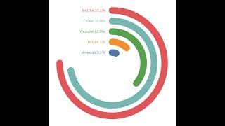
great video.. how if the response is over than 100%?
Dears,
It is possible to do this exercise with data from salesforce? i'm trying but i dont know how to duplicate data ( to create a union for it). can you please help with it? Highly appreciate your support :). Thank you in advance!
Hi Andrei. This is definitely possible with data from Salesforce, but you might first needs some data preparation. I would suggest to prepare the data as per the example, and use a Union to "duplicate" the data. If the Union is not possible, you could do this step also in your data preparation.
Thank you for your prompt reply. Regarding the preparation, i have direct connection to sfdc server which is more convenient for me i.e. automatically updates all the viz that i have. switching them to other source such as excel excludes this automation process. I know that its more easier to do it via excel as on example you show ( for which I thank you). Maybe you know another solution without doubling the data, because sfdc connection does not allow you to create custom query.
Hi Andrei. Unfortunately at the moment this is the only workable solution we have. Why not reach out to the Tableau Community to see whether someone has perhaps found a workaround.
Its exactly what I was looking for! Brilliant! however ...
If you have data that covers 304 degrees of the first circle your formula doesn't work. How was that calculated?Could you please explain the 540 in the X and Y formulas.
Hi Beata,
The example was created to work specifically with a 270-degree gauge as this allows us enough space for the labels and values. You need to ensure that your max value (I guess in this case the one that produces the 304 degrees), is "normalized" to the maximum allowed value) which will also then be applied to all the other values. You can see this put in place at 3:23 of the video.
SuperDataScience
Thanks
Seems like you need to do more than that. What if I wanted these gages to all be relative to 100% or 360?
I wanted to see a complete circle as well. In the Path calc, replace 271 with 361. In the X and Y calcs, replace 270 with 360 and replace 540 with 720. Also, my Percentage calc is Response/100.
Hi Can you please help me with the belwo two things
1. We have some items where the percentage exceeds 100%. But with this logic I am getting the circles only till 100% . Can you please let me know what calculation needs to be changed for greater than 100% (Our users wants to see something similar to Apple watch Activity tracker - where the circles go above 100%)
2. Can I show the second half of the circle in different color
Ex: Python 76% in red, 24% in "Grey"
R 59% in Blue, 41% in "Grey"
Hi Bindu,
To implement both of these changes, you will need quite a bit of changes and further custom work to this approach. With this current approach you are limited to the current visual. If you do find an easy way to do this, please do share!
Hi, This is a great video ! Can you please the concept of using (index()-1)*2 here ? and why not we moved with index() only . Thanks in Advance.
I am very new to Talbeau but my guess if we will be building an inner and outer ring for the data for each response and we need them to track.
Hi When I am trying to use only Four Orders (Instead of 6), the lines are getting distracted. Can you please let me know which calculated fields needs to be changed
Hi Bindu, The only thing you really need to update is the Percentage field, ensuring that your last record ends up at 100% and therefore you will divide the "response" with the largest response value.
Thank you !! Got it
Could you please do a tutorial on the speedo meter type gauge chat....
Guys, first of all this is amazing! Thoroughly enjoying all your tut's.
Have got one doubt in this one - It works perfectly if we have less records (~ 20-ish). I see the chart starts disorienting on higher number of records in the dataset (mine has 5000). Even if I add a filter for top 5 categories/description, it distorts.
I am currently creating a new connection in my existing workbook which imports only top 10 records for this graph. Is this a correct approach or am I missing something here?
Thanks!
R
Hi Rishiraj,
Glad to hear you are enjoying the tutorials!
With this chart, I would suggest to keep the number of items to be displayed relatively small, and therefore your approach for the top n items is good.
As for the implementation part, I would suggest you complete all of your prep before (or if possible) in your datasource as this method is quite limiting in its application inside the actual chart.
Best of luck!
Hi - does this still work in 10.5, tried to recreate but when it comes to draw it isn't happening and x axis is staying < 1. Rechecked I missed no steps and then also downloaded the worksheet from the link - this had the chart in but simply creating a new sheet and dropping in the x,y and path (bin) ...with x/y calculated on path (bin) didn't have the same results. Any advice appreciated, thank you! :)
Hi madspringy. I have just tested it again on my v10.5, and it work perfectly. There must something else that is different then. I would suggest checking the formulas of calculated fields once again andalso ensure that the "Aggregate Measures" has been enabled.
Thanks for the reply and checking! ...will deffo check out "Aggregate Measures" first chance I get - wasn't aware of this option.
@@ArtofVisualization Hello, does this work in Tableau 10.3? If so, I am struggling with the "Path Calculation" and Bin.
What exactly is the Path Calculation measuring? Is the "Table Name" the dimension you're trying to measure and display with the final graph? And then, it needs to = the 'data source' you're using, along with 1, 271?
Because when input this, and try to create a Bin, it doesn't give me the same Bin it gives you. It gives me a Bin with 271 Min, 271 Max, Diff 0, and CntD 1. What am I doing wrong and how can I get the correct Bin?
All the other calculations seem to be working. Thank you so much!
is it possible to segregate each radial by more than one data set? example if its SQL then split the responses by which version of SQL
Hi Ghazal. Yes, you can build this into your data preparation and split the SQL line into more than one line and adjust as per the tutorial. You could also use the SQL version breakdown data as a secondary dataset and u show specific versions in a secondary graph on a dashboard.
can this chart be created if multiple tables are connected together?
Like that I cannot make the path as duplication of data is not possible. Is there any other alternative?
Hi Mandar. In this case, and specifically using this method, I would suggest that you complete all data prep including the multiple tables, and then only proceed in crating the visualisation.
Hello,
I am not able to create path. In Data Source my file .xlsx is not getting in Union, due to which I am not able to get Path (Bin).
Hi Mohammed, for this approach to work you will unfortunately have to use a Union or you could prepare the data outside of Tableau up to the Union.
Thanks..!
seems to be amazing....but when i connect the data the RESPONSE field is a STRING and when you change it to NUMBER ...i get only NULL...impossible to move forward impossible to the gauge chart ..please help :)
find the solution...use REPLACE function to change a , into a . for Tableau
Apologies Jean, just saw your comment.
Glad to know that everything fixed now.
Why 271?
At time 8:26, why had the index been set to calculate across the entire table rather than it being used to calculate as a "bin?"
Hi Lotanna,
A table calculation is required to perform this function.
Please see link on what/how table calculations work:
onlinehelp.tableau.com/current/pro/desktop/en-us/calculations_tablecalculations.htm
We also cover this within our Tableau courses:
www.superdatascience.com/courses/tableau-2018-hands-on-tableau-training-for-data-science/
Not getting "response" function while creating calculated filed, any help would be appreciated
Hi Srikanth,
Thanks for adding to this thread.
"Response" is a measure not a function.
You can use this measure by right clicking it in the measures section and selecting calculated field. This will pre-populate the formula with the field name.
Hope this helps
Hi there, where can I download the txt file?
while i am increasing the values, the visualization is not working. please anyone suggest me what to do.
Hi Avijit, When increasing the values, you will also need to ensure that you update the maximum value in the "Percentage" calculated field accordingly.
It's very cool, thanks for sharing it!
BTW I've just found a really strange behaviour.
After having created the chart, if I try to re-create the same chart in a new sheet (using the same dataset of course), in the really first steps, after having added Path(Bin) to detail and added X and Y to shelf, when I change the "compute using" for X and Y, I got a different result.
Instead of having the 3/4 double circle, I just get 2 marks.
I psent 45 minutes trying to understand why but I'm losing hope
Really strange. Thanks for letting us know Fabio, we will check this out.
I am also facing same issue, any guess why its happening
Hey.. I got it , keep X in Columns and keep path bin in y , click on path bin and select show missing values and pull it back to detail .. it should work
I'll give it a try ASAP
Thanks a lot in advance!
thanks great ;) again so happy to have found you.
Thanks for coming Jean.
And Do you really want to add that Value in percentage calculated field!?
What to do when its dynamic !?
I would rather create a max of all calculted field which is “{ fixed : max(Response) } and use this calc field in percentage calculated field..
Hi Shivaprasad,
Thanks for adding to this thread.
There are different correct ways to solve problems in Tableau, thank you for sharing your solution.
Thanks, you explained it well
thank you!it really helps!
You are most welcome Belen!
Nice, they must add Infographic Wizard in Tableau to be more powerfull
Maybe one day they will do it :)
AWESOME
You are most welcome Maged!
Someone sent me the link, great stuff :)
You are most welcome Toan!
Wow!
Thanks for your comment Monte!