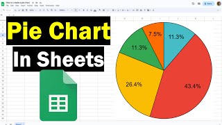
Creating a Pie Chart in Google Sheets
ฝัง
- เผยแพร่เมื่อ 29 ส.ค. 2024
- Learn how to create a pie chart using Google Sheets. To download the file used in this video, visit the following page: www.vertex42.c...
0:21 When Pie Charts are useful (and when not)
1:09 How to set up the data table for a Pie Chart
1:45 Make a Pie Chart using the Explore feature or Insert Chart
2:32 Customize your Pie Chart
Don't Forget to Subscribe! 😃
UPDATES: (2:17) Google sheets uses 3 dots "•••" instead of "More" to get to the other icons that aren't displaying. (2:21) The Chart Editor window has a new look and organization (with the "Data" tab changed to "Setup") but it's still similar enough to follow instructions. (3:44) When customizing a pie chart, go to "Pie Slices" instead of "Series."
FOLLOW VERTEX42 HERE:
Instagram: / vertex42
Facebook: / vertex42
Pinterest: / vertex42
Twitter: / vertex42
LOOKING FOR SPREADSHEET TEMPLATES? Start Here:
www.vertex42.com/


Thank you for helping me in my quest to be a spreadsheet ninja.
This has to be the finest instructive video for Sheets pie chart.
You could’ve just said it was helpful lol
really helped my on my school project i was so lost at first
U have no idea how much you helped me
Thanks so much
Super helpful for my school project.
same here
I just wanna know how to do it even though I never will.
Thank you very much! Very educational video, it helped me to understand everything so quickly!
I like how you didn't show how to manually do this, you just showed a shortcut instead of actually doing what the video title says you will be doing. Please rename this video accordingly so others are not wasting their time on this like I did.
Thanks!
EDIT: figured it out, but now I have a different issue. I have sorted my data according to the highest %. However, the pie slices are in seemingly random order. How do I order the pie slices? I can't find the option anywhere.
the vid starts at 1:11
You my friend, are a god among men
epic vid now i can teach epicly!!!
Thank you soooo much this was so helpful!!!
Thanks this really help me a lot.
Thank you! This was very helpful!
Thank you, this helped me a lot.
Thank you, very helpful.
Wonderful vid! Thank you!
also helpful for my school, thank you
THANK THE LORD FOR THIS VIDEO AAAAAAAAAAAAAAAAAAAAAAAAAAAAAAAAAAAAAAAAAAAAAAAAAAAAAAAAAAAAAA
Well done - thank you for the tutorial Vertex42!
What do you do if your data isn’t a percent
2:12 is a helpful time stamp... click that it doesn't need to be percent for it to work google auto fills
no clue why you skipped over the part of selecting the data from the sheet which has multiple columns
a pie chart from expoler suggestion - I love it! thx
actual video begins at 1:10 .
tutorial starts at 1:10
Please put bookmarks. First 80s is explaining what pie chart is and why is not necessarily what you are looking for...
Thanks. This was very clear and helpful.
sweet tutorial thanks a lot
can you rotate the pie?
like how?
how do u create a pattern fill on pie chart google sheet tho? it shows on the original ms. ppt but it won't show on google sheet
The title of your video is "Creating a Pie Chart in Google Sheets" but it is 2m15s before you start explaing how to do this, that's 50% waffle. This instruction/ video could be be 30secs long.
8:26
Google Sheets- Sort and Filters
Mike Kanfer
52K views
4:28
Making a Line Graph using GoogleSheets
MrsChampagne25
8.8K views
1:59
How to Create a Pie Chart with Google Sheets
Pamela Shoemaker
20K views
5:01
Vlookup in Google Sheets
Patrick Donovan
2.1K views
12:36
Google Sheets - Dashboard
SyncSisters
25K views
8:10
Google Sheets VLOOKUP from another Spreadsheet with IMPORTRANGE Tutorial - Part 7
Learn Google Spreadsheets
15K views
3:11
How to Make a Line Graph from Google Sheets
KnightBio1
37K views
6:10
Creating a Column Chart with Google Sheets
Tim Thompson
3.9K views
11:04
Google Sheets - Combine Data From Multiple Sheets (Tabs) Tutorial
Learn Google Spreadsheets
29K views
3:25
Calculating Percent in Google Sheets
Project IDEA
8.9K views
26:24
Google Sheets 2016 Tutorial
SyncSisters
148K views
3:41
How to create a progress chart in Google Sheets
Richard Byrne
27K views
18:42
Google Data Studio Tutorial - Create Dashboards Like a Pro
Loves Data
Recommended for you
27:44
Top 25 Excel 2016 Tips and Tricks
Sele Training
Recommended for you
6:15
Making a Simple Bar Graph in Google Sheets 12/2017
Maria Boulmetis
2.7K views
5:18
Making a Multi-Line Line Graph in Google Sheets
Maria Boulmetis
80K views
its good to have waffle to help those people that are new to the concept
How do you round off the percentage on a chart?
For some reason my label isn’t showing up on the pie chart any suggestions?
Thank you, this helped a ton!
How do you change the size of the pie slices?!
Thank you
anyone in 2023
Is there a way to customize the color of the line and percentage stretching outside of the pie chart? Both the line and the percent value seems to be automatically set according to the background, i.e. for white background they'll display as grey. I can't find a way to change font and color of those. On "Legend" only the label font and color can be edited.
the voice is vey low eventhough volume on 100
I have my volume maxed out on everything & I'm still struggling to hear what she's saying. Might want to redo the audio & increase the volume.
thanks. now i can make pac-man
Lil Snikrz 😜😂😂😂😂😂🤯
hahahahah im dead 😂😂😂😭
Anyone in 2024
How do i make the background transparent?
Click on your chart >> Customize >> Chart Style >> Background color >> None
OIIIIIIIIIIIIIIIIIIIIIIIIIIIIIIIIIIIIIIIIIIIIIIIII NAS COSTA
Not me at 10:34 making a pie chart-
Thank u
thanks lad
the tutorial starts at 1:09
Your welcome
Thanks. I modified the description to say 1:09 instead of 1:10.
You have got to be kidding me with this video. Are you sure you don't want to go over the origin of the pie?
THANK YOU!
your video is too quiet. I wish I could actually hear what you're saying
awesome
ඞ
👍🏼
this strait up doesnt work though
Adding or formatting labels is not correct.
thanku bb
This is outdated.
G-Sheets have been changed and now I don't know how to use charts all over again as if I was a newb. >:-(