One of the most disappointing features of the Theme Builder. It should be easier to make a header mimic the master heder we already use. Secondly, Divi should have built in CSS so we can just add a css class or classes to our header template to make them sticky, shrink etc. I have a feeling this turns a lot of folks off.
Couldn´t agree more I must say. I have been sitting here the entire (!!) day trying to make this header sticky and responsive. It jumps up and down on mobile, gets bigger although I didn´t change any settings, it sometimes opens on mobile, sometimes it doesn´t, especially not when I scroll down and the last menu items don´t show on mobile either. I am truly and really at the point of a nervous breakdown right now. This is WAY too user unfriendly!
@@traumafreetv2.082 Sometimes getting the padding and margins and stickiness to change from desktop to mobile can be tricky. It could be easier for you to have TWO headers, One is for the desktop and one is for mobile. Then you just hide and show them accordingly. This way for your mobile header you don't even need to worry what it looks like one desktop because it will be hidden and vise versa. I'm gonna start a YT series on Divi if you're interested.
@@KrisJolls Yes, please do, that would be awesome. And thanks for the advice about the two headers. I was actually thinking about doing this yesterday. So I guess I will spend a few hours MORE and do that. **sighs**
Could you please make a tutorial on how to make a header that goes from transparent to solid color when scrolling and combining it with the effect of resizing it
@@janetownley A developer actually. And so many sites used that function before the DiVi upgrade that's its an insult to website builders to be teased with with the new theme builder only to leave that out. Sure some can add CSS to bring that functionality back but it goes against the DiVi promise. When a product is upgraded its core features should come with the upgrade. I'd never put my customers or support staff in a position of having address that shortcoming after an upgrade with a customer. If you you can't see that I give up. 🙄
I understand where you're coming from @Patty but I still agree with the other guys on here. The Divi mission is to keep coding to a minimum. Therefore, when introducing the theme builder, it should have been possible to build the default header without resorting to the great hunks of CSS Mak is pasting in here. And this just handles the shrinking header - it hasn't even covered the "shrinking logo on scroll" which is also a part of the default header. Sorry Mak, Nick and the team - a bit more needed please :)
This is great.... but it screws up the iPad or Phone view as the menu is now stuck off screen over to the right. Why can't Wordpress / Divi accept that you want 2 different views on different size screens! If so, how... ?
Hi there! 😃 Please, go to the Module/Row/Section Settings > Advanced Tab > Position and you will find the z-index option there. Have a look at the screenshot: prnt.sc/1buerbc
i have lifetime subscription, the theme is the best i'v used , but with all that knowledge they put into the theme, they could not make better header and footer features? flatsome and other themes have better header and footer design.
It actually shows the code for me just under the menu. I'm not sure what is the problem. I've tried it with the fixed header enabled and disabled. For me, at least, I'm assuming there is something wrong in the code but I can't figure it out. I am adding the and tags. I've also tried just pasting in the code without the script and style tags. Any advice would be greatly appreciate. And on a personal note, I want to thank Mak so much because his videos are truly helpful, enlightening, and inspiring.
Show us the final product FIRST and then show us how .you got there. I had no idea what was going on because there was no rationale. Do this, do that. WHY?


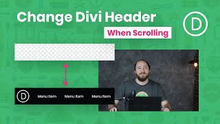


Skip to 11:00 if you want to actually see "How to Shrink Your Global Header’s Size When Scrolling with Divi’s Theme Builder"
One of the most disappointing features of the Theme Builder. It should be easier to make a header mimic the master heder we already use. Secondly, Divi should have built in CSS so we can just add a css class or classes to our header template to make them sticky, shrink etc. I have a feeling this turns a lot of folks off.
Couldn´t agree more I must say. I have been sitting here the entire (!!) day trying to make this header sticky and responsive. It jumps up and down on mobile, gets bigger although I didn´t change any settings, it sometimes opens on mobile, sometimes it doesn´t, especially not when I scroll down and the last menu items don´t show on mobile either. I am truly and really at the point of a nervous breakdown right now. This is WAY too user unfriendly!
@@traumafreetv2.082 Sometimes getting the padding and margins and stickiness to change from desktop to mobile can be tricky. It could be easier for you to have TWO headers, One is for the desktop and one is for mobile. Then you just hide and show them accordingly. This way for your mobile header you don't even need to worry what it looks like one desktop because it will be hidden and vise versa.
I'm gonna start a YT series on Divi if you're interested.
@@KrisJolls Yes, please do, that would be awesome. And thanks for the advice about the two headers. I was actually thinking about doing this yesterday. So I guess I will spend a few hours MORE and do that. **sighs**
Could you please make a tutorial on how to make a header that goes from transparent to solid color when scrolling and combining it with the effect of resizing it
Two steps forward and one step back. This should have been a native function like it was before the new theme builder.
I have never imagined such spoiled users! Wow!
@@janetownley A developer actually. And so many sites used that function before the DiVi upgrade that's its an insult to website builders to be teased with with the new theme builder only to leave that out. Sure some can add CSS to bring that functionality back but it goes against the DiVi promise. When a product is upgraded its core features should come with the upgrade. I'd never put my customers or support staff in a position of having address that shortcoming after an upgrade with a customer. If you you can't see that I give up. 🙄
I understand where you're coming from @Patty but I still agree with the other guys on here.
The Divi mission is to keep coding to a minimum.
Therefore, when introducing the theme builder, it should have been possible to build the default header without resorting to the great hunks of CSS Mak is pasting in here. And this just handles the shrinking header - it hasn't even covered the "shrinking logo on scroll" which is also a part of the default header.
Sorry Mak, Nick and the team - a bit more needed please :)
This is great thanks! Is it possible also to change the image logo for another logo when it scrolls but also shrink the size like this tutorial?
how i can make the mobile menu fullwidth in the custom header?
Shrink effect is at 11:02
On the Hamburger Menu, I saw a site that has a very nice little image that changes to another when it opens. How can I do that?
Bro looking swol! Keep it up
This is great.... but it screws up the iPad or Phone view as the menu is now stuck off screen over to the right. Why can't Wordpress / Divi accept that you want 2 different views on different size screens!
If so, how... ?
Hi, has the code for the scrolling effect changed as it doesn't seem to be working for me
Never mind found out why. Thanks for the tutorial, really good
Great! We'll be right here if you need any help. 😄
Hi, I don´t have the z index option, what can I do? Thanks so much for your tutorials as usual! Without them, I´d be lost regarding DIVI!
Hi there! 😃
Please, go to the Module/Row/Section Settings > Advanced Tab > Position and you will find the z-index option there. Have a look at the screenshot:
prnt.sc/1buerbc
@@elegantthemes Thanks so much!
It doesn't work in my custom header. Would be better if I wouldn't have to use CSS :(
@Mak what's happened to double and triple menu? The top one fixed or hide on scroll and middle one to shrink on scroll?
Awesome teacher, super awesome
You're welcome Ayesha! 😄
Can you make a full functioning LMS website with divi along with either tutorlms or lifterlms
Mark can I get a copy of jquery code
When you equalize Column Heights, is it a 100% of width or 100% of Max Width or both?
How to add a top bar above a menu which has the phone number address and social media icons
Why when I’m viewing my page the alignment of the menu in not on center?
i have lifetime subscription, the theme is the best i'v used , but with all that knowledge they put into the theme, they could not make better header and footer features? flatsome and other themes have better header and footer design.
I'm sure it's possible to change size of the logo by adding some css, but i don't konw how to do that :(
I am interested in that too (no answer :( ... )
Im getting a white div on the top of the page when i add the code, like its trying to show the code on the home page, anyone knows why?
It actually shows the code for me just under the menu. I'm not sure what is the problem. I've tried it with the fixed header enabled and disabled. For me, at least, I'm assuming there is something wrong in the code but I can't figure it out. I am adding the and tags. I've also tried just pasting in the code without the script and style tags. Any advice would be greatly appreciate. And on a personal note, I want to thank Mak so much because his videos are truly helpful, enlightening, and inspiring.
Great ! Thanks
You're always welcome! 😄
Wait til the end of the video before touching on what the title of your video is about why don't you!
Show us the final product FIRST and then show us how .you got there. I had no idea what was going on because there was no rationale. Do this, do that. WHY?
Put out some effort! Jeeeeeeeez
it never works
Interesting :)
It does not work!!!!
Our support team would be happy to help you with that! Just open a chat and the help is on its way. www.elegantthemes.com/members-area/help
Terrible result
Most irritating tutorial ever. you just needed to tell about code rather than explaining how various type of menus can be made.
First..
Jeeeez, you guys in the comments are demanding! 'Disappointing' - 'Why is it not exactly what I want' - 'Do I actually have to DO something?'