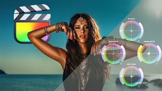
Colour grading LOG wedding films using FCPX - no LUTS
ฝัง
- เผยแพร่เมื่อ 2 ต.ค. 2024
- A quick step by step timelapse of how I achieve our wedding film colour grade in FCPX from S-LOG3 footage only using the Color Board, Color Curves and Hue/Saturation.
The wedding was shot at the Hunter Valley using a Sony A7SIII and the 50mm 1.2 GM on the DJI Ronin S.
Im shooting ProRes 422 to the atamos ninja using the waveform or false color for consistant exposure.
Whitebalance is set manually based on the scene, getting the white ballance accurate on the day will save many headaches in the editing room later.
When shooting I keep the skin tones around around 45-50% IRE on the waveform and usually keeping the whole scene around 25%-80% for the majority of the image (excluding specular highlights, lights, or the giant ball of gas in the sky, this is to ensure I have alot of dynamic range without clipping the highlights or the blacks.
I like to keep my footage muted, no harsh blacks, no bright highlights to emulate a more matt finish.
The last step in the process was to use a masking tool and select the skin, you want it to be laying on the skintone line of the Vector scope.
When editing also ensure to have the RGB overlay, this will show exposure and your colour values across the scene, keeping the blacks above 0% and the brightest light below 100%. As this was clowdy day as the storm came in, there were no complete highlights that needed to push beyond 90-95% as that is reserved for brighter light.
The end results kept the skin midtones around 55% this would increase if it were a sunny day. Another trick I use is the Luma vs Saturation and Saturation vs Saturation, I will roll them off to 0% in the highights and the blacks. This will mean that with the lumanosity in the brightest whites and darkest blacks will soften out for a more matte finish and same with the saturation. In the darkest and lightest saturated parts of the image, ive rolled them off too, so there are no strong colours. I leave the midtones in both as is.
The Orange vs Saturation is to taste, this is their skintones, I may need to adjust as I did in this, fake tans, hot faces etc can lead to the tones popping a little too much, so balancing that to the overall scene makes it look more natural.
With the Hue's I like to make adjustments to the yellow and orange to make the image pop more. The reds were increased for the bouqet, but its subtle, lips etc usually fall in this area, so be careful not to push it too much. The greens are brought down too so they aren't too fluro which can cause a distraction, this also gives more contrast between the subject and the overall image as Orange and Teal/Green are on opposite sides of the colour wheel.
The hues also get a slight work over too. The orange is where I adjust for skin tones, if the color grading has changed them or white ballance was off or there is colour cast, so a slight adjustment to that and green was brought down to make them more minty apposed to yellow.
The colour curves are to taste, that is just getting me the look I want for the overall image, these colours can be adjusted in the highlights, midtones and shadows, this is really affective in targeting paticular colours across the board, I do a similar thing with the colour board, except with the board you can be a little more selective of the colour you want to introduce with the shadows, midtones and highlights.
The Luma colour curve plays with the luma thats available 0-100. Making subtle changes that roll off nicely so there is no sharp contrast to the image.
Exposure in the Color Board just widens my luma value, all the detail thats in there needs to be expanded for a working image.
The Saturation in the Color Board, I usually drop the Shadows and Highlights by 5% so there is nothing too saturated in the dark and light areas, while the midtones are pushed right up to get color back into the image.
And thats it, one shot graded, probably takes around 10-20mins to get it like this.
MB01LBUC22I0QQK - ภาพยนตร์และแอนิเมชัน


Damn that's sooo cool🔥🔥
Thank you!
very cool! Thank you!!
Thank you too!
Please tell me you have LUTs !!!
Eeeep! We do not. But probably should create one. Every project I create is from scratch. I do kinda have a created Fcpx preset but I usually end up starting over again.
Yes I do understand that! Everything is always soooo different clip to clip!@@MomentsPhotographyFilm
Hi! Me again :) I was curious if you had any tips on how to get those creamy whites?@@MomentsPhotographyFilm
@@KCW-dv4sv 1. You want to expose for the highlights so to retain details in there, you don’t want to blow them out unless the are specular highlights.
2. Roll off the highlights in the luma so when you make an s-curve at the top right you want to bend off the tip so whites aren’t at 💯