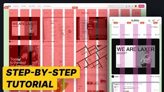
Hello Nikita! The widths of 1152px, 680px, and 320px for a container are derived from responsive design principles and the target screen sizes. These widths align with common design grid systems, such as the 12-column grid in Bootstrap. 1152px allows for a maximum container width for large screens (desktops). 680px is used for medium screens, like tablets in portrait mode and it's optimized for smaller content displays. 320px targets the smallest screens, such as smartphones in portrait orientation.


Simple, easy and organized, thank you very much for bringing this to us in a simple and succinct way!!!
This is well detailed and Top-notch. Very straight to the point and educative too, thanks Nick.
Best tutorial, all thew other top ones are just them talking for ages and not even explaining why they're doing it. Subscribed!
Your simple explanation helped me understand the grid system, thank you for sharing✨
Hey Nick! Thank you, it was very useful, you saved my life 😂
Can you make a video applying this grid to a responsive website?
As a product designer, what do you think about using a single grid of 12 columns in code for all web, tablet and mobile devices?
very clear 👍👍
Hi Nick! Thanks for making this video🙂
Pls explain how did you derive on container width ie.1152, 680 & 320px.
Hello Nikita! The widths of 1152px, 680px, and 320px for a container are derived from responsive design principles and the target screen sizes. These widths align with common design grid systems, such as the 12-column grid in Bootstrap. 1152px allows for a maximum container width for large screens (desktops). 680px is used for medium screens, like tablets in portrait mode and it's optimized for smaller content displays. 320px targets the smallest screens, such as smartphones in portrait orientation.
@babichnick Thanks! for the detailed explanation 😊
Wow! Very useful video, thank you.
Thanks, mate!
thank you
blocks are not aligned to the grid.
when you make vidoe, get yourself an app to show short cuts!
nothing new
Thanks, mate!