Responsive CSS Grid No Media Queries

ฝัง
- เผยแพร่เมื่อ 21 มิ.ย. 2020
- Profile Card Tutorial: • Responsive Profile Car...
New to CSS Grid? Watch the full Crash Course here: • CSS Grid Crash Course ...
In this video I go over how to create this Navigation Bar using only HTML and CSS. I show you the full front end coding tutorial, where I create the structure of the elements in HTML and then write all of the styling and effects with CSS. I use Flexbox for the layout and then add hover effects with a pseudo element.
Codepen: codepen.io/angeladelise/pen/g...
In this video I show you:
0:49 - Starting HTML Code
1:25 - CSS Code
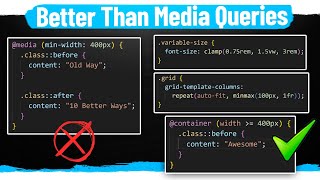
2:11 - Add Wrapper-Grid to CSS
2:36 - Grid-Template-Columns
3:15 - Repeat()
5:10 - Auto-fit
6:42 - Minmax()
7:11 - Autofit vs Autofill
Want to improve designer to development handoff? View my Sketch to Zeplin workflow here: www.youtube.com/watch?v=D3ZF2...
Let's Connect
Dribbble: dribbble.com/angeladelise
Blog: / angeladelise
#responsivecssgrid #cssgrid #responsivewithoutmediaqueries - วิทยาศาสตร์และเทคโนโลยี


![รวมเพลงลูกทุ่ง 6 หนุ่มไทบ้าน ฮิตติดกระแส ชุดที่ 1 l มนต์แคน ไมค์ ไผ่ เสถียร ไหมไทย พี [Longplay]](http://i.ytimg.com/vi/GD2v1OjMw5I/mqdefault.jpg)

This is exactly what I was looking for. I found many tutorials about grid but they were either overcomplicated or not doing what I need. 👍
Happy it helped!
@@angeladesign737 Kindly provide the source code
Thanks! this is what I've been looking for for hours. Very easy to understand and straight to the point.
That was the best explanation I've seen yet of css grid auto-fit vs auto-fill. Thank you!
After a year finally got a worthy channel where I can learn and understand concepts instead of observing tutorials!! Thanking you and wishing you a piece of good luck in future
Simple easy and clear in 10 minutes..I find your tutorial helpful than those videos who explained for 20+minutes which became boring the longer you watch
I must say you are a very hard working person that's why you have that precious knowledge you are sharing with us! I have gone through multiple solution regarding responsive grid, but they are not satisfying one.... thanks a million to save our time! Love from India❤
Thannnnnkkkkkssss! Straight to the point and simple, been looking for this for ages.
Beautiful, elegant and simple. Great tutorial!
Awesome tutorial!! I was looking for this. Keep it up!
Thank you so much... every other tutorials were just using the Media Queries but finally got what I was looking for.
Glad it helped!
Thank you for this video. You explained this better than my college professor did in a 1h30 class.
I can't like this enough, amazing videos!
Really like your videos, the process is much easier and clearer. thanks, a lot.
Thank you for creating this video!!!!!! I'm absolutely grateful!!!!😊
Short, Sweet & Enjoyable. TQVM Angela!!
Thank you!
I really like these snapshots. They are to the point and easy to follow along.
Thank you!
Well crisp and clear. Thanks a ton
Just what I was looking for! Thanks u!
Many thanks for this video. This is exactly what I wanted to find. Great explanation of the topic.
What a cracking tutorial! Thank you
Very clear and concise! Good job
Great tutorial! short and to the point.
Thanks! I really needed this. Kudos!
To the point and very well explained. Thank you!
Short video and very straight to the point. Like it!
Thank you so much!
Thank God you made this video, this was just what I wanted to know 😘
You are born for this 😁
How awesome you saved so much people
Just love this content. Thank you.
Thank you very much for the course... Plz don't stop the good work
Thank you! Happy it has been helpful
You saved my life with web designs.
Happy the videos have been helpful!
I know its hard to make a video and the process behind it but nobody explained better css grid than you did
.please continue making these videos it will serve you a greater purpose and tp your subscribers.. God bless u
Thank you so much for the kind comment!
The more i explore css grid, the more i realize that it can "auto-fit"my life ! thanks for the resourceful tutorial.
Happy it was helpful!
Love You Angela for this Super Awesome tutorial...This is what I needed for my project tomorrow...Thanks a Ton dear!!
Thank you so much for the comment! Happy it was helpful
Thank you. This helped me.
thank you soo much for explaining the auto fit and auto fill it helped me so much
thi is the exact thing i was looking for
Very well thought and tutorial
Very useful, thanks.
thank you for this vid, helps me understand better, with medie queries what min-width do you use for wide screen, desktop, laptop and phone screen sizes? thank you
This is amazing, thank you girl
Finally iget it thank you so much
Thanks ! simple and to the point.
Glad it helped!
Hi Angela I just 💕💕💕 your content. Awesome 👍👍👍👍
i'm dealing with that issue at the moment actually, used flex wrap for one of my elements, and have a few grid elements i was going to try using the container on, but i think i will use your method for the next element, using line and row names with custom properties and some carefully constructed mathematical statements can also provide a solution for responsive content, i just thought of something, i often put elements inside divs for css design purposes and one of my grid designs has a div using flex, i am going to convert to straight grid responsive, or try atleast, i have been designing a series on web design and i finally created something i think i could use as a good subject piece, i am planning on doing different variations, an early version of the series start is on github, but my new approach is much different, your video helped provide not only a solution to a current issue i have, but some good material for a video in my series, thank you, take care and God Bless
This is so helpful. Thank you so much!
Glad it was helpful!
amazing tutorial. It is really good explained and no complicated. Thanks :)
Glad it was helpful!
Nice tutorial😁
Amazing content and teaching method, not a word wasted, thanks and keep at it please.
Thank you!
excellently described
Thank you for this! I finally figured out what I was doing wrong using the repeat function. I had the body as display: flex to center the grid container vertically and horizontally, but that basically negates being able to allow a grid container to be fully responsive and caused me to need media queries. Does anyone know why this is? Also, since I cant use display flex in the body, how do i completely center a grid container in box axes?
Fantastic explanation series, thank you!
Glad it was helpful!
thank u for the awesome video, i have issues realated while applying this technique and getting the result i want. While applying auto-fit for 3 column grid, while resizing the the 3rd element falls from the row and always align to left. is there any possible way so that i can align it in centre?
Hi, I'm very thankful for every single minutes of yours, you have simplified very logical way, and it helps a lot all the beginners, although I would like to know the pattern of the e-commerce platforms which are inserted on the Facebook, does they're products are aligned with "grid-template-columns: repeat(auto-fill,)" in just one row, if so, I would be thankful to see how it was made.
Hi Angela! Great tutorial! Can you explain the minmax() a bit further? If I noticed correctly, I don't think the containers changed width at all when you expanded the window. Were the cards supposed to shrink and expand from 10rem to 20rem?
Amazing video. Such a simple way of teaching.
Thanks so much!
thanks for the tutorial
GREAT WORK !!!, you just save my day i only need someone who teach how to make good grids, this is to good to make producs with grid, im really thaks ! , my teacher will give me the best note of the class :)))
Thanks!
it is exactly to the point
Amazing content.
ok that works thank you, so which one is the best to use Media Queries or this method ?
Thanks!!! Great lesson!
Thank you!
Very helpful thanks
This in conjunction with Flexbox is insane!
What? Why?
@@kashmirtechtv2948 Insane in a good way, you can virtually layout anything, its great!
Love You ❤ !
When you have the time could you do a tutorial on fluid typography, I just like the way how you explain and implement these methods.
Great explanation. well done
Glad it helped!
Thanks Angela for this Tutorial.
May, I ask pls, is there any circumstance in which a grid-template-row setting will be needed, in addition to your grid-template-columns setting?
Make more vids 😅 highly appreciated!!
thank you !
Thanks, Angela for this video!!
Can we able to make an adaptive website with media queries??
thanks, this helped me
Glad it was helpful!
This is amazing! Thank you! you also gained 1 sub :)
Thanks!!! Thanks!!! Thanks!!!
Very Simply Very Best !!!!! More Best !!!!
Thanks!!! Thanks!!! Thanks!!!
easy to understand
Thanks A lot Angela.
Thanks for the comment!
This made my day:) This is exactly what I needed 7:03
u working awesome. Keep up the good work.
Thanks so much!
One a normal desktop view, how would you get one of those items to occupy the whole width?
just use max-width?
What if I want number of columns to not exceed 2 with auto-fit?
Cool!
first, Your voice is so cute ,also I want to thank you for this video
hello Angela thanks can you do another example with rem in grid? with the same example, because i saw in margin say 2 rem i dont understand so much
Great suggestion! Thanks!
Very well explained thanks
Thank you!
Would it work so nice with a logo and a navbar ()? Could you do a complete example as a whole website? I mean, no frameworks, just HTML and CSS. Thank you so much!
Wow Very Cool, New Subscriber...website by same user name, used this today...
Great 🎉
Good one 👍
Thank you!
Great Tutorials & Great voice.
Thank you!
i need a help madam. i want to set a menu with icon .but i can't do responsive it welly . i want hem in a line but they break down. what can i do?
hi, Can u make video tutorials on how we can make Website combining CSS Grid ,Flex & border Size with dropdown menu?
perfect
my css grid is not working properly with php database please tell me
Thanks
I LOVE YOU
This is brilliant. How old are you?
Very gud tutorial
Thank you!
There is one issue that is if the screen size will be more than 2500px these containes and contained text are looking very small.
Hi, I like your videos and they are super useful to anyone getting into css. Just one quick one, the link you specified in the description isn’t working. Thanks for your videos.
Thank you! I just fixed them, they should be working now!
@@angeladesign737 how have you fixed them?
Very nice video Angela. But in my experience, this technique is great for a card or gallery layout. But what about layouts like the Holy Grail? Can you get away without using media queries for those types of layouts? Thanks.
Hi Alex, I have not tried to create the Holy Grail layout with this method yet, but I agree it might be problematic. I have seen people use this technique for small content areas, such as for a card layout or navigation bar. For those examples I think this method works well, but for an entire page layout I would probably define the regular grid and only use this for smaller areas.
@@angeladesign737 Thanks Angela. Subscribed to your channel.
@@ajdrag Thanks Alex! I appreciate it!
Please teach us the different units: px,vh,vw,rem, em,... when are they using. Thanks for the time.
Thank you for the topic suggestion!
I briefly go over why I use em over pixels towards the end of this video: th-cam.com/video/eaU8Ml2a0So/w-d-xo.html