Create a Dynamic Excel Dashboard with Pivot Table and Chart

ฝัง
- เผยแพร่เมื่อ 17 ก.ย. 2024
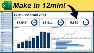
- Explore the power of data visualization with our latest tutorial: "Create a Dynamic Excel Dashboard with Pivot Table and Chart!" In this step-by-step guide, you'll learn how to transform your raw data into a visually appealing and interactive dashboard using Excel's powerful Pivot Table, Chart features and slicer.
Whether you're a beginner or looking to enhance your Excel skills, this video will cover:
- The basics of Pivot Tables and how to create them
- Tips for organizing and preparing your data for analysis
- How to design and customize charts for better data representation
- Techniques to make your dashboard dynamic and user-friendly
By the end of this video, you'll be equipped with the knowledge to create your own stunning Excel dashboard that can help you make informed decisions based on data insights. Don’t forget to subscribe for more Excel tips and tricks, and hit the notification bell to stay updated on our latest content!
#ExcelDashboard #PivotTable #DataVisualization #ExcelTips #ExcelCharts #MicrosoftExcel #DataAnalysis #ExcelTutorials #excel


I liked it. This is going to be very helpful in my recent work to present data. Keep it up. thanks
Thanks to watch and like.