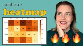
Python Correlation Heatmaps with Seaborn & Matplotlib
ฝัง
- เผยแพร่เมื่อ 8 ก.ค. 2024
- In this Python programming tutorial, we will go over how to create correlation heatmaps using Seaborn and Matplotlib.
Jupyter Notebook: github.com/groundhogday321/py... - วิทยาศาสตร์และเทคโนโลยี


![ภาพนี้ก็ฮาเหมือนกันนะเนี้ย #2 SS8 [ พากย์นรก MEME.EXE ] | easy boy](http://i.ytimg.com/vi/RMhUgxxD49Q/mqdefault.jpg)


this is one of the best tutorial have watched about heatmap,so easy to understand.
This is one of the best python tutorials on yt! I loved it how you explained the lines!!!!!
Glad it was helpful!
Thank you so much man.! I've been searching for a logical explanation as to how to read the heat map and yours is the only video that covers it. Kudos to you.!! Liked and subscribed 👍
Great to hear!
Quality tutorial. Concise and helpful.
After 4-5 useless videos on heatmap, this one was very good.
Best Video i've Ever seen on Co-relation.
appreciate your hard work
True! The best explanation. And this kind of snapshots (5:03) helps. Thanks again for this video. :)
wow this is awesome. Please make more tutorials
Some versions of Seaborn may use the size argument instead of the height argument.
seaborn.pairplot(cars_pairplot, size=1.5) vs seaborn.pairplot(cars_pairplot, height=1.5)
Thank you for this great tutorial!
Glad it was helpful!
simply awesome
thanks a lot, helped me nice :)
Really Nice
Thanks for the video, I really appreciate that!!
Glad it was helpful!
C-L-E-A-R . . Thanks !
Thanks
Awesome dude.. thanks a lot.
You're welcome!
thanks a lot.
thanks a lot
Very well explained sir 🙏🙏
Thanks
you can trim the upper triangle of the heatmap by using mask
How can we display only highly correlated feature on heatmap.for ex more than 0.6.
Greetings, may I ask if it is possible to correlate column A of dates or file names with numerical data in columns B, C, D, E and F?
Thanks. Can you provide an example?
@@RyanNoonan i don't have any example but i really would know if that's possible too, like have name of city with age of people something like this
For me, the colour coding is such, that blue goes from negative to +0.2, is there a way to make it end at 0.0, and red start from there instead?
Here are some ideas. You could create a custom colorbar and colormap and possibly use a color scheme which would allow you to specify specific ranges of numbers and their colors. A few colormap packages to check out include: matplotlib, palettable, colorcet, branca colormaps.
Really good explanation.. Can you please share me the python notebook of your class..
Thanks. I put a link to the Jupyter Notebook on GitHub in the tutorial description.