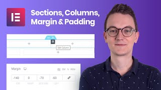
Modify the Header for the Mobile Responsive - Elementor Wordpress Tutorial

ฝัง
- เผยแพร่เมื่อ 30 ก.ค. 2022
- Modify the Header for the Mobile Responsive - Elementor Wordpress Tutorial
Hire us to work on your Website! info@websquadron.co.uk or visit websquadron.co.uk
Get Elementor Pro: be.elementor.com/visit/?bta=2...
Get Elementor Cloud Hosting: trk.elementor.com/bapnesbbfa9...
Support us: paypal.me/Websquadron
Mastery Membership: websquadron.co.uk/web-design-...
Indeed we're affiliated to them, but it helps to pay for resources to keep creating ace content for you :)
Equipment Used:
Softbox Lighting Kit (to focus main light onto me in a dark room): amzn.to/3feqH18
Soundproof Panels (to provide a dark setting, and prevent sound bounce): amzn.to/3HVfwqa
3m Ethernet Cat 7 Cable (to maximise the Internet Connection as the room is upstairs): amzn.to/3GlBvGw
Anker 6 in 1 Adaptor (for the Macbook Air to increase USB-C, USB-A, HDMI, Ethernet Ports): amzn.to/3tiukLA
USB-C to Lightning Port Cable (from my iPhone to my Macbook Air): amzn.to/3K2tGaU
Powerline Adaptor (boosts internet connection from downstairs 380mbs to the upstairs room 120mbs): amzn.to/3r8YcYc
Floodlights (positioned to glow onto the walls): amzn.to/33mRqWD
LED Light stands (either side of me): amzn.to/3Iaerez
Fifine Dynamic Microphone: amzn.to/3osbxu2
Floating Shelves: amzn.to/3Fhxyl1
Hanging Pendant Light Holders: amzn.to/3qgwnhg
Vintage Light Bulbs: amzn.to/3K0bQ8B
Music used:
Track: Will You Be Mine (Remix)
Free download: brokeinsummer.com/will-you-be...
Artists: brokeinsummer.com
Contact: brokeinsummer.com/help
Music provided by Audio Library Plus
- Get Elementor Pro here --- be.elementor.com/visit/?bta=2...
-- Of course, we're affiliated to them, but it helps to pay for resources to keep creating ace content for you :)
-- Book an Appointment/Consultation: calendly.com/info-28542
-- LinkedIn: / imran-siddiq-7320a74a
-- Instagram: / batswebsitedesign
-- Twitter: / imranwebsites
-- Facebook: / websquadrontraining
PS: websquadron.co.uk
PPS: Contact us at info@websquadron.co.uk
PPPS: We only build with Elementor Pro - แนวปฏิบัติและการใช้ชีวิต


Amazing video. Mobile headers always confused the heck out of me on how to make them work with desktop. It was the column % in the end. Thanks for making such an easy to follow video.
Thank you so much. This was exactly what I was looking for. Very thorough and easy to follow.
Really helpful finally found productive video thanks buddy
Thank you for this!
thanks for your help!!
Thank you!!! Excellent video
excellent very helpful thanks!
Finally! Thanks Imran
Thank you!
Thank you so much I'm facing this problem from 3 days
Thanks Mera Bai Love From Bangladesh
thank you so much
Excellent explanation, thank you
Do share the video (click the share button to get the right URL) and let the world know :)
thanks for this! solved many of my problems with this one vidoe
Do share the video (click the share button to get the right URL) and let the world know :)
my mobile preview looks good but completely different live on mobiles. My hero section has the vertical positions of the elements all wrong - how can i fix this?
You fixed the exact problem I had with my mobile view on my website. Thanks for the wonderful video.
Thank You
Good work sir. Problem solved.
Thanks for this! The only issue I'm having is when I've optimised for mobile and tablet with the hamburger menu to the right of the header, this causes the pages to also be on the right of the social buttons for the desktop... When changing the navigation order it changes all of them... how do I fix this?
This will depend on a lot of things in terms of content and how the columns or containers have been set up
How come the Mobile view in the editor doesn't match what I see on my phone? I'm working on the mobile header/menu. In the editor, it's properly placing the logo and hamburger menu on the same line (logo left and hamburger on the right) but on my actual phone, it's showing the logo in the center, and the hamburger on the right, but below the plane of the logo. I even set the mobile width of the editor to 412 (the width of my phone viewport) I even changed the display settings in my android phone to default for text, etc. What's the fix here? Very frustrating! Thanks for any suggestion
It may be determined by other width factors, so you'll need to adjust for that, or size them to be based on % rather than PX size.
@@websquadron I figured out the problem. On my phone, I was clearing the cache of the browser, and nothing was changing. well certain things were changing, which is why I couldn't understand why the rest didn't. Turns out I had to also clear "site settings" As soon as I did that and refreshed, then the layout was as expected. Thank you for the tutorial by the way!
How do you switch different menus between desktop and menu for tablet and smartphone? Because I'm seeing you have only one menu...
You have 2 and you hide them responsively
Thank you for this! So helpful. I have one problem: the header is showing properly on 3 out of 5 pages on my site (mobile view). Have any clues as to why this is occurring?
What's wrong on the other pages?
I think it was a cache issue. A few hours later all pages had the new header (yay!) Thank you for responding. I appreciate your time and energy.@@websquadron
how did you change the view to 378px ?
When you enter Mobile Mode, in the top right, you can change the 360 value.
Why does my text from my desktop keep overlaying the text on the mobile when I put in a new hero banner. Then I remove it from my mobile and it disappears from my desktop completely.
I need to see that. to check. - but that would be under 1-2-1 Consultation.
is this elementor pro or free version please? Ive tried fixing the mobile mode and it altered and wiped out my footer and header, i cant find the issue, and im getting blind, thanks for the video, but it doesnt work for all, Ive seen the elementor channel video expalining the same, but the mobile mode in wordpress doesnt show and it causes a lot of problems when you try to fix it...
This is EL Pro but you should see it unless you’re not using Hello?
I will check that huge thanks for your reply, I was able to fix the header and footer visibility but the mobile version still not working, i will contact you through email later to have your help thanks!
I have EL pro but whenever I change anything in mobile version it changes in the desktop too, it's so frustrating now😭
That will depend on how you're building it
On the money again thank you. Only issue is trying to convert your tutorial to encompass containers. Any chance of an update?
I'll make sure I update this soon
great video. is there a version from this video with containers?
Not yet, but I'll consider it.
Here, here!
but in flexbox its not working with mobile resposnsive with full width ? can you help me with issue
Depends on how you built it.
Thank you !!@@websquadron
can you tell me how to fix the toggle button shows the menu under the page section, it does not show up , it is hidden down,
Have you checked the Z index?
@@websquadron yes i did but nothing changes, do you have any other tip
i appreciate it and your content hs helped me a lot thankss
@@websquadron owww i just resolve it it was in z-index lol indeed
thank you very much man you are the best
My mobile header does not click on mobile phones... What could be the problem?
Deactivate any Elementor experiments and optimisation snippets etc and then check
Can this be done on free elementor
Yes you can check anything with EL Free, though you may need to use an alternate plugin for your Header.
is this pro version? iam having real trouble and wasted hours trying to make mobile navbar do anything useful
Yes, it's in the Cover Art, and I always advise that you should invest in Elementor Pro.
@@websquadron thx. I did manage to reduce the logo and align the hamburger in thr free version... I hate that u never know if u can or can't do certain things in elementor cos u might need pro version.
Lucky this time but still took me a day to figure it out.
Elementor doesn't always allow me to simply edit stuff... Firefox, Chrome, etc. In Mobile mode, it's insane... I can't click anything... clicking anywhere just makes it revert back to desktop/computer mode. When it works, it's awesome, when it doesn't... well....
Reach out here if you ever get stuck: facebook.com/groups/websquadron
all the changes made in desktop/tablet/molbile are affecting the layouts of the other modes
Did you build it with templates?
@@websquadron no did it manually
Why don't you work with the new containers?
Because they’re still in Alpha mode. We have done tutorials on it but I don’t want to lead people into a false sense of security because they may build a complex site and then regret it if the beta or final versions change things.
@@websquadron Ok, I get it. Thank.
MY mobile nav drop down does not show. I have deleted and followed step by step and I can not get it to show in live mode. The toggle box is there. However, when selected It doesn't show the nav menu
Have you regenerated the CSS and purged your site.
It could be due to many reasons and because I can't get access to your site - I can't be sure.
i really dislike the elmentor menu for mobile.. its so badly made... it should be out of the box slide left / right .. just like the popup you can make with it
No probs. It's just an example video showing the basics.