I don't have another question. I just wanted to thank you, Mark, for answering my question, and, more so, to thank you for making these terrific and informative videos. Based on the comments I've read on them, I'm not the only one learning a lot from them.
I really like your limited palet and this is once more a great demonstration of how sensitive and nuanced you can work from this palet. I use color as an abstract poetry or event a kind of music and vibrational feeling but in spite of a am nor a realist painter I have learned so much from you.🙏
I have painted in oils i got myself into a mess what i had near was a packet of baby wipes, the clean up was amazing particularly my hands i have used them on my brushes,not sure about that,thank you for putting so much wonderful content in your videos ,inspirational .
I just finished my first portarait painting using limited palette and I must admit I'm impressed about how easy is to mix colours and get the tone I need. Thank you for your insights.
Hey, Mr Carder! I guess I have seen at least 90 percent of your youtube tutorials, and they have been helpfull. Thank you. A few questions: What excites you the most when it comes to motives? The painting you love the most, is the one that you created out of your own imagination. How come you dont do more of that? How many years have you been painting actively/professionally? Do you ever paint with acryllics? Greetings from Norway
Awesome! Thanks so much! Very valid points. I prefer vivid colors in general, but that's part of my style, which is not hyper realistic. I will definitely try a more limited palette in the future to challenge myself further!
I just want to thank you. I know your channel thanks to Schafer. I love paint and, for a while want to learn how to pain. Buy some paint tubes, some brushes, tools and things to actually do. But, I was not comfortable to sit and just paint, until I meet this channel and listen to yours valuables lessons. I learn more from you than from the massive hours digging the contents on the matter in innumerous fonts. And for this, I am very grateful. I'm still working on get prepared for paint. Absorbing everything that I can from your words. Keep doing this incredible work sir. And I'm confident that, like me, many people will work to become an artist, inspired by you. I'm from Brazil, and I wish that the Geneva's paints would be accessible, but, ship (not available), the high value from the dollar in front of the brazilian currency (3/1). It's sad! I'm so impelled to seek the best in quality, and also run from fume and strong odors, since I'm allergic, those clover smell would be a dream. Im
Thanks for explaining the Zorn palette and helping me to see the benefits of a limited number of colors. While working I would lose track of the tones I started with and I'm going to try using the tips you shared
Old Holland Burnt Umber is very chromatic. It often needs to be attenuated. It is perfect for portraiture. When laid out in a value string (mixed with cremnitz white), it makes what women often call their "base coat" in applying their make up. It can be tweaked a bit with a red, yellow or a combination of these two (orange), you can arrive at good flesh tones. I also use it when making neutral gray, which is basically ivory black, a tot of burnt umber, and lightened with white. Often, as the string of neutrals lightens, it is necessary to add just a bit more burnt umber to kill ivory black's tendency to go toward blue.
Dear friends I don't know how to attach a picture of my palette here. But I wanted to share how fantastic the Geneva palette is. I'm working on a reproduction by Sargent and was just amazed by the potential and scale of what all I could mix with those 5 Geneva colors. And it's been over 3 weeks since I mixed and my palette is still wet!!
Love this series, thanks for doing them. Have you ever had an instance where you painted wet over dry? Where it was not possible/practical/or simple enough to paint wet on wet?
I have read a bit about palettes because, although I think of blue as a nice and favorite color, I never reach for blue when painting. Perhaps this is not completely true because I use Payne's Gray when needing a blue. I'm going to try this Zorn palette, which I have looked at before, because of the no 'pure' blue option. I do like the somber look of his paintings as well. Also, I have read that Sargent liked black and couldn't believe some of the Impressionists did not ever have black on their palettes. Thank you so much for these videos.
Switching out Vermillion for Cadmium Red can give your flesh tones more heat as well as amping up the whiteness in your yellow ochre. I find that works well for achieving a ' glowing ' illustrated look to the skin while staying within the Zorn palette more or less. Also adding a cobalt blue can help bring a whole new set of cools to your palette. The Zorn palette is great.
I will do realistic paints to learn, but, the most appealing paints to me is the ones done with the pallet knife. Although I like very much of Realism, and, thanks to you, i recognize the importance of artists like Sargent. Something about the sense of an unfinished look, a lacking of more details, the marks of the knife, in some of the paints even the glance of the canvas barely stained underneath, speaks strongly with me. Artists such as Tibon Nugy, Yuriy Ibragimov, Dorus Brekelmans, Alexi Zaitsev, Mike T. Liepke, Lindsey Kustusch, Andre Kohn and Gleb Goloubetski, are my favorites. Some of them, I just recently came across. I know that you, and some of those artists that I named only use brushes, but I will ask if you have any advice to give me on paint with the pallet knife. I will appreciate your words on this matter. Greetings from Brazil! Ps: Pardon my English isn't the best.
Thank you very much!!!!!! "paint what you love, paint something you are excited about it, paint like you want to do a masterpiece". Damn that's true. It's the same for drawings. I never been into art school, i learn by myself and it is hard. I spent two years copying images en photographs, read books etc... etc... I never been satisfyed because i didn't like what i was doing, but i thought it was an obligation to be into this process ... I never really enjoyed and pay attention to what i saw... So i quit for a year... Now i draw only by watching reallity, and if i have nobody to draw, i draw myself in a mirror, different angles, different lights, big mirors so i can observ my body (it's a little weird i know, but no choice...). And damn, i sometimes very pleased by the results, it's encouraging me to go ahead!!! Now i want to try watercolor.
I am a great admiror of your teaching. Its so clear and nuanced and the examples are always super inspiring. And I love your limited palet and your Geneva Oil colors - but unfortunately it was double as expensive as I had thought because of the tax ( I live in Denmark) - 🎶🌸🎵💗
Hi Mark, i live in Scotland and attend the www.academyofrealistart.co.uk we also work with the limited palette but of only three colours i use red umber, black and white, then i use the Zorn palette, then i just extend that with the blue, cad red and cad yellow. Your a Great inspiration thanks Gerry
Draw Mix Paint I hope so. I understand the grisaille part but the thin washes of transparent glazes is where I would love to see clarification. Thank you. Channel is awesome!
I tried painting in with your limited palette. I painted in my patio, in plein air. I tried to stay completely away from white and use the yellow to lighten. In the end I used very little white with color to accent. Even though it was plein air, I was pleasantly surprised how much easier it was to see and simplify. I will take your advise about fabric. I labor far too much on it. Thank you so much.
Thank you for your comments on painting fabric. You gave me the courage to try to paint fabric again. I have been painting with W&N water mixable oil colors and washed my brushes with soap and water. I would like to change to Geneva paints would I have to buy all new brushes? What would you use to clean the brushes when you use Geneva paints? Thank you for these Q & A videos.
Mark. I am a video filmaker (www.behance.net/alexruizpino) and I can tell you that your videos are very well done. That`s not common and not easy, but the most interesting fact is that you can encourage us to paint. Since a was child I´ve been painting and drawing uncontinuosly as a hobby, now that I am fifty suddenly I have the unexpected opportunity to paint as a project of life and in the way to do it You help a lot. Thanks. Alex Ruiz.
The team at Geneva is great. The man behind the videoes and editing is David Q. Carder. Mark and David make an exceptional duo! Perfectionists :) Very inspiring.
I've been oil painting on my own for a month now and your videos are truly amazing and they make me want to paint even more. I still have trouble when it comes to details. It's not that I can't achieve detail, more like I get lost in the process painting the details. For example, I'm doing my first self portrait with oil paint and when I got to my eyes before I could even realize it. I spent 3 hours trying to get them just right. Sorry for the long message but what kind of advice could you give to help me break that habit of trying to get EVEry single detail.
The deeper hue of most blacks is blue. It is important to know the type of black you are using... by using differently mixed blacks, (some companies use pigments that break down into cooler or warmer colors) It really varies, and so if your black is not based in ultramarine blue, or something close, you will get more of a brown when mixing yellow ochre into them, not green. Ventilation: when I first started, I lived in an apartment. I put a regular box fan in the window, and opened the window on the other side of the apartment. I only ran the fan when I was doing the block in at the beginning of the painting, and when cleaning up. The other times of painting do not fume up nearly as much. During the winter, I would periodically run the fan to freshen the air so I would not be in the extreme cold all the time.
@@j0nnyism That depends a lot what you are painting, european or NA trees tend to be more muted, but if you try to paint a south american forest.. it is much more vivid.
The strenght of the Zorn's palette is that you CAN'T mix every color. You are forced to concentrate on values and getting the color in the same ballpark, but not the same therefore the paintings look very realistic and all the colors are in harmony. I often see people overwork their painting by trying to nail every color there is spot on to the point it looks like a mess.
I am a beginner, but I feel that a limited palette will teach u how to mix colors. Definitely quicker as you dont have to keep up with so many colors . I know I'm going to begin working with limited palette. Cheaper also...
"Make this painting your masterpiece!..." I can only say amen to that. It is certainly the ONE thing that makes me enjoy making art. Otherwise it becomes a schlepp. In fact it ends up being the canvas or board I cover up next time. I really love watching your videos. And although I am an encaustic artist, a lot of what you say is transferable. I am seriously thinking of transferring your palette into encaustics. Do you think it would work in another medium?
I love this video. Ive tried 7 different reds , 4 different yellows , and 4 different whites. I honestly think to get his exact colors its : Flake White , Vermillion, Yellow Ochre, Ivory Black. The main thing is the Vermillion. You cannot get the same light beautiful orange pink flesh tone highlights with any other red. Also Titanium white is way to strong and is hard to tone down.
MIND BLOWN! My brain has been telling me to make a yellow ochre that I should add a little Burnt Umber to Cad Yellow. I never would have figured out that I should add Ultramarine, though now it makes sense. Do you feel like there are other similar color mixing misconceptions like this or is it really about asking yourself the right questions when mixing colors?
Timothy Thomas Yes, always match your value first, then ask the six questions, and you'll know what to do every time. Many of my students when they're first starting out know this rule, but don't actually go through all six questions. When they get stuck and ask me what to do, I make them ask each question one by one, and it always works!
@Misael Ortega he makes his own medium it consists of .....recipe for slow-dry medium (for all colors except titanium white): 10 parts odorless mineral spirits (any artist-grade odorless mineral spirits will do) 5 parts stand oil or linseed stand oil (this is viscous like honey and is not the same as refined linseed oil) 1 part refined linseed oil 5 parts Venice turpentine * 2 parts oil of cloves † recipe for slow-dry medium for titanium white: 10 parts odorless mineral spirits 1 part stand oil or linseed stand oil 5 parts refined linseed oil 5 parts Venice turpentine *
Good video! Glad I came across you. So leveling - is it basically adding some kind of medium so that the paint isn't too thick therefore creating grooves. But what if I want to see the brush stroke and use palette knife? Does that mean there is no texture to the paint layers?
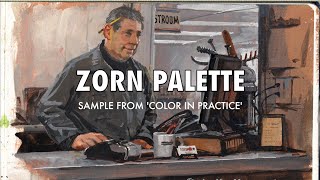
Drawmixpaint.com - Q & A episode 6 with Mark Carder : Zorn Limited Palette and more. Another very informative session. To submit questions, it is best to leave them under the current episode.In this case episode 6.
Hello,Mark. I'm a newby but love your lessons and techniques. You mentioned that you put your paint pallets in the refrigerator? To extend the paints workable time? You state that you're paints will stay workable for up to to weeks? Is that with using the fridge and or if not how much more time does the refrigerator give you? Sorry if I just haven't read more to see an explanation.
Can the geneva pallete be used to mix the very dark black skins of Africans? And can u upload more of ur paintings online. I really love ur painting style nd want to paint in that style
Hi Mark. I know that you suggest preparing a canvas with fast drying white and burnt umber, but a lot of artists simply stain their canvases with a fast drying turpentine wash with various colors added, and in this case that would be the burnt umber. Is this acceptable practice or are there problems or drawbacks in using this faster approach?
Mark, your method teaches using limited amout of colors to create a rather extensive palette of specific color groups. This, in my opinion, could cause two problems. 1. Starved palette - where you don't have enough of a specifically mixed color to cover the canvas as much as you need, [thus you need to stop painting and mix this custom color again} and 2 Excessive left overs - where at the end of the process you are left with a lot of custom paint that is no longer needed - thus there is a possible bit of waste of effort, and waste of paint. Can you tell us your thoughts about these potential issues?
Rich Westover For the Zorn colors I was just using some linseed oil to thin them down, because I was just doing a demo on the palette and didn't need all the properties I would if I was actually painting with them.
+Draw Mix Paint I purchased a Blue Ridge Artist sample pack of paints, but I think next time I am going to order the 5 color pack from Geneva. Hard to believe that all the colors can be made with those 5 paints.
Hello. I am color blind however deeply inspired by art. Can I just use and mix red ,yellow ,blue, black and white and get the results I want? I want to dive into traditional oil paint . What do you think will be the obstacles I face while doing so? Does mixing red blue yellow black and white give me any color I want? Or It doesn't work in traditional oil paint mediums that way like it does in digital medium ?
I'm not sure I agree with the idea of not doing studies. I usually do 6-8 months of commission work to earn me money for the year, and then head to an atelier for 6 months straight of studies. I get a lot better during the study period vs the final product period. The reason being when you do studies you specifically attack weak points and are forced to do things you need to do, whereas with your personal work, or professional work, you are doing what you are already used to. So I would personally from my experience advise my students to have a nice balance of study work and final work, as I have seen massive growth from studies
Hi Mr. Carder Thank you for posting your videos, they're very instructive and informative. I have some questions that you may use at your will, if they're pertinent to your Q&A series. 1. Are Geneva Oil Paints suitable for the amateur painter? 2. Can I mix Liquin (R) with Geneva Oil Paints? If possible, is it recomendable? 3. I'm an amateur "landscape painting", and maybe for painters like me a green option like Viridian (PG 18) or Chromium Oxide Green (PG 17) would be usefull to be in the limited palette. Please share your thoughts with us about green pigments. 4. I read somewhere that Ultramarine Blue has a lot of red in it. If so, could you please demonstrate to us how to get a pure blue sky color (like Cerulean PB35) with Geneva Oil Paints? 5. Do you use glazes in your paints? I appreciate very much glazing and indian yellow hues for sunrises and sunset paintings. How to get an indian yellow like color with cadmium yellow Geneva Oil Paint that is opaque? 6. What would be your recomendations for the average landscape painter using Geneva Oil Paints? (Besides trying to improve as a painter!) Thank you very much for reading and considering my questions to your Q&A series. Cheers! Natan Estivallet
Natan Estivallet 1- Yes, I think a limited palette is best for learning to mix colors and the ready-to-use nature of the paint is one less thing to deal with when first setting up. 2- I answered this in Episode 1 so check that out for my full answer. 3- I am going to be addressing this as part of the lesson in Episode 8 :) 4- Our ultramarine blue is not purply like some are, it is very "pure" blue, but cerulean is slightly green and I think it is barely out of reach of the basic essential palette, so if I wanted to match it I would probably need to very slightly boost the closest color I can get to it with a bit of phthalo blue or phthalo turquoise, which we are going to be selling soon as a "power color" for situations where you need extreme blue-greens and very intense light blues. Once we add the turquoise color to our line-up I will add a formula for cerulean PB35 to the formula list on genevafineart.com 5- No, I don't use glazing (I have a few times a long time ago but just to correct a color shift in a finished painting), but yes, you can get Indian Yellow. I will get a tube and demonstrate it sometime soon (I may reference this question for that), and I will also be doing a feature where I discuss glazing and my perspective on it in more depth sometime in the near future. 6- There are a lot of approaches you can take, but I have a full-length video on one approach if you want to check out the "Painting Landscapes" downloadable video on drawmixpaint.com :)
Draw Mix Paint Draw Mix Paint Hi, thank you very much for your answers, very instructive as all your contents around. For sure your landscape video is on my list of my next investments in oil painting. Cheers!
Thanks for these videos. They are very helpful!. My question is about opaque and transparent colors. If the paint is opaque, it is difficult to do glazing. If it is transparent, you would have to apply many times to cover the painting below. So I usually try to have a transparent and opaque version of each color. How do you conciliate these problems with your limited palette? Or is it possible to paint transparently or do a painting that simulate transparency using only your limited palette?
...Very informative video...just a question...what are the colors of you palette?...Is that a burnt sienna? ...A cad or lemon yellow?...They are not mentioned or listed?.
Of course this was first documented in Classical times described by Pliny the Elder as the palette used by Appelles 332-32x BC. The Nerdrum School still subscribe to it, but they are a dogmatic bunch. It does not compete with the substitution of a nice transparent burnt umber and Ultramarine blue instead of Ivory Black.
Is it better to add simple premixed gray to your color to make it less chromatic/ intense? Or adding the opposite color on the wheel works better? I usually add gray because for example, if i want to get a less intense red and if i add green to make that, it changes the HUE of my red instead of simply making it less chromatic as adding gray does...
Hello Mark: I sent this question previously but think it got lost in the shuffle. When oil paints are thinned as you instruct, is there a noticeable difference with paints of lower quality (eg. Georgian paints which contain a lot of fillers) compared to paints of higher quality (eg. Old Holland paints that are virtually all pigment and no filler)? Could you do a live demonstration to show everyone what the differences would look like? Thanks.
Hi Mark, thanks for sharing your really helpful and insightful videos! I have a few questions regarding the medium and levelling in the Geneva paints, and in fact for whenever such fluid paints/mediums are used: How can you achieve the sort of "dry brush" effect? Also, do you need to wait for the paint colours (not necessarily in different layers) to dry in between applications, so as to avoid everything becoming too smooth... does the levelling making the brush strokes blend in to each other? Thanks! Michael
Michael Jamieson Give me an example of the sort of "dry brush" effect you're going for. I have seen the term refer to a few different things. But regarding the leveling, it doesn't affect the way two colors blend together on the canvas.
I am almost out of the four colors that I use based on your palette and medium formula, and will wish to purchase the Geneva paint you now offer. My painting method is such that I want a faster drying time rather than have to wait days for the paint to dry. You add oil of cloves to your painting medium to slow down the drying time. Will you offer the option for purchasing the Geneva colors without the oil of cloves being added?
+John Clark ....if you want faster drying colours, you have three main options 1__use alkyds from CAS Pro, Da Vinci , Gamblin Fast matte , Winsor & Newton, and Archival Oils ( CAS Pro is my choice ). They all contain petrochemicals , so ventilate accordingly. 2__the best method.....check out Louis Velasquez at calcitesunoil.com and actually learn how the old masters really painted ( their paints were quick drying as they glazed a lot ) 3__add driers , however, you had better know what you are doing with these. check out Rob Howard for their proper use. He will help you cut through all the crap of art myths and get down to the nitty gritty. ciao now
Tom Cuff Watch the "varnishing a painting" video in my free video list on drawmixpaint.com, I show you the full procedure. I use Winsor & Newton's Artists' Gloss Varnish. For a demonstration of why I use gloss varnish instead of matte varnish, there is another video in the free video list on drawmixpaint.com called "gloss varnish vs matte varnish".
is it possible to use the geneva paint with the blemish method? have you ever applied thin layers of color to a finish painting to create color effects? is the geneva paint good for glazing?
Guillermo Novo The Flemish method and other layering/glazing techniques… I will address these in a future episode, but no, I don't ever use glazing for color effects etc. I have used it a few times in my career to fix color shifts in a certain area of a finished painting (let's say I painted the shadow slightly too blue, I can go back and add orange glaze to make it less blue), but I normally just paint alla prima. In Episode 7 I talk a bit about alla prima versus other historical methods.
Dear Mark, could you please describe how you follow Fat-over-Lean rule in your painting process? Many people describe it and use it in different ways. What is the right way? Thanks Oleg Litvak
OLEG LITVAK I mention this in Episodes 2 and 3, but basically you just need to make sure that if you are painting layers (wet paint over dry paint) that each successive layer has a higher oil content than the layer below it. So if you have three layers, the middle layer should have more oil than the bottom layer, and the top layer should have more oil than the middle layer. That's really all there is to it. If you are not painting on top of dry paint than you don't need to worry about it.
wonderful informativ video! But I have a question. There are many reds, blues, yellows. Which are the right ones for the limited palette? Cad red, ultramarine, Lemon yellow? Thank you.
Hi Mark, great video! How do you prepare or visualize working on a project that is not from a photo but rather from the imagination. For example, I wanted to paint a historical scene of Alexander the Great on a horse marching with his army by the Pyramids of Giza... I found a good reference photo for the pyramids, but how do I set up Alexander? How do imagine where the light is coming from... any techniques you can give us? Thanks!
Maybe that's why he chose those colours, no need for great restraint when you simply can't mix too many really strong colours with your limited palette?
ebutuoyjg There are different things that can help with leveling. First and foremost is simply thinning the paint down adequately, not just by mixing oil or medium into stiff tube paint as you go, but by thoroughly combining the two beforehand. Thinner more consistent paint will level better, so that's the main difference with Geneva. Secondly, some ingredients such as stand oil (linseed oil that has been polymerized) act a bit like honey and will help, however too much stand oil can also make the paint too "stringy", some colors more than others (ultramarine for example gets stringy quickly). Another ingredient that is widely used to adjust viscosity and other rheological properties in artists' paint is organoclay, which is found in many tube paints and which we use in small quantities with some Geneva colors to ensure consistent flow and leveling across the whole palette of colors, while also strengthening the long-term paint film.
Colour perception is such a personal thing (e.g.the " is it blue or green?" debate that often occurs). I love Zorn's brush style but find his colours dead and un-lifelike. For me they are missing the blue/green tones that underlie some many other colours. Adding just a pop of colour doesn't quite satisfy me. Plus I enjoy buying the pre-mixed colours - sometimes just looking at the colour is enough for me, without even using it in a painting 🤔😀
Just some thoughts, i can really imagine that Zorn didnt use blue coz of 2 reasons i could imagine, 1. it was too expensive or not available and 2. i can imagine it was simply kinda forbidden to paint with coz it was the colour of the "High Society".
Hi Mark, I'm from Asia. I'm really interested with your Geneva Paints. Is it possible we can order Geneva Paints? Do you ship here?I'd appreciate if you see this comment and reply :) Good day!
Does the lack of mineral spirits help Geneva paints dry more slowly? What is the purpose of mineral spirits/turpentine in paints, that can't be accomplished with additional linseed oil?
John Watson Mineral spirits are used to thin down paint because they will evaporate out, leaving paint without an excessive amount of oil and thus a strong structure. There are other ingredients (look up organoclay) which are widely used in modern artists' paints that in addition to rheological benefits can provide this structure or even better structure if properly incorporated, and that's why it isn't necessary in Geneva paint (also, clove oil evaporates completely too, just not as quickly as mineral spirits). So the reason we don't use mineral spirits is because they're toxic, while the drying time is adjusted for each color using only linseed oil (refined or cold-pressed depending on the pigment used) and clove leaf oil. We do not actually slow down the drying rate of all colors… for example, for titanium white, we speed up the drying rate by using 100% refined linseed oil and only using a tiny amount of clove oil (to keep the paint in the jar fresh and prevent it from forming skin).
6:04 - the most important thing: YOU CANNOT paint whatever you want with this limited palette, you need additional colors, that's all i wanted to know about Zorn palette.
I don’t think levelling is something worth worrying about. Just move a little. The zorn palette is great way to train yourself with colour mixing. Try to mix your colour slightly less vivid than you see it as the eye can make it pop more than it does in reality
Is it possible to achieve the kind of 'success' and 'fame' that artists like Sargent and Picasso accomplished. Those are wrong pursuits but I'm curious as to what kind of paintings make it to the museums in today's day and age! Aren't we on the mercy of the audience and the critics (as always).


![BOWKYLION - วิงวอน (ex-change) [Official MV]](http://i.ytimg.com/vi/cLdnZWDaO-w/mqdefault.jpg)

Just to thank you for free lessons. So great to have your expert help . I,ve followed you for years and am always thankful.
I don't have another question. I just wanted to thank you, Mark, for answering my question, and, more so, to thank you for making these terrific and informative videos. Based on the comments I've read on them, I'm not the only one learning a lot from them.
Another brilliant video. It's amazing what Zorn could do with so little, simplicity rules.
I really like your limited palet and this is once more a great demonstration of how sensitive and nuanced you can work from this palet. I use color as an abstract poetry or event a kind of music and vibrational feeling but in spite of a am nor a realist painter I have learned so much from you.🙏
I have painted in oils i got myself into a mess what i had near was a packet of baby wipes, the clean up was amazing particularly my hands i have used them on my brushes,not sure about that,thank you for putting so much wonderful content in your videos ,inspirational .
I just finished my first portarait painting using limited palette and I must admit I'm impressed about how easy is to mix colours and get the tone I need. Thank you for your insights.
Hey, Mr Carder!
I guess I have seen at least 90 percent of your youtube tutorials, and they have been helpfull. Thank you.
A few questions:
What excites you the most when it comes to motives?
The painting you love the most, is the one that you created out of your own imagination. How come you dont do more of that?
How many years have you been painting actively/professionally?
Do you ever paint with acryllics?
Greetings from Norway
Awesome! Thanks so much! Very valid points. I prefer vivid colors in general, but that's part of my style, which is not hyper realistic. I will definitely try a more limited palette in the future to challenge myself further!
I just want to thank you. I know your channel thanks to Schafer. I love paint and, for a while want to learn how to pain. Buy some paint tubes, some brushes, tools and things to actually do. But, I was not comfortable to sit and just paint, until I meet this channel and listen to yours valuables lessons. I learn more from you than from the massive hours digging the contents on the matter in innumerous fonts. And for this, I am very grateful. I'm still working on get prepared for paint. Absorbing everything that I can from your words. Keep doing this incredible work sir. And I'm confident that, like me, many people will work to become an artist, inspired by you. I'm from Brazil, and I wish that the Geneva's paints would be accessible, but, ship (not available), the high value from the dollar in front of the brazilian currency (3/1). It's sad! I'm so impelled to seek the best in quality, and also run from fume and strong odors, since I'm allergic, those clover smell would be a dream. Im
Thanks for explaining the Zorn palette and helping me to see the benefits of a limited number of colors. While working I would lose track of the tones I started with and I'm going to try using the tips you shared
Wonderful info Mark, thank you for sharing your knowledge!
Old Holland Burnt Umber is very chromatic. It often needs to be attenuated. It is perfect for portraiture. When laid out in a value string (mixed with cremnitz white), it makes what women often call their "base coat" in applying their make up. It can be tweaked a bit with a red, yellow or a combination of these two (orange), you can arrive at good flesh tones. I also use it when making neutral gray, which is basically ivory black, a tot of burnt umber, and lightened with white. Often, as the string of neutrals lightens, it is necessary to add just a bit more burnt umber to kill ivory black's tendency to go toward blue.
Richard Budig love this comment! Very helpful
Dear friends I don't know how to attach a picture of my palette here. But I wanted to share how fantastic the Geneva palette is. I'm working on a reproduction by Sargent and was just amazed by the potential and scale of what all I could mix with those 5 Geneva colors. And it's been over 3 weeks since I mixed and my palette is still wet!!
So glad you're doing these, really help, love watching, thank you!
Becoming one of my favorite content creators. 🙏🤝
Love this series, thanks for doing them.
Have you ever had an instance where you painted wet over dry?
Where it was not possible/practical/or simple enough to paint wet on wet?
I have read a bit about palettes because, although I think of blue as a nice and favorite color, I never reach for blue when painting. Perhaps this is not completely true because I use Payne's Gray when needing a blue. I'm going to try this Zorn palette, which I have looked at before, because of the no 'pure' blue option. I do like the somber look of his paintings as well. Also, I have read that Sargent liked black and couldn't believe some of the Impressionists did not ever have black on their palettes. Thank you so much for these videos.
Switching out Vermillion for Cadmium Red can give your flesh tones more heat as well as amping up the whiteness in your yellow ochre. I find that works well for achieving a ' glowing ' illustrated look to the skin while staying within the Zorn palette more or less. Also adding a cobalt blue can help bring a whole new set of cools to your palette. The Zorn palette is great.
I will do realistic paints to learn, but, the most appealing paints to me is the ones done with the pallet knife. Although I like very much of Realism, and, thanks to you, i recognize the importance of artists like Sargent. Something about the sense of an unfinished look, a lacking of more details, the marks of the knife, in some of the paints even the glance of the canvas barely stained underneath, speaks strongly with me. Artists such as Tibon Nugy, Yuriy Ibragimov, Dorus Brekelmans, Alexi Zaitsev, Mike T. Liepke, Lindsey Kustusch, Andre Kohn and Gleb Goloubetski, are my favorites. Some of them, I just recently came across. I know that you, and some of those artists that I named only use brushes, but I will ask if you have any advice to give me on paint with the pallet knife. I will appreciate your words on this matter. Greetings from Brazil!
Ps: Pardon my English isn't the best.
Thank you very much!!!!!! "paint what you love, paint something you are excited about it, paint like you want to do a masterpiece". Damn that's true. It's the same for drawings. I never been into art school, i learn by myself and it is hard. I spent two years copying images en photographs, read books etc... etc... I never been satisfyed because i didn't like what i was doing, but i thought it was an obligation to be into this process ... I never really enjoyed and pay attention to what i saw... So i quit for a year... Now i draw only by watching reallity, and if i have nobody to draw, i draw myself in a mirror, different angles, different lights, big mirors so i can observ my body (it's a little weird i know, but no choice...). And damn, i sometimes very pleased by the results, it's encouraging me to go ahead!!! Now i want to try watercolor.
I am a great admiror of your teaching. Its so clear and nuanced and the examples are always super inspiring.
And I love your limited palet and your Geneva Oil colors - but unfortunately it was double as expensive as I had thought because of the tax ( I live in Denmark) - 🎶🌸🎵💗
Fantastic instructional vid. The best part: "make a masterpiece", for yourself.
Love you man the way you explain things.....
thank you Mark, for a very informative video, I really appreciate it
Hi Mark, i live in Scotland and attend the www.academyofrealistart.co.uk we also work with the limited palette but of only three colours i use red umber, black and white, then i use the Zorn palette, then i just extend that with the blue, cad red and cad yellow. Your a Great inspiration thanks Gerry
Wow perfect matching .
Thanks Mark, this is awesome. So much to take away from this lesson. If you could break down Bouguereau, that would be over the top.
lonemapper I will probably do a feature on Bouguereau in an upcoming episode.
Draw Mix Paint I hope so. I understand the grisaille part but the thin washes of transparent glazes is where I would love to see clarification. Thank you. Channel is awesome!
I tried painting in with your limited palette. I painted in my patio, in plein air. I tried to stay completely away from white and use the yellow to lighten. In the end I used very little white with color to accent. Even though it was plein air, I was pleasantly surprised how much easier it was to see and simplify. I will take your advise about fabric. I labor far too much on it. Thank you so much.
Thank you for your comments on painting fabric. You gave me the courage to try to paint fabric again.
I have been painting with W&N water mixable oil colors and washed my brushes with soap and water. I would like to change to Geneva paints would I have to buy all new brushes? What would you use to clean the brushes when you use Geneva paints?
Thank you for these Q & A videos.
Mark. I am a video filmaker (www.behance.net/alexruizpino) and I can tell you that your videos are very well done. That`s not common and not easy, but the most interesting fact is that you can encourage us to paint. Since a was child I´ve been painting and drawing uncontinuosly as a hobby, now that I am fifty suddenly I have the unexpected opportunity to paint as a project of life and in the way to do it You help a lot.
Thanks.
Alex Ruiz.
The team at Geneva is great. The man behind the videoes and editing is David Q. Carder. Mark and David make an exceptional duo! Perfectionists :)
Very inspiring.
Kamlika Chandla Keep on. Congratulations. Thanks kamlika.
I've been oil painting on my own for a month now and your videos are truly amazing and they make me want to paint even more. I still have trouble when it comes to details. It's not that I can't achieve detail, more like I get lost in the process painting the details. For example, I'm doing my first self portrait with oil paint and when I got to my eyes before I could even realize it. I spent 3 hours trying to get them just right. Sorry for the long message but what kind of advice could you give to help me break that habit of trying to get EVEry single detail.
Reno Stehlik Watch the opening lesson in Episode 7, this is exactly what it's about :)
The deeper hue of most blacks is blue. It is important to know the type of black you are using... by using differently mixed blacks, (some companies use pigments that break down into cooler or warmer colors) It really varies, and so if your black is not based in ultramarine blue, or something close, you will get more of a brown when mixing yellow ochre into them, not green.
Ventilation: when I first started, I lived in an apartment. I put a regular box fan in the window, and opened the window on the other side of the apartment. I only ran the fan when I was doing the block in at the beginning of the painting, and when cleaning up. The other times of painting do not fume up nearly as much. During the winter, I would periodically run the fan to freshen the air so I would not be in the extreme cold all the time.
I think the point of the Zorn palette is automatic harmony, because you can't mix all colors
Even with the limited green you can use it well for landscapes. Many greens in nature are more muted than they appear to the eye
@@j0nnyism That depends a lot what you are painting, european or NA trees tend to be more muted, but if you try to paint a south american forest.. it is much more vivid.
The strenght of the Zorn's palette is that you CAN'T mix every color. You are forced to concentrate on values and getting the color in the same ballpark, but not the same therefore the paintings look very realistic and all the colors are in harmony. I often see people overwork their painting by trying to nail every color there is spot on to the point it looks like a mess.
You are a great teacher
I am a beginner, but I feel that a limited palette will teach u how to mix colors. Definitely quicker as you dont have to keep up with so many colors . I know I'm going to begin working with limited palette. Cheaper also...
Thank you for the usefull advice!! I've learned much. :)
"Make this painting your masterpiece!..." I can only say amen to that. It is certainly the ONE thing that makes me enjoy making art. Otherwise it becomes a schlepp. In fact it ends up being the canvas or board I cover up next time.
I really love watching your videos. And although I am an encaustic artist, a lot of what you say is transferable. I am seriously thinking of transferring your palette into encaustics. Do you think it would work in another medium?
I love this video. Ive tried 7 different reds , 4 different yellows , and 4 different whites. I honestly think to get his exact colors its : Flake White , Vermillion, Yellow Ochre, Ivory Black. The main thing is the Vermillion. You cannot get the same light beautiful orange pink flesh tone highlights with any other red. Also Titanium white is way to strong and is hard to tone down.
Frans Hals is also incredible in terms of a limited pallete
Not only that we two look similar I am surprised how close we think too.
great video, thanks
Hi Mark... What is your medium recipe for non-geneva colors (like you used in the the Zorn demo)?
Zorn also used cobalt blue. Thanks for the video
And green also
There were tubes of green all over his studio
@@nickfanzo I know. It's interesting how everyone assumes that was his only palette just based on that one painting. Funny
MIND BLOWN! My brain has been telling me to make a yellow ochre that I should add a little Burnt Umber to Cad Yellow. I never would have figured out that I should add Ultramarine, though now it makes sense. Do you feel like there are other similar color mixing misconceptions like this or is it really about asking yourself the right questions when mixing colors?
Timothy Thomas Yes, always match your value first, then ask the six questions, and you'll know what to do every time. Many of my students when they're first starting out know this rule, but don't actually go through all six questions. When they get stuck and ask me what to do, I make them ask each question one by one, and it always works!
What medium do you use to thin down the paints at 12:38. I'm still new to oil painting. There are alot of mediums It's overwhelming.
@Misael Ortega he makes his own medium it consists of .....recipe for slow-dry medium (for all colors except titanium white):
10 parts odorless mineral spirits (any artist-grade odorless mineral spirits will do)
5 parts stand oil or linseed stand oil (this is viscous like honey and is not the same as refined linseed oil)
1 part refined linseed oil
5 parts Venice turpentine *
2 parts oil of cloves †
recipe for slow-dry medium for titanium white:
10 parts odorless mineral spirits
1 part stand oil or linseed stand oil
5 parts refined linseed oil
5 parts Venice turpentine *
Good video! Glad I came across you. So leveling - is it basically adding some kind of medium so that the paint isn't too thick therefore creating grooves. But what if I want to see the brush stroke and use palette knife? Does that mean there is no texture to the paint layers?
Drawmixpaint.com - Q & A episode 6 with Mark Carder : Zorn Limited Palette and more. Another very informative session. To submit questions, it is best to leave them under the current episode.In this case episode 6.
The veiw when he looks back at the camera.. from the table-
SOMEONE paint that .
Can you dissect Odd Nerdrum's palette and technique?
Hello,Mark. I'm a newby but love your lessons and techniques. You mentioned that you put your paint pallets in the refrigerator? To extend the paints workable time? You state that you're paints will stay workable for up to to weeks? Is that with using the fridge and or if not how much more time does the refrigerator give you? Sorry if I just haven't read more to see an explanation.
What do u think of Leonardo Da Vinci's paintings. His use of sfumato,smooth brush strokes and technique as a whole in oil painting.Thanks
Can the geneva pallete be used to mix the very dark black skins of Africans? And can u upload more of ur paintings online. I really love ur painting style nd want to paint in that style
Hi Mark. I know that you suggest preparing a canvas with fast drying white and burnt umber, but a lot of artists simply stain their canvases with a fast drying turpentine wash with various colors added, and in this case that would be the burnt umber. Is this acceptable practice or are there problems or drawbacks in using this faster approach?
Thank you :)
Mark, your method teaches using limited amout of colors to create a rather extensive palette of specific color groups. This, in my opinion, could cause two problems. 1. Starved palette - where you don't have enough of a specifically mixed color to cover the canvas as much as you need, [thus you need to stop painting and mix this custom color again} and 2 Excessive left overs - where at the end of the process you are left with a lot of custom paint that is no longer needed - thus there is a possible bit of waste of effort, and waste of paint. Can you tell us your thoughts about these potential issues?
Rich Westover For the Zorn colors I was just using some linseed oil to thin them down, because I was just doing a demo on the palette and didn't need all the properties I would if I was actually painting with them.
+Draw Mix Paint I purchased a Blue Ridge Artist sample pack of paints, but I think next time I am going to order the 5 color pack from Geneva. Hard to believe that all the colors can be made with those 5 paints.
Can you do a video on portrait painting ? From beginning to end ?
Hello. I am color blind however deeply inspired by art. Can I just use and mix red ,yellow ,blue, black and white and get the results I want? I want to dive into traditional oil paint . What do you think will be the obstacles I face while doing so? Does mixing red blue yellow black and white give me any color I want? Or It doesn't work in traditional oil paint mediums that way like it does in digital medium ?
How mix and match dark tones with lighter while creating a realistic potrait or a landscape.
I'm not sure I agree with the idea of not doing studies. I usually do 6-8 months of commission work to earn me money for the year, and then head to an atelier for 6 months straight of studies. I get a lot better during the study period vs the final product period. The reason being when you do studies you specifically attack weak points and are forced to do things you need to do, whereas with your personal work, or professional work, you are doing what you are already used to.
So I would personally from my experience advise my students to have a nice balance of study work and final work, as I have seen massive growth from studies
Hi Mr. Carder
Thank you for posting your videos, they're very instructive and informative. I have some questions that you may use at your will, if they're pertinent to your Q&A series.
1. Are Geneva Oil Paints suitable for the amateur painter?
2. Can I mix Liquin (R) with Geneva Oil Paints? If possible, is it recomendable?
3. I'm an amateur "landscape painting", and maybe for painters like me a green option like Viridian (PG 18) or Chromium Oxide Green (PG 17) would be usefull to be in the limited palette. Please share your thoughts with us about green pigments.
4. I read somewhere that Ultramarine Blue has a lot of red in it. If so, could you please demonstrate to us how to get a pure blue sky color (like Cerulean PB35) with Geneva Oil Paints?
5. Do you use glazes in your paints? I appreciate very much glazing and indian yellow hues for sunrises and sunset paintings. How to get an indian yellow like color with cadmium yellow Geneva Oil Paint that is opaque?
6. What would be your recomendations for the average landscape painter using Geneva Oil Paints? (Besides trying to improve as a painter!)
Thank you very much for reading and considering my questions to your Q&A series.
Cheers!
Natan Estivallet
Natan Estivallet 1- Yes, I think a limited palette is best for learning to mix colors and the ready-to-use nature of the paint is one less thing to deal with when first setting up.
2- I answered this in Episode 1 so check that out for my full answer.
3- I am going to be addressing this as part of the lesson in Episode 8 :)
4- Our ultramarine blue is not purply like some are, it is very "pure" blue, but cerulean is slightly green and I think it is barely out of reach of the basic essential palette, so if I wanted to match it I would probably need to very slightly boost the closest color I can get to it with a bit of phthalo blue or phthalo turquoise, which we are going to be selling soon as a "power color" for situations where you need extreme blue-greens and very intense light blues. Once we add the turquoise color to our line-up I will add a formula for cerulean PB35 to the formula list on genevafineart.com
5- No, I don't use glazing (I have a few times a long time ago but just to correct a color shift in a finished painting), but yes, you can get Indian Yellow. I will get a tube and demonstrate it sometime soon (I may reference this question for that), and I will also be doing a feature where I discuss glazing and my perspective on it in more depth sometime in the near future.
6- There are a lot of approaches you can take, but I have a full-length video on one approach if you want to check out the "Painting Landscapes" downloadable video on drawmixpaint.com :)
Draw Mix Paint Draw Mix Paint Hi, thank you very much for your answers, very instructive as all your contents around. For sure your landscape video is on my list of my next investments in oil painting. Cheers!
Thanks for these videos. They are very helpful!.
My question is about opaque and transparent colors. If the paint is opaque, it is difficult to do glazing. If it is transparent, you would have to apply many times to cover the painting below. So I usually try to have a transparent and opaque version of each color. How do you conciliate these problems with your limited palette? Or is it possible to paint transparently or do a painting that simulate transparency using only your limited palette?
Andre Ohara I will answer this in a future episode, maybe Episode 8. I wanted to answer it in Episode 7 but ran out of time!
...Very informative video...just a question...what are the colors of you palette?...Is that a burnt sienna? ...A cad or lemon yellow?...They are not mentioned or listed?.
+fineartist They are all listed at genevafineart.com/color
Of course this was first documented in Classical times described by Pliny the Elder as the palette used by Appelles 332-32x BC. The Nerdrum School still subscribe to it, but they are a dogmatic bunch. It does not compete with the substitution of a nice transparent burnt umber and Ultramarine blue instead of Ivory Black.
When making color steps do you just add white once you have a good base color?
Is it better to add simple premixed gray to your color to make it less chromatic/ intense? Or adding the opposite color on the wheel works better? I usually add gray because for example, if i want to get a less intense red and if i add green to make that, it changes the HUE of my red instead of simply making it less chromatic as adding gray does...
Where would you place the ivory black on the color wheel?
Hello dear mark, is it possible for you to analyze skin tones with Geneva limited colors ? thank you so much
Amir Erfanian I answer a question that covers this in Episode 7. :)
Hello Mark: I sent this question previously but think it got lost in the shuffle. When oil paints are thinned as you instruct, is there a
noticeable difference with paints of lower quality (eg. Georgian paints which contain a lot of fillers) compared to paints of higher
quality (eg. Old Holland paints that are virtually all pigment and no filler)? Could you do a live demonstration to show everyone what
the differences would look like? Thanks.
Andrew Achmann Good question. I will do some kind of demonstration on this in a future episode.
Great video! Thanks!!! Your colors looks so vivid! What is your oil painting brand?
Geneva: genevafineart.com/collections/artists-oil-colors
Hi Mark, thanks for sharing your really helpful and insightful videos! I have a few questions regarding the medium and levelling in the Geneva paints, and in fact for whenever such fluid paints/mediums are used: How can you achieve the sort of "dry brush" effect? Also, do you need to wait for the paint colours (not necessarily in different layers) to dry in between applications, so as to avoid everything becoming too smooth... does the levelling making the brush strokes blend in to each other? Thanks! Michael
Michael Jamieson Give me an example of the sort of "dry brush" effect you're going for. I have seen the term refer to a few different things. But regarding the leveling, it doesn't affect the way two colors blend together on the canvas.
What type of red is that you are using?
Ivory black is warmer, payne's gray is cooler for Zorn's pallet
What is the perfect room temperature to paint in ??
I am almost out of the four colors that I use based on your palette and medium formula, and will wish to purchase the Geneva paint you now offer. My painting method is such that I want a faster drying time rather than have to wait days for the paint to dry.
You add oil of cloves to your painting medium to slow down the drying time. Will you offer the option for purchasing the Geneva colors without the oil of cloves being added?
+John Clark ....if you want faster drying colours, you have three main options
1__use alkyds from CAS Pro, Da Vinci , Gamblin Fast matte , Winsor & Newton, and Archival Oils ( CAS Pro is my choice ). They all contain petrochemicals , so ventilate accordingly.
2__the best method.....check out Louis Velasquez at calcitesunoil.com and actually learn how the old masters really painted ( their paints were quick drying as they glazed a lot )
3__add driers , however, you had better know what you are doing with these.
check out Rob Howard for their proper use. He will help you cut through all the crap of art myths and get down to the nitty gritty. ciao now
Hello Mark, do you mix your own varnish? If not, what brand do you prefer and how many coats do you apply?
Tom Cuff Watch the "varnishing a painting" video in my free video list on drawmixpaint.com, I show you the full procedure. I use Winsor & Newton's Artists' Gloss Varnish. For a demonstration of why I use gloss varnish instead of matte varnish, there is another video in the free video list on drawmixpaint.com called "gloss varnish vs matte varnish".
is it possible to use the geneva paint with the blemish method? have you ever applied thin layers of color to a finish painting to create color effects? is the geneva paint good for glazing?
Guillermo Novo whats the blemish method?
Guillermo Novo The Flemish method and other layering/glazing techniques… I will address these in a future episode, but no, I don't ever use glazing for color effects etc. I have used it a few times in my career to fix color shifts in a certain area of a finished painting (let's say I painted the shadow slightly too blue, I can go back and add orange glaze to make it less blue), but I normally just paint alla prima. In Episode 7 I talk a bit about alla prima versus other historical methods.
Dear Mark, could you please describe how you follow Fat-over-Lean rule in your painting process? Many people describe it and use it in different ways. What is the right way?
Thanks
Oleg Litvak
OLEG LITVAK I mention this in Episodes 2 and 3, but basically you just need to make sure that if you are painting layers (wet paint over dry paint) that each successive layer has a higher oil content than the layer below it. So if you have three layers, the middle layer should have more oil than the bottom layer, and the top layer should have more oil than the middle layer. That's really all there is to it. If you are not painting on top of dry paint than you don't need to worry about it.
Hi Why don't you use Cadmium red?
wonderful informativ video! But I have a question. There are many reds, blues, yellows. Which are the right ones for the limited palette? Cad red, ultramarine, Lemon yellow? Thank you.
+Fabienne78 I list all the colors I recommend in the supply list on drawmixpaint.com
+Draw Mix Paint ....what about sea greens__wouldn't you need some thing like a phthalo /prussian blue ?
Hi Mark, great video! How do you prepare or visualize working on a project that is not from a photo but rather from the imagination. For example, I wanted to paint a historical scene of Alexander the Great on a horse marching with his army by the Pyramids of Giza... I found a good reference photo for the pyramids, but how do I set up Alexander? How do imagine where the light is coming from... any techniques you can give us? Thanks!
Mark A Good question. I will get into this in a future episode.
Thank you Mark :)
color tone mixing ?
Maybe that's why he chose those colours, no need for great restraint when you simply can't mix too many really strong colours with your limited palette?
yes but when you say "you put some leveling into it" what is it that you put in? i know what leveling does but what is it that you put into the paint?
ebutuoyjg There are different things that can help with leveling. First and foremost is simply thinning the paint down adequately, not just by mixing oil or medium into stiff tube paint as you go, but by thoroughly combining the two beforehand. Thinner more consistent paint will level better, so that's the main difference with Geneva. Secondly, some ingredients such as stand oil (linseed oil that has been polymerized) act a bit like honey and will help, however too much stand oil can also make the paint too "stringy", some colors more than others (ultramarine for example gets stringy quickly). Another ingredient that is widely used to adjust viscosity and other rheological properties in artists' paint is organoclay, which is found in many tube paints and which we use in small quantities with some Geneva colors to ensure consistent flow and leveling across the whole palette of colors, while also strengthening the long-term paint film.
Draw Mix Paint got it. thanks for that
Mark I'm a student of Portraiture. Is there a rule of thumb with the middle where a shadow blends with a light plain, that colour in the middle?
mark H generally, from a traditional “academic” POV, it’s either green(oliveish or muted) or grey.
Also, it’s called a “dark halftone”.
Colour perception is such a personal thing (e.g.the " is it blue or green?" debate that often occurs). I love Zorn's brush style but find his colours dead and un-lifelike. For me they are missing the blue/green tones that underlie some many other colours. Adding just a pop of colour doesn't quite satisfy me. Plus I enjoy buying the pre-mixed colours - sometimes just looking at the colour is enough for me, without even using it in a painting 🤔😀
Just some thoughts, i can really imagine that Zorn didnt use blue coz of 2 reasons i could imagine, 1. it was too expensive or not available and 2. i can imagine it was simply kinda forbidden to paint with coz it was the colour of the "High Society".
Zorn had lots of blue and he was rich.
Greetings from Sweden.
Hi Mark, I'm from Asia. I'm really interested with your Geneva Paints. Is it possible we can order Geneva Paints? Do you ship here?I'd appreciate if you see this comment and reply :) Good day!
what is that leveling chemical that you put in your pants thank you are you talking about Linseed
Does the lack of mineral spirits help Geneva paints dry more slowly?
What is the purpose of mineral spirits/turpentine in paints, that can't be accomplished with additional linseed oil?
John Watson Mineral spirits are used to thin down paint because they will evaporate out, leaving paint without an excessive amount of oil and thus a strong structure. There are other ingredients (look up organoclay) which are widely used in modern artists' paints that in addition to rheological benefits can provide this structure or even better structure if properly incorporated, and that's why it isn't necessary in Geneva paint (also, clove oil evaporates completely too, just not as quickly as mineral spirits). So the reason we don't use mineral spirits is because they're toxic, while the drying time is adjusted for each color using only linseed oil (refined or cold-pressed depending on the pigment used) and clove leaf oil. We do not actually slow down the drying rate of all colors… for example, for titanium white, we speed up the drying rate by using 100% refined linseed oil and only using a tiny amount of clove oil (to keep the paint in the jar fresh and prevent it from forming skin).
6:04 - the most important thing: YOU CANNOT paint whatever you want with this limited palette, you need additional colors, that's all i wanted to know about Zorn palette.
I don’t think levelling is something worth worrying about. Just move a little. The zorn palette is great way to train yourself with colour mixing. Try to mix your colour slightly less vivid than you see it as the eye can make it pop more than it does in reality
black and yellow only turns green though
If you want to learn how to paint fabrics, just copy Jean-Auguste-Dominique Ingres fabrics.
@2:30...that would be called a "cartoon". lol
Why are your paints so expensive!
Cuz its quality is so good
well my question was not answered
Is it possible to achieve the kind of 'success' and 'fame' that artists like Sargent and Picasso accomplished. Those are wrong pursuits but I'm curious as to what kind of paintings make it to the museums in today's day and age! Aren't we on the mercy of the audience and the critics (as always).
Thank you!
I think Zorn used more colors then that.
Look at 1:59 you can see blue oil color.
m.th-cam.com/video/XV8ECRSdLAU/w-d-xo.html