Insightful Data Visualization Using ggplot2 in R (Ft.
ฝัง
- เผยแพร่เมื่อ 15 ธ.ค. 2024
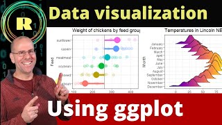
- This video explains how to draw insightful graphics using the ggplot2 package in the R programming language. The main speaker for this video is Albert Rapp, a Math PhD student, freelancer, and content creator.
Albert has recently launched a comprehensive online course on the topic Insightful Data Visualizations for "Uncreative" R Users. I highly recommend checking it out: arapp.thinkifi...
You may also have a look at this TH-cam channel. He provides great R programming content there: / @rappa753
In the video, Albert is mentioning a ggplot2 introduction video. You can find it here: • Beautiful Charts with ...
Follow me on Social Media:
Facebook - Statistics Globe Page: / statisticsglobecom
Facebook - R Programming Group for Discussions & Questions: / statisticsglobe
Facebook - Python Programming Group for Discussions & Questions: / statisticsglobepython
LinkedIn - Statistics Globe Page: / statisticsglobe
LinkedIn - R Programming Group for Discussions & Questions: / 12555223
LinkedIn - Python Programming Group for Discussions & Questions: / 12673534
Twitter: / joachimschork
Instagram: / statisticsglobecom
TikTok: / statisticsglobe


![[Live สด] การออกรางวัลสลากกินแบ่งรัฐบาล งวดวันที่ 16 ธันวาคม 2567](http://i.ytimg.com/vi/dNTiBBthKgQ/mqdefault.jpg)


I love all the memes in the videos. So eye-catching!
That's great, glad you like it!
Thanks for this, great help 🎉
Thank you so much Oscar, glad you found it helpful!
Hi buddy, thanks a lot for the great work I have learnt so much. And by the way, how did you set your R environment such that your graphs appear on a separate plane. In my case, all the graphs appear directly below the script which is a little inconvenience. I like the way your layout looks, how do I get the same?
That's great to hear, thank you so much for the kind comment. In RStudio, to arrange the panels so that plots appear in the bottom right, go to Tools -> Global Options -> Pane Layout, and then set the Plots pane to the bottom right position.
Where can the code for this video be found? Great content! ;)
Thanks for the kind feedback, glad you like the video! I have forwarded your request for the code to Albert, maybe we can find a way to make it available. I'll keep you updated. Regards, Joachim
Hey, Albert sent me this link: albert-rapp.de/posts/ggplot2-tips/19_example_charts/19_example_charts You can find all the code there. :)
Please do not speak so quickly. Thank you.
Hi Peter, thanks for the feedback! The speaking speed is always an issue. Some people prefer the speaker to be faster, others prefer it to be slower. Fortunately, there's the speed option in TH-cam videos, where you can decrease/increase the speed of the video. Have you tried this out already? Regards, Joachim
@@StatisticsGlobe Hi StatisticsGlob, thanks for the feedback. My English is not that perfect. And then when people speak fast, you can't always follow. I know that younger people speak fast these days. That's not a problem in German. Sometimes it is in English, depending on the speaker. But of course I adapt to your different audience.
Thanks Peter, we'll keep your feedback in mind!