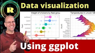
Learn to plot Data Using R and GGplot2: Import, manipulate , graph and customize the plot, graph
ฝัง
- เผยแพร่เมื่อ 29 ก.ย. 2024
- #ggplot2 #rprogramming #datavisulisation #tidyr #dplyr
In this video i explained the procedure to get publication ready plot.
Data import, data frame, how to understand the data in data frame, how to plot basic ggplot( scatter plot as example). how to add smooth line, adding labels - title, subtitle, caption, axis label, getting long table using pivot longer function, summarizing data using dplyr function summarize and gather, how to modify the code to get different plot types like boxplot, violin pot have been explained.
Facebook page:
/ rajendrachoureisc
Mail Id:
rajuchoure@gmail.com
youtube playlist:
• R programming tutorials
#Code used in this tutorial ( You can copy-paste from this downward.)
data file link : drive.google.c...
setwd("D:/Rworks/datatoplot") # Change working directory to directory where your data file is saved
getwd()
df = read.csv("polyphenolassay.csv")
df
summary(df)
str(df)
plot(df)
install.packages("ggplot2")
library(ggplot2)
ggplot(df, aes(conc,rep1))+
geom_point()+
geom_point(aes(y=rep2),color="red")+
geom_point(aes(y=rep3),color="green")+
geom_smooth(method="lm",formula=y~x-1,se=0)+
geom_smooth(aes(y=rep2),method="lm",formula=y~x-1,se=0,color="red")+
geom_smooth(aes(y=rep3),method="lm",formula=y~x-1,se=0,color="green")+
theme_classic()+
labs(title="Estimation of Polyphenol Content",subtitle="Folin Dennis Method",caption="Exepriment conducted as biochemistry lab",
x="Concentration of polyphenol in mcg/ml",y="OD795nm")
install.packages("tidyr")
library(tidyr)
df_long= pivot_longer(df,cols=2:4,names_to = "rep",values_to = "OD795")
df_long
str(df_long)
ggplot(df_long, aes(conc,OD795,color= rep))+
geom_point()+
geom_smooth(method="lm",formula=y~x-1,se=0)+
theme_classic()+
labs(title="Estimation of Polyphenol Content",subtitle="Folin Dennis Method",caption="Exepriment conducted as biochemistry lab",
x="Concentration of polyphenol in mcg/ml",y="OD795nm")
install.packages("dplyr")
library(dplyr)
I have removed the pipes as angled brackets are not allowed in description
df_summary= group_by(df, conc)
df_summary= summarise(df_summary, mean_OD795=mean(OD795))
ggplot(df_summary, aes(conc,mean_OD795))+
geom_point()+
geom_smooth(method="lm",formula=y~x-1,se=0)+
theme_classic()+
labs(title="Estimation of Polyphenol Content",subtitle="Folin Dennis Method",caption="Exepriment conducted as biochemistry lab",
x="Concentration of polyphenol in mcg/ml",y="OD795nm")
ggplot(df_long, aes(rep,OD795,color= rep))+
geom_boxplot()+
theme_classic()+
labs(title="Estimation of Polyphenol Content",subtitle="Folin Dennis Method",caption="Exepriment conducted as biochemistry lab",
x="Concentration of polyphenol in mcg/ml",y="OD795nm")
ggplot(df_long, aes(rep,OD795,color= rep))+
geom_violin()+
geom_jitter()+
theme_classic()+
labs(title="Estimation of Polyphenol Content",subtitle="Folin Dennis Method",caption="Exepriment conducted as biochemistry lab",
x="Concentration of polyphenol in mcg/ml",y="OD795nm")


Thank you sir , the video is really on point , thank you once again , you have rescued me
Thanks Nd glad that it helped.. please share my channel in your contacts.
Sir, is very nice presentation. Can u please show us how to prepare it with netcdf files. Thank you
I will. Very soon.
sir when the equation of the line is y = x-1 , then how is it passing through (0,0) ? The origin does not lie on the line . Am i misunderstanding what you said ? Kindly clarify
Sorry for the late reply as I was busy with other work. The formula y=x-1, tells R programming to fit the linear regression without intercept term, i.e. it forces the regression line to pass through zero. It is required in certain relationships where x= 0 has the corresponding y=0 like Bear and Lambert's law in spectrometry.
sir,..i want to see you plotting a bar graph that have x=conc and y axis to represent atleast two replicate,.
sorry for replying late. I didn't understand it at first glance. But when i started planning , it struck: x axis is concentration(numeric) and for bar axis Y needs to be numeric to be height. If replicates are required in Y, then the height must be summary of replicates, if continuous normally distributed reading we can use mean as height else median or mode. This can be done if you want to treat the x axis as a categorical to visualize pattern in Y. This can be done well using line plot, treating x as continuous axis. may be bit verbose, but hopefully , I am clear enough.
Sir whenever I type df = read.csv("filename.csv"). it says there is no such file in directory. what should I do now?
Set your working directory.
setwd("\path of file")
To see in which directory you are working
getwd()
Can I do the same thing using SPSS?
Yes, with a little steep learning curve if you are familiar with R. If not SPSS will help you to do it with little compromise on you expecations as it offers click based interface. R certainly provide more customisation opprtunity.
Thank you so much sir
Lewis Michael Thomas Cynthia Lee Sarah
Ty Nice vídeo greetings from Ecuador South America 😀😀
you have explained it very well :) please keep posting such stuff
Thanks you liked it. Please like and share my other videos also. It helps my channel to grow.
gge bi plot analysis is very interesting giving commands are of unknown lessons where to learn writing commands to R studio are there tutorials to standardize R pacakage thank you sir
THANK YOU SIR
This plots can't be published. I don't know any respected journal that would publish plots of replicates. You need to plot means, calculate an error metric like SD, and add it to the plot. Then it would be ready.
Also who plots 3 regression lines, one for each replicate? You need only one regression line for their means. 3 lines obscure the plot and doesn't make it publication ready.
These are exploratory plots. One cant learn publication ready plots without practicing a lot. These exploratory plots train to get publication ready plots.
Dear sir pls make vedios on GBbiplot and PCA analysis.....again requesting for data analysis for alpha-lattice design
I will ,very soon
Great sir. Waiting for many more videos like this.
Glad you liked it.
Great. Thank you very much @Rajendra!
Most welcome! so nice of you.
❤🔥
how to plot correlogram with only significant values represented in stars(*)?
Try This
library(corrplot)
#change the corrplot function
trace(corrplot, edit=TRUE)
M
best lecture.Thankyou
So nice of you
Thank you very much for sharing.
Great job
Excellent tutorial on ggplot2. thank you very much
Thank you very much. This appreciation will motivate me.
Best, thanks!❤❤❤❤❤
Thanks for appreciation.
Thank you very much
Glad you like it. Please subscribe , of yiu have not and share it with friends. Also watch my other videos also.
Awesome 👌, well structured, delivered and very informative 👏 👏
Thanks a lot for these good words.
One of the best introductory ggplot2 videos out there! Thank you, sir.
Thanks for the appreciation
Thank you man, you've saved my master thesis
Do watch my other videos also. Those are also useful.
Classic!!!
I want to plot result of mankendell test..
MannKendall() test from Kendall package will provide you kendalls tau and p value. You can visualise the trend by adding smooth line by loess to the timeseries plot. Using following code
plot(ts) lines(lowess(time(ts),ts), col='blue')
Wow....thank you so much
You are so welcome! Please share word about my channel.
Ecellent video on R
Thanks for the appreciation. Please do share with your contacts.
Thank you so much dear
Glad you liked it. Please watch my other videos also and share with your friends.
Thankyou
Glad that it helped. Please share with your friends.
Wonderful, thank you.
Glad you liked it. Please share with your friends do watch my otHer videos also.
@@DevResearch Sure sir.