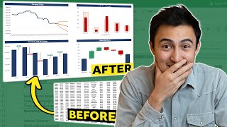
10 Advanced Excel Charts and Graphs (Creating from Scratch) | FREE Excel Course
ฝัง
- เผยแพร่เมื่อ 31 ก.ค. 2024
- In this video of this Free Online Excel training, I will show you how to use some tricks to create advanced charts and graphs in Excel.
The following advanced Excel charts examples are covered in this video:
-- Multi-Category Charts
-- Gauge Chart
-- Thermometer Chart
-- Milestone Chart
-- Water Fall Chart
-- Gantt Chart
-- Chart with Trend Arrows in Data Labels
-- Actual Vs. Target Values
-- Spotting Data in a Scatter Chart in Excel
-- Dynamic Target Line in Excel Bar Charts
There a lot of advanced charting technique shown in this video and you can use the same techniques to create more types of advanced charts in Excel.
In most cases, you will notice that an advance chart is nothing but a regular chart that is dependent on the cells in Excel. And these cells are dynamic as these have formulas.
☕ If you're the videos useful and would like to support me, you can buy me a coffee - www.buymeacoffee.com/SumitB
This video is a part of my Free Online Excel Training where I show you how to use Excel from the basics and also cover a lot of advanced topics.
You can find more details about this Free Excel Training + the download files here: trumpexcel.com/learn-excel/
You can also access the Full Excel Training on TH-cam here: • Getting Started with E...
Free Excel Course - trumpexcel.com/learn-excel/
Paid Online Training - trumpexcel.com/excel-training/
Best Excel Books: trumpexcel.com/best-excel-books/
⚙️ Gear I Recommend:
Camera - amzn.to/3bmHko7
Screen Recorder - techsmith.z6rjha.net/26D9Q
USB Mic - amzn.to/2uzhVHd
Wireless Mic: amzn.to/3blQ8uk
Lighting - amzn.to/2uxOxRv
Subscribe to get awesome Excel Tips every week: th-cam.com/users/trumpexc...
Note: Some of these links here are affiliate links!
#Excel #ExcelTips #ExcelTutorial


The living LEGEND, Sumit Bansal !!! You are a God among men to all techno-idiot, passing themselves off as Excel experts.....And as all great artists, underappreciated in their time. Cheers to you, old friend!
I smell a Hollywood movie contract coming soon.
Hi Sumit - Thank you for sharing your knowledge with us. God bless you 👏
thank you for these beautiful charts you're working on . you are making a really great effort teaching these charts!
Beautiful, beautiful charts!!! Thank you sooo much for sharing! Amazing job!!!!
Hi Sumit.. great lesson. I especially like the Dynamic Target Line Bar Chart. Thanks for sharing this video. Thumbs up!
Thank you so much for this technical support and I really appreciate
Some really smart charts here. Learnt a lot, let me see how I can apply these to some of my stuff.
This was Amazing, so much information in one video. Thank You💯
Thanks, i am already using few of them and few other than these
I have learned a lot from this Sir, thank you so much!
Thanks for all your effort Bro. Hope you get something out of this from YT.
great tutorial , thanks much for sharing!
Thanks! These are great. They are very useful and extremely well explained and demonstrated. I shall use these impressive charts of yours and take credit for them at my place of employment. 😀
Very nice way you are explaining, thank you sir.
Excellent tutorial. Worthy 50 minutes
Thanks for this lecture
Very helpful tips explained lucidly
Very useful. Thank you!!
Excellent tutorial. On my own, I would never have figured out how to make a gauge chart. Never.
thanks!, it`s very useful!
awesome video, need to practice these !!
very well explained, and quite creative
You are amazing Sir. Realey you are excel expert
superb, thank you.
Very nicely explained. It helped to improve my presentation slides.
Thank you so much bro for this
Excellent, mind blowing sir
Superb. Thanks
Hello,
the VLOOKUP for the ScatterChart (38:00) needs its range lookup parameter set to FALSE (exact match only).
Thank you Sumit for these great courses! I am learning so much :)
Thanks for the this course.
Thanks bro!
great tips
Hey! Can you please explain how you connected the Actual Value cell to the chart while making the speedometer chart? Thanks
Thanks for the explanation bro
Great sir
Blessed !!! ♥️
GREAT
Thank Samit, great video!! By the way, I have got a problem on Gant Chart (26:40): when I select all the data and then stacked bar, it shows me on the chart only the duration data and not the starting date as well. Any suggestions about the mistake I made?
you are excellent
Great efforts..
Very useful bro👍
Great.
Thanks
Could the milstone chart be done using pivot charts+ pivot tables?
align is not visible to me? what should i do
how did you connect the actual value to the needle?
Where can I find the practice workbooks ?
Is there a data file available please so we can work along with you?
38:54 Shouldn't company 4 have 2053 revenue and 4.2% profit margin?
Thanks for the tutorial! Just saying a Tomato is a fruit though not a vegetable
@Guy Parrotta Why the fuck would you do that its nothing to be proud of. Clearly a scam. And even if its not hacking peoples accounts isn't fun, its a criminal offence and the person you did that to is definitely no longer your friend cause thats not what mates do to each other.
@Bryant Maverick Whoa my ass. Your obviously his mate trying to tempt someone into a scam.
On the "Milestone Chart" when I enter the formula =IF(B3"".B3,"") I get an error. Everything looks the same as yours. I have no idea what is wrong.
There is a dot .. that's the error
Thousand likes
I used the NA formula but still getting that dot in my chart after deleting any cell
tomato is a fruit