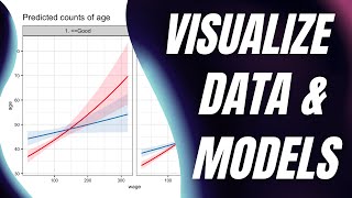
Beautiful Charts with R & ggplot2 (Step-By-Step Tutorial for Beginners)
ฝัง
- เผยแพร่เมื่อ 23 ก.ค. 2024
- FULL CODE AND DESCRIPTION:
DESCRIPTION:
ggplot2 is an incredibly powerful tool to create great charts with R. But it has a bit of a learning curve. This tutorial shows you everything you need to know to get started with ggplot in 45 minutes
FULL CODE:
The corresponding blog post to this video (including the full code) can be found at albert-rapp.de/posts/ggplot2-...
WANT TO GET EVEN BETTER?
You have started to learn the mechanics of ggplot. That's a great start. But if you want to create insightful charts, then you will have to combine ggplot with data visualization principles. If you're interested in that, then check out my video course at arapp.thinkific.com/courses/i...
LINKS TO THINGS I'VE MENTIONED:
🔗 Quarto: If you've never used Quarto files to mix texts and code chunks, then you can find all of that information about this incredibly powerful tool at quarto.org/
🔗 TidyTuesday: github.com/rfordatascience/ti...
🔗 Allison Horst: The idea to create an ugly chart to learn the mechanics first wasn't my idea. I picked that up from one of Allison's blog posts. You should check out here website (and her great educational cartoons) at allisonhorst.com/
MORE VIDEOS
📺 Avoid duplicate R code in 150 seconds • Avoid duplicate code w...
📺 Shiny modules in 100 seconds • Shiny Modules in 100 S...
📺 Fast explainer playlist • Explainer videos
Subscribe at 👉 / @rappa753
MORE CONTENT
- weekly 3-minute newsletter about R, DataViz and webdev at alberts-newsletter.beehiiv.co...
- LinkedIn at / rappa753
#rstats #dataviz #ggplot2
TIMECODES
00:00 Intro
00:30 First Chart
01:43 What the heck is aes()?
03:50 Why coordinates in aes() & scales?
05:07 Use a real data set
06:19 Set aesthetics to fixed values
07:20 Make color dependent on data
09:30 Avoid code repetition
10:12 Nicer labels & titles
10:58 theme_*() layer and font size
11:38 theme() function: using values for changes
12:50: theme() function: using elements
15:29: Try out scales
16:21 Our first bar chart
17:50 Statistical transformations
19:00 Trying to work with statistical transformation
20:30 Identical statistical transformation
21:20 Creating a histogram with a stat_* layer
22:40 Connection between stat and geom layers
24:10 Easier layers without touching stat
24:45 Add labels to bar chart
27:00 Formatting the labels
27:45 Change color of bars
28:40 Remove more duplicate code
29:40 Split histogram by sex
31:30 Change positioning of colored histograms
33:03 More position changes (dodge and jitter)
35:44 Use multiple windows for different histograms
37:00 Putting it all together with a new data set
44:20 How to learn more?
45:02 Shameless plug & outro


![ลักพาตัว เอาลูกเอิร์นกลับมา...!! [เอิร์นไดเม่]](http://i.ytimg.com/vi/f4NVKlZ5qkk/mqdefault.jpg)


If you want to get even better at ggplot and create insightful charts, then you can check out my video course arapp.thinkific.com/courses/insightful-data-visualizations-for-uncreative-r-users
dark mode + properly zoomed + logical well-paced instruction = straight in my faves
Glad that you like my style ❤️
@@rappa753 you are IMO an excellent teacher. Working my way through your content currently. Thank you for providing such high-quality material for free.
For a casual R user, myself, this is great. The video format, pacing, audio quality and everything; great.
Nice. So glad that you enjoyed it. I put a lot of thought into this one 🤗
Really grateful for this. This is a power packed video, informational and compact. Thanks again sir
You're welcome 🤗
Thanks for the really nice intro, I'll share it.
Personally, I'm a bit more advanced, currently learning how to expand the base package.
Thank you for sharing 🤗🥳
Though I've been using ggplot for few years I was still able to learn new things about scale x continuous and adjusting geom text. Thx
Btw, I think it would have helped newbies if you had shown 'group' parameter in geom line.. That's always needed in geom line and it's not very intuitive when you look at documentation
Nice! I'm always oddly happy when my beginner's content also has nuggets for advanced users 🥳🤗 As for the group aesthetic, that's true. This could have been an easy add-on 🤔
Very nice and helpful introduction to ggplot! Do you also plan to create such an introduction to data wrangling?
Glad that you enjoyed it 🤗 and yes, there's a lot of intros that I want to create in the next couple of weeks 🥳
how do i insert those bars on the left side of the R code
That's a setting in RStudio. It's called rainbow indent
Please how do I add the rainbow indent in R Studio?
I click on tools; then global option; then I click on code; then I click on Display then I check Use rainbow parentheses then I apply it but I cannot see those bars in which you have at the left. Please can you walk me through on how I can set this up ?
You're on the correct page. On the same page, you should be able to find "Indentation guides". In the dropdown menu select rainbow fills. If you don't see that in your settings, you might have to update your RStudio.