the idea of the different types of the primary colors (warm and cool) not mixing as you would expect with the opposite type of one of the other colors is something i really wish my current art teacher had started with because this was really helpful :)
I was surfing YT, and saw this! I have not even listened/watched it yet, but am I excited? YES! YES! Can't wait to take some time to watch. Getting ready today for 3 weeks of guests in the house. That too is exciting... Many Hugs and Kisses for this episode! Later sweet pea! BTW, when are YOU coming. . . . . is schussing ja'lls thang? Paula
Thank you very much, I've always had a hard time figuring out the warm/cool yellows because they all look the same to me! It helped to look at which secondary color it leans toward, instead of just calling it "warm" or "cool." I used different shades, since I was practicing with my Reeves water colors and they don't have the colors you chose. I finally recognized that the "medium yellow" is the warm one! Thanks again!
Thanks so much for the color wheel lesson. There is so much to learn! When I feel more comfortable using my watercolors I will then buy some tubes of paint so I can start mixing colors with the ones that you have suggested.
I did a colour theory course in college but they never taught us to mix the different cool and warm tones, only the primaries. Thank you for the extra info!
Thank you so much for this lesson Lindsay. I learned so much, and now I have my own homemade color wheel! Color theory is difficult for me; this helped enormously.
Hi Lindsay, Thank you for the video, that was very helpful, I have never understood the colour wheel that well before, but your help is always great, Cheers Anna.
Lindsay, this was the most awesome video I have seen. And it is exactly what I have been looking for. You are so awesome. Thank you so much for doing this.
OMG I was just thinking about this a couple of days ago! I wasn't one of the people that asked, but I feel like you read my mind. Thank you Lindsay!! ENJOY the weekend!
Great video Lindsay! I am going to make me a color wheel when I get back home, I will be home tomorrow so if I am not tired I will be back in my craft room. Thanks for sharing.
Great video lots of good clear tips on how to get the colors you want or how to mix them. I must say I really enjoy all your videos please keep making them because I have subscribed and I'm reblogging you on my tumblr so people can see your great technique and tips thanks again
Very helpful information! Thank you, I don't own a color wheel and have a good sense in my colors but when I go to mixing colors with my paint I get off colors. My problem has always been I never know what my colors lean toward cool or warm. For some reason I can't get that into my head but this is going to help. Thanks a bunch!
dear lindsay, hon you are great! i follow all your videos. love your frugality and your wisdom. i do not see the pdf link here to get your paint info for this vide. btw i Love that you made sap green and raw sienna which i need ! thanks so very much, peace from gracein Vermont... keep being you !
Thankyou sssooooo much for doing this. It will be valuable and helpful for me. I am eternally grateful. I have printed the basic supply list and save this tyo my watch later list so I can refer to it again.
Thank You Lindsay, I don't do craft pieces anymore but I enjoy watching all your art videos and always learn something valuable. I really enjoyed this color wheel video. I'm working with Inktense pencils and would like to pare down the numbers to a personal palette of about 15. I tend to use too many colors in my paintings.......not good, and I think using a smaller color palette would help. However, I'm having a hard time seeing my blues accurately. I can't always tell whether one shade is warm or cool. Inktense does not use traditional color names like Pthalo, Cerulean, cobalt or Prussian Blue. Help! Any suggestions?
Lindsey, I just bought a Windsor and Newton Professional Pan Set to begin with. But...am I just supposed to wet..and use..or do I have to do something to them first?
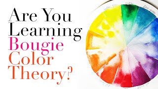
I'm confused. It appears that you mixed the warm blue with the cool red to make the vibrant purple. So, in that segment of your color wheel, a warm color is near a cool color. Then it seems that in the other two segments, the warm yellow is near the warm red (and they mix to make a vibrant orange), and the cool blue is near the cool yellow. Am I understanding that correctly? Can you help me understand why purple is made with a warm and a cool, but green and orange are made with two of the same (both warm or both cool)/
Marianne Vakiener I'm having the same problem with that. Seems to me that Ultramarine blue should be a cool blue, as it is further away from yellow and close to purple. The other blue is close to yellow, which seems like it should be the warm blue.
Marianne Vakiener think of it in terms of undertones and it will be clear, look for what the primary is closer too the cooler blue has more green undertones so it makes a brighter green with the cool lemon yellow. The warmer blue (warmed by the purple/red undertones) makes a better purple with the cooler red (cooled by the purple/blue undertones) try mixing and you will "feel" it.
thefrugalcrafter Lindsay Weirich Thanks! I am very left-brained and the intuitive things are hard to grasp sometimes. Trying out the color mixing myself is a much better approach than parsing every word. :-)
yep what I was going to suggest. No matter how many times I watch artists explain the warm/cool mixing, it still confuses me. Finally decided that maybe some day I'll understand but in the meantime it's best to just mix out my colors on a piece of scrap paper until I get the desired shade -- and then write down what was mixed to get that shade. It's weird... I can look at a color and easily identify the "undertone" and also have a pretty good guess as to how it will look when mixed with another color but... I can't ever identify it as "warm" or "cool". To me, the color wheel theory is backwards regarding how "warm" and "cool" are sorted -- but I know that is just me over-thinking it. So I try not to think about it too much, but pretending to ignore a theory bugs me even more because I like to know how every little thing works and I feel awkwardly stupid when something as easy as "warm" and "cool" confuses me so easily. If ANY of that makes sense to anybody, you deserve a prize. :D
I find that there are two camps about color mixing! One in the palette, and one on the paper! I find the on paper approach, quite exciting, because there are remnants of both primary colors at the same time and not a blaw one hue secondary! What is your call about both campy mixing techniques? Cheap Joe and Don Andrews have an on page WC mixing video, and palette techniques where you can have a mix of both without a blender-like blaw puddle....Also! In college, 1974 Watercolor class, I was nominated as the MUD-MASTER! Soooo...Now that I am 44 years older, I made a promise never to have an Umber, Ochre, Sienna, or Burnt anything on my Pallet! All my paintings will be screaming Magenta, Chartreuse, and Sunshine Yellow, and Galaxy Blue! What ever that is? Ha Ha! Sooo...I have Opera, Quin Fuchsia, Green Gold, Royal Blue, Gamboge Hue, and too many other unmixables in my 31 color palette to mention. If I want a Quin Magenta...Voila one squirt and away I go! Look MA! No Guessing!
Lisa Waitt think of which way the color leans, rather than a warm yellow you could call it yellow with orange undertones, what ever makes sence to you. Ask yourself what color does the primary lean towards and you will be all set:) Like both blues are rather cool but the purple based ones feel warmer than the green based ones. It is an instinct you develop!
luvmusic082300 I heard someone once say that the yellows remind you of the sun which is hot, so they would be warm colors. The blues remind you of the ocean which is cold, so they are the cool colors. That tip has helped me. So, like Lindsay said if it's leaning towards the yellow (sun) it's warm, if it's leaning towards the blues (ocean) it's cool.
Lisa Waitt Been painting over 20 years, suggestion is learn the color wheel, and the best way is to actually make one, it's a lot of fun and you'll learn what is warm, cold, and everything in between. Then look at things with color and think where does that color sit on the color wheel? Have fun... you'll never look at things the same way
TheMajalill you would use white to lighten a color if using oils or acrylics but you use water with watercolor. That creates a tint. You CAN add black and you get a "shade" however I prefer not to add black because it dulls and muddies color in my opinion.
Hi Lindsay, I have no experience in painting, and I am not quite getting this. Are you saying that the top left third of the wheel consists of warm colors, and the right third of cool colors? I don't understand what that makes the bottom third. You seem to just know if this is mixed with this, I get that, but I don't know how you know that. Is it a matter of memorization? I always thought all yellows, oranges, and reds were warm colors and all blues and greens were cool colors. I have a color wheel I just bought at Michaels a short time ago that says the same thing: The red violet through yellow and all those in between are designated as warm colors, and violet through yellow-green and those in between are all designated as cool colors. That's confusing me. Also, how do I know by looking at it if a yellow is a warm yellow or a cool one since this color wheel I bought and several others just designate all yellows as warm colors? Help!
Deirdre Powers warm and cool is not as important as looking for the undertones in a color, if you want to make orange pick the read that looks more like orange than the other, you are looking for undertones in a color. Use your instinct and practise. Basically we use two of each of the primary colors to make a range of brighter colors.
thefrugalcrafter Lindsay Weirich Thank you for being kind enough to answer my questions, Lindsay. I am beginning to think that at 66-years of age, I am too old to start trying to learn what most people knew by their teens. I will keep trying though thanks to your wonderful videos. Dee
If you haven't found it yet: look in the description under this video. It mentions her blog post on WordPress. Click that link. Once on that blog post, scroll down where it has a link for "supplies list". It's in blue. Click on that link to download. Hope this helps.
Jr M thanks it does! Sadly the pdf is not what I expected...thought it was going to be print out of the color wheel in the video and how to mix each color...that’s what I was really hoping for
One last question about warm or cool colors! Can I place Cool Sterno-Blue in my palette, and whenever I need a warm color, without any guessing, I can just mix any Primary or Secondary color with it, in its cool state, and then torch it and VIOLA! WARM COLORS from a cool STERNO!! Taa-Daa! Sounds good to me! In a very warm way! What'cha think? Oops...The voices are coming back! Duck!
This is a question I don't know where I should ask, so I hope you forgive me doing it here. PSX stamps are sold by several people on eBay. One person who sells quite a number of them says that, because the company is out of business, the stamps are angels and can be used to make and sell greeting cards and other projects made with them. I am assuming the designers of the stamps must have sold their copyrights over to PSX, but I don't know that for sure. If not, wouldn't there be designers who owned the copyrights and whose permission to use them would be necessary to obtain?. I can't find anyone that knows if any of this is true or any place where I can find out. Can you help?


Fve years on this is still helping people Llindsay! Thank you
the idea of the different types of the primary colors (warm and cool) not mixing as you would expect with the opposite type of one of the other colors is something i really wish my current art teacher had started with because this was really helpful :)
The best warm cool demo I have seen! Thank you
thanks!
I was surfing YT, and saw this! I have not even listened/watched it yet, but am I excited? YES! YES! Can't wait to take some time to watch. Getting ready today for 3 weeks of guests in the house. That too is exciting... Many Hugs and Kisses for this episode! Later sweet pea! BTW, when are YOU coming. . . . . is schussing ja'lls thang? Paula
Once again, after viewing a bunch of videos, Lindsay explains all of them. Eternal thanks!
Really appreciated this approach to the split colour wheel. Thank you
Thank you very much, I've always had a hard time figuring out the warm/cool yellows because they all look the same to me! It helped to look at which secondary color it leans toward, instead of just calling it "warm" or "cool." I used different shades, since I was practicing with my Reeves water colors and they don't have the colors you chose. I finally recognized that the "medium yellow" is the warm one! Thanks again!
Thanks so much for the color wheel lesson. There is so much to learn! When I feel more comfortable using my watercolors I will then buy some tubes of paint so I can start mixing colors with the ones that you have suggested.
How have I not seen this before? Yep! Super helpful, vital really for any beginner. Thanks Lindsay. Two thumbs way up.
THANKS LINDSAY! This was enlightening!
Absolutely vital information...thank you for teaching us.
Karen Erwin you're welcome:)
Thanks Lindsay. Very well explained.
You made this so easy to understand! Thank you!
I did a colour theory course in college but they never taught us to mix the different cool and warm tones, only the primaries. Thank you for the extra info!
Thank you Lindsay, this tutorial was very helpful. You're so generous and encouraging.
Thank you so much for this lesson Lindsay. I learned so much, and now I have my own homemade color wheel! Color theory is difficult for me; this helped enormously.
So much fun! Better than what I got at art school! Warm vs cool makes so much sense. Thank you!
Hi Lindsay, Thank you for the video, that was very helpful, I have never understood the colour wheel that well before, but your help is always great, Cheers Anna.
Lindsay, this was the most awesome video I have seen. And it is exactly what I have been looking for. You are so awesome. Thank you so much for doing this.
Thank you Lindsay for the video. I work with polymer clay, but they mix the same as paints, so this was helpful. Blessings.
Thanks so much for this very important tutorial!
your the best ....learned so much... thank you ..thank you ... linsey...hugs
OMG I was just thinking about this a couple of days ago! I wasn't one of the people that asked, but I feel like you read my mind. Thank you Lindsay!! ENJOY the weekend!
Great video Lindsay! I am going to make me a color wheel when I get back home, I will be home tomorrow so if I am not tired I will be back in my craft room. Thanks for sharing.
Great video lots of good clear tips on how to get the colors you want or how to mix them. I must say I really enjoy all your videos please keep making them because I have subscribed and I'm reblogging you on my tumblr so people can see your great technique and tips thanks again
ausetkmt thanks!
Very helpful information! Thank you, I don't own a color wheel and have a good sense in my colors but when I go to mixing colors with my paint I get off colors. My problem has always been I never know what my colors lean toward cool or warm. For some reason I can't get that into my head but this is going to help. Thanks a bunch!
Awesome video! Thank you so much!😊💗
Great info....this one makes so much sense!
TFS
Anita
Thanks, great demo. It really helps to see it as apposed to just telling someone. 😀
dear lindsay, hon you are great! i follow all your videos. love your frugality and your wisdom. i do not see the pdf link here to get your paint info for this vide. btw i Love that you made sap green and raw sienna which i need ! thanks so very much, peace from gracein Vermont... keep being you !
Thankyou sssooooo much for doing this. It will be valuable and helpful for me. I am eternally grateful. I have printed the basic supply list and save this tyo my watch later list so I can refer to it again.
Thank you so much for the basics! I for sure saved this video!
Love your tutorials you have helped me to learn watercolor and can you do more beginner ones animals and flowers and landscapes, love you to pieces
Thanks for giving me the specific names of the colors that go together.
thanks so much... it helped me a lot. and now evrythng is crystal clear!
Thanks for the info Lindsay! :) Have a nice weekend!
you're a magician! i don't use paints, but this was fascinating to watch!
Thanks for this very helpful video!
Excellent, thank you, Blessings
really enjoyed this tutorial, thanks for taking the time, avid fan of your channel thanks kaizer
Thank you happy Lindsay :)xx
Great info!
Thank You Lindsay,
I don't do craft pieces anymore but I enjoy watching all your art videos and always learn something valuable. I really enjoyed this color wheel video. I'm working with Inktense pencils and would like to pare down the numbers to a personal palette of about 15. I tend to use too many colors in my paintings.......not good, and I think using a smaller color palette would help. However, I'm having a hard time seeing my blues accurately. I can't always tell whether one shade is warm or cool. Inktense does not use traditional color names like Pthalo, Cerulean, cobalt or Prussian Blue. Help! Any suggestions?
Thank you, will need to keep this and watch a few more times, then play!!!
Thank you this is very helpful but I don't have the cad red and aliz crimson and phthalo blue if i use any orage red and blue red
will it work
Dot Imbro if I understand your question correctly it will:)
thefrugalcrafter Lindsay Weirich You are the best. thank you
Thank you Lindsay so Much!
Excellent demo on the color-wheel. I loved it.
Very helpful as i am a rank beginner--and need to learn which colors are warm/cool thanks Julierose
Awesome info. Thank you!
Thank you so much!!
I wish I had learned this years ago at school...
Lindsey, I just bought a Windsor and Newton Professional Pan Set to begin with. But...am I just supposed to wet..and use..or do I have to do something to them first?
Thanks for sharing
I'm confused. It appears that you mixed the warm blue with the cool red to make the vibrant purple. So, in that segment of your color wheel, a warm color is near a cool color. Then it seems that in the other two segments, the warm yellow is near the warm red (and they mix to make a vibrant orange), and the cool blue is near the cool yellow. Am I understanding that correctly? Can you help me understand why purple is made with a warm and a cool, but green and orange are made with two of the same (both warm or both cool)/
Marianne Vakiener I'm having the same problem with that. Seems to me that Ultramarine blue should be a cool blue, as it is further away from yellow and close to purple. The other blue is close to yellow, which seems like it should be the warm blue.
Marianne Vakiener think of it in terms of undertones and it will be clear, look for what the primary is closer too the cooler blue has more green undertones so it makes a brighter green with the cool lemon yellow. The warmer blue (warmed by the purple/red undertones) makes a better purple with the cooler red (cooled by the purple/blue undertones) try mixing and you will "feel" it.
thefrugalcrafter Lindsay Weirich Thanks! I am very left-brained and the intuitive things are hard to grasp sometimes. Trying out the color mixing myself is a much better approach than parsing every word. :-)
yep what I was going to suggest. No matter how many times I watch artists explain the warm/cool mixing, it still confuses me. Finally decided that maybe some day I'll understand but in the meantime it's best to just mix out my colors on a piece of scrap paper until I get the desired shade -- and then write down what was mixed to get that shade.
It's weird... I can look at a color and easily identify the "undertone" and also have a pretty good guess as to how it will look when mixed with another color but... I can't ever identify it as "warm" or "cool". To me, the color wheel theory is backwards regarding how "warm" and "cool" are sorted -- but I know that is just me over-thinking it.
So I try not to think about it too much, but pretending to ignore a theory bugs me even more because I like to know how every little thing works and I feel awkwardly stupid when something as easy as "warm" and "cool" confuses me so easily.
If ANY of that makes sense to anybody, you deserve a prize. :D
yay you get a prize Aldewyne! :D
If they were the same price... would you prefer m graham or daniel smith please
Very helpful, yes, thank you!
I find that there are two camps about color mixing! One in the palette, and one on the paper! I find the on paper approach, quite exciting, because there are remnants of both primary colors at the same time and not a blaw one hue secondary! What is your call about both campy mixing techniques? Cheap Joe and Don Andrews have an on page WC mixing video, and palette techniques where you can have a mix of both without a blender-like blaw puddle....Also! In college, 1974 Watercolor class, I was nominated as the MUD-MASTER! Soooo...Now that I am 44 years older, I made a promise never to have an Umber, Ochre, Sienna, or Burnt anything on my Pallet! All my paintings will be screaming Magenta, Chartreuse, and Sunshine Yellow, and Galaxy Blue! What ever that is? Ha Ha! Sooo...I have Opera, Quin Fuchsia, Green Gold, Royal Blue, Gamboge Hue, and too many other unmixables in my 31 color palette to mention. If I want a Quin Magenta...Voila one squirt and away I go! Look MA! No Guessing!
Thank you💎
Lindsay, I need your help. I need to make a sage green color and I am wondering if you could tell me the ratio of blue : yellow
Try lemon and ultramarine in equal parts and add water until you get the desired tone
@@thefrugalcrafter thanks
This is so helpful :) Tfs :)
Which kind of watercolor paints set are you using?
Bryan Flaherty m Graham & co, my personal fave
How do you get a feel for if a color is a warm color or cool?
Lisa Waitt think of which way the color leans, rather than a warm yellow you could call it yellow with orange undertones, what ever makes sence to you. Ask yourself what color does the primary lean towards and you will be all set:) Like both blues are rather cool but the purple based ones feel warmer than the green based ones. It is an instinct you develop!
Thanks so much for this video. I have the same question, how do you know if it's a cool or warm color?
luvmusic082300 I heard someone once say that the yellows remind you of the sun which is hot, so they would be warm colors. The blues remind you of the ocean which is cold, so they are the cool colors. That tip has helped me. So, like Lindsay said if it's leaning towards the yellow (sun) it's warm, if it's leaning towards the blues (ocean) it's cool.
Lisa Waitt
Been painting over 20 years, suggestion is learn the color wheel, and the best way is to actually make one, it's a lot of fun and you'll learn what is warm, cold, and everything in between.
Then look at things with color and think where does that color sit on the color wheel?
Have fun... you'll never look at things the same way
Excellent question Lisa as I have problems with that too! Thanks for having the courage to ask....me 'chicken little' LOL!
Helpful video! But what happens when you add black and white? :)
TheMajalill you would use white to lighten a color if using oils or acrylics but you use water with watercolor. That creates a tint. You CAN add black and you get a "shade" however I prefer not to add black because it dulls and muddies color in my opinion.
Very useful. Thanks
Thank you, thank you, thank you!
Hi Lindsay, I have no experience in painting, and I am not quite getting this. Are you saying that the top left third of the wheel consists of warm colors, and the right third of cool colors? I don't understand what that makes the bottom third. You seem to just know if this is mixed with this, I get that, but I don't know how you know that. Is it a matter of memorization? I always thought all yellows, oranges, and reds were warm colors and all blues and greens were cool colors. I have a color wheel I just bought at Michaels a short time ago that says the same thing: The red violet through yellow and all those in between are designated as warm colors, and violet through yellow-green and those in between are all designated as cool colors. That's confusing me. Also, how do I know by looking at it if a yellow is a warm yellow or a cool one since this color wheel I bought and several others just designate all yellows as warm colors? Help!
Deirdre Powers warm and cool is not as important as looking for the undertones in a color, if you want to make orange pick the read that looks more like orange than the other, you are looking for undertones in a color. Use your instinct and practise. Basically we use two of each of the primary colors to make a range of brighter colors.
thefrugalcrafter Lindsay Weirich Thank you for being kind enough to answer my questions, Lindsay. I am beginning to think that at 66-years of age, I am too old to start trying to learn what most people knew by their teens. I will keep trying though thanks to your wonderful videos. Dee
I 'feel' ya Deirdre....at almost sixty, but it's fun and relaxing so WE will keep going!
Thanks
can you do a painting tutorial for a german shepered (there a kind of dog)(police dogs)
Is the bottom third of the circle cool colors? Thanks
I couldn’t find the printable sheet for this video. Could someone point me in the right direction? Thanks!
If you haven't found it yet: look in the description under this video. It mentions her blog post on WordPress. Click that link. Once on that blog post, scroll down where it has a link for "supplies list". It's in blue. Click on that link to download. Hope this helps.
Jr M thanks it does! Sadly the pdf is not what I expected...thought it was going to be print out of the color wheel in the video and how to mix each color...that’s what I was really hoping for
One last question about warm or cool colors! Can I place Cool Sterno-Blue in my palette, and whenever I need a warm color, without any guessing, I can just mix any Primary or Secondary color with it, in its cool state, and then torch it and VIOLA! WARM COLORS from a cool STERNO!! Taa-Daa! Sounds good to me! In a very warm way! What'cha think? Oops...The voices are coming back! Duck!
This is a question I don't know where I should ask, so I hope you forgive me doing it here. PSX stamps are sold by several people on eBay. One person who sells quite a number of them says that, because the company is out of business, the stamps are angels and can be used to make and sell greeting cards and other projects made with them. I am assuming the designers of the stamps must have sold their copyrights over to PSX, but I don't know that for sure. If not, wouldn't there be designers who owned the copyrights and whose permission to use them would be necessary to obtain?. I can't find anyone that knows if any of this is true or any place where I can find out. Can you help?
Deirdre Powers PSX was an angel company when it was in business so it should still be so.
you can get a brighter purple if you use rose but it does not matter
Lindsay! Do You have an Art Amino account?
it is a mobile app, which I recently discovered, and so far it's been great!
If You'd like- try it out :)
If you color in any medium you can see how you will never need more than a few to get what you need. Saves a lot of money. Sorry copic friends.
Sorry prussian blue or cobolt.
The wheel looks kinda like a bear🐻
"Yellow and Blue do not make Green"