Glad you enjoyed the video. On a side note, TH-cam has cancelled my partner program since I don't have enough subscribers, so it would really help if you subscribe (and all your friends) 😉
Not sure how to actually add them in the histogram and also still showing the frequency densities, think it becomes messy and usually a chart is there to clarify results. Petry and Friesen (2012, p. 20) even argue that cumulative frequency densities are pointless. If you insist I'd think to divide the cumulative frequency then by the total class with, starting with the lower bound of the first category and ending with the upper bound of the category for which you want the cumulative frequency density. Reference Petry, R. G., & Friesen, B. (2012). STAT 100; Elementary Statistics for Applications. Campion College. amberlin.asuscomm.com/university_of_regina_copies/stat_100_lecture_notes_v2/intro_stats_v2.pdf
For my specific case, I am working with sieves and powders, so my data values don't numerically conform with the bins. I have intervals of sieve sizes, then the amount of powder in mass that is left behind. See below: sieve size (um) : 1000, 710, 500, 355, 250, 180, 125, 0 granule mass on sieve mesh (g) : 0, 0, 1.32, 10.35, 11.12, 13.09, 8.47, 5.61 frequency (g/um*100): 0, 0.62 7.13 10.59, 18.7, 15.4, 4.48 As you can tell, I can't really make excell see that 10.35 fit 355-500 for example, I am not sure what to do. Those are the frequency calculations as well. Any help would be greatly appreciated on how I can make a histogram of that data (size on x-axis and frequency on y-axis with unequal bin widths)
Not really sure what the frequency represents here. Do you perhaps simply want to plot the sieve size vs. granule mass in a scatterplot? Or sieve size vs. frequency, or granule mass vs. frequency. For each of these the histogram can be made in the same way as the video. Or am I missing something..
@@stikpet Frequency, in this case, is the percentage of total granule mass on each different sieve size. The goal is to create a histogram of sieve size vs. frequency (x and y-axis respectively). The unequal bin widths stem from the unequal differences between the sieve sizes.
@@stikpet So far, I've been able to create a histogram that has those trapezoid-triangle columns, but once I change it to date-axis it becomes all "spikey" and messed up lol
@@AhmedShadi95 hard to tell what's going wrong. If its just this one histogram you might try using an XY scatterplot with connected dots to mimic the histogram. Its explained on this site: peltiertech.com/excel-histogram-using-xy-andor-area-charts/ Hope that helps
i attempted this with class boundary values that were not intergers (in terms of 0.5) and they keep getting rounded down. Any solution for this? Thanks for the amazing video :)
since the trick used is to convert it to days, these are to my knowledge always integers. Only solution would be to multiply all scores and boundaries by 10 so the boundaries become integer. Note that this video is if you have unequal bin widths, if they are all equal you can use th-cam.com/video/n9hUd-gcoSE/w-d-xo.html . Hope this still helps a bit.
not sure what you mean. The horizontal axis can start at a negative number, the vertical axis are frequencies and don't know how frequencies could be negative. Could you perhaps explain a bit more your intentions?


Thank you so much!! This video was so helpful :)
Glad it was helpful!
Very helpful and well explained video, thank you! 😊
Glad it was helpful!
Thank you so much sir, this video was of great help to me.
Glad it helped
Thank you very much, this helps alot.
Glad it helped!
Thank you, this was very helpful!
Glad it was helpful!
This is great...many thanks..You've helped me a lot
Glad you enjoyed the video.
On a side note, TH-cam has cancelled my partner program since I don't have enough subscribers, so it would really help if you subscribe (and all your friends) 😉
hello, I am using Mac and when pressing on the date for x-axis it did not work to straigten up the lines
Unfortunately I don't have a Mac so cannot check if this works or doesn't on a Mac. It's hard to troubleshoot if I can't replicate the issue.
How would you add cumulative frequency to this?
Not sure how to actually add them in the histogram and also still showing the frequency densities, think it becomes messy and usually a chart is there to clarify results.
Petry and Friesen (2012, p. 20) even argue that cumulative frequency densities are pointless. If you insist I'd think to divide the cumulative frequency then by the total class with, starting with the lower bound of the first category and ending with the upper bound of the category for which you want the cumulative frequency density.
Reference
Petry, R. G., & Friesen, B. (2012). STAT 100; Elementary Statistics for Applications. Campion College. amberlin.asuscomm.com/university_of_regina_copies/stat_100_lecture_notes_v2/intro_stats_v2.pdf
@@stikpet thank you for the help
For my specific case, I am working with sieves and powders, so my data values don't numerically conform with the bins. I have intervals of sieve sizes, then the amount of powder in mass that is left behind. See below:
sieve size (um) : 1000, 710, 500, 355, 250, 180, 125, 0
granule mass on sieve mesh (g)
: 0, 0, 1.32, 10.35, 11.12, 13.09, 8.47, 5.61
frequency (g/um*100):
0, 0.62 7.13 10.59, 18.7, 15.4, 4.48
As you can tell, I can't really make excell see that 10.35 fit 355-500 for example, I am not sure what to do. Those are the frequency calculations as well. Any help would be greatly appreciated on how I can make a histogram of that data (size on x-axis and frequency on y-axis with unequal bin widths)
Not really sure what the frequency represents here. Do you perhaps simply want to plot the sieve size vs. granule mass in a scatterplot?
Or sieve size vs. frequency, or granule mass vs. frequency. For each of these the histogram can be made in the same way as the video. Or am I missing something..
@@stikpet Frequency, in this case, is the percentage of total granule mass on each different sieve size. The goal is to create a histogram of sieve size vs. frequency (x and y-axis respectively).
The unequal bin widths stem from the unequal differences between the sieve sizes.
@@stikpet So far, I've been able to create a histogram that has those trapezoid-triangle columns, but once I change it to date-axis it becomes all "spikey" and messed up lol
@@AhmedShadi95 hard to tell what's going wrong. If its just this one histogram you might try using an XY scatterplot with connected dots to mimic the histogram. Its explained on this site: peltiertech.com/excel-histogram-using-xy-andor-area-charts/ Hope that helps
i attempted this with class boundary values that were not intergers (in terms of 0.5) and they keep getting rounded down. Any solution for this? Thanks for the amazing video :)
since the trick used is to convert it to days, these are to my knowledge always integers. Only solution would be to multiply all scores and boundaries by 10 so the boundaries become integer.
Note that this video is if you have unequal bin widths, if they are all equal you can use th-cam.com/video/n9hUd-gcoSE/w-d-xo.html . Hope this still helps a bit.
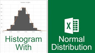
Hi! I was just wondering how I'd then able to add a line graph to the same graph. Thank you for the vid!
good question. Haven't tried this myself, but you could try to add the data to the diagram, and then use a secondary axis for that data series?
How would you do this with negative numbers?
not sure what you mean. The horizontal axis can start at a negative number, the vertical axis are frequencies and don't know how frequencies could be negative. Could you perhaps explain a bit more your intentions?
It is soooo useful
thanks
you're welcome. glad it helped. Happy holidays.