Dynamic Comparison Analysis Chart in Excel

ฝัง
- เผยแพร่เมื่อ 25 ส.ค. 2024
- #DynamicChart #PivotChart
Hello Friends,
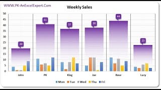
In this video, you will learn how to create a dynamic comparison Analysis Chart in Microsoft Excel. Using this chart you can compare one employee's performance with other. We have used Pivot Chart and Slicers to create this chart. In this chart, we have used dynamic legend and dynamic Chart Title.
Download the practice file from below link:
www.pk-anexcel...
Download the Free Project Management Dashboard
www.pk-anexcel...
Download the Calendar Control in VBA from below link
www.pk-anexcel...
Download our free Excel utility Tool and improve your productivity:
www.pk-anexcel...
See our Excel Products:
www.pk-anexcel...
Visit to learn more:
Chart and Visualizations: www.pk-anexcel...
VBA Course: www.pk-anexcel...
Download useful Templates: www.pk-anexcel...
Dashboards: www.pk-anexcel...
Watch the best info-graphics and dynamic charts from below link:
• Dynamic Graphs
Learn and free download best excel Dashboard template:
• Excel Dashboards
Learn Step by Step VBA:
• VBA Tutorial
Website:
WWW.PK-AnExcel...
Facebook:
/ pkanexcelexpert
Telegram:
t.me/joinchat/...
Pinterest:
/ pkanexcelexpert
Visit our Amazon Store
www.amazon.in/...


The moment I saw this video I paused whatever I was working on till I was done watching and trying my hands on it. Each time I watched any of your videos my analytics skill in excel moves up exponentially. great video, great content. Thank you PK
Thanks for your valuable feedback
Very same.. This channel has potentially a great back up in taking me up in corporate ❤
Great, you have covered all topics like chart, slicer, title everything, thank you
Thanks for your valuable feedback🙏
Always like your tutorials.Thank you very much.
Thanks for your valuable feedback
a very very simple and extremely helpful video sir, thanks a lot for demonstrating step by step
You are most welcome
u just make things easy !!! God bless u
Thanks a lot 😊
Excellent PK, Thanks very much for this tutorial. Regards . Martin ( South Africa)
Thanks for your valuable feedback
@@PKAnExcelExpert pleasure Pk. I always follow your tutorials. Extremely informative... !!
Very educational! Thank you!
Thanks for your valuable feedback
Liked without even watching because you always make out of the box
Thanks for your valuable feedback
i really love youe tutorial..
many thanks
very respectful
Thanks for your valuable feedback
Always giving valuable contents and great teaching. Thank you Sir
Thanks for your valuable feedback
Thank you
You're welcome
Thank you so much Mr PK
Thanks for your valuable feedback
Very informative. Thanks.
Thanks for your valuable feedback🙏
How you make looks easy bt most of the ppl don't know thx this is useful
You are simply Great... 🎊💗💖
Thanks for your valuable feedback
Beautiful work. Thanks for the share.
Sir your all videos good idea., excellent think
Thanks for your valuable feedback
Very informative. Thank u PK
Thanks for your valuable feedback
you are amazing man i love your work
Thanks for your valuable feedback
Its a great tutorial, thankz mate
Thanks for your valuable feedback
Very informative!
Thanks a lot it is really helpfull
Thanks for your valuable feedback
I like your knowledge
Thank you brother, it releally helped me
Glad it helped
@@PKAnExcelExpert Yes bro, I have a dought actually for can we create a graph with 2 different tables coloum graph or bar graph not the line graph, If have time can you let me know
Thank, very useful
Most welcome
Thanks you.......
Most welcome🙏
Very good sir!
Many thanks!
Loved it👍
Thanks for your valuable feedback
very impressive idea..
Thanks for your valuable feedback
Great Video
Thanks for your valuable feedback
Toog Good PK Sir 👏
Thanks for your valuable feedback
Fantastic. How about to increase the comparison by 2 employees, and still have the option All?
Thanks PK
Most Welcome
PK the chart is very elegant and your explanation is very lucid. Thanks
Nice Sir, i am 6th viewer sir, please prepare more vedios on Google Sheets also sir 👍
Thanks for watching. I will definitely try to create a series of videos on Google sheets
Very nice Video Sir
Please make some videos other than sales i.e. supply chain, procurement related
We will try
Nice vedio sir
Thanks and welcome
Nice
Thanks for your valuable feedback
I learned so much from this video. Thank you. Can you demonstrate how to maintain this dashboard when a user selects between years? Can this type of comparison be shown as a daily comparison from one employee to all employees?
Yes, It can. we need to make the changes accordingly
I love this chart how can I use it to show minute by minute productivity?
It is great video.. please suggest how to connect you if in case we need to get some suggestions or help on your videos
In the helper table that displays the comparison in a graph, I was able to do one year, no problem. Now I want to add 2023 to the helper table but cannot get the index match function to pull in the correct data from Jan 2022 and Jan 2023. Please provide clarification as to how to get this to work.
1st viewer
Yes you are.. Thanks for watching
Hi PK, if possible to show the actual outstanding received against Sales with this graph chart
Dear, i tried to copy some text from excel into text box by linking with formula but in the text box the text is cut...i cant get the full text in the text box. tried to google and its due to some character limit...so how can i get the full text copied to the text box? need your help.
Selected data export and save in csv file.. plz make add ins sir.. pk utility tools
Hi PK - Any comparison chart which can sent over email with working slicers in email itself
I am confused.....why the average line is changing Everytime when you change the emp name.....it should be constant?
Hi average line remains constant until you change the region.
Sir i need a help because I got an error
Omg
Hi, your videos are very good and nicely explained 👍. Can you help to create dashboard for employees trainings status video?, it will be great support!