BONUS TIP: When converting to CMYK from RGB in Photoshop, remember to flatten all of your layers into one layer beforing doing it! If you try to convert it with all the layers intact, it might not look right depending on the blending modes used in your layers. And don't forget to undo the "flattening" to bring your layers back after exporting. Thanks for watching! Use coupon code washyourhands for 50% off any of my color courses or bundles: learn.comiccolor.com/
I'm fairly new colorist I ended up getting on some very big crowd funded comics. Clients do ask me for RGB files and I'm worried about them getting converted to CMYK at another source. My solution has been to flatten my pages convert to CMYK to get rid of unprintable colors then convert back to RGB and send them a flattened .TIFF file. I'm hoping by doing this it will lessen the chances of someone else messing it up when they convert it.
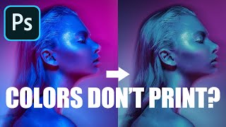
I've been a very casual artist for over 20 years. I've delved into digital art for the last 6 months. I ordered a print of work I did and boy, did it look washed out. THANK YOU for this video! I wished I'd known all of this before 😅
You speak a lot about color field effect without calling it that. As a traditionally trained painter, now digital and traditional painter, it's still the most profound tenet for the understanding of how color works that i've encountered. It still astounds me how a particular color looks different, based upon the colors that surround it. Magic!
Looking to print some designs for an online market on clothes and this preemptively saved me a TON of headache. Thank you for sharing your expertise to help us improve!
another layer of complication is that it also depends on your screen how accurately you see the colors... so unless you calibrate your screen that's also a thing to consider even when you are working in cmyk files 🤯
Another great video. I’ve literally learned all of my coloring techniques from you from years of watching your channel. I don’t get to do much color work these days due to my work being a strictly black & white manga. But I Cary over the coloring to my covers and promotional art and it always stands out. Keep making these vids my man!
A good rule of thumb is 72 dpi/rgb for things that will not be printed (internet), 300dpi/cmyk for print. If it's going to spot printing or screen printing use pantone coated in layers. That"s pretty much most of it.
I'd say those are final output resolutions. I usually try to double those DPIs when working on files, giving me more flexibility in scaling art within a piece (especially if I am scaling or liquifying so multiple times to tweak proportions, etc) and reusing files in promotional materials. More likely to have the resolution to be able to take art from a comic frame and pull in on it sequentially over a few frames, or as an illustration in an ad, postcard or on merch, and cover art as a poster that way.
I remember my college classmate printed her work for practice session and it became so dark that it wasn't possible to see anything there I asked her if she used CMYK and she responded like she didn't even know about it. Well, someone didn't listen to teacher at all when he explained it to us lol
I actually did soe work recently for Games Workshop on a colorisation of one of their old comics - and they actually encouraged me to sue colours out of CMYK Gamut becuase they have a printing process that would work - and when I got the hard copy in my hands I was really surprise how well it printed. I used some bright blues and some purples I thought would never print (when I submitted them to my editor, I half expected the notes ont he pages to ask me to bring them back in a bit..) - but they turned out great... I have no idea how lol.
CMYK is a subset of RGB meaning CMKY has less colors. It is possible to design something in RGB on your computer screen with colors that fall outside of what CMYK can produce.
@@dumbcat I am very aware of that.. I've been colouring for comics for a while now. I am saying I am surprised how well the obviously out of gamut colours printed using what ever technique it is that games workshop used.
There are some digital printers now that extend their printing gamut by using extra toners. I've been surprised by how well some light-blues have held without going purple lately. They have one cartridge for Cyan, then another for "light cyan", and so forth. I know they always want art submitted in RGB. They also have cartridges for fluorescents, metallic, varnishes, and even raised dimensional inks that can simulate textures and embossing somewhat (good for a more affordable almost letter-press feel). Working with those presses is a bit tricky, as I often want my art to be printed in full color, but lettering as 1-color black. That usually means working in multiple programs if I have to combine RGB illos with BW text.
Yeah I wish CSP's looked like PS's preview. If it did, I could drop PS. :) It just doesn't show the right colors for me regardless of the CMYK profile you choose.
Great explanation! I'm curious - when you convert from RGB to CMYK, how often do you end up tweaking some of your colors so they look better in CMYK? Or are you just using Ctrl+Y (Proof Colors) as you go along so you aren't surprised at the end? Thanks in advance!
It's pretty rare that I have to tweak things after conversion to CMYK but sometimes it needs a little. I've got a pretty good eye for what's in gamut and out though.
Yes it's very noticeable that the artwork was dull, and the color wheel was definitely noticeable. It's a bit sad that most printers aren't efficient enough.
I was doing research on color profiles because I wanted to sell prints on ArtStation and this helped a lot but another thing I noticed was in ArtStation’s print requirements they were actually saying sRGB only, I guess I’ll have to trust the process with their printers then!
@@colorwithkurt Every device has its own specific profile when using color management so if you convert to a generic CMYK profile like SWOP or GRACoL that will limit your artwork to a gamut that is achievable using CMYK ink i.e for offset printing. But if you're not sure what process will be used by the printer you should definitely keep in in RGB because printers may achieve larger color gamuts than the generic CMYK by adding more ink colors. For instance, some photo printers use 10 different inks like C M Y LC LM GY LGY V PK MK. Others add in OGV (orange, green, violet) to make 7-color printing. So converting to CMYK may result in a less-saturated result than if you leave the file in RGB and the printer then converts directly to their device-specific output profile. Just remember that you will lose visible colors converting to CMYK but you won't get them back going to RGB, so at very least make a copy of the original file to convert to CMYK and do not stunt the original.
To make things even worse pigment inks opposed to dye based ink are even duller. Why use pigment inks? Archival reasons. When will Canon/Epson work out how to get that 'RGB' look in a print?
Thank you for this! Some questions... When a comic is for printing, do you always have to convert it to CMYK first? Or it can be done without much trouble in RGB ir you are careful..? And to what color profile? You ask the publisher witch profile does the printer use everytime? Too many questions, sorry!
You can go from a bigger gamut (RGB) to a smaller gamut (CMYK) just by converting, and you lose some colors. But when you go from CMYK to RGB you don't gain color. So if you want the pictures to be used on both digital and print, keep it in RGB. If you want it as vibrant as possible, keep it in RGB until time to print. If you want to tweak or preview how it prints, when you're done designing convert to CMYK. In photoshop there's a "Proof Colors" option (Cmd+Y) to instantly preview in CMYK. Not sure about Procreate but my limited experience with non Adobe software tells me that they do not reliably work in subtractive color spaces. It's very tricky trying to preview a CMYK image on a RGB display and most of the non-adobe software doesn't do it accurately at all.
So I use procreate for digital art and usually work with a generic cmyk canvas So that should only have cmyk colors available on it, and I should be good to go right?
It would be a preference on your part to work in CMYK, it's not a best practice and the benefit is highly debatable. Keep in mind that every professional photographer captures photos in RGB and keeps them in RGB. Personally I would not be confident that Procreate is previewing the CMYK color accurately on-screen. To test this you would need a color-accurate printer and a 5000K viewing booth. I would stick to RGB which will give you the most possible colors and look better in digital form, unless there is some reason the digital version needs to exactly match the printed version.
Im facing a huge problem and i don’t know what im doing wrong or how to fix it. Is it my printer? Is it the format? Is it procreate itself? I don’t know. Whenever i print an image, the colors are all wrong. The dark purple becomes bright pink. The orange is too dark. The blue is too dark. What is going on? I have it in CYMK. Im printing from pdf. What am i doing wrong?
Do you have a lot of colors in the darkest bottom third of the color picker? Very often I find that when the brightness of the screen is too high. The colors end up too dark.
And people who dont even paint cant stop telling me to go cmy, and they dont understand that you can never get as vivid colors with something you mixed as a pure vivid pigment. Not even with the holy, true basic colors cmy...
Icc profile with best rgb color conversion? They're all pretty similar, and not great. In my opinion if you're designing in RGB color you should keep files in RGB. The printer will use CMYK obviously but the actual colors they can produce via CMYK are going to vary from device to device, the offset printer will be able to do something different than the inkjet printer or the screen printer. Generally, the printer will try to achieve a standard like SWOP but this is purely so you can anticipate what colors you will get; you can preview how it will look by converting or previewing in the SWOP CMYK profile (U.S. Web Coated SWOP) . BUT, you might not want to design the file in SWOP because that could short-change you, i.e you may get less color than the printer is capable of making had you stayed in RGB and let them convert it. Plus you have limited digital editing options when using CMYK over RGB. But if you're working in CMYK, maybe try the GRACoL profile, Coated GRACoL 2006 or something. It's a little bigger gamut than SWOP and generally better for color accuracy. Generally the quality lost when converting to CMYK is saturation, i.e vibrancy. So if you're looking for vibrant specifically, and not necessarily numerical accuracy, you might try converting to CMYK and then just bumping up the saturation, which may change the hue compared to direct conversion but may look better.
@@gorkyd7912 SWOP is absolute trash, what are you even talking about? it was the very first one I tried, all of the crappy standard ones-- and no, for the record professional illustrators do not work in cmyk, everyone converts from RGB. OP already replied to me with a useful comment a long time ago and I re-found the artist who uses the best cmyk profiles and had zero problems with converting using those. thanks but...no thanks.


BONUS TIP: When converting to CMYK from RGB in Photoshop, remember to flatten all of your layers into one layer beforing doing it! If you try to convert it with all the layers intact, it might not look right depending on the blending modes used in your layers.
And don't forget to undo the "flattening" to bring your layers back after exporting. Thanks for watching!
Use coupon code washyourhands for 50% off any of my color courses or bundles: learn.comiccolor.com/
This was so helpful. Thank you!
I'm fairly new colorist I ended up getting on some very big crowd funded comics. Clients do ask me for RGB files and I'm worried about them getting converted to CMYK at another source. My solution has been to flatten my pages convert to CMYK to get rid of unprintable colors then convert back to RGB and send them a flattened .TIFF file. I'm hoping by doing this it will lessen the chances of someone else messing it up when they convert it.
I've been a very casual artist for over 20 years. I've delved into digital art for the last 6 months. I ordered a print of work I did and boy, did it look washed out. THANK YOU for this video! I wished I'd known all of this before 😅
Paper can make a huge difference also. Brighter paper = more vibrant print. Coated paper = more vibrant print.
You speak a lot about color field effect without calling it that. As a traditionally trained painter, now digital and traditional painter, it's still the most profound tenet for the understanding of how color works that i've encountered. It still astounds me how a particular color looks different, based upon the colors that surround it. Magic!
color theory is magic
grays are amazing
Looking to print some designs for an online market on clothes and this preemptively saved me a TON of headache. Thank you for sharing your expertise to help us improve!
another layer of complication is that it also depends on your screen how accurately you see the colors... so unless you calibrate your screen that's also a thing to consider even when you are working in cmyk files 🤯
Good explanation. Also the GL example is instructive.
THANK YOU!!! So helpful to break down the color technology behind CMYK
Another great video. I’ve literally learned all of my coloring techniques from you from years of watching your channel. I don’t get to do much color work these days due to my work being a strictly black & white manga. But I Cary over the coloring to my covers and promotional art and it always stands out. Keep making these vids my man!
First time viewing a video from your channel. I just want to say this is a great video; I can't believe it doesn't have more views.
Welcome to my channel! I think I'm just generally bad at the YT thing. Haha...
Amazing job creating an informative and important video but making it super easy to watch! Thank you for making this!
Very very informative and well explained. Thank you!
Very useful tip! Thanks a lot for the information.
Just realized it was you at the end! I bought your course in Udemy~ very very helpful~ 😄😄
Thanks!
Thank you! This is super helpful!
Wow this is really great in-depth info on the matter, thank you!
Glad it was helpful!
THANKS FOR THIS! SUPER USEFUL 😭🙏🏾
Thanks Kurt!
hit crtl shift y in your color picker and photoshop will gray out the colors the printer wont be able to pull off
A good rule of thumb is 72 dpi/rgb for things that will not be printed (internet), 300dpi/cmyk for print. If it's going to spot printing or screen printing use pantone coated in layers. That"s pretty much most of it.
I'd say those are final output resolutions. I usually try to double those DPIs when working on files, giving me more flexibility in scaling art within a piece (especially if I am scaling or liquifying so multiple times to tweak proportions, etc) and reusing files in promotional materials. More likely to have the resolution to be able to take art from a comic frame and pull in on it sequentially over a few frames, or as an illustration in an ad, postcard or on merch, and cover art as a poster that way.
Thank you💜
Really helpful, thanks.
This is rad, thank u
Helpful. Thank you
l aways wanted to watch a video about this, you really teched me a lot of stuff man thx a lot man
I remember my college classmate printed her work for practice session and it became so dark that it wasn't possible to see anything there
I asked her if she used CMYK and she responded like she didn't even know about it. Well, someone didn't listen to teacher at all when he explained it to us lol
I actually did soe work recently for Games Workshop on a colorisation of one of their old comics - and they actually encouraged me to sue colours out of CMYK Gamut becuase they have a printing process that would work - and when I got the hard copy in my hands I was really surprise how well it printed. I used some bright blues and some purples I thought would never print (when I submitted them to my editor, I half expected the notes ont he pages to ask me to bring them back in a bit..) - but they turned out great... I have no idea how lol.
CMYK is a subset of RGB meaning CMKY has less colors. It is possible to design something in RGB on your computer screen with colors that fall outside of what CMYK can produce.
@@dumbcat I am very aware of that.. I've been colouring for comics for a while now. I am saying I am surprised how well the obviously out of gamut colours printed using what ever technique it is that games workshop used.
There are some digital printers now that extend their printing gamut by using extra toners. I've been surprised by how well some light-blues have held without going purple lately. They have one cartridge for Cyan, then another for "light cyan", and so forth. I know they always want art submitted in RGB. They also have cartridges for fluorescents, metallic, varnishes, and even raised dimensional inks that can simulate textures and embossing somewhat (good for a more affordable almost letter-press feel). Working with those presses is a bit tricky, as I often want my art to be printed in full color, but lettering as 1-color black. That usually means working in multiple programs if I have to combine RGB illos with BW text.
Plesse drop the printers you use! @@jaypeacemyth
Thank you.
This is gold.
Well in RGB maybe, CMYK not so much.
This video is helping me realize how color blind I probably am and how complicated color theory can be. 😂
I usually have my preview set to CMYK in photoshop to get an idea and doing that also in clip studio
Yeah I wish CSP's looked like PS's preview. If it did, I could drop PS. :) It just doesn't show the right colors for me regardless of the CMYK profile you choose.
Great explanation! I'm curious - when you convert from RGB to CMYK, how often do you end up tweaking some of your colors so they look better in CMYK? Or are you just using Ctrl+Y (Proof Colors) as you go along so you aren't surprised at the end? Thanks in advance!
It's pretty rare that I have to tweak things after conversion to CMYK but sometimes it needs a little. I've got a pretty good eye for what's in gamut and out though.
@@colorwithkurt Awesome, thanks! I just need to keep practicing. Keep up the great videos. They're really helpful.
Thanks. To be clear, my final tweaks are always with CMYK proofing on, so that it isn't ever a complete surprise.
every time I press ctrl y i come one step closer to throwing my laptop off the balcony
thanks This helped me out a lot
Yes it's very noticeable that the artwork was dull, and the color wheel was definitely noticeable. It's a bit sad that most printers aren't efficient enough.
Interesting. How do you adjust RGB in the printer colour profile to print CMYK. THANKS
You can't. You have to start in CMYK in Procreate.
I was doing research on color profiles because I wanted to sell prints on ArtStation and this helped a lot but another thing I noticed was in ArtStation’s print requirements they were actually saying sRGB only, I guess I’ll have to trust the process with their printers then!
I've had a printer ask for that before, so I just did the CMYK conversion, then back to RGB. I felt like I had more control that way.
@@colorwithkurt Every device has its own specific profile when using color management so if you convert to a generic CMYK profile like SWOP or GRACoL that will limit your artwork to a gamut that is achievable using CMYK ink i.e for offset printing. But if you're not sure what process will be used by the printer you should definitely keep in in RGB because printers may achieve larger color gamuts than the generic CMYK by adding more ink colors. For instance, some photo printers use 10 different inks like C M Y LC LM GY LGY V PK MK. Others add in OGV (orange, green, violet) to make 7-color printing. So converting to CMYK may result in a less-saturated result than if you leave the file in RGB and the printer then converts directly to their device-specific output profile.
Just remember that you will lose visible colors converting to CMYK but you won't get them back going to RGB, so at very least make a copy of the original file to convert to CMYK and do not stunt the original.
To make things even worse pigment inks opposed to dye based ink are even duller. Why use pigment inks? Archival reasons. When will Canon/Epson work out how to get that 'RGB' look in a print?
Thank you for this!
Some questions... When a comic is for printing, do you always have to convert it to CMYK first? Or it can be done without much trouble in RGB ir you are careful..?
And to what color profile? You ask the publisher witch profile does the printer use everytime? Too many questions, sorry!
With this in mind should I just avoid RGB altogether and use CMYK exclusively? I’m using Procreate not Photoshop.
You can! You'll see the difference in the color picker. It even hides the extra RGB colors there.
You can go from a bigger gamut (RGB) to a smaller gamut (CMYK) just by converting, and you lose some colors. But when you go from CMYK to RGB you don't gain color. So if you want the pictures to be used on both digital and print, keep it in RGB. If you want it as vibrant as possible, keep it in RGB until time to print. If you want to tweak or preview how it prints, when you're done designing convert to CMYK. In photoshop there's a "Proof Colors" option (Cmd+Y) to instantly preview in CMYK.
Not sure about Procreate but my limited experience with non Adobe software tells me that they do not reliably work in subtractive color spaces. It's very tricky trying to preview a CMYK image on a RGB display and most of the non-adobe software doesn't do it accurately at all.
@ Thank you very much. This is very helpful.
So I use procreate for digital art and usually work with a generic cmyk canvas
So that should only have cmyk colors available on it, and I should be good to go right?
Yup, probably so
It would be a preference on your part to work in CMYK, it's not a best practice and the benefit is highly debatable. Keep in mind that every professional photographer captures photos in RGB and keeps them in RGB. Personally I would not be confident that Procreate is previewing the CMYK color accurately on-screen. To test this you would need a color-accurate printer and a 5000K viewing booth. I would stick to RGB which will give you the most possible colors and look better in digital form, unless there is some reason the digital version needs to exactly match the printed version.
Im facing a huge problem and i don’t know what im doing wrong or how to fix it. Is it my printer? Is it the format? Is it procreate itself? I don’t know.
Whenever i print an image, the colors are all wrong. The dark purple becomes bright pink. The orange is too dark. The blue is too dark. What is going on?
I have it in CYMK. Im printing from pdf. What am i doing wrong?
Do you have a lot of colors in the darkest bottom third of the color picker? Very often I find that when the brightness of the screen is too high. The colors end up too dark.
Deadpool The War of Ths Realms #13 cover... did the colorist just color on top of pencil? If so awesome.
And people who dont even paint cant stop telling me to go cmy, and they dont understand that you can never get as vivid colors with something you mixed as a pure vivid pigment. Not even with the holy, true basic colors cmy...
I just came here looking for an icc profile with the best rgb color conversion and left empty handed. -_-
Search Matt Hollingsworth. He recently showed how.
Icc profile with best rgb color conversion? They're all pretty similar, and not great. In my opinion if you're designing in RGB color you should keep files in RGB. The printer will use CMYK obviously but the actual colors they can produce via CMYK are going to vary from device to device, the offset printer will be able to do something different than the inkjet printer or the screen printer. Generally, the printer will try to achieve a standard like SWOP but this is purely so you can anticipate what colors you will get; you can preview how it will look by converting or previewing in the SWOP CMYK profile (U.S. Web Coated SWOP) . BUT, you might not want to design the file in SWOP because that could short-change you, i.e you may get less color than the printer is capable of making had you stayed in RGB and let them convert it. Plus you have limited digital editing options when using CMYK over RGB.
But if you're working in CMYK, maybe try the GRACoL profile, Coated GRACoL 2006 or something. It's a little bigger gamut than SWOP and generally better for color accuracy.
Generally the quality lost when converting to CMYK is saturation, i.e vibrancy. So if you're looking for vibrant specifically, and not necessarily numerical accuracy, you might try converting to CMYK and then just bumping up the saturation, which may change the hue compared to direct conversion but may look better.
@@gorkyd7912 SWOP is absolute trash, what are you even talking about? it was the very first one I tried, all of the crappy standard ones-- and no, for the record professional illustrators do not work in cmyk, everyone converts from RGB. OP already replied to me with a useful comment a long time ago and I re-found the artist who uses the best cmyk profiles and had zero problems with converting using those. thanks but...no thanks.
I love your channel and all the tutorials are great. But if at some point you could translate them into Spanish it would be great!
A wile back someone showed me that there is a button on Photoshop that will preview how it will look if printed. Can’t remember which tho …
you deserve more sub, just one from me !!
Helo
Y u have so little subs!!!! What's wrong with this world?!