
- 49
- 433 213
J. Holt the Illustrator
เข้าร่วมเมื่อ 24 เม.ย. 2022
I'm an illustrator who draws comics, and talks about art theory and history, illustration and drawing methods until others edge quietly from the room.
The Grand Little World of Aurumek | Illustrator Spotlight #8
Aurumek's links for prints, Patreon, and following: linktr.ee/Aurumek
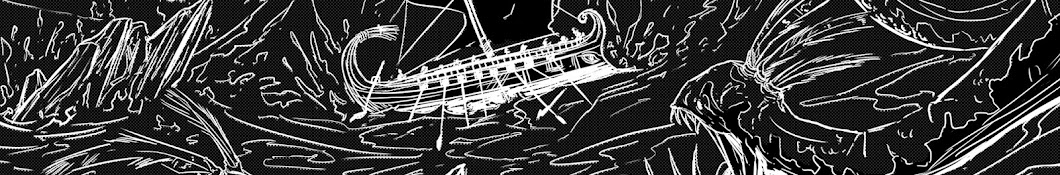
Kelly Brack Illustration: x.com/NOIRComics
Keep up with me over at jholtillus.substack.com
Kelly Brack Illustration: x.com/NOIRComics
Keep up with me over at jholtillus.substack.com
มุมมอง: 1 221
วีดีโอ


The Batsuit, Batmobile, City & Color of Batman '89
มุมมอง 8K3 หลายเดือนก่อน
My original, illustrated Greek mythology card game is crowdfunding right now. Please give it a look ► www.kickstarter.com/projects/jholtillus/panomachea-battle-with-gods-heroes-and-monsters FOLLOW ME ► Twitter: jholtillus

The Best Rivalry Story from the Renaissance
มุมมอง 1.1K7 หลายเดือนก่อน
Artistic geniuses, petty rivals. MY ILLUSTRATION PROJECTS ► Look at my new card game: panomachea.com Buy copies of my graphic novel: carthageproject.com FOLLOW ME ► Twitter: jholtillus A couple of sources I pulled diagrams from: Franklin K. B. Toker. “Florence Cathedral: The Design Stage.” The Art Bulletin 60, no. 2 (1978): 214-31. doi.org/10.2307/3049777. Toker, Franklin. “Arnolfo’...

The Marvelous Inkwork of Elena Kononenko | Illustrator Spotlight #7
มุมมอง 1.5K7 หลายเดือนก่อน
I'm continuing the Illustrator Spotlights, intending to alternate between short spotlights and longform videos to keep the content coming. Elena's ink work is among the best around. Check out her work. Follow her: x.com/KononenkoElena MY ILLUSTRATION PROJECTS ► Look at my new card game: panomachea.com Buy copies of my graphic novel: carthageproject.com FOLLOW ME ► Twitter: jholtillus

How Over the Garden Wall Builds Its World
มุมมอง 43K8 หลายเดือนก่อน
Over the Garden Wall accomplishes the difficult task of building a world we love to revisit. Let's break down how the writers and animators pulled it off. MY ILLUSTRATION PROJECTS ► Look at my new card game: panomachea.com Buy copies of my graphic novel: carthageproject.com FOLLOW ME ► Twitter: jholtillus

3 Reasons We're Bad at Criticizing Art & Better Methods to Try
มุมมอง 3.9K8 หลายเดือนก่อน
What 10 years of teaching art at a university has taught me about criticism. Check out my card game (sign up to be notified when it goes to crowdfunding): panomachea.com 0:00 Criticism 3:20 Three Reasons We're Bad at Critique 3:50 Low Self Esteem 8:11 Attaching Goals w/out Realizing 10:55 Lack of Perception 13:12 Testing on Bernini 16:30 Pearls Before Swine 19:06 Solution 1 - Treat Critique Lik...

A Storytelling Principle from Japanese Architecture (Jun'Ichiro Tanizaki)
มุมมอง 2K10 หลายเดือนก่อน
In 1933 a Japanese fiction author wrote an essay on the aesthetics of traditional Japan viewed through the lens of architecture and light called "In Praise of Shadows". In it, Tanizaki gives us a principle grapple with in our own writing, and in our understanding of beauty. Read my comic online: theseuscomic.com Or buy it in hardcover: carthageproject.com FOLLOW ME ► Instagram: jh...

2 Campaigns, $25k, Everything I've Learned About Crowdfunding Comics
มุมมอง 1.5K10 หลายเดือนก่อน
Kickstarter and crowdfunding are intimidating. Risks are real and the customers (backers) are real. Here's everything I've gleaned from two successfully funded campaigns for my graphic novel and comic work. Theseus Campaign #1: www.kickstarter.com/projects/jholtillus/theseus-volume-1-a-graphic-novel Theseus Campaign #2: www.kickstarter.com/projects/jholtillus/theseus-volume-2-a-graphic-novel Ca...

Everything I've Tried in Marketing Pt. 1 | Social Media, Webcomics, Webtoons and First Print
มุมมอง 3.4K11 หลายเดือนก่อน
I am not a guru of marketing advice. I don't have all the answers. But finally my comic work is making a profit. Here's a completely honest walkthrough of what I've tried so far to get readers: my successes and failures. 0:00 I'm Not a Marketing Master 1:59 Use Comments to Ask Questions 3:01 The Genesis of My Comic 3:49 The Webcomic Phase 6:40 Webcomic Directories 7:37 Social Media 8:01 Instagr...
What Can a Comic Artist Learn from Art History?
มุมมอง 2Kปีที่แล้ว
Often graphic designers, illustrators and comic artists don't see themselves as connected to art history. Here's how my thinking on that changed after hitting professional creative burnout, and an analysis of a classical painting that demonstrates how I glean ideas from works from the past even if my work seems nothing like it. 0:00 My Big Professional Burnout 1:36 A Wrong Way of Thinking 2:50 ...
Speech Bubbles & Text in Comics: Guide for New Artists
มุมมอง 4.3Kปีที่แล้ว
A broad introduction to using speech bubbles and text within comics. Rather than a specific how-to from a technical perspective, we're delving into theory with some of those technical details filled in as we go. The basic question: what are the mistakes we commonly make with text and how to address them. Read my comic online: theseuscomic.com Or buy it in hardcover: carthageproject.com Video on...
Setting a Resolution for Art in the New Year? If You're Just Starting, This is for You
มุมมอง 6Kปีที่แล้ว
I was really hesitant to upload this video. It's not my usual fare, but if you're new to art and want to make a go of it, this is something I would tell my students to help them start on the right foot. So take this short video for whatever it's worth to you, and remember that my credibility is nothing and you shouldn't take me seriously at all. New Comicking video on speech bubbles and text la...
Three Things I'd Tell My Younger Self About Drawing
มุมมอง 2Kปีที่แล้ว
I've learned a lot about drawing in the last 15 years, but my younger self continues to still be naive. What's wrong with him? Well here's the three things I'd tell him before mocking his lack of facial hair. Full video on creativity, drawing, writing and being an artist: th-cam.com/video/fVxpf_nanqQ/w-d-xo.htmlsi=evUIIPuvLZp4G4l7 0:00 Overview 0:34 Loosen Up 2:05 Draw Something, Then Fix It 3:...
Everything I Wish I'd Known About Drawing, Writing, Creativity & Artists
มุมมอง 19Kปีที่แล้ว
If I got to tell my younger self about art, writing, drawing and creativity, what would I say? Here's 13 things I'd tell myself to change the way I thought about art. ►Theseus Vol. 1 & 2: www.carthageproject.com/produ... ►Check it out for free here: theseuscomic.com 0:00 I got serious about art at 11 1:38 Change your thinking 3:19 Loosen up 4:50 Draw, then fix 5:53 Draw from life 8:22 Worry les...
What Artists Can Learn from Aladdin's Incredible Color
มุมมอง 145Kปีที่แล้ว
What Artists Can Learn from Aladdin's Incredible Color
How to Color a Comic | Methods and Tips for Digital Artists
มุมมอง 6Kปีที่แล้ว
How to Color a Comic | Methods and Tips for Digital Artists
The Mythical Monster of Paul Reid | Illustrator Spotlight #6
มุมมอง 1.3Kปีที่แล้ว
The Mythical Monster of Paul Reid | Illustrator Spotlight #6
Inking a Mustachioed Knight | Tutorial w/ Commentary
มุมมอง 1.8Kปีที่แล้ว
Inking a Mustachioed Knight | Tutorial w/ Commentary
What New Comic Artists Should Know About Color
มุมมอง 21Kปีที่แล้ว
What New Comic Artists Should Know About Color
Analyzing the Page Design of Danny Earls | Illustrator Spotlight #5
มุมมอง 3.5Kปีที่แล้ว
Analyzing the Page Design of Danny Earls | Illustrator Spotlight #5
Inking a Comic | Things New Artists Should Know
มุมมอง 73Kปีที่แล้ว
Inking a Comic | Things New Artists Should Know
Alariko's Line & Color Makes Living Buildings | Illustrator Spotlight #4
มุมมอง 4.5Kปีที่แล้ว
Alariko's Line & Color Makes Living Buildings | Illustrator Spotlight #4
Animals Alive in the Paintings of Greg Beecham | Illustrator Spotlight #3
มุมมอง 3.5Kปีที่แล้ว
Animals Alive in the Paintings of Greg Beecham | Illustrator Spotlight #3
The Titanic Creatures of Gregory Fromenteau | Illustrator Spotlight #2
มุมมอง 773ปีที่แล้ว
The Titanic Creatures of Gregory Fromenteau | Illustrator Spotlight #2
The Mystical Landscapes of Philipp "Soma" Urlich | Illustrator Spotlight #1
มุมมอง 484ปีที่แล้ว
The Mystical Landscapes of Philipp "Soma" Urlich | Illustrator Spotlight #1
Drawing Session: Testing Out Ink Brushes on Landscape and Figure
มุมมอง 718ปีที่แล้ว
Drawing Session: Testing Out Ink Brushes on Landscape and Figure
Designing Puddleglum: Drawing Book Characters from Description
มุมมอง 3322 ปีที่แล้ว
Designing Puddleglum: Drawing Book Characters from Description
Designing Snape: Drawing Characters from Book Description
มุมมอง 1.8K2 ปีที่แล้ว
Designing Snape: Drawing Characters from Book Description
Hey , enjoying your tips and stories.Great stuff and loving the backround jazz...Just a note from a Greek...Chapter one in Greek is written " πρωτο κεφαλαιο " . Without the "s" s
Thanks for this. I have knowledge with computers but I prefer traditional.
Tysm this is so helpful 🙂↕️🫶🏼✨
I love this! This is actually a friend of mine and it was such a pleasant surprise to see their work featured in one of your videos! I hope to see more niche artists showcases in the future! This is so cool!❤❤❤❤❤
Dude, I've been inking for 30 years off and on. You are put inking into words so concisely and so well! Thank you!!
Have you done any videos about arthur rack ham
3:00 Thought it was a horse. No disrespect
I love his work, it’s such raw and powerful energy as well as skill. But the way you described his Art and touched on various related points really made me look even deeper and see even more. This is unusual for me with Art “critiquing” - you have a wonderful way of both perceiving and describing - which is rare :)
Your artist highlights have been a godsend. Ive been beginning a journey of developing my confidence in inks and having artists I can do studies on who I admire has been wonderful. I look forward to showing off how much Ive learned from these masters of their craft. Some of them will no doubt leave their indelible mark on my own work for years to come so thank you.
You have a very Ron Swanson delivery in your jokes. I approve.
Thank you for this video! Super helpful! I have Scott McCloud's "Making Comics - Storytelling Secrets of Comics, Manga, and Graphic Novels," and it has been so informative, but I truly enjoyed your breakdown of speech bubbles and text. Adding Understanding Comics to my cart right now lol
I learned to never use black in painting as well. Not even for mixing. It deadens the painting
Great content, easily understandable for non-English speakers, and with a touch of humor. Thanks!
Love the design and oddly enough the face gave me metalocalypse vibe
Id tell my younger self to trade the nice high-quality sketchbooks i was gifted, for many cheaper ones - so i felt less precious and concerned about making bad drawings.
Just recently found your channel and I think this is my place. Please continue to make more videos on art history. I went to school for art and my art history classes are one of the things I miss most.
Thank you sOOOO much for this, clicked the light in my head
I’ve been looking for a video like this on TH-cam for months! Thank you!
I love your version of Severus Snape. He looks intelligent, aloof, difficult to approach He is by far my favourite character in the saga.
Thanks! This is great.
Great strory Holt, THX for this interesting chapter , hope se can ser More Like this one!
never heard of Aurumek. I'm a new fan.
Thank you very much! Nothing like total sincerity. Great lessons! ...well...about the best Inker? Me! 🥳
stayed after I saw the photoshop logo 🤣
Hello Mr Holt! Always good to see You, I have a request, please do a study of Lee Bermejo art. Batman Damned, Noel, Luthor, Rorschach and many others! Btw this triceratops reminds me how much prehistoric animals fascinate me! Greetings from Poland!
I followed Aurumek since almost a year, and I fell in love with his style immediately. Also, this video is so well made and your technicality is amazing, are you a teacher?
Thank you! And yes art professor is my day job.
I've been following Aurumek for many years. His work has always had a special place in my heart and makes me feel a certain nostalgia. As a fellow artist, he has also helped keep my inspiration and motivation up. It's been such a treat watching him grow as an artist over the years. So glad to see him featured here! He really deserves it! ❤️
What you are saying totally resonates with my experience: you go into artwork looking for something good, when you find it, you can then analyze what there hurdles were along the way. If it’s your own art or you are providing feedback to somebody, finding these “hurdles” on the way to the good provides actionable advice for improvement.
How can artists get on this?
I just pull stuff I see on Twitter/X.
@@jholtillus there’s nothing I could do?
Yes ! A new video ^^ I’m excited
I'm sincerely glad
Good grief - a tutorial which actually...teaches? This is great. Even just the idea of using a midtone on the background layer was new to me. And the daft humour around Gandalf was priceless. Liked and subscrified!
Glad to have you
Great stuff, thanks!
CLIP STUDIO PAINT !!!!
What an astute observation. To ask your students how people would see Batman over a hundred years ago, because in yester yeats the Jester may be mistaken for the hero & Batman may have been seen as the terrorist. 🤔
Aladdin actually has Richard Corben colours
Three things drove me, well, batty about this movie's artistic choices. First, after a marketing tsunami centered around the classic yellow-and black Batman logo (you know the one), the actual logo on Batman's actual chest was DIFFERENT. THAT bat had two extra pointy bits at the bottom, I suppose to represent the bat's feet. Anyway it was irritatingly, distractingly different. If the studio feared it lacked the legal rights to show the classic logo on film, why have the opening title scene consist of slowly traversing a carved-in-stone version of the classic logo?
Second, as is overwhelmingly established by generations of comics and comic-derived products, Batman's eyes are supposed to be blank white, with no visible iris or pupil - a supernaturally scary and cool look. And yet 1989, like every other live-action depiction of Batman going back to the TV show and the serials, and all the following movies, neglects this essential part of his look, instead showing his eyes. With his eyes, it always just looks like a guy in a Batman outfit, kind of silly. With blank white eyes, you instantly have BATMAN.
Third, they cast Michael Keaton. Yes, he took the role seriously and his acting was decent. 1989 fan unease about casting a comic actor proved misguided. But the LOOK is wrong; and in comic book movies the look is crucial. Christopher Reeve didn't just nail the acting for Clark Kent & Superman, he LOOKED the part, PERFECTLY. Keaton does not. He's already balding, he lacks "leading man" good looks, and worst of all he lacks the clear sharp jawline. He's got pudgy, jowly baby fat that looks ridiculous.
The two Burton films will always be my favorite Batman films because of how much they understand that Batman is a PULP character. Burton embraces that not just visually, but with the storytelling as well. Miss me with the "comic accuracy" AKA "the worst and most boring way to talk about superhero movies" debate. I'm here for the whole schmear. And Batman 89 and Returns are indeed, the whole schmear.
I love 89 better than the dark knight trilogy- which has a lot of problems
Have you tried Globalcomix?
Not where the term came from, but interesting take
Never said it was
100% sure the you're the first person to describe Bob the Goon as a stallion. I'm picturing girls with Tracey Walter Tiger Beat photos on their wall. The movie is so dense with style, not a common thing anymore. Reality is boring, take me somewhere for 2 hours. I think Denny O'Neil described it as something like Batman is good dressed in evil and the Joker is evil disguised as good. That's a contributor to their arch rivalry appeal.
Thx so much for the time you put into this video.This is also my favorite Batman etc.Saw it 3 times on the same day it was released.Saw the 30th anniversary that was special.Ive watched it @ least 200 times.Looking fwd to your videos ☮️☮️
Beautifly said.
I am actually watching the video as I type this. The version of Batman you are cutting two seems blue/green shifted, and a bit blown out, the colours are not the same as the theatrical release. Is it the 4k version? They also for some reason or other changed the sound effects of the guns, especially in the Axis Chemical shoot out. All thr interiors matches the exteriors in feel, closterfobic, Wayne Manors room all seem small, the press office, the mayors office, all except Vicky Veils which is bright and open. There is an great video on the making of BTAS and they called the look of Gotham as Dark Deco
Lots of people have mentioned the color shift. This is from a completely separate 35mm film scan I acquired a good while ago though. Probably just different because of that. But for heaven's sake people have raked me over the coals for it.
Surprisingly enough, I found that my pages are the most visually interesting and naturally flowing when I don't plan them at all. I don't plan pages ahead, or even plan one page at a time. I just start messing around, sometimes having a vision to what the page will look like, other times having no idea what the composition should look like, and staring at the black page for half an hour. This results in the best pages, for me, at least, as is also much more efficient (as I'm combining the planning stage with the penciling stage.
The human lines that you see as coraltive with automobile design, says more about your psychology than the actual object IRL. i wonder if this guy maths. Go look at the historical trends of drag coefficients.
yeah so every sportscar in the 70s is a muscle car?
lamborghinis are based off of f-14 and u talking about muscles on bodies, which one sounds cooler???
Speaking of symbolism, why not mention that the inside of the cathedral looks deserted. The fog, the broken seats and the lack of faith. It also represents the lack of faith in the people living in Gotham
Well I did mention it.
Muscle cars is a term given to cars with a massive engine options eg muscle 💪. Nothing to do with styling. Generally, the corvette shown would not evrn be considered a muscle car, but a sports car. Prime example of a muscle car is a 1967 pontiac GTO, which is a more powerful tempest. The GTO is a beautifully styled car but i wouldnt say its styling mimics muscles atq all. But yes, modern crossovers seem to converge on a potato shape 🥔 with accents slapped on them.