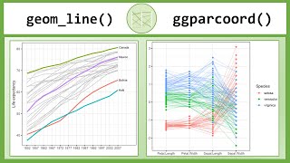
Line charts and Connected Scatterplots in R with geom_line() and geom_path()
ฝัง
- เผยแพร่เมื่อ 23 ก.ค. 2024
- In this tutorial I show you how to create line charts and connected scatterplots in R with geom_line() and geom_pat() and ggplot().
I will explain the different function arguments, like linetype and how you can map the color to a certain variable of your data frame.
I show many examples of how you can use these function to create the Beveridge curve or use it for mapping and Cleveland dot plots to visualize change over time.
⏱ Time Stamps ⌚
0:00 - Intro
0:33 - geom_line for bitcoin
2:33 - function arguments
5:40 - geom_path and geom_step
7:08 - Amanda vs Ashley
13:11 - Beveridge curve
17:05 - Napoleons march to Moscow
20:31 - Cleveland dot plot
External Links:
www.r-graph-gallery.com/conne...
www.data-to-viz.com/graph/con...
sape.inf.usi.ch/quick-referenc...
ggplot2.tidyverse.org/referen...
sape.inf.usi.ch/quick-referenc...
archive.nytimes.com/www.nytim...
steveharoz.com/research/connec...
en.wikipedia.org/wiki/Charles...
vincentarelbundock.github.io/...
github.com/andrewheiss/fancy-...
/ andrewheiss
en.wikipedia.org/wiki/Beverid...
www.bls.gov/opub/ted/2014/ted...
uc-r.github.io/cleveland-dot-...
Outro Animation:
AA-VFX Motion Backgrounds
• 4K Relaxing Live Wallp...


They don't know how much content you covered. Amazing
Well thank you. And I already have ideas for the next 30 videos :) We will see what the future brings.
Very nice work
Thanks
Thanks for the comment. Before the video I had not used geom_path() and geom_step(), so I learn quite a bit in the creation and I am glad that other people find it useful.
Nice video. But how to label the max and the min values in the line plot?
You can always add geom_text() with specific x- and y-values and whatever label = "example" you wish. I recommend using the base functions which.max() and which.min(). So if you have two vectors with y_values as dates and x_values you want to find the min and max you could do:
+ geom_text(mapping(aes(x=min(x_values), y=y_values[which.min(x_values)]), label = "this is the minimum"),
and then repeat the same for max values.
Sir put more vedio regulaely
That's the plan! At least weekly uploads this year. Hopefully even more in the future.