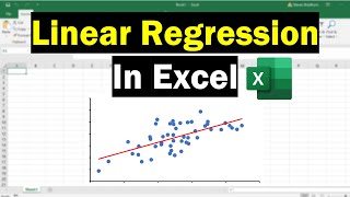
Excel: Two Scatterplots and Two Trendlines

ฝัง
- เผยแพร่เมื่อ 28 ม.ค. 2025
- Here we add two series in one scatter plot, and make separate trendlines for them.
Download File Used: docs.google.co...
Excel Video Playlist 1: • Excel Videos
Excel Video Playlist 2: • Short Excel Videos: Bu...
My Website: www.burkeyacade...
Support me on Patreon! / burkeyacademy
Talk to me on my SubReddit: / burkeyacademy
Buy me a cup of coffee on PayPal? paypal.me/Burke...


Thank you so much! I needed to add two trendlines to one Excel graph and could not figure out how to do it. Your video helped tremendously!
Thank you very much :-) Always wondered how to put two separate data and lines into one excel graph :-). Very easy to understand and follow.
Brilliant simple straight forward no nonsense epic tutorial ! Loved it. Thank you
Thank you for this man. I was looking for this all over the place
Brilliant. So good to know how to do this in Excel rather than using the SPSS graphs.
I needed to make a scatterplot real quick for some data at work. It was very helpful knowing were to go . thanks.
have been looking for this for an hour. thank you so much !
Thank you for breaking it in a very easy way
Thank you so much!!!!!!!! I spent a lot of time trying to solve this problem
Thank you. I was having trouble with this and you made it easy for me.
The past series data trick is amazing!
Many thanks for making this tutorial easy to understand. It's awesome!
I love you man, you just saved me
You helped me on my assignment, thank you.
This was so helpful today! Thank you!
Hi, looking closely the dots of import is on top of the domestic ones. If I want to specifically set one to be on top, is there a quick way to do it? thanks!
I found the answer. By default, the second series would be on top. Simply rearrange the series.
Thanks a lot for this video, I really need the exact one,. ❤️❤️ From INDIA.
Thank you I had to break out the scatter plot into it's individual components
Thanks a ton. Excellent video.
How can I do scatterplot with categorical / ordinal data in the X axis?
3:30 life saver
Is this possible to do only with 2, not for >2 scatterplots in the same? Thanks
Thank you so much for explaining things so clearly!! You're a lifesaver!
Very helpful, thanks a lot for this. Could you make a video or explain how to create an Interactive one please?
Thank you! was hoping to insert multiple scatter plots & superimpose each data sets trendlines. Wondering if there is a way to arrive at a single unified trendline based on individual trendlines?? Or is there another statistical concept which applies to achieve this.
Extremely helpful! Thank you!
Great explanation! Do you know how to combine the two trendlines to get one master trendline for the entire data?
I think that the easiest thing would be to combine both into a third dataset, and add that trendline. You can hide those points by making their dot color "no color".
@@BurkeyAcademy how to combine the dAtasets
tks from Brazil!
thanks for the help in this - was a great assist!
i’m trying to do one but because i have so many points the scatter graph only gives a proportion of my info i want all of it what should i do
You're a legend
how did you get the colours to change? mine stays blue even after I do your steps
Thank you so much for this!
How to use different symbols e.g triangle, square, diamond etc for different series instead of different colours round dots.
If I want to rationalize frieghts in particular distance slab.. how this works ..
Very helpful. thanks!
Thank you so much. This video was really helpful
Very valuable thank you
When I click edit series, It doesn't allow me to enter X and Y series values. It just has to field to enter series values (Doesn't specify x and y values. How can I solve this pls help!
Amazing! Any idea how to reference the slope of the trendline equation in a separate cell? For example, I'd like to incorporate the slope of the trendline into a separate formula, but don't know how to refer to it so that it updates with any changes to the trendline.
In Excel the slope command will calculate the slope.
@@BurkeyAcademy Thank you!
You rock, thank you!!
Is it possible to do this but keep only the lines? Is it possible to remove the scatter plots but keep the trendiness?
Sure, just tell it to make the points "no color" (or called something similar) under the color options.
@@BurkeyAcademy Thank you. Is there a way to get rid of the labels for the points? I try adding a trend line and it says Linear (*insert data*) and it has the names of the data sets next to where the colored points would be on the legend. I can't figure out what to do
hello, first of all tq for the knowledge. May i know where to ge the link for this dataset?
The link is at the top of the video description.
Thank you very much! Does this mean there can be more than two data sets , say 3? Will the procedure remain the same?
Is there a way to have the Model and Type included in the dot when you hover over it? This would make it easy to distinguish what the dots in the graph represent.
sorry "Make and Model"
I am not sure how to get it to do both of those, but I have a video with a few ideas that might help you. th-cam.com/video/jbv68cEEee8/w-d-xo.html
very helpful, thank you
Hello Dear, I want to Plot two independent variables such soil organic matter and soil nitrogen and dependent variable Nitrogen use efficiency (NUE) on one graph with two trend lines but it show different R square value when i plotted this data separately (soil Nitrogen and NUE and Soil organic matter and NUE ) what is the actual reason ?
Because with two data sets and two trendlines, you will have two different R^2 values. The R^2 tells you how well the lines fit the data, on a scale from 0 to 1.
Very helpful, thank you!
This is great. But I want to show data level in tooltip. How I can do that?
I have to make a spread chart with 76474 values, when i make the chart it is only showing some dots. How to make it properly?
can I remove the "Linear Domestic" part from the legend?
Thank you Sir
Paste special is not available for me after I copied the data. Helpppp
I want to change y=mx+c to y=-mx+c in excel scatter plot! How to do convert of the inverse diagram?
I don't understand what you want to do.
Thank you so much sir!
Thank you! Only question I had is is there a way to make the trend lines as slopes instead of linear?
Can you clarify the question? I don't get it. Trend lines have slopes... I can't figure out "as slopes instead of lines".
Good video friend. I have one question, i want to change the shape of the dots for each serie because i am going to print my paper in white and black, so I need to distinguish one from the other. thank you
Left click one of the points, then right click, Format Data Point. Then click the bucket to change the color, click on Marker to change the shape.
Is there any option to combine these trend lines?
Sure, just combine both datasets together, and add a third trendline using the combined data.
you help me so I leave a like
Thank you so much for this video. Keep going (Y)
How to add only one Trendline for both Scatterplots ??
The easiest way is to probably graph three sets of points: First all the points, and add the trendline. Then change the point type to None, and add the other two groups separately.
simply great!
tnx
Splendid.
thank you so much🤙🤙
Its Awesome. thankx a ton:)
HOW TO MAKE SCATTER PLOT ABOUT X AND Y
ok, Master of the Trend Lines
I went to a MAJOR amount of work to create what I wanted, but there must be an easier way
What I want is a Trend line (straight line) with a second and third trend line, each parallel to the original trend line,
one 15% above and one 15% below the Median (or Average) of the value of the original line
As I said, I was able to do it, but it was a ton of work
So, what is the easy way
I don't know of a VERY easy way. but it doesn't seem too bad... I'll make a quick video here and you can see what you think...
I can email you the spreadsheet I did it on, but as I said,m it is a lot of work and there must be an easier way
Here is your video... th-cam.com/video/mNd52jRTYWM/w-d-xo.html
Thanks brotha
Thank You!!!
Your voice just like tony stark
thank you!
3:00 onwards
Is it just me or does he sound bit like Sal Khan?
Thank you good sir
Very helpful thanks.
Thank you sir