Pedantic note: sRGB is like that not just because "cathode ray tubes worked like that", the reason is that human eyes are more sensitive to differences in dim light than in bright light, so the sRGB curve gives you more precision on the low end and less on the high end. If we switched to 16-bit floats per channel, then you could use a linear RGB colour space (and float encoding automatically gives you more precision for smaller values), but at the cost of doubling our memory requirements. Back in the day we were lucky to have enough space even for 8 bits per channel and sometimes had to quantise down to 5/6/5 bits for red, green and blue channel respectively (6 for green because your eyes are most sensitive to green). So sRGB follows CRTs because the curve for CRTs was already optimised for use in memory-restricted scenarios (like desktop and laptop PCs until about 5 years ago, or TV signal bandwidth back in the day). If you want to save yourself pain and have the memory for it, by all means use 16 or even 32 bit floats per channel in linear RGB for your rendering calculations, then convert the image to sRGB as a final display step.
ERRATA: I just realized that in the diagrams showing the XYZ colorspace at around 6:00 in the video, the labels on the "X" and "Y" axes are accidentally swapped -- the one going up should be labeled "Y", and the one going down and to the right should be labeled "X". My apologies if this confused anyone.
Such a good presentation on what one would probably consider a dry topic. From a colourblind perspective, thanks for considering the 4.5% of us who often do really stupid things to be able to tell, often unsucessefully, what on earth we're looking at.
kinda wish they had more time to the full presentation. i'm a graphic designer and also a nerd and it's very interesting hearing the reasoning behind the color choices.
Very interesting talk. However, I have a question: what would be the "ideal" colormap for a person not being colorblind, and not having the need for a colormap that looks good printed in grey??
Search for example for "Turbo, An Improved Rainbow Colormap for Visualization" which dropped requirement to convert well to grayscale, what allowed noticeable improvements.
Any thoughts on the best "default" diverging color maps? In theory, one would use a diverging color map if there is a special value (say zero) in the data and you want to have separate colors for values on either side. For example, if I was doing a simulation of convection and was plotting the vertical velocity, I may want positive (upward) velocities with a reddish color map and downward (negative) velocities with a blueish color map. The main disadvantage is that printing out in gray essentially takes the absolute value of the data (not quite, but close enough) and so you preserve magnitude of velocity, but lose all info on sign. All of this, of course, is avoided with a sequential color map (like viridis), but then there isn't the instant recognition that upward (positive) and downward (negative) are different. As Kenneth Moreland states: "The middle point serves as much to highlight the two extremes as it does to highlight itself. In effect, the divergent color map allows us to quickly identify whether values are near extrema and which extrema they are near." But maybe the printing to gray issue should be a more dominant concern.
I like the colour map being such that green-red colour perception is not an issue. All too often I cannot discriminate. The 'viridis' one looks fine to me.
The 'to brain' part is actually four dimensional, as some recent research has shown, the neurons in the retina 'transcode' the three dimensional data to four dimensional data to save bandwidth on the optic nerve. Unfortunately I can't find the paper on it anymore. :|
6:53 "if you've spent any time with --" with what? I didn't get the word and the youtube generated captions say 'koolaid' LOL. If someone could clarify, I'd really appreciate it, thanks!!
Like this talk? See more like it at the SciPy 2016 Conference, to be held July 11-17, 2016 in Austin, Texas. More details at the conference website: scipy2016.scipy.org.
Great presentation indeed! But this case also shows that perfect in theory does not necessarily mean perfect in reality. I think matlab did better job even if their map isn't "perfect" in theory. Viridis produces unbelievanle sickly colors. And what value is there to argue that a color map is good or bad by using them in photographs or paintings? Photographs are not height maps, not by any means.
Long shot, but if anyone reads this and happens to know what publication the image at 9:50 with the neural mapping of visual part of the brain comes from of can help me along the way to find it, please let me know. Thank you kindly in advance
Apparently from Felleman, Cerebral Cortex 1, 1 (1991); I found the picture reproduced in J. Silvanto, Consciousness and Cognition 32(30(8)) (2014), which is open access.
That would be correct but only works if you use green(I explain below). It's less aesthetic and wouldn't be taken as serious and accepted as the default. In case of a simple monochromatic gradient it would be better to just use greyscale. Otherwise the range gets limited because pure white is replaced with your colour of choice. Thus your maximum contrast between black and white is reduced. The least you have to do is black->colour->white which isn't straight forward anymore. On top of that pure colors have a certain brightness to them, for example blue is darker than yellow. When you only use blue and try to steadily increase the brightness it is impossible to get more blue after a certain brightness. The only pure color that leads to more contrast than greyscale is green.
I just checked CubeHelix. It seems to be fun if you see colors or no color (Desaturated). It looks bad for: Green-Blind (Deuteranopia), Red-Blind (Protanopia), Blue-Blind (Tritanopia).
Would have been more convincing if he had tested the proposed colormap in some real data application. I have not seen anyone using a colormap for a photo before.


![[DeepLearning | видео 1] Что же такое нейронная сеть?](http://i.ytimg.com/vi/RJCIYBAAiEI/mqdefault.jpg)


Pedantic note: sRGB is like that not just because "cathode ray tubes worked like that", the reason is that human eyes are more sensitive to differences in dim light than in bright light, so the sRGB curve gives you more precision on the low end and less on the high end. If we switched to 16-bit floats per channel, then you could use a linear RGB colour space (and float encoding automatically gives you more precision for smaller values), but at the cost of doubling our memory requirements. Back in the day we were lucky to have enough space even for 8 bits per channel and sometimes had to quantise down to 5/6/5 bits for red, green and blue channel respectively (6 for green because your eyes are most sensitive to green). So sRGB follows CRTs because the curve for CRTs was already optimised for use in memory-restricted scenarios (like desktop and laptop PCs until about 5 years ago, or TV signal bandwidth back in the day). If you want to save yourself pain and have the memory for it, by all means use 16 or even 32 bit floats per channel in linear RGB for your rendering calculations, then convert the image to sRGB as a final display step.
meow didnt read meow
ERRATA: I just realized that in the diagrams showing the XYZ colorspace at around 6:00 in the video, the labels on the "X" and "Y" axes are accidentally swapped -- the one going up should be labeled "Y", and the one going down and to the right should be labeled "X". My apologies if this confused anyone.
This changes everything. I've been living a lie.
No problem. But was wondering why the axes were left-landed.
It’s ok. We’ll just pretend z=-z.
My left hand enjoyed it's time in the spotlight
this guy is awsome. I wish I had this level of entertaining presentation skills.
This talk is amazing! There's lots of high level content and the jokes killed me every time! Please, do more talks on anything, lol. TYVM
Such a good presentation on what one would probably consider a dry topic. From a colourblind perspective, thanks for considering the 4.5% of us who often do really stupid things to be able to tell, often unsucessefully, what on earth we're looking at.
Really don't know there are so many theories behind a colormap. Very informative. Thanks!
These guys definitely know their business... Thanks for the excellent explanations!
kinda wish they had more time to the full presentation. i'm a graphic designer and also a nerd and it's very interesting hearing the reasoning behind the color choices.
Congratulations, fantastic work and great talk!!
This talk is awesome!
This is a great talk! Very clear and useful, I will switch to the new colormap.
Sounds like great work. And the talk is done really well. Thanks!
Great talk and the work on colors is awesome!
Very interesting talk. However, I have a question: what would be the "ideal" colormap for a person not being colorblind, and not having the need for a colormap that looks good printed in grey??
the same one.
@@edwnx0 why?
Search for example for "Turbo, An Improved Rainbow Colormap for Visualization" which dropped requirement to convert well to grayscale, what allowed noticeable improvements.
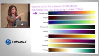
Any thoughts on the best "default" diverging color maps? In theory, one would use a diverging color map if there is a special value (say zero) in the data and you want to have separate colors for values on either side. For example, if I was doing a simulation of convection and was plotting the vertical velocity, I may want positive (upward) velocities with a reddish color map and downward (negative) velocities with a blueish color map. The main disadvantage is that printing out in gray essentially takes the absolute value of the data (not quite, but close enough) and so you preserve magnitude of velocity, but lose all info on sign. All of this, of course, is avoided with a sequential color map (like viridis), but then there isn't the instant recognition that upward (positive) and downward (negative) are different. As Kenneth Moreland states: "The middle point serves as much to highlight the two extremes as it does to highlight itself. In effect, the divergent color map allows us to quickly identify whether values are near extrema and which extrema they are near." But maybe the printing to gray issue should be a more dominant concern.
Google "What is a “good” palette for divergent colors" and go for the 1st link
I like the colour map being such that green-red colour perception is not an issue. All too often I cannot discriminate. The 'viridis' one looks fine to me.
wow, great talk! interesting, informative, entertaining.
Great presentation. Is there made a publication on the work?
Nerd programmer humour is alive and well in the new millennium!
The 'to brain' part is actually four dimensional, as some recent research has shown, the neurons in the retina 'transcode' the three dimensional data to four dimensional data to save bandwidth on the optic nerve. Unfortunately I can't find the paper on it anymore. :|
how about the divergent (or divergence) colormaps? I've been using blue-white-red for the whole time.
Google "What is a “good” palette for divergent colors" and go for the 1st link
Great presentation !!!!
6:53 "if you've spent any time with --" with what? I didn't get the word and the youtube generated captions say 'koolaid' LOL. If someone could clarify, I'd really appreciate it, thanks!!
color
Very informative. Thanks!
Like this talk? See more like it at the SciPy 2016 Conference, to be held July 11-17, 2016 in Austin, Texas. More details at the conference website: scipy2016.scipy.org.
Great presentation indeed! But this case also shows that perfect in theory does not necessarily mean perfect in reality. I think matlab did better job even if their map isn't "perfect" in theory. Viridis produces unbelievanle sickly colors. And what value is there to argue that a color map is good or bad by using them in photographs or paintings? Photographs are not height maps, not by any means.
Very cool talk, thanks a lot
Long shot, but if anyone reads this and happens to know what publication the image at 9:50 with the neural mapping of visual part of the brain comes from of can help me along the way to find it, please let me know. Thank you kindly in advance
Apparently from Felleman, Cerebral Cortex 1, 1 (1991); I found the picture reproduced in J. Silvanto, Consciousness and Cognition 32(30(8)) (2014), which is open access.
@@hankwangn thank you very much!
Well played.
Where does the figure in 9:14 comes from?
Blue yellow dress: Actually measuring the raw RGB reveals that there is a difference in the TH-cam image at least. 100 136 250 vs. 129 145 183
Why multicolor gradient if the data is od one type? IMHo monochrome gradient would be better as default
That would be correct but only works if you use green(I explain below). It's less aesthetic and wouldn't be taken as serious and accepted as the default.
In case of a simple monochromatic gradient it would be better to just use greyscale. Otherwise the range gets limited because pure white is replaced with your colour of choice. Thus your maximum contrast between black and white is reduced.
The least you have to do is black->colour->white which isn't straight forward anymore.
On top of that pure colors have a certain brightness to them, for example blue is darker than yellow. When you only use blue and try to steadily increase the brightness it is impossible to get more blue after a certain brightness.
The only pure color that leads to more contrast than greyscale is green.
Heh. I also came across that lightning brain while looking for an image recently.
awesome!
Just here to say I like "tag10" for classification tasks.
That's a really good one
The colormap great, but the name... Inferno, Plasma, Magma, viridis? Please change it to Venom and get your shit together :P.
Venom is too close to people's fear of spiders.
great talk...
Very Informative
Surprising there is no mention of CubeHelix.
I just checked CubeHelix. It seems to be fun if you see colors or no color (Desaturated). It looks bad for: Green-Blind (Deuteranopia), Red-Blind (Protanopia), Blue-Blind (Tritanopia).
Uhm, at 15:00 I see something that appears quite similar, both visually and conceptually. But sure, no explicit mention :)
Interesting!
Can't copyright a selection of colours.
Thanks for not Anish Kapooring the colormap as Matlab did!
I like green.
Viridis: Origins (2015)
plt.style.use('ggplot')
th-cam.com/video/xAoljeRJ3lU/w-d-xo.html because green....
gets me every time xD
Can't wait to get my hands on viridis and see for myself
Would have been more convincing if he had tested the proposed colormap in some real data application. I have not seen anyone using a colormap for a photo before.
Plenty of examples if you search for "end the rainbow" on Google or Twitter
Sound quality is terrible
18:20 _You can’t name a thing and then kill it._