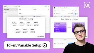
Figma Token and Variable Setup: Top Mistakes to Avoid

ฝัง
- เผยแพร่เมื่อ 4 ก.ค. 2024
- Learn how to avoid common mistakes when configuring variables and tokens in your design projects. Subscribe for our Tokens 101 video coming soon!
*Jumper variables can also be called adaptive variables
Build a community profile + join the community: www.uicollective.co/
Resource library: resources.uicollective.co/
Request a design system audit: www.uicollective.co/design-sy...
Advanced library setup: • Creating an Advanced F...
0:00 An Introduction
0:20 Too many variables
3:16 Improper token definitions
5:35 Ignoring Accessibility
9:04 Not factoring in responsiveness


The amount of value you provide to design community is immeasurable :) Thank you!
Thanks, man!! Please share our channel :)
Really well explained with great examples. Thanks for sharing
Glad you liked it! Please subscribe and share where you can :)
If you're already using Mapped for light and dark mode, then having sizes in there would mean that you'd need a Light-Desktop and Light-Tablet as well as equivalent for dark. I would think it better to have a separate collection for sizes and just have the modes applicable to sizing specified there.
Great call out!
I really see your point in making less variables to make it less complex. But here is a thought though that people should know. And that is that if gap and padding are combined into one token called for example xl (24) . If for some reason you have to change the overall padding on 100 of elements and leave the gap as is. Well then you have a major problem, because you just applied the same token on both the padding and the gap thus linking them together if you change the setting of the "XL token".
Just a thought- great video !
Really great point! In a number of other videos, and resources, I had these seperated for that reason. Really great call out though!!
I just wanted to say the same thing
Great insights and valuable lessons, thanks!
Glad it helped! Please subscribe and share our video :)
Surface on disabled colors do not need to meet AA contrast ratios as disabled elements are not interactive, they cannot receive focus and are not announced by screen readers. Disabling an element is the same as hiding it from an accessibility and inclusion point of view.
That being said it is true that earlier you start thinking about color contrast, the better.
Great call out!
5:37 disabled element is not a good example here. They are not required to pass color contrast ratio check.
I tend to think that anything that has text, should pass the contrast check ratio. It's always interesting to hear how other designers do things, however!
@@UICollectiveDesign for disable state, contrast should pass 3.5:1 ratio in order to meet accessibility requirements (WCAG 2.1)
@@UICollectiveDesign I still remember the neverending email loop with a11y auditors around 12 months ago. Here’s the quote from Success Criteria for 1.4.11:
”User Interface Components that are not available for user interaction (e.g., a disabled control in HTML) are not required to meet contrast requirements. An inactive user interface component is visible but not currently operable. An example would be a submit button at the bottom of a form that is visible but cannot be activated until all the required fields in the form are completed.”
In this situation, mentioned 3:1 is enough :)
Have a great day, I love your videos!
I Agree @tomaszgens
@@UICollectiveDesignan issue with retaining clear contrast in this case, and making text more legible is that not everyone would know that our light grey surface is representing the property; disabled. That means the button could just as easily be interpreted as a tertiary level button, for instance, they are not familiar with our styles after all. So to avoid use ability issues and frustration, it’s actually better to not make it legible, IMO.
Additionally, I would like to say that you do a great job in explaining your approach to variables, in the video. It’s well put together and considered!
but #676767 color is not sutble for disable button!
Hello 👋
I’m not sure for your “jumper” variables naming. I’ve done exactly the same 1 month ago but it was a better solution to keep a kind of scaling system. In a collection called Resolutions I specified all transformations depending from width or height. So for example viewport or container-min is not the same for mobile/tablet/laptop/desktop
The term « mapped » is interesting. I use “Theme” I do a lot of multi brand systems
Anyway thank you
Great call-out & tips! Always interesting to see how other designers do things :)
Sorry I have to ask this.
Are you familiar with the different tier groups of tokens? For example global as base for alias and alias as base for componen specific tokens?
Yup!
Those are talked about in a number of our videos.
Okay - then sorry for playing the smart guy here :D I was just confused by the didactic of the first third of the video. But then I get where this is coming from. Thanks.@@UICollectiveDesign
haha no problem@@nutellanorbert2799
Hey, pretty huge mistake imo that you are making: disabled elements are not required to meet contrast requirements :/
And luckily, because this kind of disabled buttons are so dark they look like primary neutral haha
However, I love your videos, thanks for what you are bringing to the table
It's just an example. I also come from the banking world, where our disabled buttons needed to be accessible due to corporate policy.
the gap and the padding example was not good. they can alias to the same primitive if they have the same value but they are semantic tokens, so they give context to where they should be applied. they make sense to exist in a lot of cases. you are falling into the trap of thinking that because you achieve the same visual with both variables, you can just simplify the tokens. that beats the principles of tokens which is flexibility. with your approach, the gap and the padding can never have different values and that might limit the adaptability of the system. again, just a bad a example.
also, please don't reduce accessibility as color contrast.color is just a very very very small part of accessibility. calling it color contrast would be better suited.
Spacing variables here are intended to be primitives that you are referencing. These can be reused with context if needed for greater flexibility. Our goal is show that you should start with a primitive set of spacing tokens that can scale or be mapped according to your design needs. Appreciate the input!
Of course, there's a lot more that goes into it, so the wording here could have been better for sure. Be sure to watch our talk on Accessibility posted on our channel@@rafaelmatosdasilva