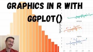
R-Studio Tutorial: Multiple Lines in One Plot With GGPlot

ฝัง
- เผยแพร่เมื่อ 17 เม.ย. 2021
- In today's video, we are going to discover how to create a plot in ggplot2 for R that contains multiple lines in the same graphic. We are also going to add dots to the lines to make each datapoint more visible.
If you liked this #tutorial, make sure to subscribe to the channel for updates on future videos with similar content.
Also, you might want to check out the #GGPlot playlist here:
• R-Studio - GGPlot
If you have any questions about this video or GGPlot in general, leave them down below in the comments and I'll do my best to answer them.


This is one of the few videos I have found showing how to combine ggplot and wide format data. Thank you.
Great explanation; a real time-saver! Thank you!
Thank you! I have been struggling for awhile to get a nice plot out and this video helped alot
Awesome video! Been searching forever to find this specific information. Thank you!!
Thanks a lot! I was breaking my head for the past 3 hours because I was getting so many errors. This saved my day and grades for my assignment.
Amazing video! Time saver!
As someone just starting out with learning to use RStudio, this video has been by far the most helpful for me so far. What a hero, thanks so much for the explanation!
I'm happy to hear that you found my video helpful. Thanks for leaving a comment.
At a loss for words. It save me from a lot of headache. Much appreciated.
Excellent, glad it was helpful. Thanks for leaving a comment!
Great Video. Thank you
Just started rstudio last week and was having difficulties with two line plot, this is tremendous! Would love to see you apply loess\lowess smoothing to this chart. Thank you for your easy and straightforward tutorials 👍
Thanks for the kind words. Glad that my video was helpful for you. I've noted your suggestion for a future video as well.
Thank you :)
You've literally saved my butt in my statistics course at university, thank you! (:
Brilliant! Glad that it was helpful.
Thank you sir, you have saved my keister.
Thank you 😊
thank you so much sir
Excellent
I could do my homework, thanks to your video :)
Excellent! Glad that it was helpful.
Many thanks
muhcas gracias amigo me ayudo mucho manita arriba
Dear sir can you analyze my some simple ecology data in R ?
If it is vertex in linear graph, the area of highest value in ggplot is called as?
I have a 300 x 450 matrix, 300 samples with 450 factors. I´d like to plot the 300 lines in a graph (if possible, 5 diferent colors to represent categories which samples belong to), i´ve tried many approaches, now I have transposed the data, and can´t find a way to put column data [2:454] versus x=column 1. in other words, is there a way to plot 200 collumns without having to write one by one?
Du bist King
thanks god someone posted it ! and could you specify how to add independent legend on the sides of the plot? instead of renaming the y-axis. Thanks !!
Hello, and how would it be if instead of 2 graphs I wanted to make 3 or more on the same graph? Could you help me please? Thank you very much.
good video
🔥🔥🔥🔥
This was a really useful video. Thanks for this.
I wondered if you had any advice on how to connect two points with a line using the mean of different columns in a dataset?
I have tried using different methods but I thought the following would work in R but it doesn't.
ggplot()+
geom_point(data = wsd, mapping = aes(x = "Mud intact", y = mean(Mud_intact)), colour = "blue", size = 3)+
geom_point(data = wsd, mapping = aes(x = "Sand intact", y = mean(Sand_intact)), colour = "blue", size = 3)+
geom_line()+
geom_point(data = wsd, mapping = aes(x = "Mud hair cut", y = mean(Mud_hair.cut)), colour = "red", size = 3)+
geom_point(data = wsd, mapping = aes(x = "Sand hair cut", y = mean(Sand_hair.cut)), colour = "red", size = 3)+
geom_line()+
labs(title = "Comparison of mean worm speed with/without hairs on different substrates", x = "Worm condition and Surface type", y = "Mean Speed")+
theme_bw()
Any advice greatly appreciated.
Very helpful. I kindly request for a video on how to add a legend, given 2 y variables. Thanks
Thanks. I'll do a follow-up on that soon!
Can we add filters in?
11:04 It is not a good solution for ylab (what about if you have to add another line..). I will recommend :
ylab = "Effectif" (or something else ) and adding a *legend* with "blue" armed forces etc...
That's great and working! and many thanks for that!! however - where is the legend? how can I know which group is the correct one?
I have a small R script below that creates a graph.
This script only imports one .csv to .tsv file.
However, I need to tweak it in a way that it can import multiple .tsv files and create overlaying graphs (transparent histogram and line) with different colours.
Can you do it for me?
# read in data
df = read.csv("your_distribution.tsv", sep="\t")
# filter Ks distribution (0.001 < Ks < 5)
lower_bound = 0.001
upper_bound = 5
df = df[df$Ks < upper_bound,]
df = df[df$Ks > lower_bound,]
# perform node-averaging (redo when applying other filters)
dff = aggregate(df$Ks, list(df$Family, df$Node), mean)
# reflect the data around the lower Ks bound to account for boundary effects
ks = c(dff$x, -dff$x + lower_bound)
# plot a histogram and KDE on top
hist(ks, prob=TRUE, xlim=c(0, upper_bound), n=50)
lines(density(ks), xlim=c(0, upper_bound))
Thanks, just what I was looking for. Do you know how to add a legend?
can you link your code in the decription please
I want insert legend, can you help me ?
I made a follow-up here: th-cam.com/video/0TzDjG8jwXE/w-d-xo.html
Nice tutorial. Adding legend would have been better
Thank you, and you're right. That's why I have made a follow-up video in the meantime where I add a legend to this plot. th-cam.com/video/0TzDjG8jwXE/w-d-xo.html
Hi,
I do the same but the result only shows the point and warning that geom_path: Each group consists of only one observation. Do you need to adjust the group aesthetic? It means that the line does not appear. Could you help me out?
hear is my data :
RCI = data.frame (year = c(2015, 2016, 2017, 2018, 2019, 2020),
b1_AU = c(1.0975, 1.0998, 1.1341, 1.1386, 1.1141, 1.1598),
b5_AU = c(0.9262, 0.9754, 0.9163, 0.9637, 0.9399, 0.9284),
b10_CN = c(0.9201, 0.9679, 1.0682, 1.0217, 1.0690, 1.0687),
b21_CH = c(1.1347, 1.1067, 1.0332, 0.9687, 0.9618, 0.9989),
b43_KS = c(0.9532, 0.9278, 0.9561, 1.0208, 1.0095, 1.1224),
b79_US = c(1.0332, 1.0311, 0.9370, 0.9749, 0.9929, 1.0182))
I transfer year into factor then,
library(ggplot2)
ggplot() +
geom_point(data = RCI, aes(x=year, y = b1_AU))+
geom_line(data= RCI,aes(x=year, b1_AU))
Hi, thanks for leaving a comment. I have reproduced your example and I think if you leave "year" as numeric instead of factor the code should work fine. At least it did for me. Let me know if that works.
@@DataGarden Yes, you are right. It was my mistake to transform year to factor. Thanks for your well informative video and quick response. How can I contact you in case we have some small projects in the future
@@mychudungco Great, happy I could help. You can contact me at data.garden@icloud.com with any follow up questions.